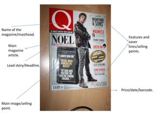
SlideShare a Scribd company logo
1 of 6
Name of the
magazine/masthead.
                              Features and
                              cover
    Main                      lines/selling
    magazine                  points.
    article.

   Lead story/Headline.


                          Price/date/barcode.


Main image/selling
point.
What about the magazine appeals to me?

❶ The fist thing about the magazine that interests me is the design. Everything seems
to have it’s place and everything seems to fit together well giving the cover as a whole
a professional, clean ‘polished’ look. Yet Q still manages to keep their house style on
going through out, this also contributes to the well though layout of the magazine.

❷ I also like the colour scheme of the magazine, the reds and blacks seem to work
well together as does all of the added extras to the cover and contents page such as
pictures and features which all fit together.

❸ The articles within the magazine also reflect well to the types of audience and
genre of musical fans reading. Staying true to their style.

❹ The contents page of Q magazine is a double page spread, adding extra detail and a
experimental design to it, making theirs different and more recognizable to them
rather than other magazines, the contents page pays more attention to their features
including pictures and descriptions whereas the regulars just have headlines and small
description text.
Banner/Plug-
                        magazine
                        selling point.


Magazine name.
Masthead/Identifier.


Cover lines/
magazine articles      Lead story-
to be found inside.    Headline.
What about the magazine appeals to me?

❶ The most organised thing about this magazine is the design/layout the masthead
especially, It’s bold and intriguing also the identifier aspect of the NNE gives the
regular readers or even new readers instant identification of the mag.

❷The cover lines of the magazine give a instant idea of what is to be found inside ‘Alt-J
all the info on music’s new big deal’ and ‘Palma Violets behind the scenes on their new
video’ etc, you also from the headline/main story and cover lines get the music genre
of the magazine due to the types of bands being mentioned.

❸ The overall house style of the magazine stays constant through out however the
colour scheme does often vary, yet it doesn’t vary so much so that it’s un recognisable
to the magazines overall exterior style.

❹The content page of NNE magazine is very basic, sticking to a one page spread and
concentrating more on the issues features, compared to the regulars section which
seem to have been thrown into a column of ‘Plus’ articles.
Masthead
and               Banner and
magazine          magazine
identifier.       advertisement.


        Plug.

                  Cover lines.


                 Flash box.
Lead image
and headline
article (Lead
                Barcode/issue
line).
                number/
                date/price
What about the magazine appeals to me?

❶The design and layout of the Kerrang magazine is traditional to it’s know style, the
identifier/masthead for example even though it is being slightly covered by the lead
image it can still be recognised, giving it the rock theme look.

❷The magazine has also included some unique selling points such as poster
advertisement on the front for example ‘ 10 epic posters’ as a plug, this helps the
magazine stand out for competing magazines.

❸The cover and headlines also use different font techniques also to intrigue readers
and add something extra making it stand out to other magazine.

❹The use of red and black is evident throughout the magazine as far as colour scheme
goes with the added acceptation of blues, yellows etc used to introduce features.

❺The contents page is again a single page spread using most of it as advertisement
for the feature articles, however also does give noticeable attention to the regulars
with headings and small descriptions.

More Related Content

What's hot

Magazine contents analysis
Magazine contents analysisMagazine contents analysis
Magazine contents analysis
Browner97
 
Presentation1.pptx
Presentation1.pptxPresentation1.pptx
Presentation1.pptx
tonieastup
 
KERRANG! - Contents Page
KERRANG! - Contents PageKERRANG! - Contents Page
KERRANG! - Contents Page
asmediac15
 
Contents page analysis
Contents page analysisContents page analysis
Contents page analysis
james_631
 
Magazine Analysis
Magazine Analysis Magazine Analysis
Magazine Analysis
Lottie-1995
 
Magazine Analysis - Kerrang
Magazine Analysis - KerrangMagazine Analysis - Kerrang
Magazine Analysis - Kerrang
guestb26673
 

What's hot (20)

Magazine contents analysis
Magazine contents analysisMagazine contents analysis
Magazine contents analysis
 
Magazine Front Cover Analysis.
Magazine Front Cover Analysis.Magazine Front Cover Analysis.
Magazine Front Cover Analysis.
 
Nme contents
Nme contentsNme contents
Nme contents
 
Presentation1.pptx
Presentation1.pptxPresentation1.pptx
Presentation1.pptx
 
Media homework
Media homeworkMedia homework
Media homework
 
Magazine Cover Analysis
Magazine Cover AnalysisMagazine Cover Analysis
Magazine Cover Analysis
 
Magazine cover analysis of similar texts
Magazine cover analysis of similar texts Magazine cover analysis of similar texts
Magazine cover analysis of similar texts
 
Question 1 evaluation
Question 1  evaluationQuestion 1  evaluation
Question 1 evaluation
 
KERRANG! - Contents Page
KERRANG! - Contents PageKERRANG! - Contents Page
KERRANG! - Contents Page
 
Contents page analysis
Contents page analysisContents page analysis
Contents page analysis
 
Unit 30 - LO1
Unit 30 - LO1Unit 30 - LO1
Unit 30 - LO1
 
Texual research.
Texual research.Texual research.
Texual research.
 
School Magazine Analysis
School Magazine AnalysisSchool Magazine Analysis
School Magazine Analysis
 
Magazine analysis
Magazine analysisMagazine analysis
Magazine analysis
 
Magazine Analysis
Magazine Analysis Magazine Analysis
Magazine Analysis
 
Evaulation question 1
Evaulation question 1Evaulation question 1
Evaulation question 1
 
Magazine Analysis - Kerrang
Magazine Analysis - KerrangMagazine Analysis - Kerrang
Magazine Analysis - Kerrang
 
KERRANG! - Double Page
KERRANG! - Double PageKERRANG! - Double Page
KERRANG! - Double Page
 
Codesandconventions
CodesandconventionsCodesandconventions
Codesandconventions
 
Codes and conventions covers
Codes and conventions coversCodes and conventions covers
Codes and conventions covers
 

Similar to Magazine analysis's

Textual analysis
Textual analysisTextual analysis
Textual analysis
katieniz
 
Analysis of professional_contents_page new ( upload to blog)
Analysis of professional_contents_page new ( upload to blog)Analysis of professional_contents_page new ( upload to blog)
Analysis of professional_contents_page new ( upload to blog)
stephhhhh
 
Unit 14 digital magazine production new (1)
Unit 14 digital magazine production new (1)Unit 14 digital magazine production new (1)
Unit 14 digital magazine production new (1)
sophieeprior
 
Deconstruction of music magazines
Deconstruction of music magazines Deconstruction of music magazines
Deconstruction of music magazines
annaloynsasmedia
 
Deconstructing music magazines
Deconstructing music magazinesDeconstructing music magazines
Deconstructing music magazines
annaloynsasmedia
 

Similar to Magazine analysis's (20)

Textual analysis
Textual analysisTextual analysis
Textual analysis
 
Codes & Conventions of Lifestyle Magazines
Codes & Conventions of Lifestyle MagazinesCodes & Conventions of Lifestyle Magazines
Codes & Conventions of Lifestyle Magazines
 
Textual analysis
Textual analysisTextual analysis
Textual analysis
 
Codes and conventions covers
Codes and conventions coversCodes and conventions covers
Codes and conventions covers
 
Codes & Conventions of Lifestyle Magazines
Codes & Conventions of Lifestyle MagazinesCodes & Conventions of Lifestyle Magazines
Codes & Conventions of Lifestyle Magazines
 
Research into codes and conventions of contents page
Research into codes and conventions of contents pageResearch into codes and conventions of contents page
Research into codes and conventions of contents page
 
Analysis of professional_contents_page new ( upload to blog)
Analysis of professional_contents_page new ( upload to blog)Analysis of professional_contents_page new ( upload to blog)
Analysis of professional_contents_page new ( upload to blog)
 
Contents Page Analysis
Contents Page Analysis Contents Page Analysis
Contents Page Analysis
 
Unit 14 digital magazine production new (1)
Unit 14 digital magazine production new (1)Unit 14 digital magazine production new (1)
Unit 14 digital magazine production new (1)
 
Deconstruction of music magazines
Deconstruction of music magazines Deconstruction of music magazines
Deconstruction of music magazines
 
Contents page analysis gorilaz
Contents page analysis   gorilazContents page analysis   gorilaz
Contents page analysis gorilaz
 
Contents Page Analysis
Contents Page AnalysisContents Page Analysis
Contents Page Analysis
 
NME magazine analysis
NME magazine analysisNME magazine analysis
NME magazine analysis
 
LO4 Presentation
LO4 PresentationLO4 Presentation
LO4 Presentation
 
LO4 Presentation
LO4 PresentationLO4 Presentation
LO4 Presentation
 
Deconstructing music magazines
Deconstructing music magazinesDeconstructing music magazines
Deconstructing music magazines
 
Cover pages
Cover pagesCover pages
Cover pages
 
Movie Magazine Analysis
Movie Magazine AnalysisMovie Magazine Analysis
Movie Magazine Analysis
 
Kerrang!
Kerrang!Kerrang!
Kerrang!
 
Analysis of Music magazine front covers, contents pages and double page spreads.
Analysis of Music magazine front covers, contents pages and double page spreads.Analysis of Music magazine front covers, contents pages and double page spreads.
Analysis of Music magazine front covers, contents pages and double page spreads.
 

More from brittdoran_ox (8)

Evaluation question 3-
Evaluation question 3-Evaluation question 3-
Evaluation question 3-
 
Digipak- The making of
Digipak- The making ofDigipak- The making of
Digipak- The making of
 
Contents page skills development
Contents page skills developmentContents page skills development
Contents page skills development
 
Skills development double page spread
Skills development double page spreadSkills development double page spread
Skills development double page spread
 
Front page skill development
Front page skill developmentFront page skill development
Front page skill development
 
Pie chart survey analysis
Pie chart survey analysisPie chart survey analysis
Pie chart survey analysis
 
Technical Skills- Colour splash tutorial.
Technical Skills- Colour splash tutorial.Technical Skills- Colour splash tutorial.
Technical Skills- Colour splash tutorial.
 
Skills Development- CD Cover Tutorial
Skills Development- CD Cover TutorialSkills Development- CD Cover Tutorial
Skills Development- CD Cover Tutorial
 

Magazine analysis's

  • 1. Name of the magazine/masthead. Features and cover Main lines/selling magazine points. article. Lead story/Headline. Price/date/barcode. Main image/selling point.
  • 2. What about the magazine appeals to me? ❶ The fist thing about the magazine that interests me is the design. Everything seems to have it’s place and everything seems to fit together well giving the cover as a whole a professional, clean ‘polished’ look. Yet Q still manages to keep their house style on going through out, this also contributes to the well though layout of the magazine. ❷ I also like the colour scheme of the magazine, the reds and blacks seem to work well together as does all of the added extras to the cover and contents page such as pictures and features which all fit together. ❸ The articles within the magazine also reflect well to the types of audience and genre of musical fans reading. Staying true to their style. ❹ The contents page of Q magazine is a double page spread, adding extra detail and a experimental design to it, making theirs different and more recognizable to them rather than other magazines, the contents page pays more attention to their features including pictures and descriptions whereas the regulars just have headlines and small description text.
  • 3. Banner/Plug- magazine selling point. Magazine name. Masthead/Identifier. Cover lines/ magazine articles Lead story- to be found inside. Headline.
  • 4. What about the magazine appeals to me? ❶ The most organised thing about this magazine is the design/layout the masthead especially, It’s bold and intriguing also the identifier aspect of the NNE gives the regular readers or even new readers instant identification of the mag. ❷The cover lines of the magazine give a instant idea of what is to be found inside ‘Alt-J all the info on music’s new big deal’ and ‘Palma Violets behind the scenes on their new video’ etc, you also from the headline/main story and cover lines get the music genre of the magazine due to the types of bands being mentioned. ❸ The overall house style of the magazine stays constant through out however the colour scheme does often vary, yet it doesn’t vary so much so that it’s un recognisable to the magazines overall exterior style. ❹The content page of NNE magazine is very basic, sticking to a one page spread and concentrating more on the issues features, compared to the regulars section which seem to have been thrown into a column of ‘Plus’ articles.
  • 5. Masthead and Banner and magazine magazine identifier. advertisement. Plug. Cover lines. Flash box. Lead image and headline article (Lead Barcode/issue line). number/ date/price
  • 6. What about the magazine appeals to me? ❶The design and layout of the Kerrang magazine is traditional to it’s know style, the identifier/masthead for example even though it is being slightly covered by the lead image it can still be recognised, giving it the rock theme look. ❷The magazine has also included some unique selling points such as poster advertisement on the front for example ‘ 10 epic posters’ as a plug, this helps the magazine stand out for competing magazines. ❸The cover and headlines also use different font techniques also to intrigue readers and add something extra making it stand out to other magazine. ❹The use of red and black is evident throughout the magazine as far as colour scheme goes with the added acceptation of blues, yellows etc used to introduce features. ❺The contents page is again a single page spread using most of it as advertisement for the feature articles, however also does give noticeable attention to the regulars with headings and small descriptions.