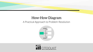
How- How Diagram is used when seeking a practical solution to a problem. It works by repeatedly asking: How can this be solved. Multiple answers can be given for a single question, and therefore the result can be represented in a hierarchical tree format.
Operations ImprovementBUS255 GoalsBy the end of this.docxhopeaustin33688
Operations Improvement
BUS255
Goals
By the end of this chapter, you should know:
Importance of Operations improvement
Improvement Techniques
Broad approaches to improvement
Elements of Improvement
2
In ‘Alice’s adventures through the looking glass’, by Lewis Carroll, Alice encounters living chess pieces and, in particular, the ‘Red Queen’.
‘Well, in our country’, said Alice, still panting a little, ‘you’d generally get to somewhere else – if you ran very fast for a long time, as we’ve been doing’. ‘A slow sort of country!’ said the Queen. ‘Now, here, you see, it takes all the running you can do, to keep in the same place. If you want to get somewhere else, you must run at least twice as fast as that!
The Red Queen effect
3
Think about examples!
Automotive sector
Telecommunications sector (cell phones)
Implications
Operations Improvement is necessary to retain competitive position
Greater operations improvements (comparatively) are necessary to improve competitive position
Improvement Techniques
Scatter Diagram
Scatter Diagram: A graph of the value of one variable vs. another variable
Absenteeism
Productivity
6
Scatter Diagram
Help us understand the relationship between variables (tool to generate ideas)
Remember, correlation doesn’t mean causation
X and Y have positive relationship doesn’t necessarily mean X causes Y.
Refer to in-class problem # 1
7
Flowchart
Flowchart (Process Diagram): A chart that describes the steps in a process. It is also called as process map.
8
Flow Chart
MRI Flowchart
Physician schedules MRI
Patient taken to MRI
Patient signs in
Patient is prepped
Technician carries out MRI
Technician inspects film
If unsatisfactory, repeat
Patient taken back to room
MRI read by radiologist
MRI report transferred to physician
Patient and physician discuss
11
10
20%
9
8
80%
1
2
3
4
5
6
7
Flow Chart
Flowcharts are vey useful in visually describing processes (tool to organize data)
Refer to in-class problem # 2
Let’s do it in Visio
Cause and Effect Diagram
Cause-and-Effect Diagram: A tool that identifies process elements (causes) that might effect an outcome. Also called Fishbone diagram or Ishikawa diagram.
Cause
Materials
Methods
Manpower
Machinery
Effect
11
Cause-and-Effect Diagram
Material
(ball)
Method
(shooting process)
Machine
(hoop &
backboard)
Manpower
(shooter)
Missed
free-throws
Rim alignment
Rim size
Backboard stability
Rim height
Follow-through
Hand position
Aiming point
Bend knees
Balance
Size of ball
Lopsidedness
Grain/Feel (grip)
Air pressure
Training
Conditioning
Motivation
Concentration
Consistency
12
Cause-and-Effect Diagram
Very helpful for performing root cause analysis. Can also identify areas where further data is needed (tool to generate ideas)
Most used categories: Machinery, Manpower, Materials, Methods, and Money
Other categories can also be used
Refer to in-class problem # 3.
Yokoten: Enhancing Performance through Best Practice SharingCIToolkit
Everybody can benefit from the successes of others. Developing a best practice program for your company is an integral part of becoming a world-class performer in your industry. The more you can do to promote the creation and sharing of great ideas within your company, the better your performance will be in the long run and the more engaged your employees will be. You need also to consider what other world-class organizations are doing to become even more innovative and competitive.
The Role of Fishbone Diagram in Analyzing Cause and EffectCIToolkit
A fishbone diagram is one of the various techniques available for conducting cause-and-effect analyses. It provides a structured way to identify and organize the potential causes contributing to a particular problem or effect. It allows the establishment and presentation of causal relationships in a straightforward and understandable format.
STAT 200 Final ExaminationSpring 2017 OL1US1Page 2 of 10STAT .docxwhitneyleman54422
STAT 200 Final ExaminationSpring 2017 OL1/US1Page 2 of 10
STAT 200 Introduction to Statistics Name______________________________
Final Examination: Spring 2017 OL1/US1 Instructor __________________________
Answer Sheet
Instructions:
This is an open-book exam. You may refer to your text and other course materials as you work on the exam, and you may use a calculator.
Record your answers and work in this document.
Answer all 20 questions. Make sure your answers are as complete as possible. Show all of your work and reasoning. In particular, when there are calculations involved, you must show how you come up with your answers with critical work and/or necessary tables. Answers that come straight from calculators, programs or software packages without explanation will not be accepted. If you need to use technology to aid in your calculation, you have to cite the source and explain how you get the results. For example, state the Excel function along with the required parameters when using Excel; describe the detailed steps when using a hand-held calculator; or provide the URL and detailed steps when using an online calculator, and so on.
Show all supporting work and write all answers in the spaces allotted on the following pages. You may type your work using plain-text formatting or an equation editor, or you may hand-write your work and scan it. In either case, show work neatly and correctly, following standard mathematical conventions. Each step should follow clearly and completely from the previous step. If necessary, you may attach extra pages.
You must complete the exam individually. Neither collaboration nor consultation with others is allowed. It is a violation of the UMUC Academic Dishonesty and Plagiarism policy to use unauthorized materials or work from others. Your exam will receive a zero grade unless you complete the following honor statement.
Please sign (or type) your name below the following honor statement:
I understand that it is a violation of the UMUC Academic Dishonesty and Plagiarism policy to use unauthorized materials or work from others. I promise that I did not discuss any aspect of this exam with anyone other than my instructor. I further promise that I neither gave nor received any unauthorized assistance on this exam, and that the work presented herein is entirely my own.
Name _____________________Date___________________
Record your answers and work.
Problem Number
Solution
1
Answer:
(a)
(b)
(c)
(d)
(e)
Justification:
2
Answer:
(a)
(b)
(c)
Justification:
3
Answer:
(a)
IQ Scores
Frequency
Cumulative Relative Frequency
50 - 69
23
70 - 89
249
90 -109
0.722
110 - 129
130 - 149
25
Total
1000
(b)
(c)
Work for (a) and (b):
4
Answer:
(a)
(b)
(c)
Justification:
5
Answer:
(a)
(b)
Work for (a) and (b):
6
Answer:
(a)
(b)
Work for (b):
7
Answer:
(a)
(b)
Work for (a) and (b):
.
Making Sense of Multiple Ideas with Affinity DiagramsCIToolkit
An affinity analysis is a grouping method for classifying items together into meaningful categories. It is also known as KJ Analysis and Affinity Mapping. It is often used to capture and group the output of brainstorming and problem-solving meetings in order to provide better understanding of the topic.
Beyond the Five Whys: Exploring the Hierarchical Causes with the Why-Why DiagramCIToolkit
A why-why diagram is used to identify the root causes of a problem when there are multiple factors to consider. There may be multiple answers at each stage, and each of these answers need to go through a separate process of the why-whys analysis. It is an extension of the 5 Whys approach where they are similar in that they both ask the same Why question multiple times. #WhyWhyDiagram
For the uninitiated, the Lean Startup methodology is a practice for developing products and businesses based on 'validated learning', getting customer feedback quickly and often. The objective is to eliminate uncertainty in the product development process.
Product Roadmap Prioritization by Amazon Principal PMProduct School
Main Takeaways:
- Helps you build your own frameworks as per your business and the stage of growth
- Make unbiased decisions while prioritization - convincing partner teams for central platforms specifically
- Formulate metrics for prioritization given a variety of constraints
ImportantSummary discussion of chapter not article or sectio.docxbradburgess22840
Important
Summary discussion of chapter not article or section
Due date today 6/30/15 in 8 hours or earlier
No plagiarism in own words
Will run through a plagiarism checker
Will not accept if after due date
Please cite and reference
References and citation page must include a valid URL to take the reader to the electronic copy of each source.
If cannot complete with the given instructions do not reply
Please contact me if you have questions
Write as a discussion of this part of the chapter with another student
Please post I found the material interesting, or what do you think
I may ask to change some areas at later date
Please title first followed by discussion
100 to 200 word count each, can be longer if needed
Please write clearly simplify
I am in the U.S.
No charts or graphs
Needs to be like a discussion in class or post
Make the minimum 10 post for discussion
The Tools of Quality
When we introduce a particular method of doing a job, it is natural to consider whether the method is appropriate or not. The decision is usually based on past results and experience, or perhaps on conventional methods. Procedures will be most effective if a proper evaluation is made, and on-the-job data are essential for making a proper evaluation.
KAORU ISHIKAWA, Quality Tools Inventor 1
1Ishikawa, K., “Guide to Quality Control,” Asia Productivity Organization, Tokyo, Japan, 1985.
Quality improvement in manufacturing or services, to be effective, should address the needs of the system as a whole. In this book we have attempted to address quality management from an integrative perspective. This perspective has encompassed the many functional areas of business, including supply chain management, marketing, accounting, human resources, operations, engineering, and strategy. None of these fields of endeavor operate in a vacuum. They are all interrelated and interdependent.
Improving the System
To be successful, a business or organization must balance the needs of these different functional areas around a coherent business vision and strategy. The objective of the system is to satisfy the customer. Customer satisfaction means higher customer retention, which leads to improved profitability.
A quality system (Figure 10-1) uses the business model with a focus on the customer and includes the dynamics of continual improvement, change, planning, and renewal. Continual improvement is necessary for a company to learn to grow. Companies that are unable to adapt find themselves with stagnant cultures and labor forces. Many managers, on discovering that their organization has reached this point, believe they must resort to draconian measures such as layoffs and organizational reengineering to achieve change. If they had pursued continual improvement and learning in the first place, they might not have reached this juncture.
Figure 10-1 Quality System Model
This quality system is not just a series of variables and relationships. It is an interconnect.
Product Roadmap Prioritization by Amazon Principal PMProduct School
Main Takeaways:
-Helps you build your own frameworks as per your business and the stage of growth
-Make unbiased decisions while prioritization - convincing partner teams for central platforms specifically
-Formulate metrics for prioritization given a variety of constraints
http://finishedexams.com/Computer_Science.php
Immediate access to solutions for ENTIRE COURSES, FINAL EXAMS and HOMEWORKS “RATED A+" - Without Registration!
Using Logic for Productive Presentations and ReportsMark Buckwell
An approach to writing consulting style reports using a method proven for over 40 years using logic based on pyramid logic. Ensuring a clear structure and story is key to conveying a set of messages.
Continuous Improvement Infographics for LearningCIToolkit
The purpose of this section is to provide all the continuous improvement tools in an infographic format. These flashcards are easy to read and understand, and very useful if you are looking for brief, concise, and to-the-point summaries. They are quick refreshers for continuous improvement and can speed up the learning process.
Continuous Improvement Posters for LearningCIToolkit
The intention of this section is to provide all the continuous improvement tools in a poster format that is easy to print and share. These posters are great tools for training, sharing and posting, and can also be distributed as hand-outs during continuous improvement workshops.
Simplifying Complexity: How the Four-Field Matrix Reshapes ThinkingCIToolkit
A Four Field Matrix is an effective model for planning, organizing and making decisions. It is a two-dimensional chart that consists of four equal-sized quadrants, each will describe different aspects of information.
More Related Content
Similar to How-How Diagram: A Practical Approach to Problem Resolution
Beyond the Five Whys: Exploring the Hierarchical Causes with the Why-Why DiagramCIToolkit
A why-why diagram is used to identify the root causes of a problem when there are multiple factors to consider. There may be multiple answers at each stage, and each of these answers need to go through a separate process of the why-whys analysis. It is an extension of the 5 Whys approach where they are similar in that they both ask the same Why question multiple times. #WhyWhyDiagram
For the uninitiated, the Lean Startup methodology is a practice for developing products and businesses based on 'validated learning', getting customer feedback quickly and often. The objective is to eliminate uncertainty in the product development process.
Product Roadmap Prioritization by Amazon Principal PMProduct School
Main Takeaways:
- Helps you build your own frameworks as per your business and the stage of growth
- Make unbiased decisions while prioritization - convincing partner teams for central platforms specifically
- Formulate metrics for prioritization given a variety of constraints
ImportantSummary discussion of chapter not article or sectio.docxbradburgess22840
Important
Summary discussion of chapter not article or section
Due date today 6/30/15 in 8 hours or earlier
No plagiarism in own words
Will run through a plagiarism checker
Will not accept if after due date
Please cite and reference
References and citation page must include a valid URL to take the reader to the electronic copy of each source.
If cannot complete with the given instructions do not reply
Please contact me if you have questions
Write as a discussion of this part of the chapter with another student
Please post I found the material interesting, or what do you think
I may ask to change some areas at later date
Please title first followed by discussion
100 to 200 word count each, can be longer if needed
Please write clearly simplify
I am in the U.S.
No charts or graphs
Needs to be like a discussion in class or post
Make the minimum 10 post for discussion
The Tools of Quality
When we introduce a particular method of doing a job, it is natural to consider whether the method is appropriate or not. The decision is usually based on past results and experience, or perhaps on conventional methods. Procedures will be most effective if a proper evaluation is made, and on-the-job data are essential for making a proper evaluation.
KAORU ISHIKAWA, Quality Tools Inventor 1
1Ishikawa, K., “Guide to Quality Control,” Asia Productivity Organization, Tokyo, Japan, 1985.
Quality improvement in manufacturing or services, to be effective, should address the needs of the system as a whole. In this book we have attempted to address quality management from an integrative perspective. This perspective has encompassed the many functional areas of business, including supply chain management, marketing, accounting, human resources, operations, engineering, and strategy. None of these fields of endeavor operate in a vacuum. They are all interrelated and interdependent.
Improving the System
To be successful, a business or organization must balance the needs of these different functional areas around a coherent business vision and strategy. The objective of the system is to satisfy the customer. Customer satisfaction means higher customer retention, which leads to improved profitability.
A quality system (Figure 10-1) uses the business model with a focus on the customer and includes the dynamics of continual improvement, change, planning, and renewal. Continual improvement is necessary for a company to learn to grow. Companies that are unable to adapt find themselves with stagnant cultures and labor forces. Many managers, on discovering that their organization has reached this point, believe they must resort to draconian measures such as layoffs and organizational reengineering to achieve change. If they had pursued continual improvement and learning in the first place, they might not have reached this juncture.
Figure 10-1 Quality System Model
This quality system is not just a series of variables and relationships. It is an interconnect.
Product Roadmap Prioritization by Amazon Principal PMProduct School
Main Takeaways:
-Helps you build your own frameworks as per your business and the stage of growth
-Make unbiased decisions while prioritization - convincing partner teams for central platforms specifically
-Formulate metrics for prioritization given a variety of constraints
http://finishedexams.com/Computer_Science.php
Immediate access to solutions for ENTIRE COURSES, FINAL EXAMS and HOMEWORKS “RATED A+" - Without Registration!
Using Logic for Productive Presentations and ReportsMark Buckwell
An approach to writing consulting style reports using a method proven for over 40 years using logic based on pyramid logic. Ensuring a clear structure and story is key to conveying a set of messages.
Continuous Improvement Infographics for LearningCIToolkit
The purpose of this section is to provide all the continuous improvement tools in an infographic format. These flashcards are easy to read and understand, and very useful if you are looking for brief, concise, and to-the-point summaries. They are quick refreshers for continuous improvement and can speed up the learning process.
Continuous Improvement Posters for LearningCIToolkit
The intention of this section is to provide all the continuous improvement tools in a poster format that is easy to print and share. These posters are great tools for training, sharing and posting, and can also be distributed as hand-outs during continuous improvement workshops.
Simplifying Complexity: How the Four-Field Matrix Reshapes ThinkingCIToolkit
A Four Field Matrix is an effective model for planning, organizing and making decisions. It is a two-dimensional chart that consists of four equal-sized quadrants, each will describe different aspects of information.
Unlocking Productivity and Personal Growth through the Importance-Urgency MatrixCIToolkit
Importance Urgency Matrix is an effective method of organizing priorities. It is a two-dimensional chart that is used to prioritize work activities as well as personal activities.
Measuring True Process Yield using Robust Yield MetricsCIToolkit
Process yield measures should be able to expose even the smallest inefficiencies within a process, empowering operations to understand their true process yield in order to set realistic targets for improvement. Many organizations employ two primary measures of process yield: First Time Yield (FTY) and Final Yield (FY).
From Goals to Actions: Uncovering the Key Components of Improvement RoadmapsCIToolkit
An improvement roadmap is an approach used to achieve improvement. It is used to guide through the implementation of a long-term improvement journey. It helps us to understand where we are now as well as where we want to go.
Paired Comparison Analysis: A Practical Tool for Evaluating Options and Prior...CIToolkit
Paired Comparison Analysis is an activity for evaluating a small range of options by comparing them against each other. It is an easy and useful tool for rating and ranking alternatives for decision making where evaluation criteria are subjective.
From Red to Green: Enhancing Decision-Making with Traffic Light AssessmentCIToolkit
Traffic Light Assessment is a rating system for evaluating the performance of a process or variable in relation to a goal. It is a good way to communicate information and have the advantage of being universally recognized by everyone.
Mind Mapping: A Visual Approach to Organize Ideas and ThoughtsCIToolkit
Visually organizing ideas, thoughts and information around a single topic or problem. Mind mapping has many applications in personal, professional and educational situations.
Adapting to Change: Using PEST Analysis for Better Decision-MakingCIToolkit
A strategic and structured planning tool for evaluating the external environment of an organization. PEST stands for Political, Economic, Social, and Technological external factors.
The Role of Box Plots in Comparing Multiple Data SetsCIToolkit
A box plot is a graph that shows the frequency of numeric data values. It can be drawn either horizontally or vertically. It is referred to as a Box-and-Whisker Plot.
Exploring Variable Relationships with Scatter Diagram AnalysisCIToolkit
A Scatter Diagram is a way of showing whether two variables are correlated or related to each other. It shows patterns in the relationship that cannot be seen by just looking at the data. A scatter diagram uses a two-axis chart to represent data.
The Role of Histograms in Exploring Data InsightsCIToolkit
A graph which shows the frequency of continuous data values. Histograms are mainly used to explore data as well as to present the data in an easy and understandable manner. They are often used as the first step to determine the underlying probability distribution of a data set or a sample.
Leveraging Gap Analysis for Continuous ImprovementCIToolkit
Gap analysis compares two different states of something, the current state and the future state. It is mainly used to assess where a company or process is today, where it needs to be in the future, and what needed to be there. Gap analysis is also known as need analysis or need assessment.
Flowcharting: The Three Common Types of FlowchartsCIToolkit
A graphical tool that illustrates the flow of a business process and the relationships between its activities. It helps you and your team to understand the activities and decisions, and thus, perform the tasks correctly and in the right order.
Value Analysis: How Lean Thinking Defines ValueCIToolkit
Value Analysis as per Lean definition focuses on what adds value to business processes as perceived by the customer. A process that does not add value to the product or service should be redesigned or eliminated altogether.
The Main Components of an Effective Visual Management SystemCIToolkit
Visual Management is a business management technique that communicates important information in the physical workplace. It is a system of information displays, visual controls, labels and signs, color coding and other markings instead of written instructions.
Process Charts and Process Sequence Charts: Tools for Process ImprovementCIToolkit
A symbolic representation that illustrates the sequence of activities within a process. Used to show all the operation, inspection, storage, transportation, and delay activities that exist in a process.
Achieving Business and Personal Goals with SWOT AnalysisCIToolkit
SWOT analysis is a simple and structured planning tool for reviewing and assessing the position and health of an organization. It allows the organization to look deeply within itself to understand the factors that influence its ability to achieve its goals.
Oprah Winfrey: A Leader in Media, Philanthropy, and Empowerment | CIO Women M...CIOWomenMagazine
This person is none other than Oprah Winfrey, a highly influential figure whose impact extends beyond television. This article will delve into the remarkable life and lasting legacy of Oprah. Her story serves as a reminder of the importance of perseverance, compassion, and firm determination.
Artificial intelligence (AI) offers new opportunities to radically reinvent the way we do business. This study explores how CEOs and top decision makers around the world are responding to the transformative potential of AI.
Modern Database Management 12th Global Edition by Hoffer solution manual.docxssuserf63bd7
https://qidiantiku.com/solution-manual-for-modern-database-management-12th-global-edition-by-hoffer.shtml
name:Solution manual for Modern Database Management 12th Global Edition by Hoffer
Edition:12th Global Edition
author:by Hoffer
ISBN:ISBN 10: 0133544613 / ISBN 13: 9780133544619
type:solution manual
format:word/zip
All chapter include
Focusing on what leading database practitioners say are the most important aspects to database development, Modern Database Management presents sound pedagogy, and topics that are critical for the practical success of database professionals. The 12th Edition further facilitates learning with illustrations that clarify important concepts and new media resources that make some of the more challenging material more engaging. Also included are general updates and expanded material in the areas undergoing rapid change due to improved managerial practices, database design tools and methodologies, and database technology.
The Team Member and Guest Experience - Lead and Take Care of your restaurant team. They are the people closest to and delivering Hospitality to your paying Guests!
Make the call, and we can assist you.
408-784-7371
Foodservice Consulting + Design
2. citoolkit.com
Introduction
Once you have identified a problem, you need to find a solution that will
permanently solve the problem.
Oftentimes, you should get to
the root cause of the problem
to understand why it’s
happening.
And this is where tools like the
5 whys can help.
How-How Diagram 2
3. citoolkit.com
Introduction
Other times, you don’t even need to dig into the problem, you just need to
solve the it right away.
How-How Diagram 3
This is what is called
low hanging fruits.
These low hanging
fruits may be quick
wins or larger projects
that may involve
capital expenditure
5. citoolkit.com
Introduction
Other examples include . . .
How-How Diagram 5
Change workplace
layout
Modify a procedure
Mistake proof a process
Improve management
reports
Improve existing
infrastructure
Train employees
6. citoolkit.com
Introduction
In both cases, you need to come up with actionable items in order to solve
the problem permanently.
How-How Diagram 6
This can be easily done by
performing the How-How Analysis.
7. citoolkit.com
Definition
The How-How Diagram is a simple method that is used to generate
multiple ideas to solve a specific problem.
How-How Diagram 7
It is a tree diagram used
when seeking a practical
solution to a problem
8. citoolkit.com
Definition
Provides an effective structure for organizing possible ideas and solution
options all in one place.
How-How Diagram 8
It works by repeatedly asking: ‘How can this be solved?‘ Until you can no longer
break the answers any further.
10. citoolkit.com
Benefits
How-How Diagram 10
Provides a list of possible solution
items all in one place.
Promotes collaboration and
strengthens the levels of
responsibility.
Helps breaking down the solution into
smaller components.
Supports the non-linear way in which
we tend to think.
11. citoolkit.com
Steps for Creating the How-How Diagram
How-How Diagram 11
With your team, clearly state the problem then write it on a post-it card
• Place the problem card on the left side of a whiteboard or wall.
//
12. citoolkit.com
Steps for Creating the How-How Diagram
How-How Diagram 12
Ask ‘how can this problem be solved?’
• Let the team write as many answers as possible on postcards.
• Stick the postcards to the right of the problem.
//
//
//
//
//
13. citoolkit.com
Steps for Creating the How-How Diagram
How-How Diagram 13
Repeat this sequence of breaking down the problem by keep asking ‘How’
• Repeat until the ideas are specific enough or until you have no more answers,
and you are satisfied with the improvement ideas.
//
//
//
//
//
//
//
//
//
//
//
//
14. citoolkit.com
Steps for Creating the How-How Diagram
How-How Diagram 14
Once you are finished, prioritize and identify the key ideas for implementation
//
//
//
//
//
//
//
//
//
//
//
//
// //
//
//
15. citoolkit.com
Two Formats
How-How Diagram 15
From
center to
the outside
///
///
///
///
/// ///
///
///
///
///
///
///
///
///
///
///
///
///
///
///
///
///
///
///
///
///
///
///
///
///
///
///
///
///
///
///
From left to
right
16. citoolkit.com
Tips
Note that you might use the ‘OR’ symbol to indicate alternative ideas.
How-How Diagram 16
You can also add thick
borders around the ideas
that has been chosen to
be part of the final
///
///
///
///
///
///
///
///
///
///
///
///
///
///
OR
Both ideas are
alternative to
each other
Indicates
successive
actions
An idea that
has been
chosen
An idea that
has not been
chosen
17. citoolkit.com
Example – Energy Reduction
Let’s consider the goal of reducing energy consumption in a production
plant. The following how-how diagram illustrates the ideas generated by a
team for achieving this goal.
How-How Diagram 17
High energy
consumption
Improve energy
monitoring
Change oven burner
type
Draw energy
consumption map
Daily monitoring and
reporting
Weekly energy
meeting
Purchase best quote
HOW?
HOW?
18. citoolkit.com
Example – Reducing Spoilage in a Production Line
The following is another example which involves a team seeking ways to
minimize spoilage in a manufacturing business.
How-How Diagram 18
HOW?
High
Spoilage
Reduce
changeover time
Review current
responsibilities
Train operators
Monitor and report
Train operators
Clarify and allocate
responsibilities
Reduce
breakdowns
Analyze
breakdowns
Provide internal
training
Hire an external
training provider
Implement a SMED
workshop
Implement a
breakdown system
OR
19. citoolkit.com
Further Information
Very similar to the whys-why technique which focuses on finding the root
causes of the problem.
How-How Diagram 19
There may be multiple answers at each stage, and each of these answers need to
go through a separate process of the why-whys analysis.
//
//
//
//
//
//
//
//
//
//
//
//
20. citoolkit.com
Further Information
The Power of Asking ‘How’ Instead of ‘Why’ in Coaching.
How-How Diagram 20
Asking ‘why’
will get you
nowhere
Asking 'how’
will get
straight to
the point
Instead of asking ‘Why is your performance so poor?’ ask 'How can you improve your
performance and keep it up?'