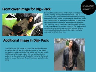
1. I decided to use this image for the front cover because the
artist is looking directly into the lens which I feel is
addressing the audience and therefore more eye catching.
Her whole outfit is shown in the image as well as her shoes
which is important as we as a group wanted to make sure
her clothing fit into our target audiences typical fashion .
This therefore makes the audience automatically relate to
the artist and again is more eye catching. The back ground
complements her clothing and creates a colour scheme
which is aesthetically pleasing, it also makes her facial
expression and hair stand out.
I decided to use this image for one of the additional images
in my Digi- Pack. It was a good image to use as she stands
out against the background of the bridge and her skin tone is
highlighted, which again makes this eye catching for the
audience as the artist herself already fits into what the target
audience would like to see. This will include a quote from the
song.
Intro: these images are
the images that I have
decided to use for both
my products.
2. This is another additional image I decided to use for
my Digi-Pack. In this image, the artist stands out in
front of the background and the blue tinted light
allows her face to light up and her facial expression
to stand out which is eye catching for the audience.
I will also include a quote from a song on this page.
This image is also being used for an additional
image of my Digi- pack. This is a close up of
the artist which allows the audience to see the
artists facial expression and stance. This image
will also have a quote from a song on the side
that will fit well with the artist.
3. I decided to use this image as another
additional image for the Digi- pack. The
long shot allows the audience to see both
the artists stance and clothing. It also
allows them to see the background well
which fits into the theme of the Digi pack
and therefore links to every image. This
image will be the CD hold in the Digi
pack.
This image will also be used. This image will
be the back cover of the Digi- pack and
contain the tracks of the album with
additional information about the CD. This
image again fits well with the genre and is
of other activities going on at Leake street
where the graffiti scenes were shot.
4. I decided to use this image for the
Album Advertisement because this is a
good long shot of the artist at an angle
that shows her facial expression, stance
and clothing. It also shows a good
amount of the art behind her that
complements her clothing and also
leaves a lot of negative space for
information about the album to be
added and therefore a lot can be done
with this image so all typical
conventions can be included.
Conclusion: these images
have been selected as I feel
that all these image link well
together and allow the
audience to view the artist
from different perspectives
and angles therefore both
products will link together
like other existing albums and
advertisements.