Print production mood board
•Download as PPTX, PDF•
0 likes•145 views

The document summarizes key aspects and conventions found in album cover designs across several alternative rock albums. It notes that most covers use simple, dark color palettes prominently featuring black and white. Text and imagery on the covers is also typically simple, focusing on a single object or element. Back covers then mirror the front visually and list the album's songs. Overall, the designs establish conventions for the genre through their understated and moody aesthetic that matches the lyrical themes of heartbreak.

More Related Content
What's hot
What's hot (20)
Viewers also liked
Viewers also liked (19)
Similar to Print production mood board
Similar to Print production mood board (20)
More from Charley Easter
Recently uploaded
Recently uploaded (20)
Print production mood board
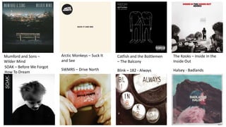
- 1. Mumford and Sons – Wilder Mind Arctic Monkeys – Suck It and See Catfish and the Bottlemen – The Balcony The Kooks – Inside In the Inside Out SOAK – Before We Forgot How To Dream SWMRS – Drive North Blink – 182 - Always Halsey - Badlands
- 5. What have I learnt from these designs? I researched into artists that I believed were a similar subgenre to my own, as well as this I researched into those around the general genre to get a wider understanding of album covers. One aspect I noticed within most of the albums was the simplicity and use of dark or primary colours promoting the simplicity. Seeming to create a convention of the genre. The use of the black and whites used throughout the covers makes them dark yet pure, reflecting much on the genre due to lyrics within most songs focussing on heartbreak. This also creating a convention within the genre. Thirdly, I notices the simplicity in design focusing on either just words, people or objects, each having one stand out object within each. For example, the mouth in the Drive North album, or the bench in the Wilder Mind album. Finally, the back covers use similar imagery to that used on the fronts, showing consistency. They also consist mostly of just the songs from the album and possibly textured images showcased on the front cover.