Control charts are graphs used to monitor quality during manufacturing. They allow issues to be identified and addressed early to maintain consistent product quality. Key aspects of control charts include:
- Plotting statistics like the mean or range of sample measurements over time
- Using statistical limits to identify processes that are in or out of control
- Interpreting patterns in the charts to determine if corrective action is needed
Control charts enable manufacturers to efficiently produce uniform products by catching problems early and avoiding unnecessary adjustments to processes that are performing normally.
In this document
Powered by AI
Introduction to quality control charts that graph product quality during manufacturing for corrective action.
Mr. Shewart invented control charts for variable and attribute data in the 1920s, contributing significantly to quality control.
Graphical presentation of data aids understanding of manufacturing and service processes.
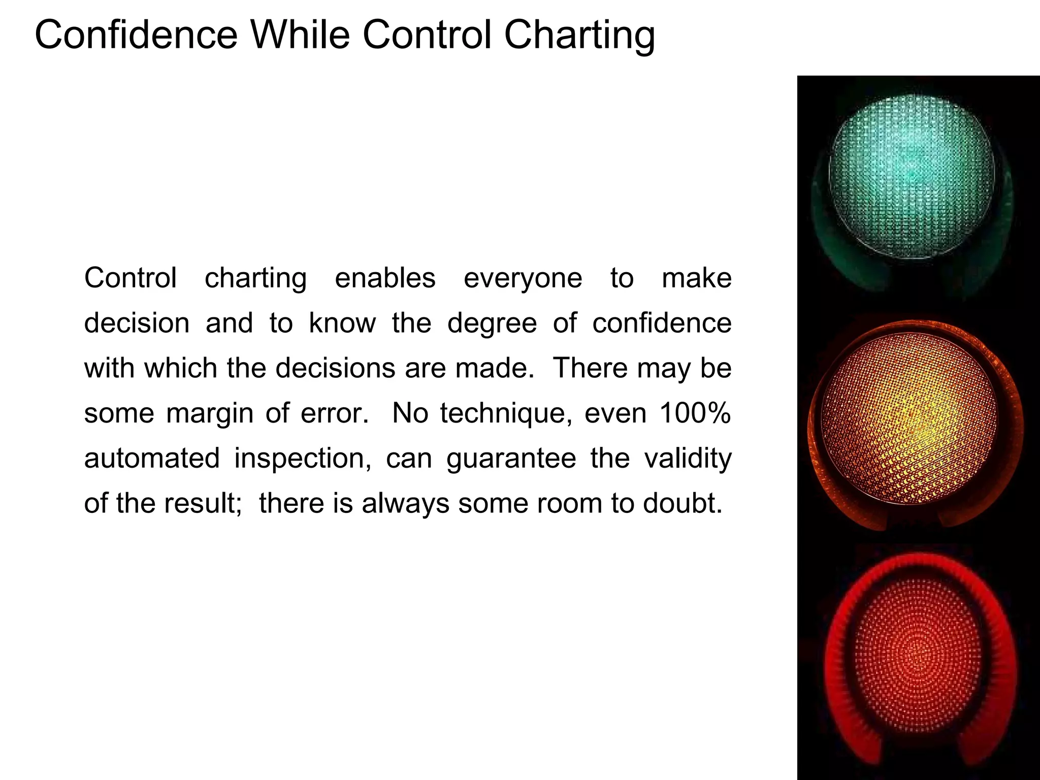
Control charting provides decision-makers with confidence, acknowledging potential errors.
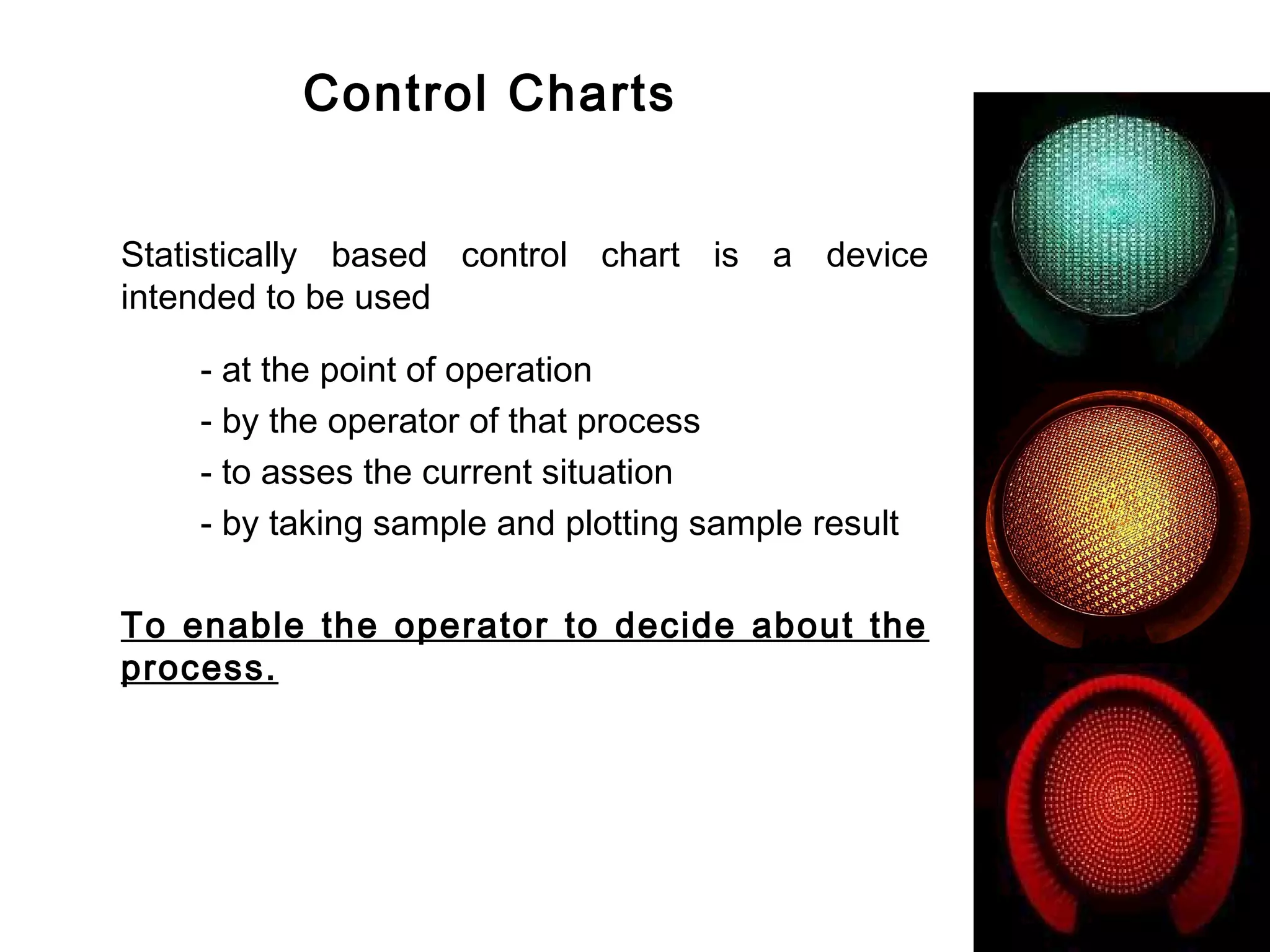
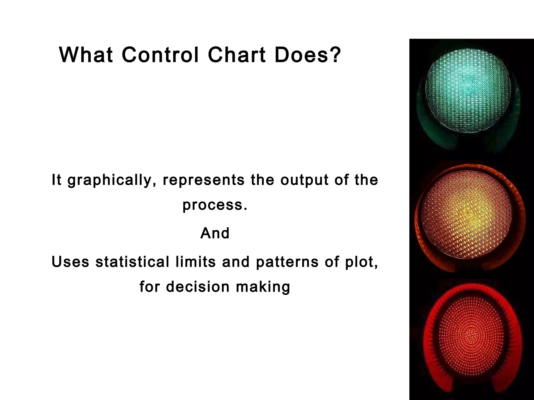
Control charts assess current process situations by graphically representing output using statistical limits.
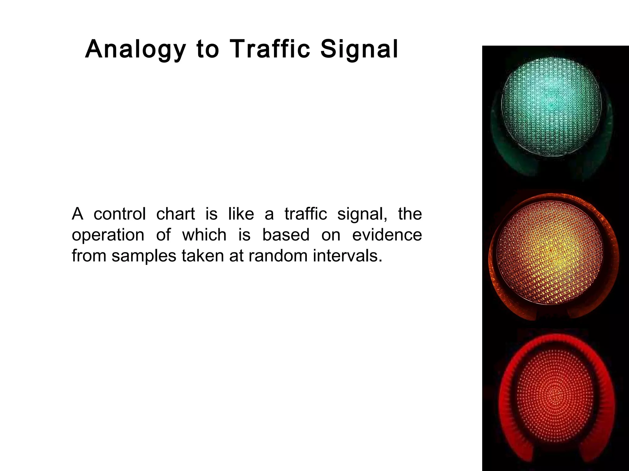
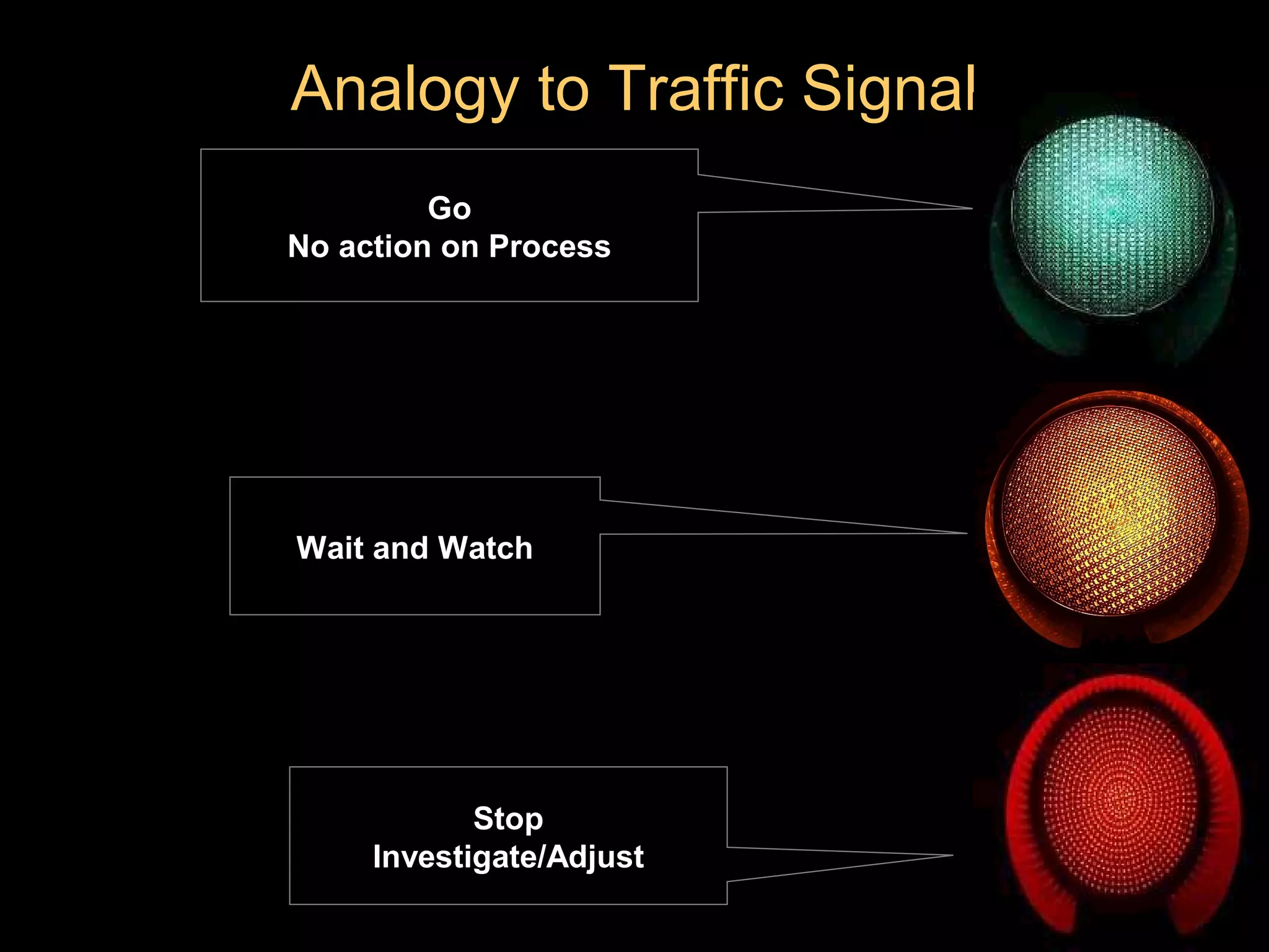
Control charts are compared to traffic signals, guiding actions based on data signals.
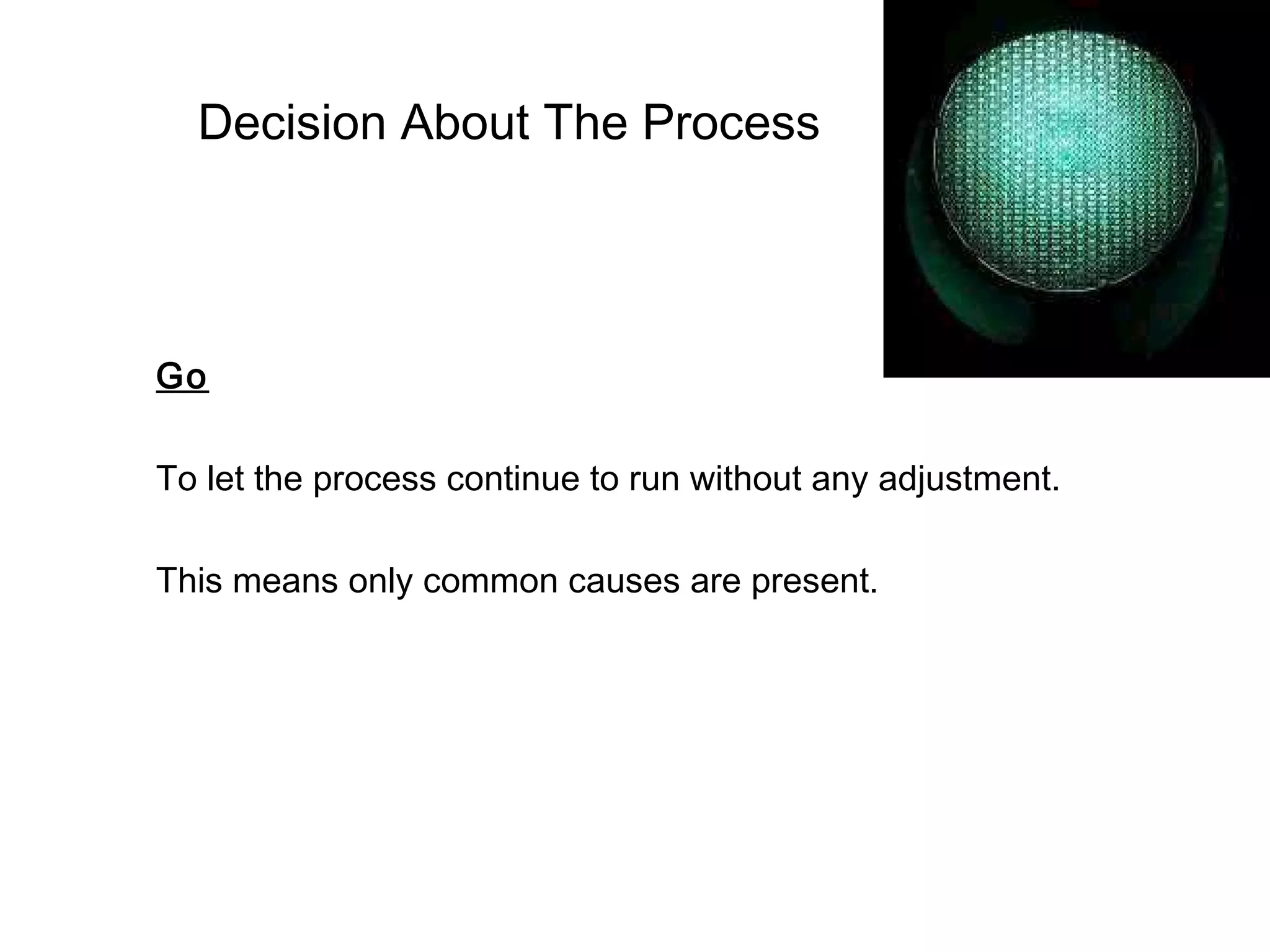
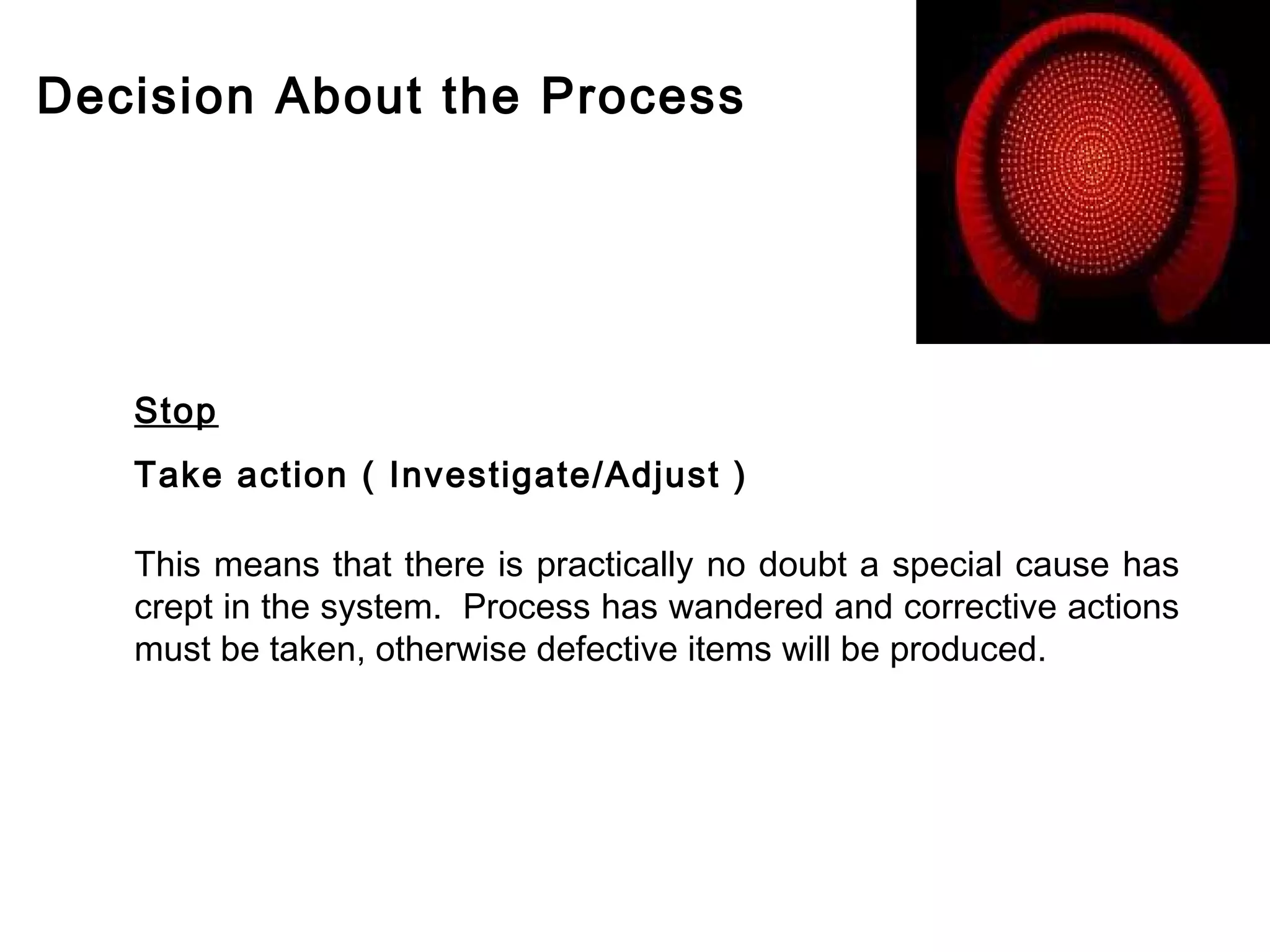
Decisions based on control chart signals: allow process, monitor, or halt for investigation.
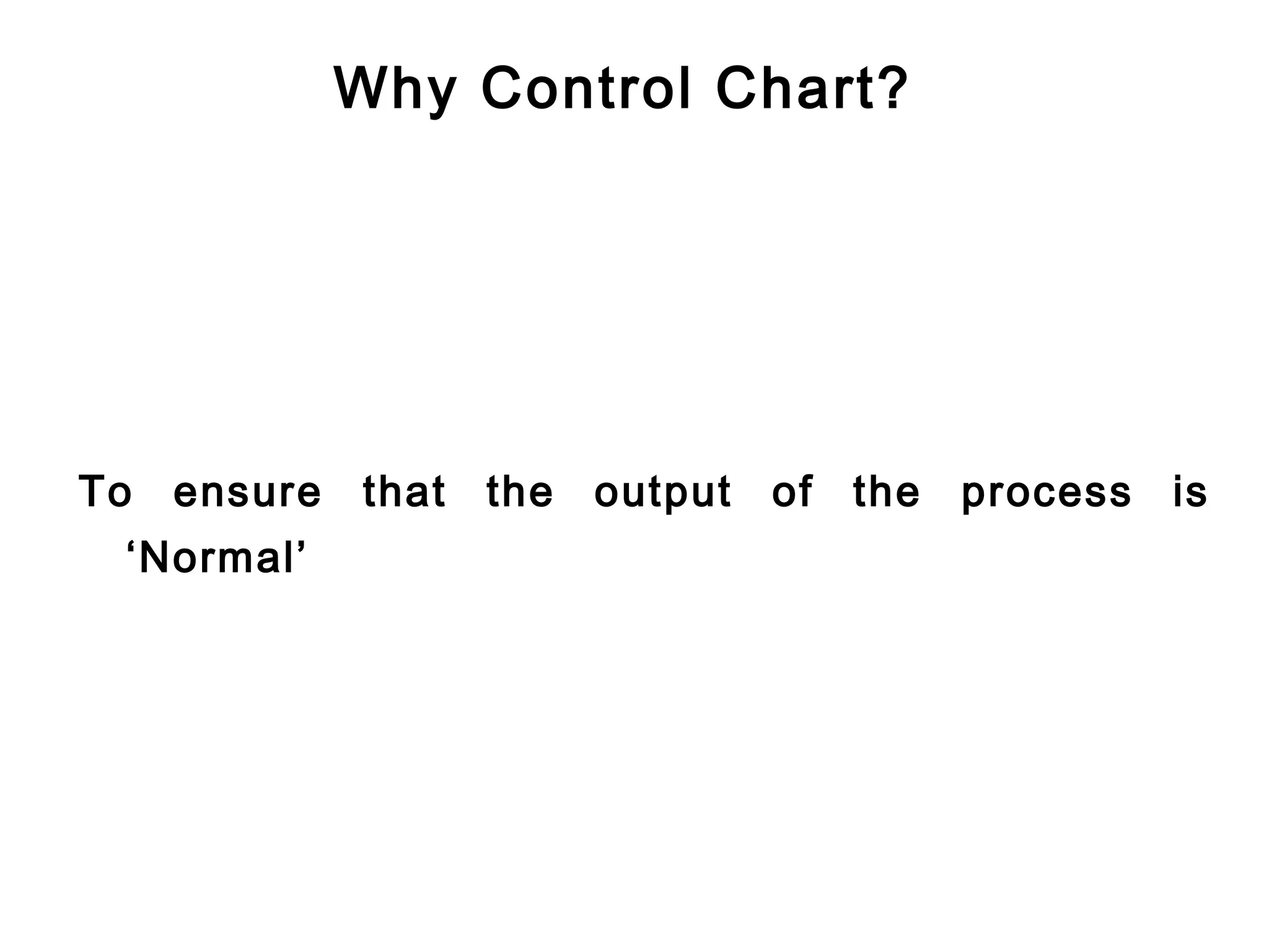
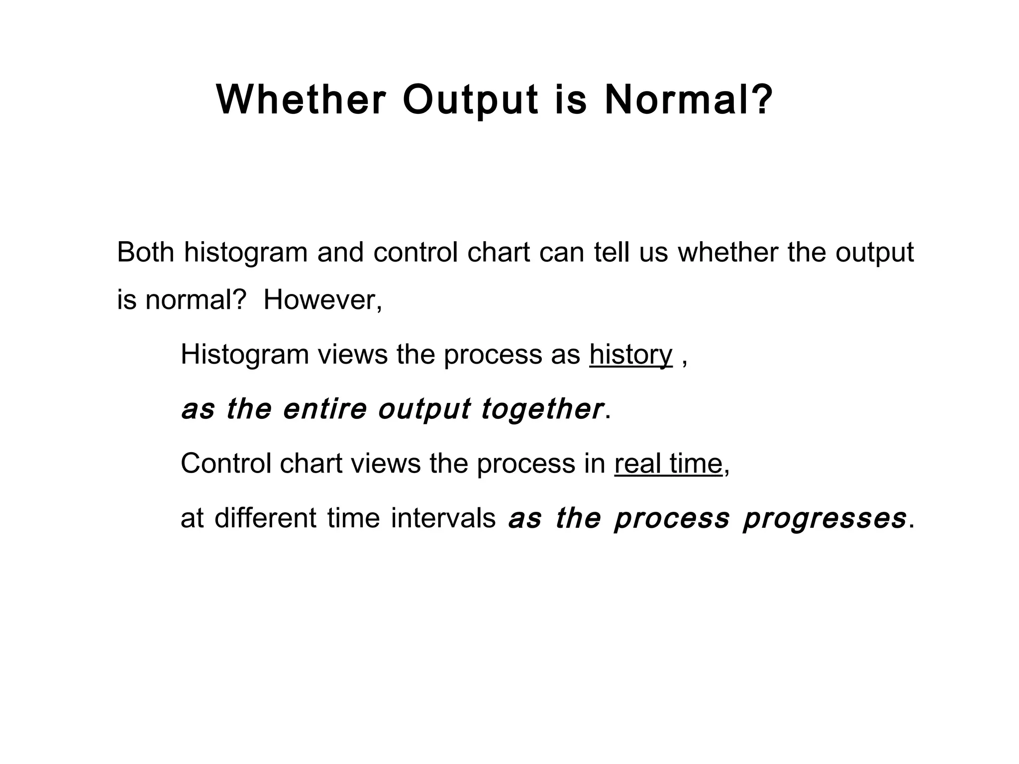
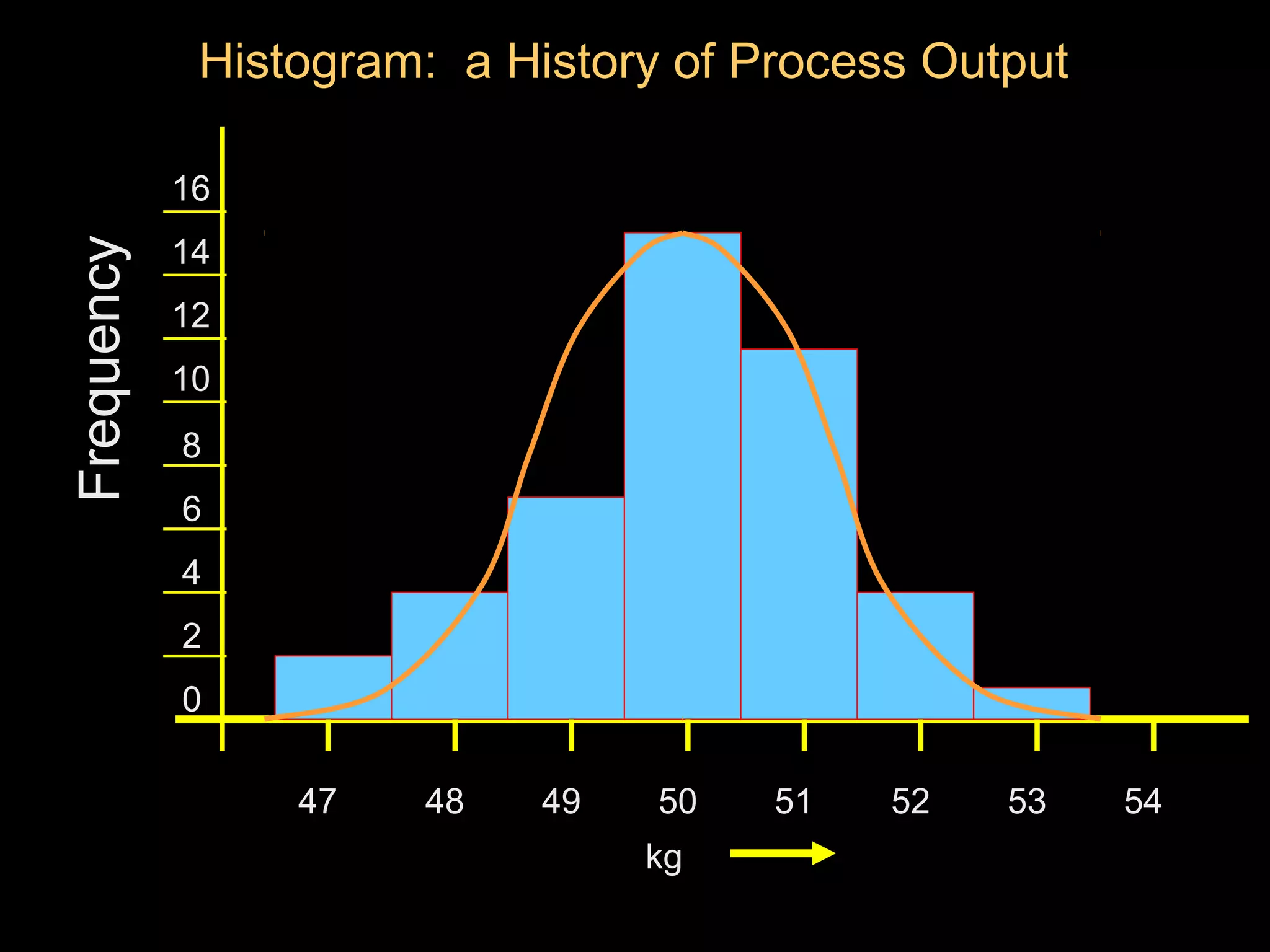
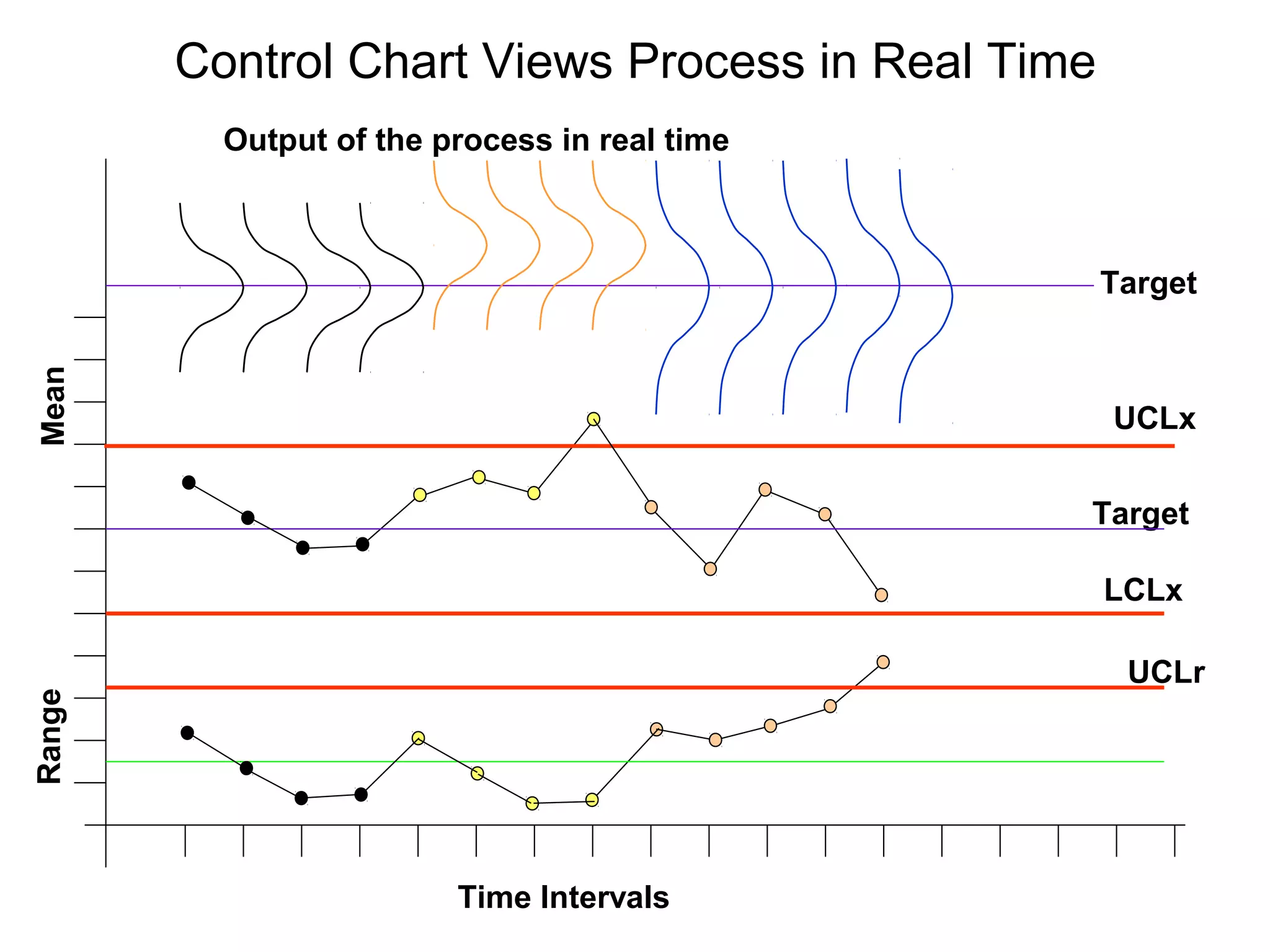
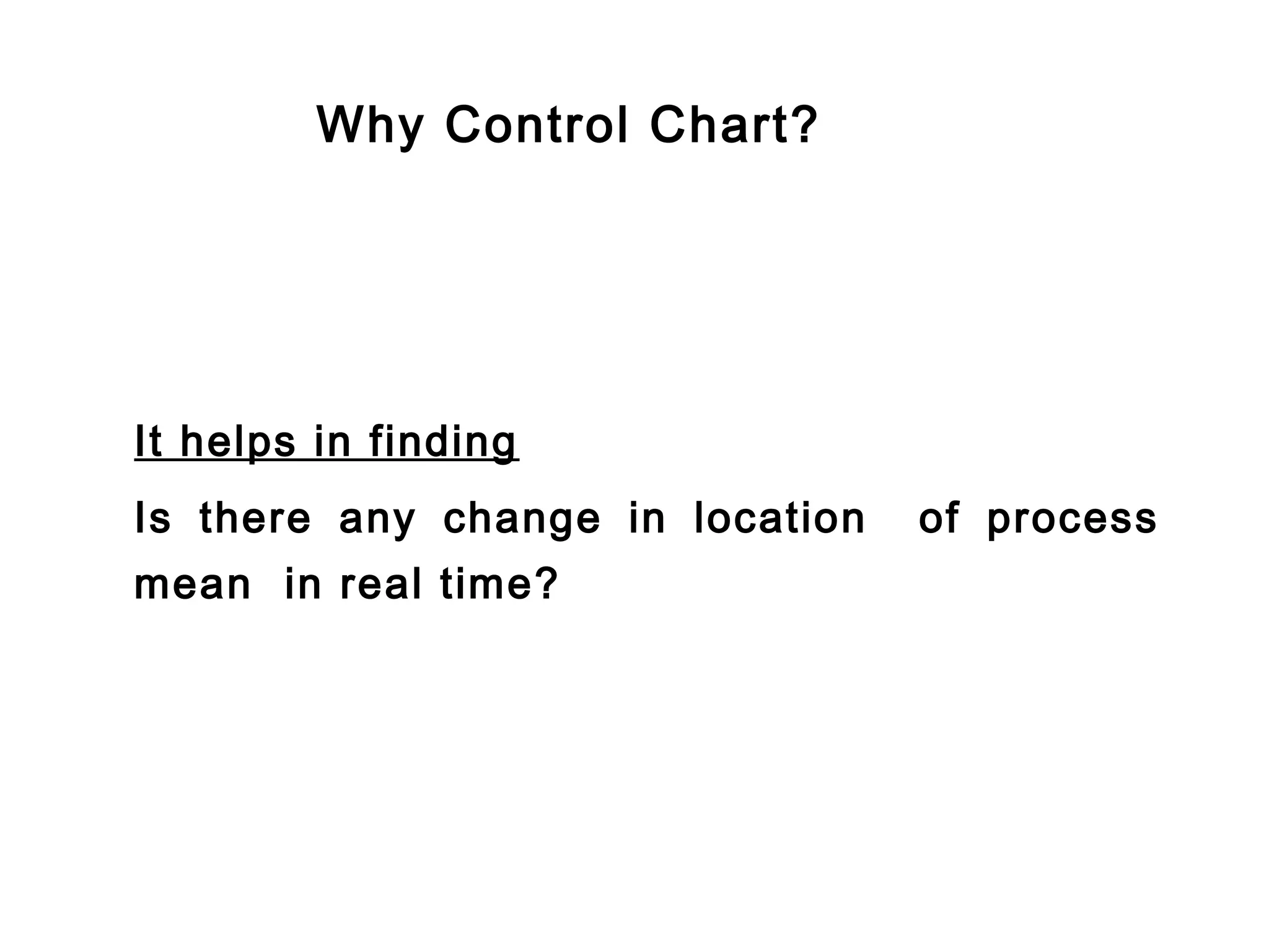
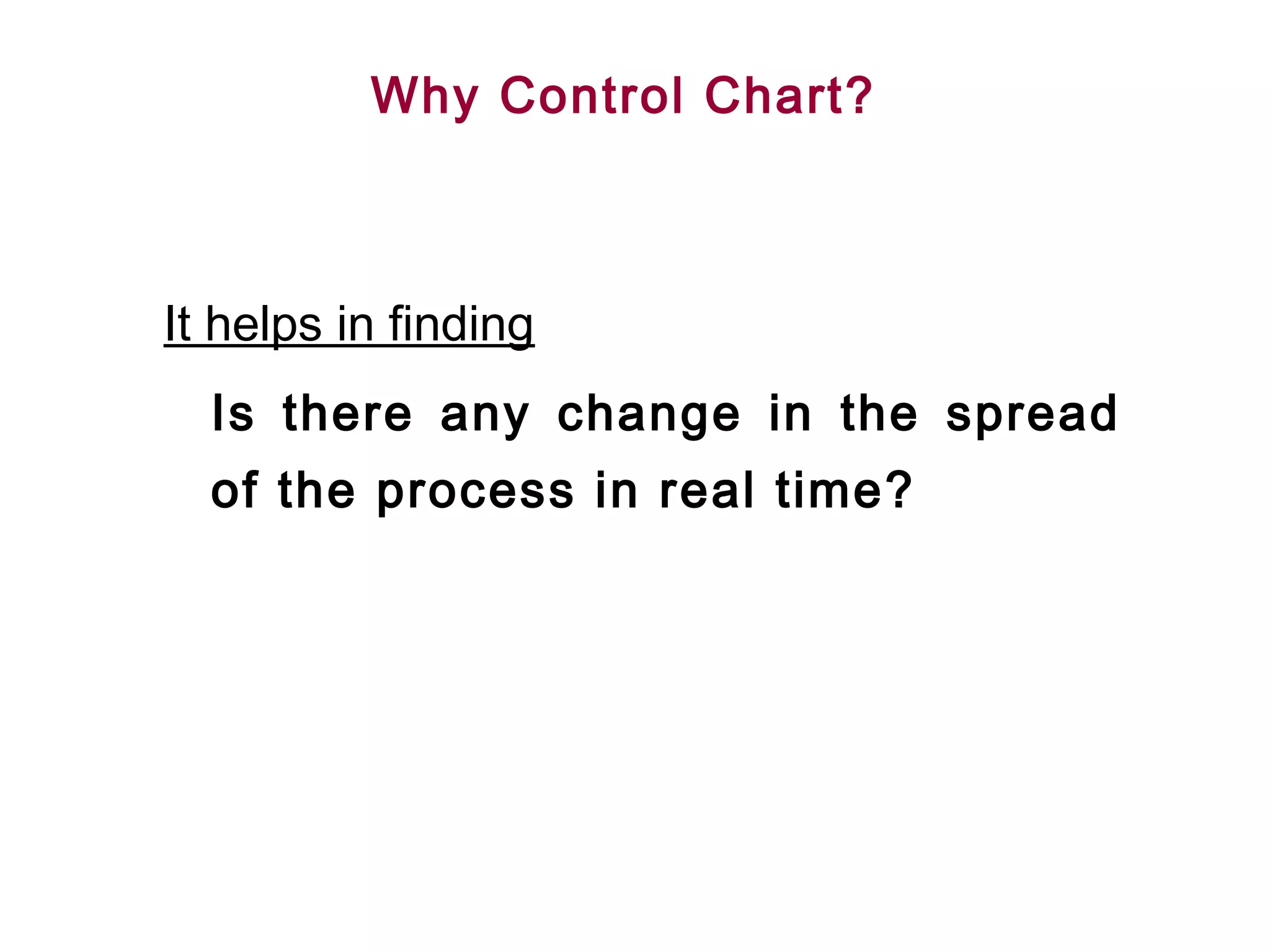
Reasons to use control charts include ensuring normal output, detecting changes, maintaining low production costs, supporting capability studies, and guiding production decisions.
Four critical steps in control charting: identify quality characteristics, design sampling plan, plot statistics, and take corrective action.
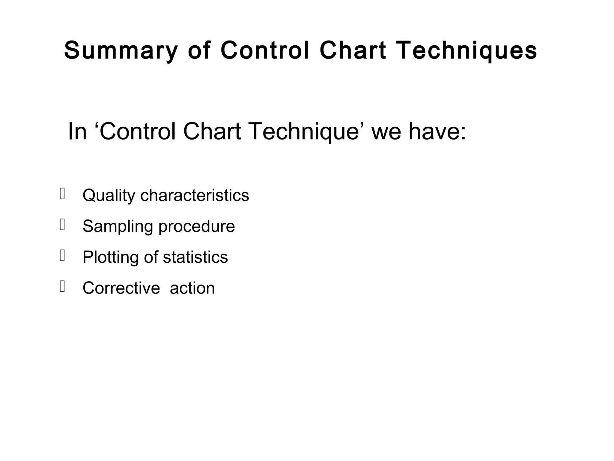
Summary of control chart techniques covering quality characteristics, sampling, statistics plotting, and corrective actions.
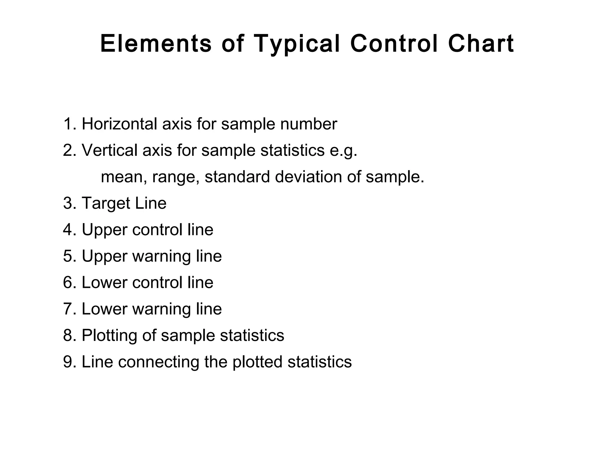
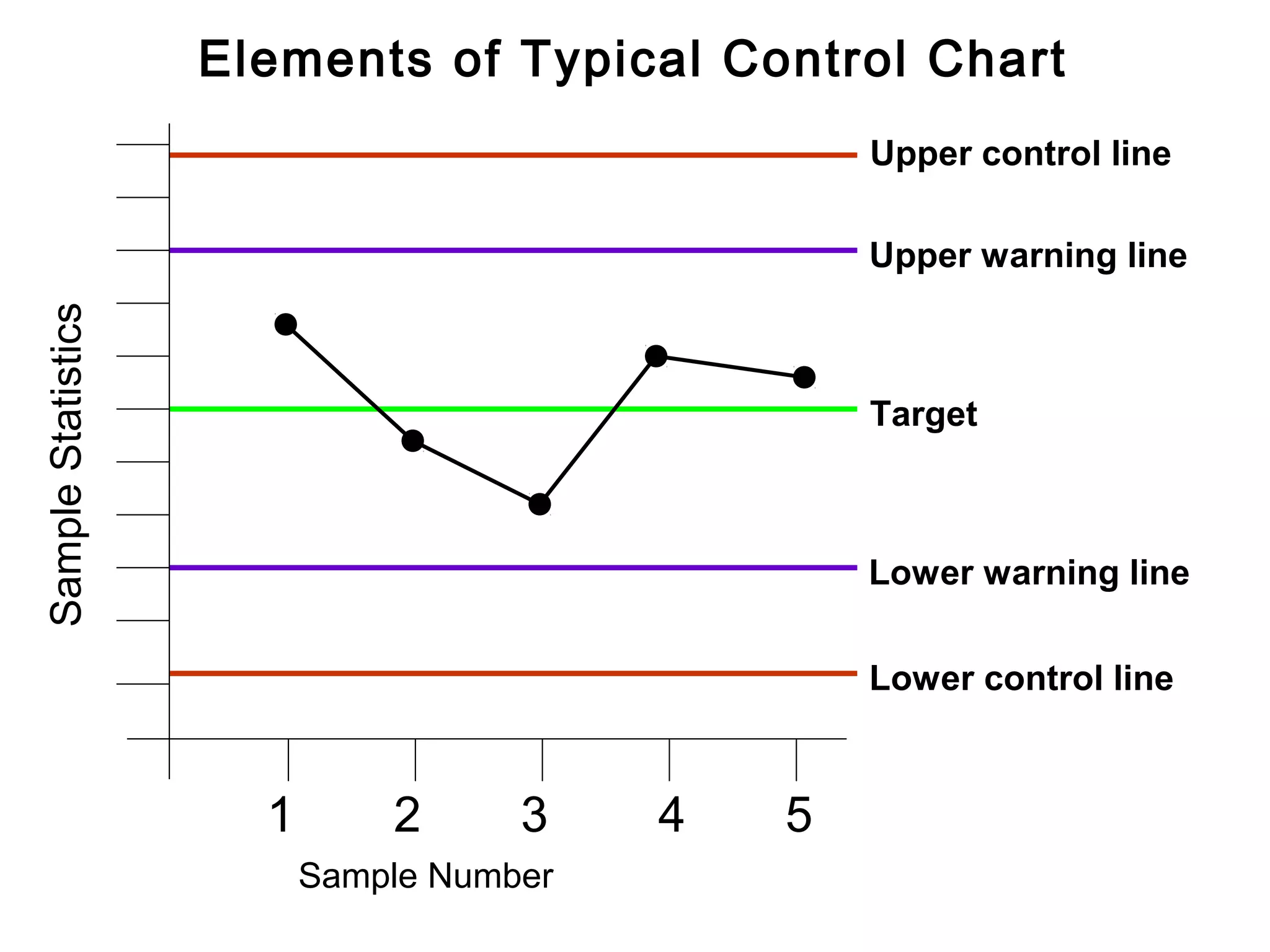
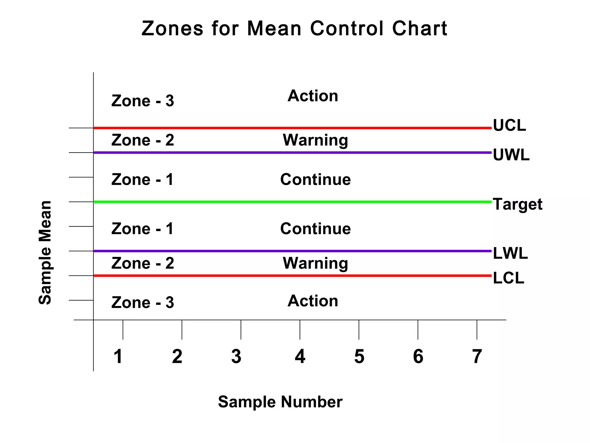
Elements defining typical control charts: axes for statistics, target line, control limits, and plotted statistics.
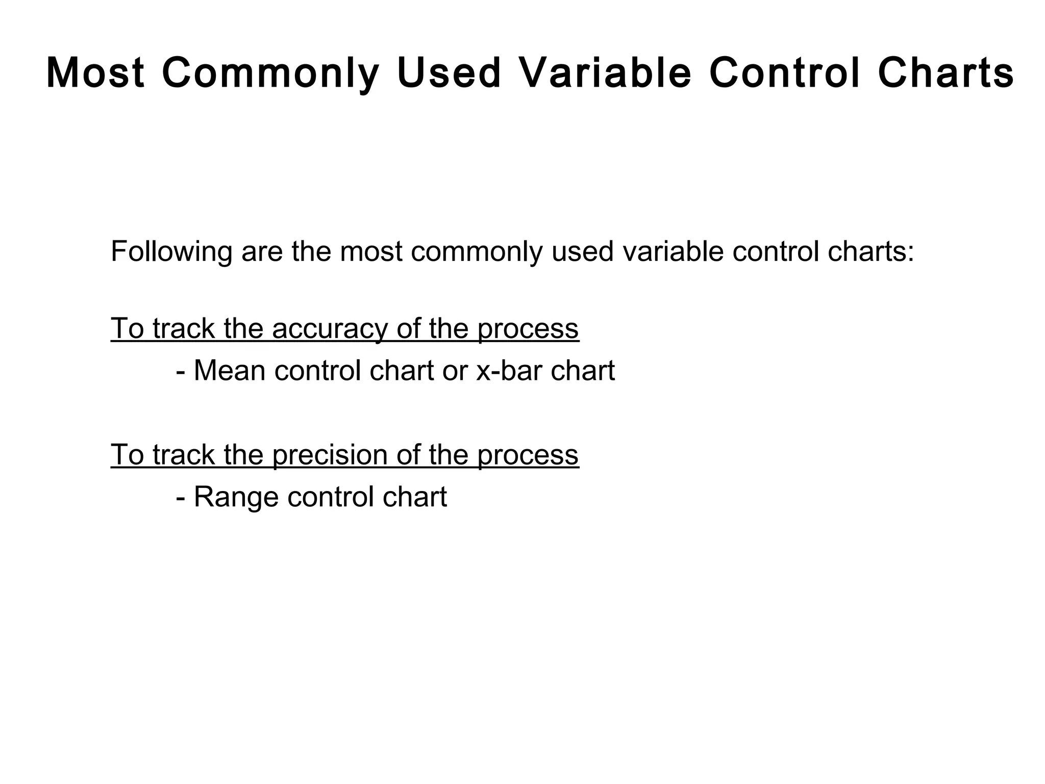
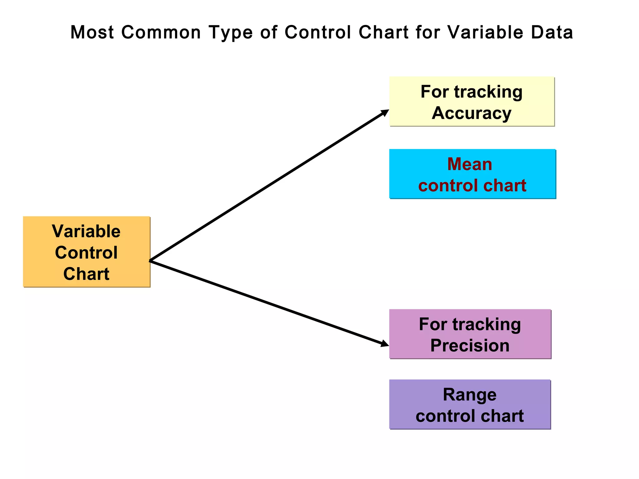
Two primary types exist: for variable and attribute data; focus on variable methods like mean and range control charts.
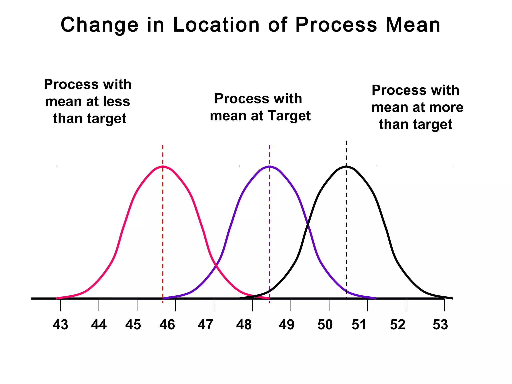
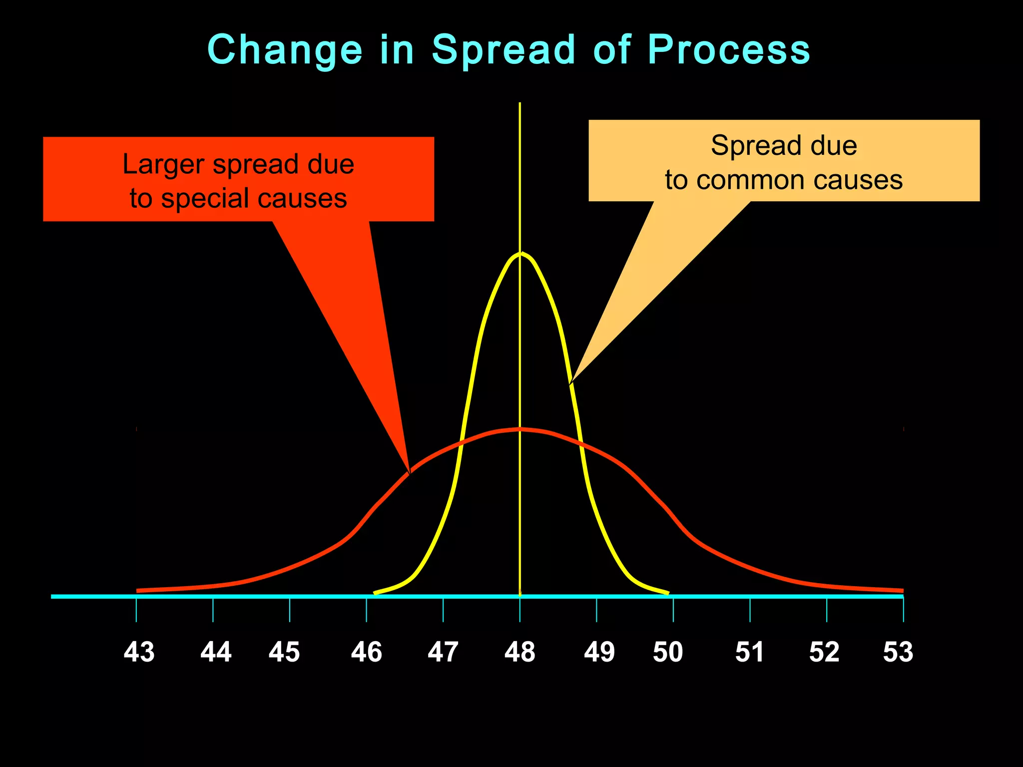
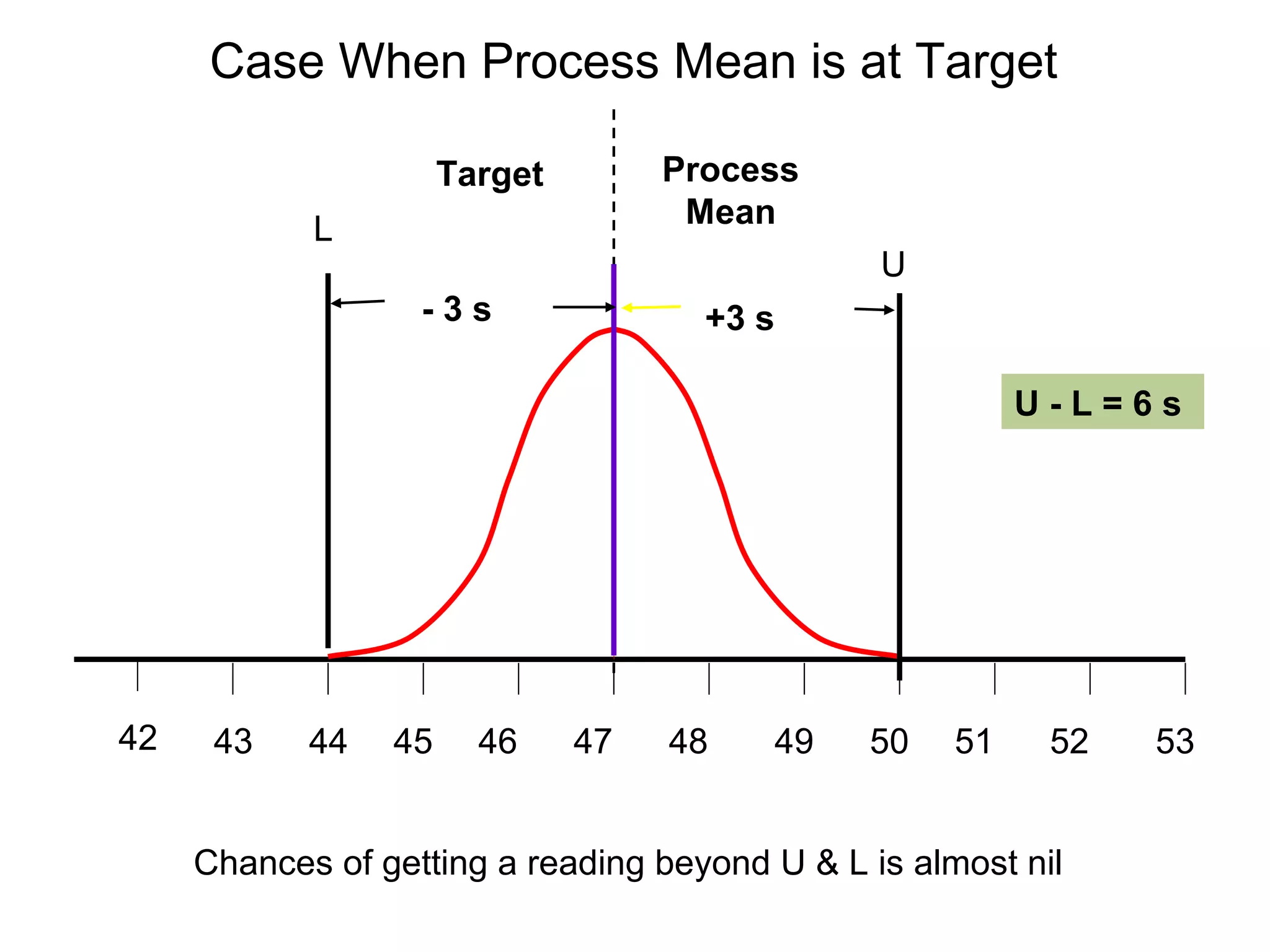
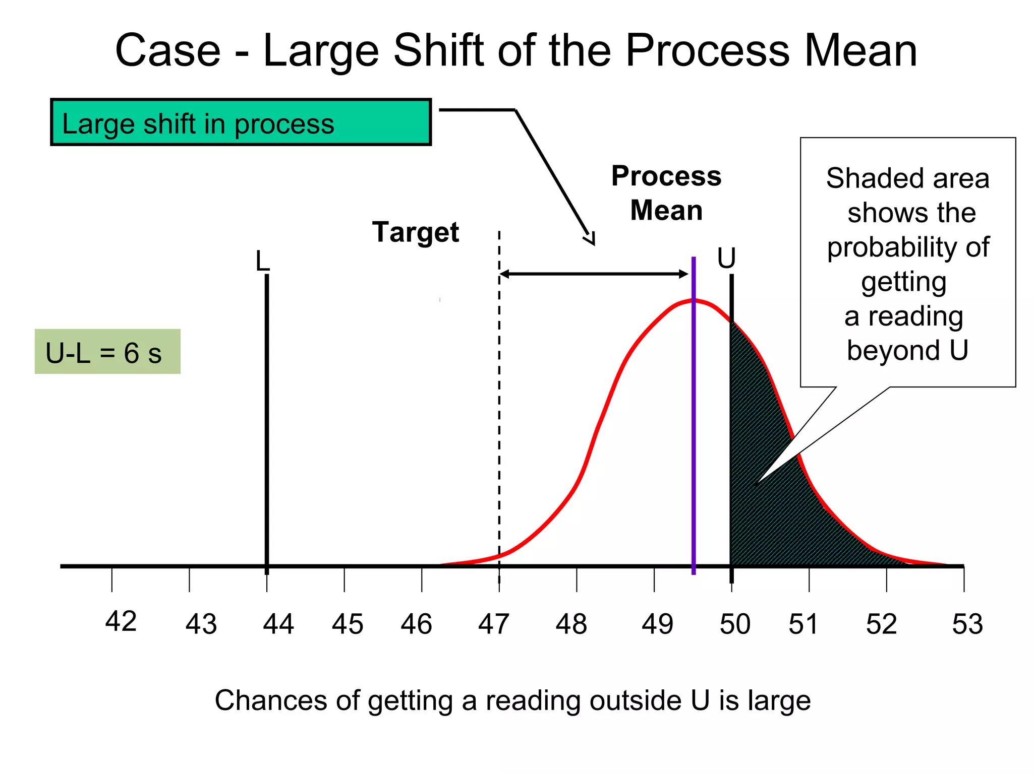
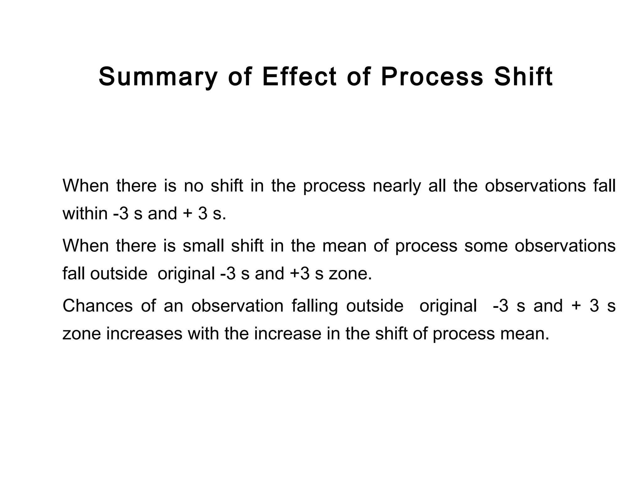
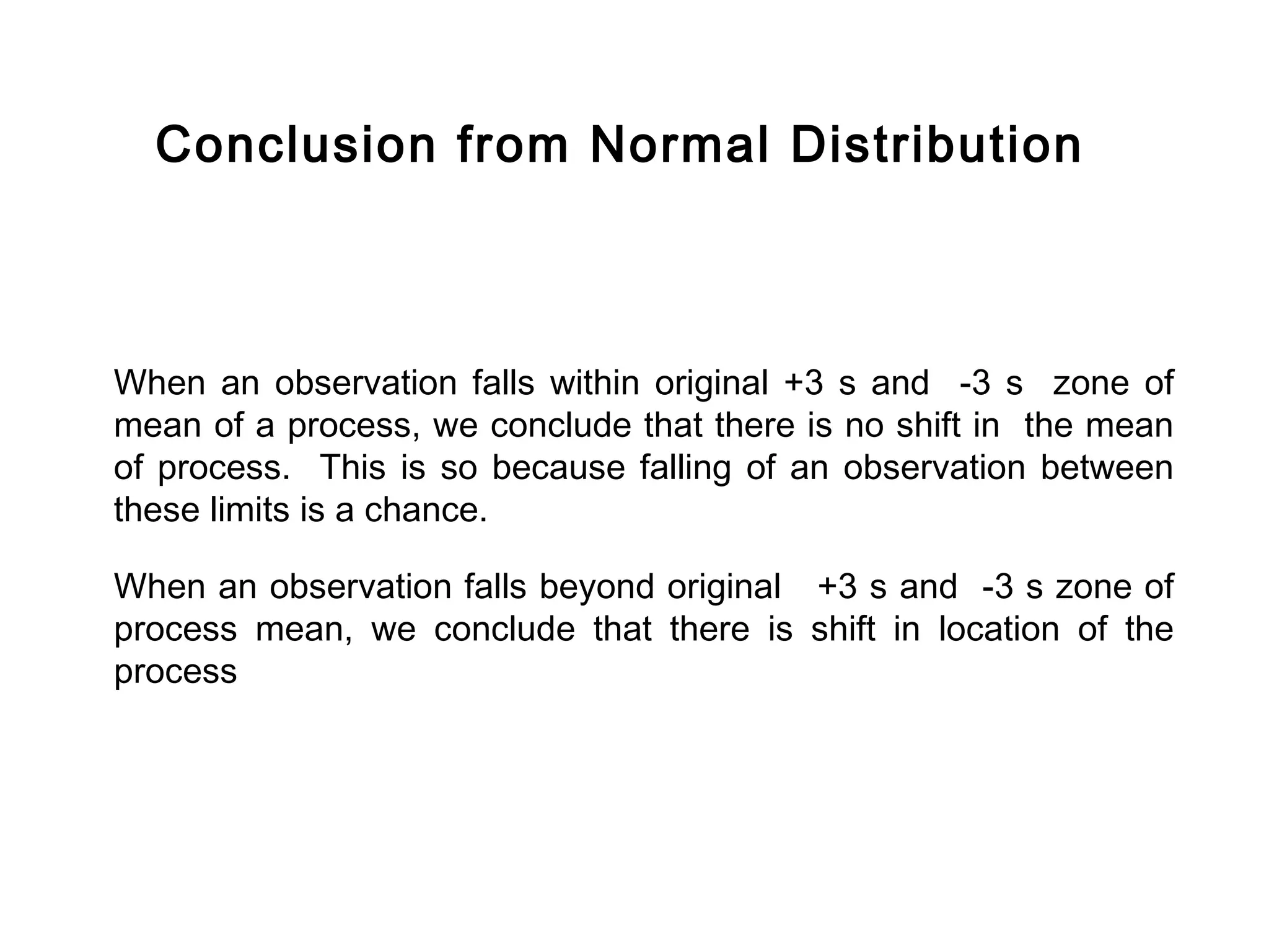
Explores effects of shifts in process mean on data distributions, highlighting normal and altered variations.
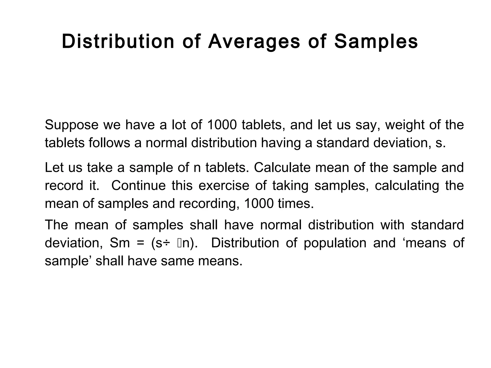
Differences in distributions of population and sample means, focusing on behavior in quality control.
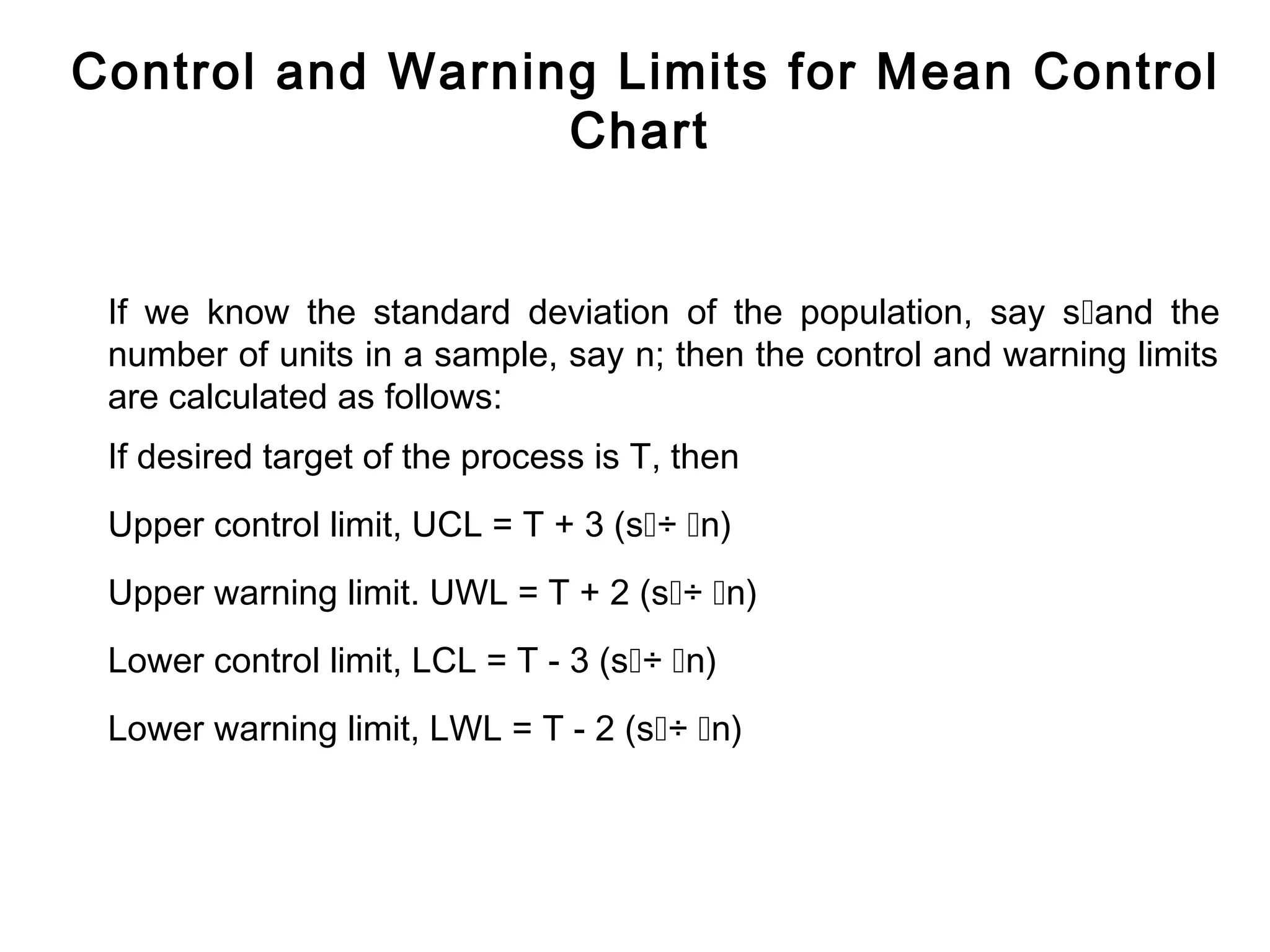
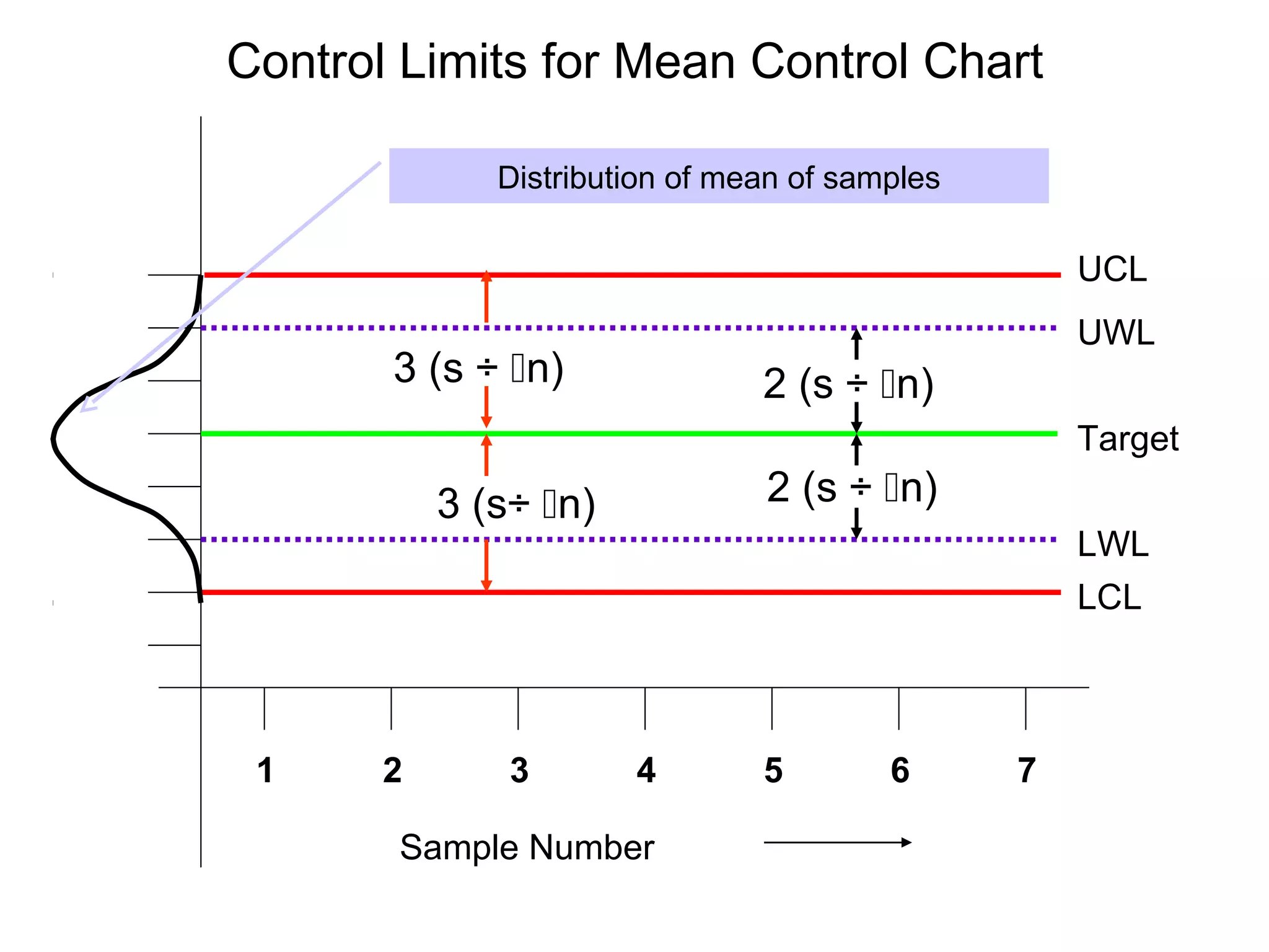
Calculating control and warning limits based on population standard deviation and sample size.
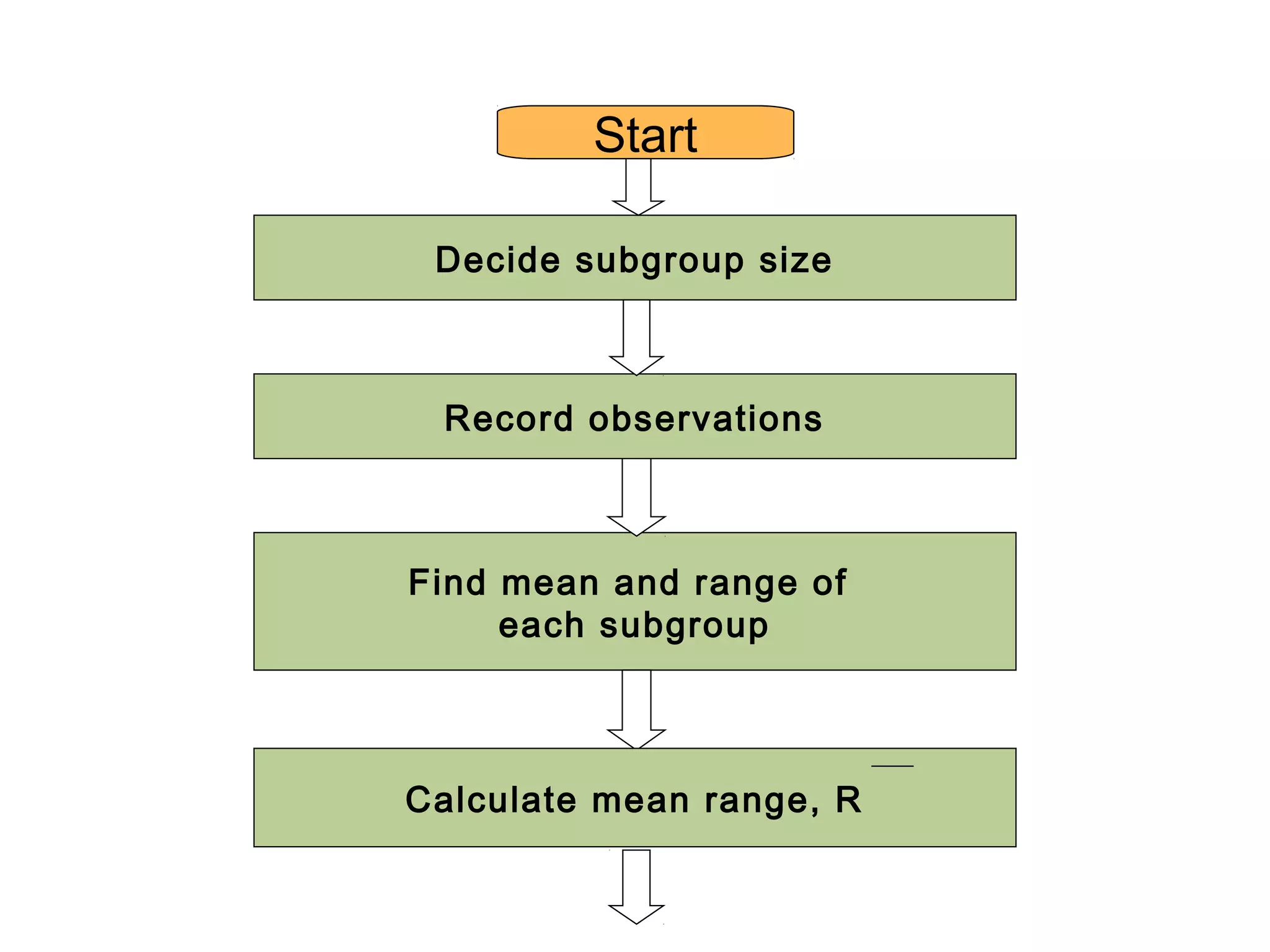
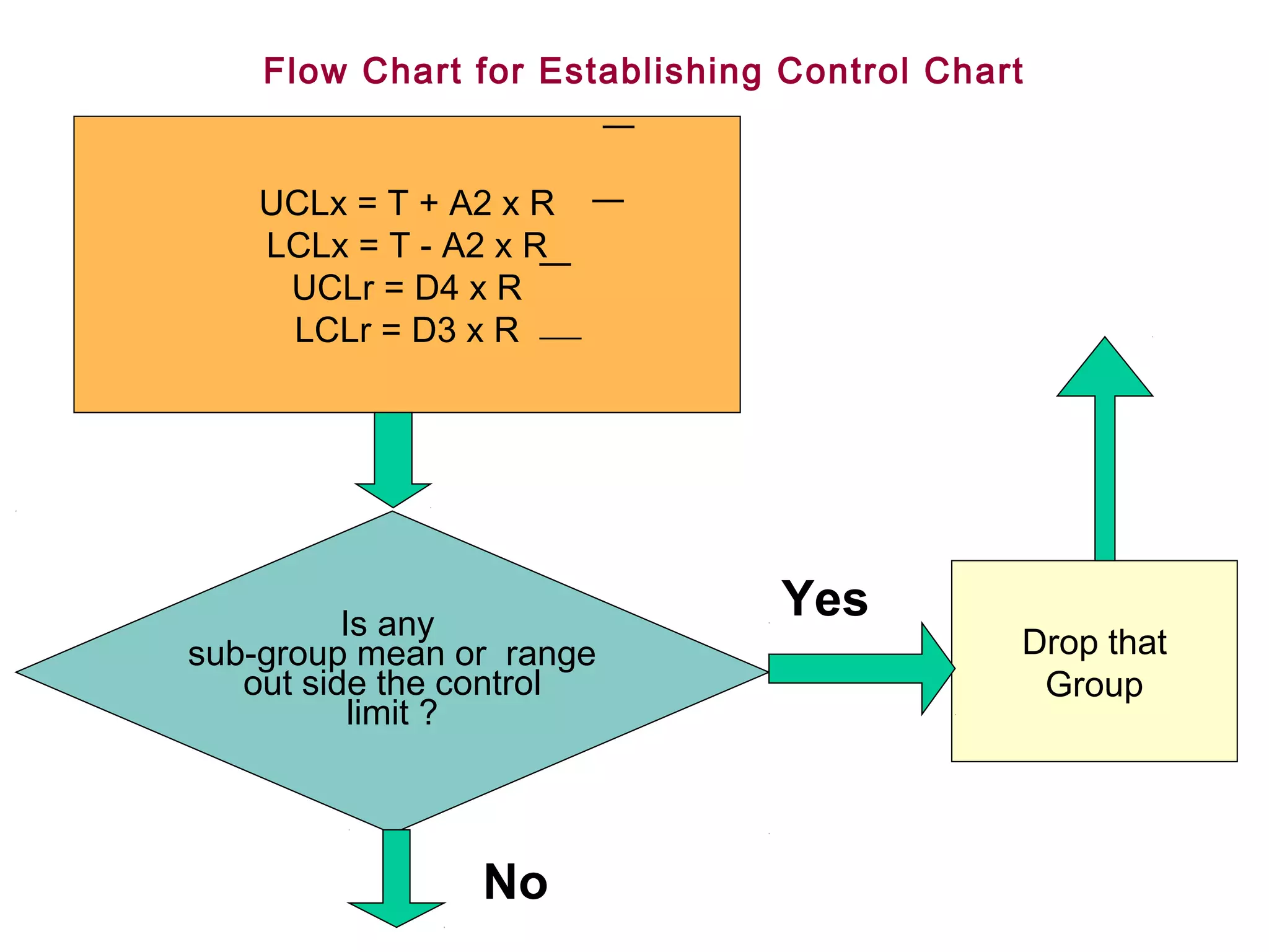
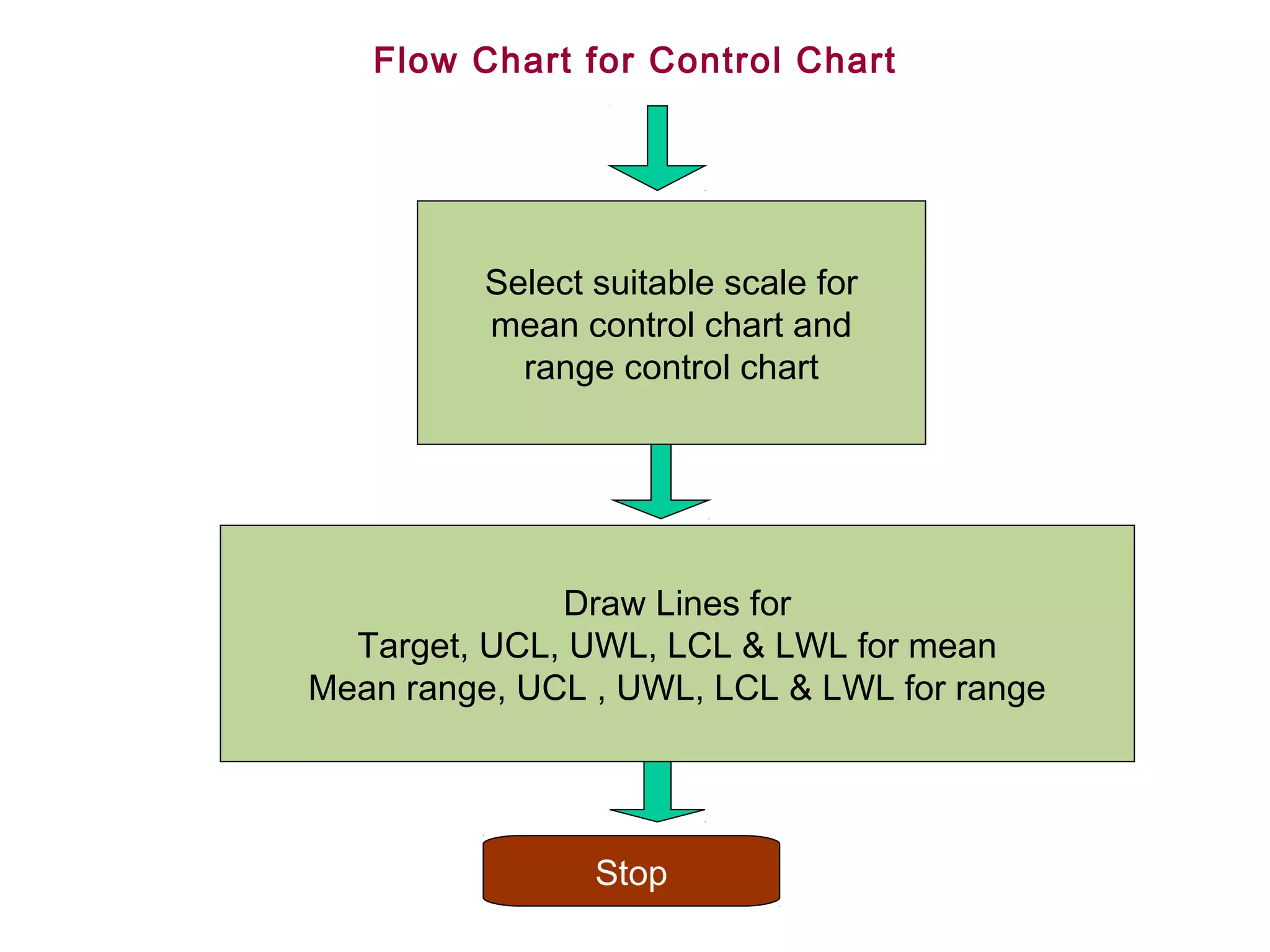
Step-by-step flow of establishing and maintaining control charts through observation and calculation.
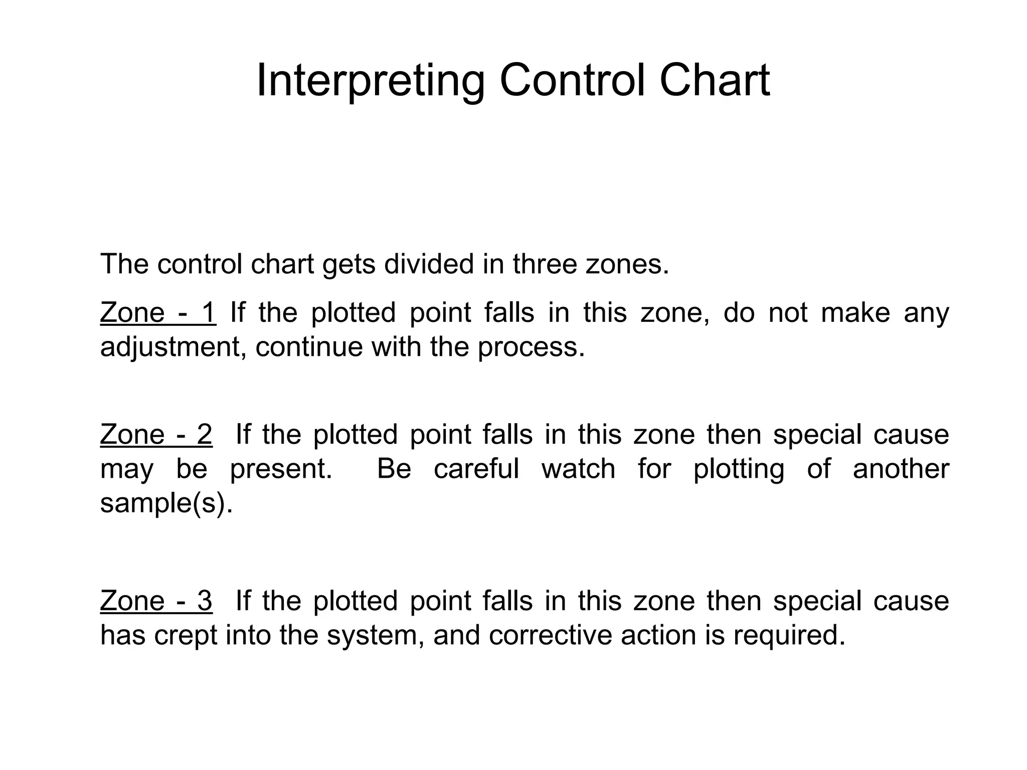
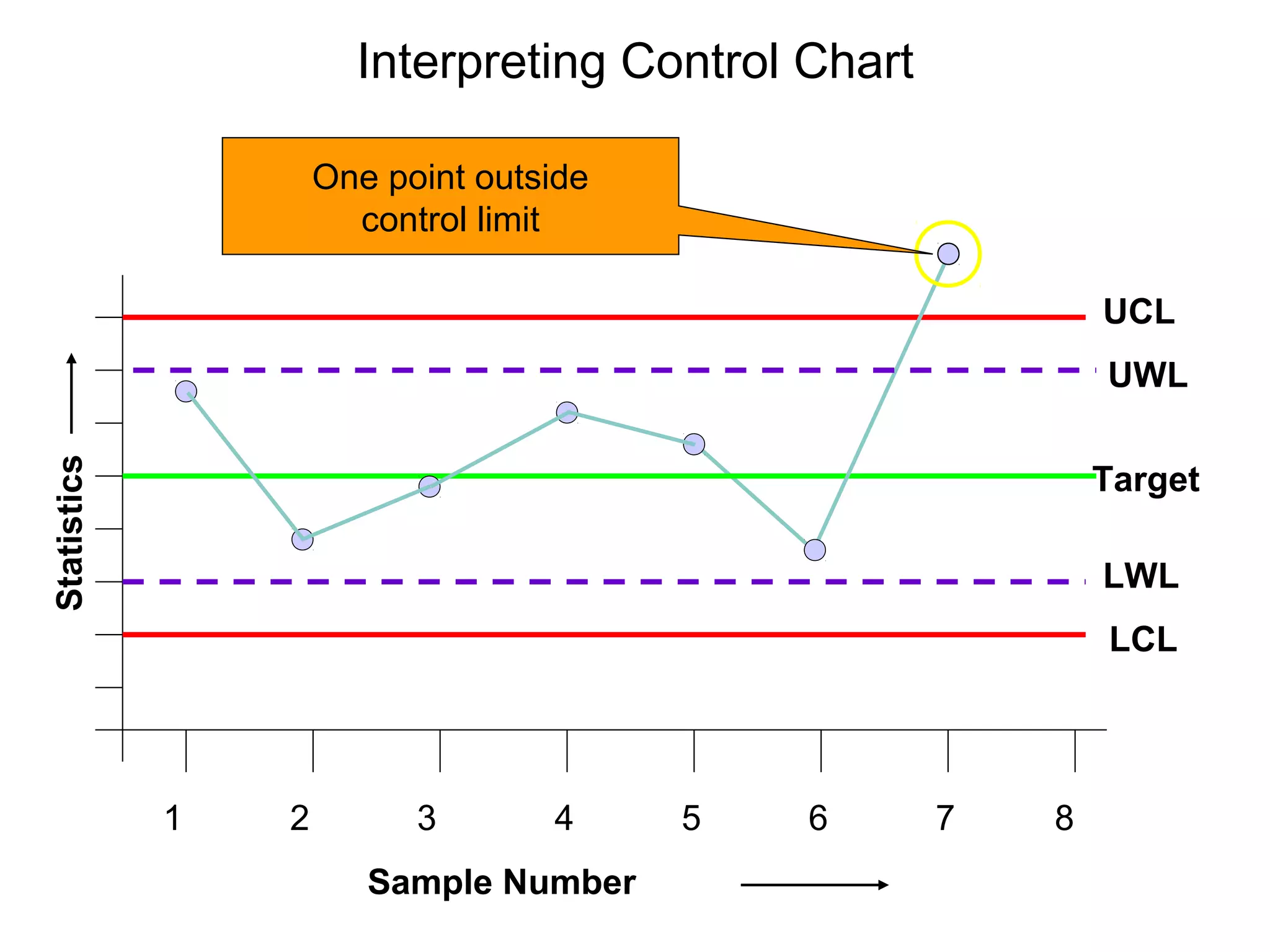
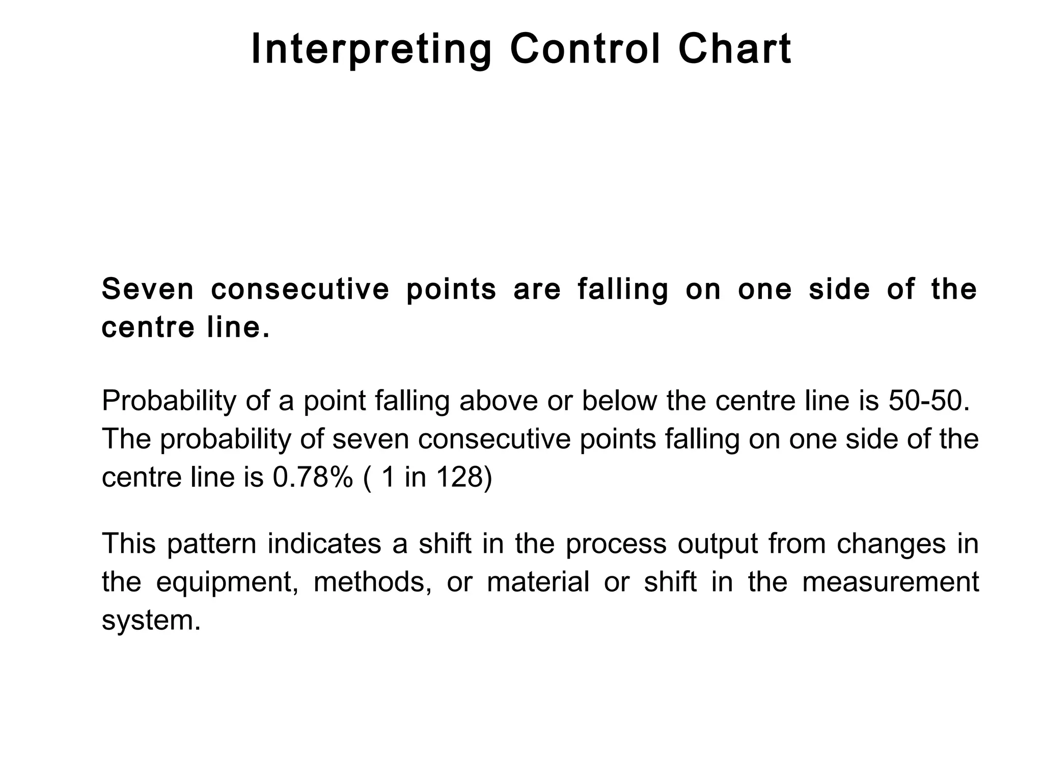
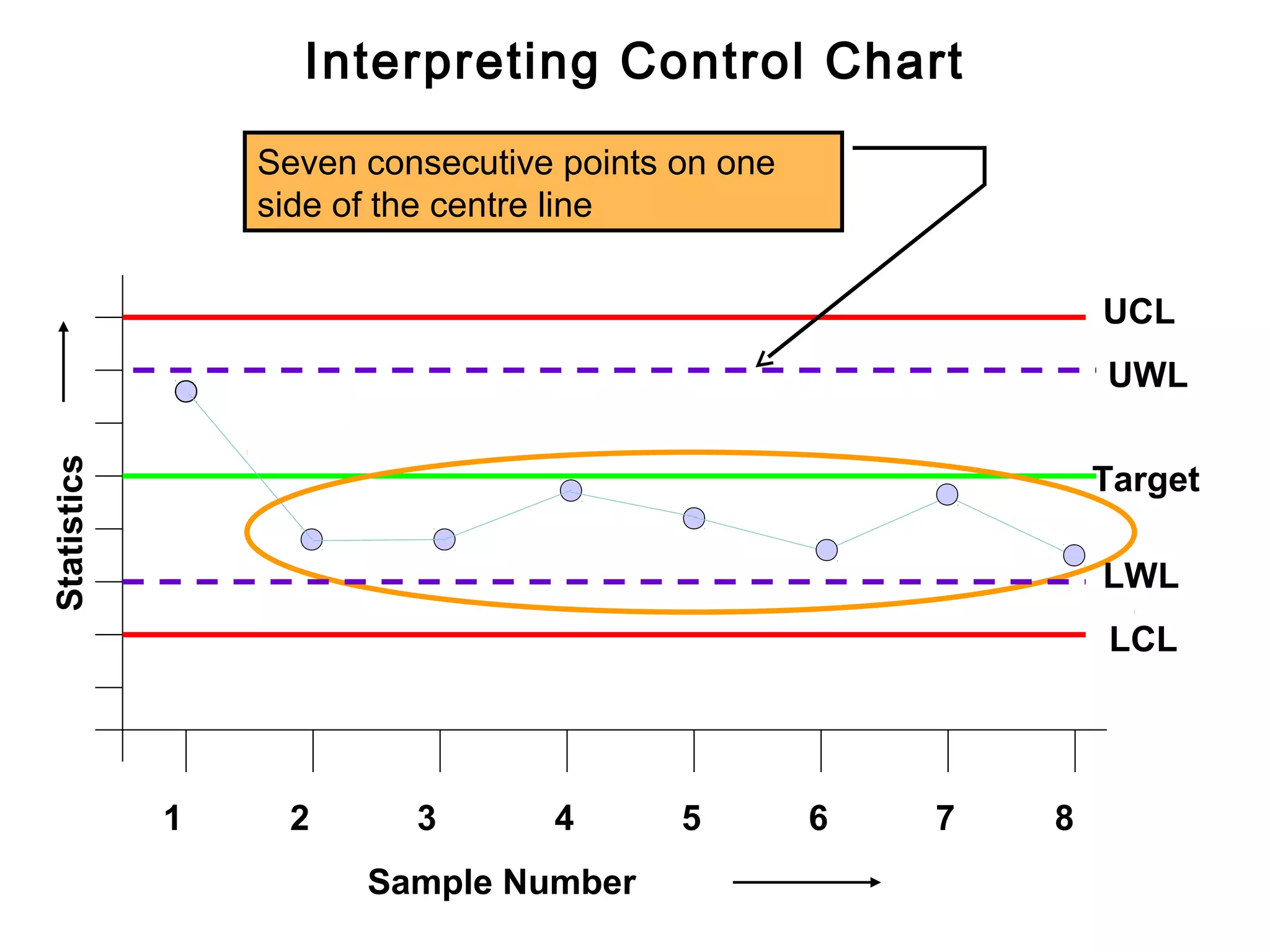
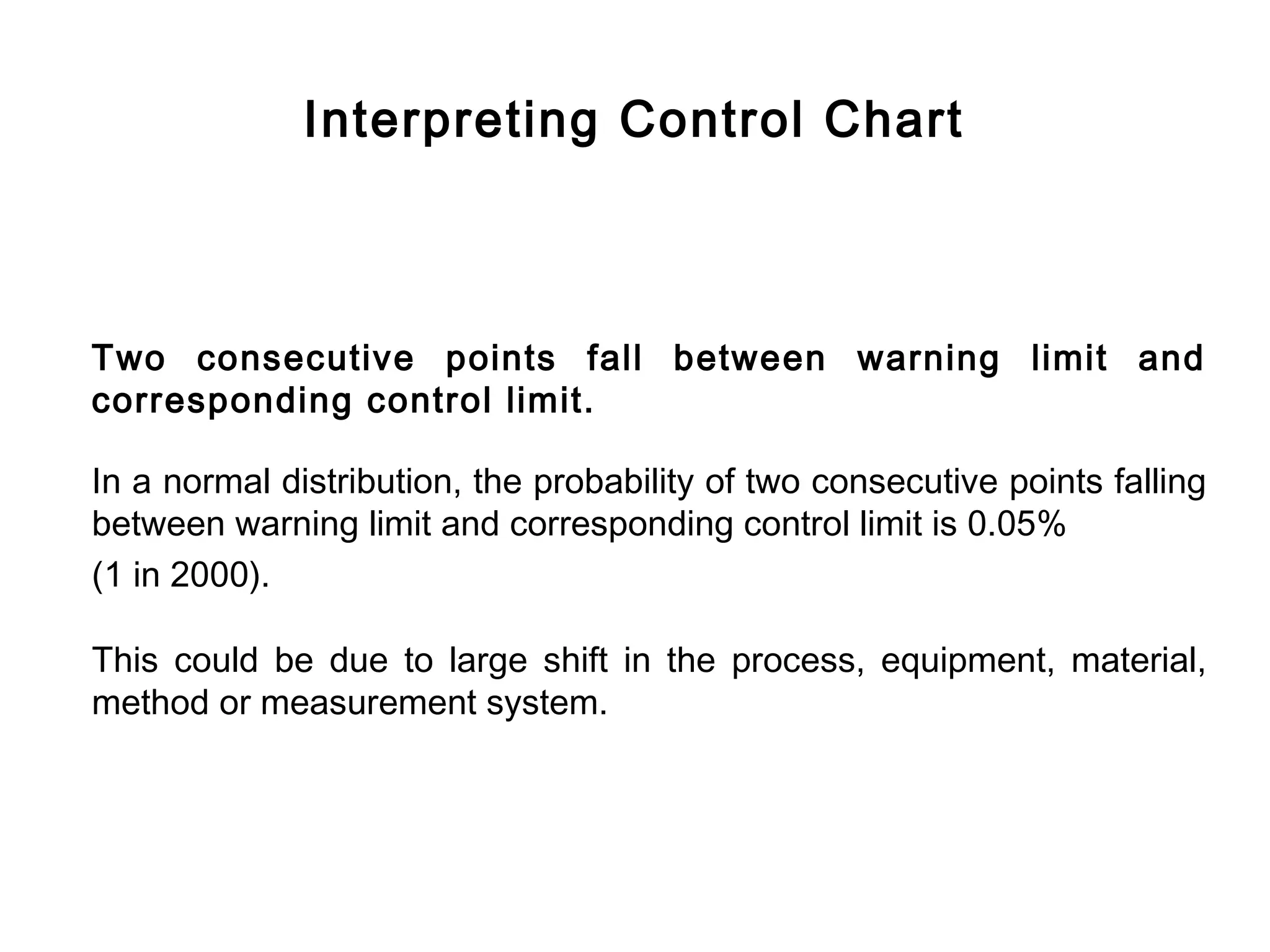
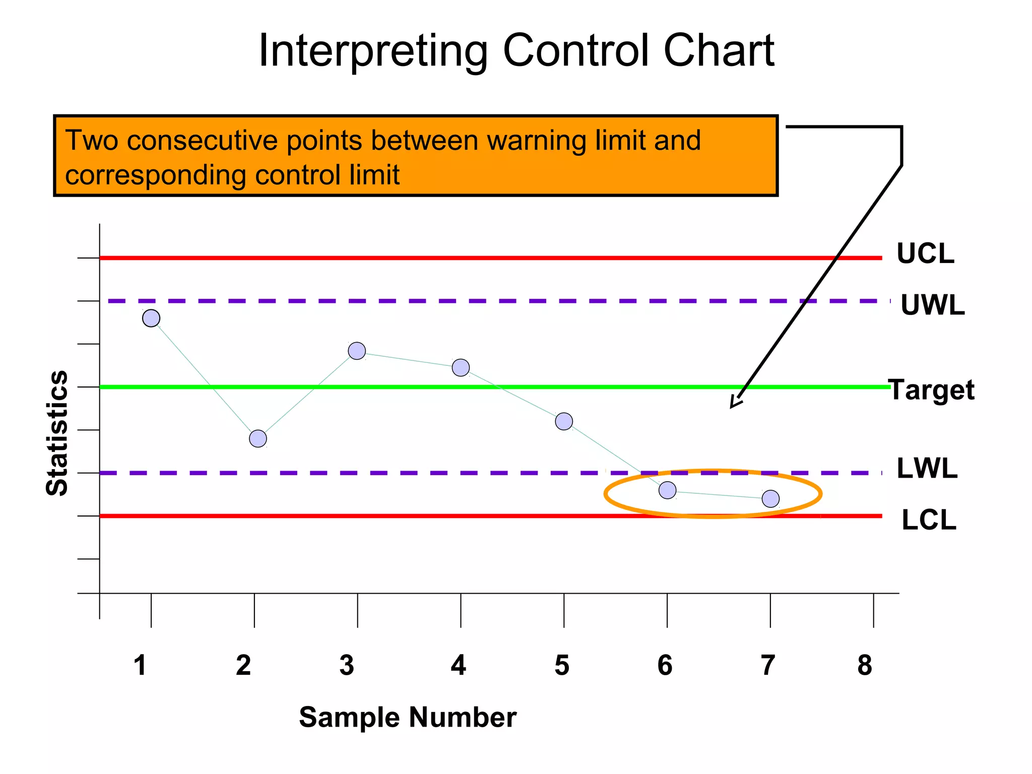
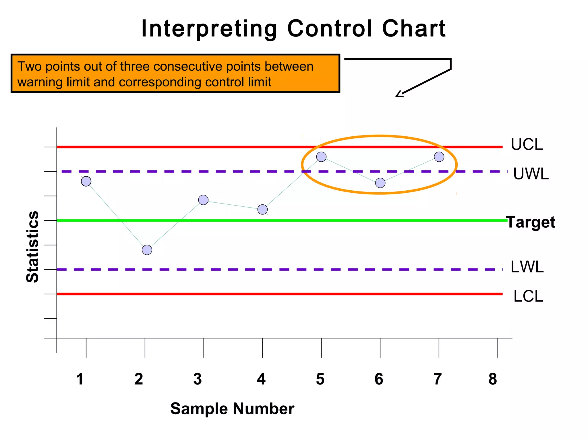
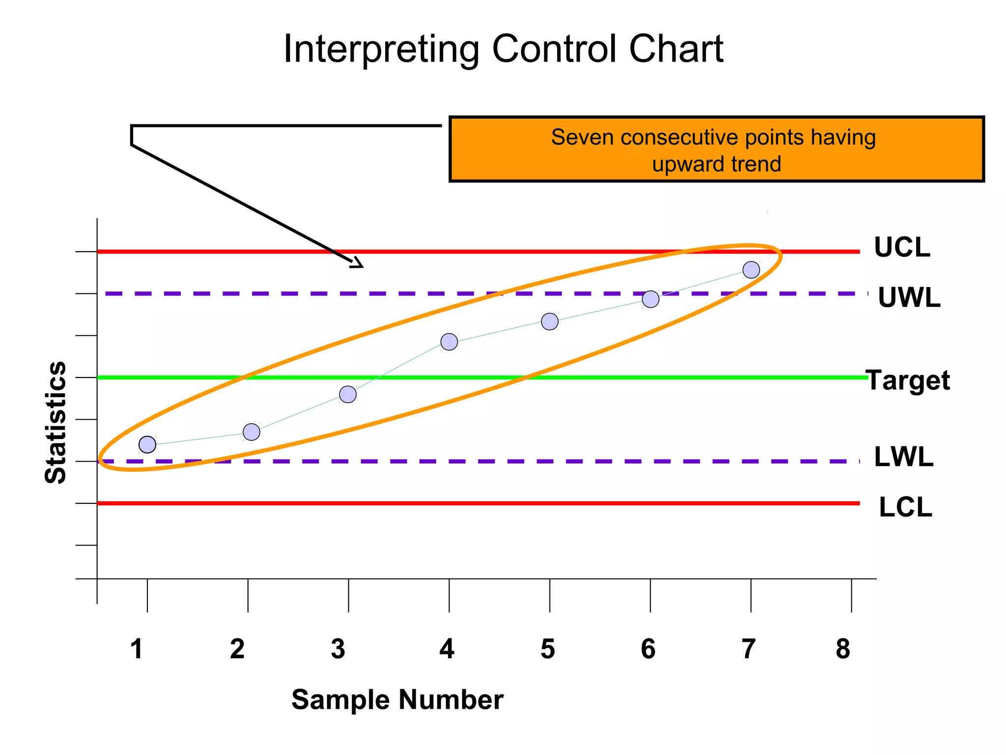
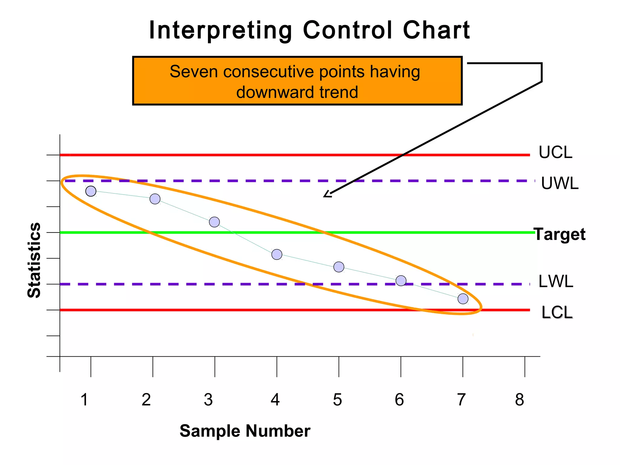
Guidelines for interpreting control charts, noting adjustments needed based on plotted data patterns.
Introduction
Qualitycontrol charts, are graphs on which the
quality of the product is plotted as the
manufacturing is actually proceeding.
By enabling corrective actions to be taken at the
earliest possible moment and avoiding
unnecessary corrections, the charts help to ensure
the manufacture of uniform products.
4.
History of ControlChart
Mr. Shewart, an American, has been credited with
the invention of control charts for variable and
attribute data in the 1920s, at the Bell Telephone
Industries.
The term ‘Shewart Control Charts’ is in common
use.
5.
Dynamic Picture ofProcess
Plotting graph, charting and presenting the data as
a picture is common to process control method,
used throughout the manufacturing and service
industries.
Converting data into a picture is a vital step
towards greater and quicker understanding of the
process.
6.
Confidence While ControlCharting
Control charting enables everyone to make
decision and to know the degree of confidence
with which the decisions are made. There may be
some margin of error. No technique, even 100%
automated inspection, can guarantee the validity
of the result; there is always some room to doubt.
7.
Control Charts
Statistically basedcontrol chart is a device
intended to be used
- at the point of operation
- by the operator of that process
- to asses the current situation
- by taking sample and plotting sample result
To enable the operator to decide about the
process.
8.
What Control ChartDoes?
It graphically, represents the output of the
process.
And
Uses statistical limits and patterns of plot,
for decision making
9.
Analogy to TrafficSignal
A control chart is like a traffic signal, the
operation of which is based on evidence
from samples taken at random intervals.
10.
Analogy to TrafficSignal
Go
No action on Process
Wait and Watch
Stop
Investigate/Adjust
11.
Decision About TheProcess
Go
To let the process continue to run without any adjustment.
This means only common causes are present.
12.
Decision About theProcess
Wait and watch
Be careful and seek for more information
This is the case where presence of trouble is possible
13.
Decision About theProcess
Stop
Take action ( Investigate/Adjust )
This means that there is practically no doubt a special cause has
crept in the system. Process has wandered and corrective actions
must be taken, otherwise defective items will be produced.
Whether Output isNormal?
Both histogram and control chart can tell us whether the output
is normal? However,
Histogram views the process as history ,
as the entire output together .
Control chart views the process in real time,
at different time intervals as the process progresses .
17.
Histogram: a Historyof Process Output
16
14
Frequency
12
10
8
6
4
2
0
47 48 49 50 51 52 53 54
kg
18.
Control Chart ViewsProcess in Real Time
Output of the process in real time
Target
Mean
UCLx
Target
LCLx
UCLr
Range
Time Intervals
19.
Why Control Chart?
Ithelps in finding
Is there any change in location of process
mean in real time?
20.
Change in Locationof Process Mean
Process with Process with
mean at less Process with
mean at more
than target mean at Target
than target
43 44 45 46 47 48 49 50 51 52 53
21.
Why Control Chart?
Ithelps in finding
Is there any change in the spread
of the process in real time?
22.
Change in Spreadof Process
Spread due
Larger spread due
to common causes
to special causes
43 44 45 46 47 48 49 50 51 52 53
23.
Why Control Chart?
Tokeep the cost of production minimum
Since the control chart is maintained in real time, and gives us a signal
that some special cause has crept into the system, we can take timely
action. Timely action enables us to prevent manufacturing of
defective. Manufacturing defective items is non value added activity; it
adds to the cost of manufacturing, therefore must be avoided.
By maintaining control chart we avoid 100% inspection, and thus save
cost of verification.
24.
Why Control Chart?
Pre-requisitefor process capability studies
Process capability studies, are based on premises that the process
during the study was stable i.e. only common causes were present.
This ensures that output has normal distribution. The stability of the
process can only be demonstrated by maintaining control chart during
the study.
25.
Why Control Chart?
Decisionin regards to production process
Control chart helps in determining whether we should :
- let the process to continue without adjustment
- seek more information
- stop the process for investigation/adjustment.
Basic Steps forControl Charts
Step No. 1
Identify quality characteristics of product or process that affects
“fitness for use”.
Maintaining control chart is an expensive activity. Control charts
should be maintained only for critical quality characteristics. Design of
Experiments is one of the good source to find the critical quality
characteristics of the process.
28.
Basic Steps forControl Charts
Step No . 2
Design the sampling plan and decide method of its measurement.
At this step we decide, how many units will be in a sample and how
frequently the samples will be taken by the operator.
29.
Basic Steps forControl Charts
Step No. 3
Take samples at different intervals and plot statistics of the sample
measurements on control chart.
Mean, range, standard deviation etc are the statistics of
measurements of a sample. On a mean control chart, we plot the
mean of sample and on a range control chart, we plot the range of the
sample.
30.
Basic Steps forControl Charts
Step No. 4
Take corrective action - when a signal for significant change in
process characteristic is received.
Here we use OCAP (Out of Control Action Plan) to investigate, as
why a significant change in the process has occurred and then take
corrective action as suggested in OCAP, to bring the process under
control.
31.
Summary of ControlChart Techniques
In ‘Control Chart Technique’ we have:
Quality characteristics
Sampling procedure
Plotting of statistics
Corrective action
Elements of TypicalControl Chart
1. Horizontal axis for sample number
2. Vertical axis for sample statistics e.g.
mean, range, standard deviation of sample.
3. Target Line
4. Upper control line
5. Upper warning line
6. Lower control line
7. Lower warning line
8. Plotting of sample statistics
9. Line connecting the plotted statistics
34.
Elements of TypicalControl Chart
Upper control line
Upper warning line
Sample Statistics
Target
Lower warning line
Lower control line
1 2 3 4 5
Sample Number
Types of ControlChart
We have two main types of control charts. One for variable data and
the other for attribute data.
Since now world-wide, the current operating level is ‘number of parts
defective per million parts produced’, aptly described as ‘PPM’;
control charts for ‘attribute data’ has no meaning. The reason being
that the sample size for maintaining control chart at the ‘PPM’ level,
is very large, perhaps equal to lot size, that means 100%
inspection.
37.
Most Commonly UsedVariable Control Charts
Following are the most commonly used variable control charts:
To track the accuracy of the process
- Mean control chart or x-bar chart
To track the precision of the process
- Range control chart
38.
Most Common Typeof Control Chart for Variable Data
For tracking
Accuracy
Mean
control chart
Variable
Control
Chart
For tracking
Precision
Range
control chart
Case When ProcessMean is at Target
Target Process
L Mean
U
-3s +3 s
U-L=6s
42 43 44 45 46 47 48 49 50 51 52 53
Chances of getting a reading beyond U & L is almost nil
42.
Case - SmallShift of the Process Mean
Small shift in process Process
Mean Shaded area
L U shows the
probability of
Target getting
a reading
beyond U
U-L = 6 s
42 43 44 45 46 47 48 49 50 51 52 53
Chances of getting a reading outside U is small
43.
Case - LargeShift of the Process Mean
Large shift in process
Process Shaded area
Mean shows the
Target
L U probability of
getting
a reading
U-L = 6 s beyond U
42 43 44 45 46 47 48 49 50 51 52 53
Chances of getting a reading outside U is large
44.
Summary of Effectof Process Shift
When there is no shift in the process nearly all the observations fall
within -3 s and + 3 s.
When there is small shift in the mean of process some observations
fall outside original -3 s and +3 s zone.
Chances of an observation falling outside original -3 s and + 3 s
zone increases with the increase in the shift of process mean.
45.
Conclusion from NormalDistribution
When an observation falls within original +3 s and -3 s zone of
mean of a process, we conclude that there is no shift in the mean
of process. This is so because falling of an observation between
these limits is a chance.
When an observation falls beyond original +3 s and -3 s zone of
process mean, we conclude that there is shift in location of the
process
Distribution of Meanof Samples
Since on the control charts for accuracy we plot and watch the trend
of the means and ranges of the samples, it is necessary that we
should understand the behaviour of
distribution of mean of samples.
48.
Distribution of Averagesof Samples
Suppose we have a lot of 1000 tablets, and let us say, weight of the
tablets follows a normal distribution having a standard deviation, s.
Let us take a sample of n tablets. Calculate mean of the sample and
record it. Continue this exercise of taking samples, calculating the
mean of samples and recording, 1000 times.
The mean of samples shall have normal distribution with standard
deviation, Sm = (s÷ n). Distribution of population and ‘means of
sample’ shall have same means.
49.
Distribution - PopulationVs Sample Means
Distribution of
means of samples
[standard deviation = (s÷ n)]
Distribution of population
(standard deviation = s
43 44 45 46 47 48 49 50 51 52 53
Quality Characteristics
50.
Control and WarningLimits for Mean Control
Chart
If we know the standard deviation of the population, say sand the
number of units in a sample, say n; then the control and warning limits
are calculated as follows:
If desired target of the process is T, then
Upper control limit, UCL = T + 3 (s÷ n)
Upper warning limit. UWL = T + 2 (s÷ n)
Lower control limit, LCL = T - 3 (s÷ n)
Lower warning limit, LWL = T - 2 (s÷ n)
51.
Control Limits forMean Control Chart
Distribution of mean of samples
UCL
UWL
3 (s ÷ n) 2 (s ÷ n)
Target
3 (s÷ n) 2 (s ÷ n)
LWL
LCL
1 2 3 4 5 6 7
Sample Number
Start
Decide subgroupsize
Record observations
Find mean and range of
each subgroup
Calculate mean range, R
54.
Flow Chart forEstablishing Control Chart
UCLx = T + A2 x R
LCLx = T - A2 x R
UCLr = D4 x R
LCLr = D3 x R
Is any
Yes
sub-group mean or range Drop that
out side the control Group
limit ?
No
55.
Flow Chart forControl Chart
Select suitable scale for
mean control chart and
range control chart
Draw Lines for
Target, UCL, UWL, LCL & LWL for mean
Mean range, UCL , UWL, LCL & LWL for range
Stop
Interpreting Control Chart
Thecontrol chart gets divided in three zones.
Zone - 1 If the plotted point falls in this zone, do not make any
adjustment, continue with the process.
Zone - 2 If the plotted point falls in this zone then special cause
may be present. Be careful watch for plotting of another
sample(s).
Zone - 3 If the plotted point falls in this zone then special cause
has crept into the system, and corrective action is required.
58.
Zones for MeanControl Chart
Zone - 3 Action
UCL
Zone - 2 Warning
UWL
Zone - 1 Continue
Target
Sample Mean
Zone - 1 Continue
LWL
Zone - 2 Warning
LCL
Zone - 3 Action
1 2 3 4 5 6 7
Sample Number
59.
Interpreting Control Charts
Sincethe basis for control chart theory follows the normal
distribution, the same rules that governs the normal distribution are
used to interpret the control charts. These rules include:
- Randomness.
- Symmetry about the centre of the distribution.
- 99.73% of the population lies between - 3 s of and + 3 s the
centre line.
- 95.4% population lies between -2 s and + 2 s of the centre line.
60.
Interpreting Control Chart
Ifthe process output follows these rules, the process is said to be
stable or in control with only common causes of variation present.
If it fails to follow these rules, it may be out of control with special
causes of variation present. These special causes must be found
and corrected.
61.
Interpreting Control Chart
Asingle point above or below the control limits.
Probability of a point falling outside the control limit is less than 0.14%.
This pattern may indicate:
- a special cause of variation from a material,
equipment, method, operator etc.
- mismeasurement of a part or parts.
- miscalculated or misplotted data point.
62.
Interpreting Control Chart
One point outside
control limit
UCL
UWL
Statistics
Target
LWL
LCL
1 2 3 4 5 6 7 8
Sample Number
63.
Interpreting Control Chart
Sevenconsecutive points are falling on one side of the
centre line.
Probability of a point falling above or below the centre line is 50-50.
The probability of seven consecutive points falling on one side of the
centre line is 0.78% ( 1 in 128)
This pattern indicates a shift in the process output from changes in
the equipment, methods, or material or shift in the measurement
system.
64.
Interpreting Control Chart
Seven consecutive points on one
side of the centre line
UCL
UWL
Statistics
Target
LWL
LCL
1 2 3 4 5 6 7 8
Sample Number
65.
Interpreting Control Chart
Twoconsecutive points fall between warning limit and
corresponding control limit.
In a normal distribution, the probability of two consecutive points falling
between warning limit and corresponding control limit is 0.05%
(1 in 2000).
This could be due to large shift in the process, equipment, material,
method or measurement system.
66.
Interpreting Control Chart
Two consecutive points between warning limit and
corresponding control limit
UCL
UWL
Statistics
Target
LWL
LCL
1 2 3 4 5 6 7 8
Sample Number
67.
Interpreting Control Chart
Twopoints out of three consecutive points fall between
warning limit and corresponding control limit.
This could be due to large shift in the process, equipment,
material, method or measurement system.
68.
Interpreting Control Chart
Twopoints out of three consecutive points between
warning limit and corresponding control limit
UCL
UWL
Statistics
Target
LWL
LCL
1 2 3 4 5 6 7 8
Sample Number
69.
Interpreting Control Chart
Atrend of seven points in a row upward or downward
demonstrates non-randomness.
This happens in the following cases:
- Gradual deterioration or wear in equipment.
- Improvement or deterioration in technique.
- Operator fatigue.
70.
Interpreting Control Chart
Seven consecutive points having
upward trend
UCL
UWL
Statistics
Target
LWL
LCL
1 2 3 4 5 6 7 8
Sample Number
71.
Interpreting Control Chart
Seven consecutive points having
downward trend
UCL
UWL
Statistics
Target
LWL
LCL
1 2 3 4 5 6 7 8
Sample Number