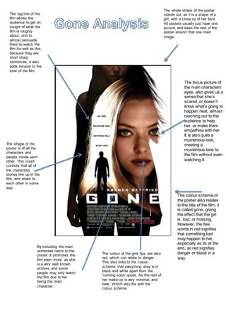
1. The whole shape of the poster
stands out, as it is a shape of a
girl, with a close up of her face.
All posters usually just have one
picture, and base the rest of the
poster around that one main
image.
The colour scheme of
the poster also relates
to the title of the film, it
is called gone, giving
the effect that the girl
is lost, or missing.
However, the few
words in red signifies
that something bad
may happen to her,
especially as its at the
end, as red signifies
danger or blood in a
way.
The focus picture of
the main characters
eyes, also gives us a
sense that she’s
scared, or doesn’t
know what’s going to
happen next, almost
reaching out to the
audience to help
her, or make them
empathise with her.
It is also quite a
mysterious look,
creating a
mysterious tone to
the film without even
watching it.
The tag line of the
film allows the
audience to get an
insight of what the
film is roughly
about, and to
almost persuade
them to watch the
film.As well as this,
because they are
short sharp
sentences, it also
adds tension to the
tone of the film.
By including the main
actresses name to the
poster. It promotes the
film even more, as she
is a very well known
actress, and some
people may only watch
the film due to her
being the main
character.
The shape of the
poster is of all the
characters and
people inside each
other. This could
connote that all of
the characters
stories link up in the
film, and relate to
each other in some
way.
The colour of the girls lips, are also
red, which can relate to danger.
This also links to the colour
scheme, that everything else is in
black and white apart from the
“coming soon: quote. As the rest of
her make up is very minimal, and
bare. Which also fits with the
colour scheme.