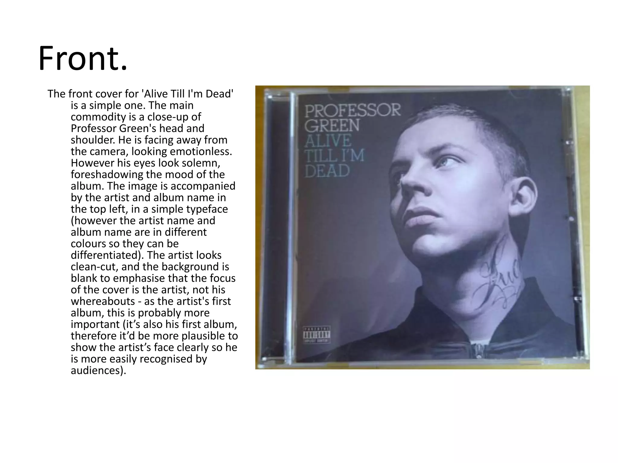
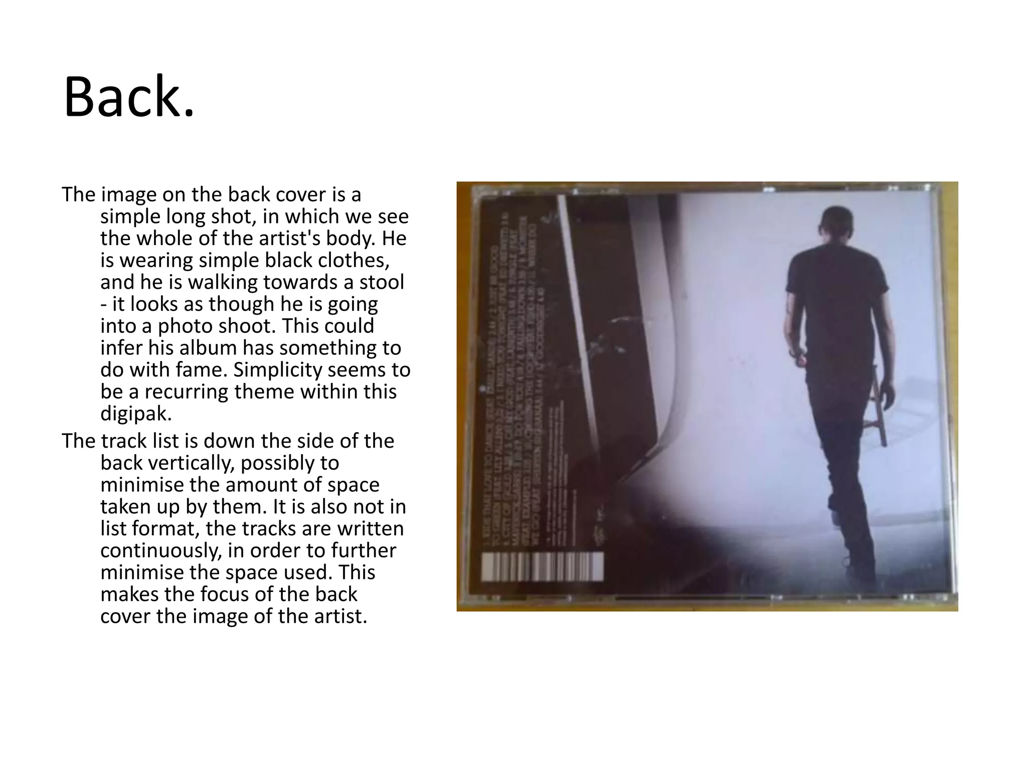
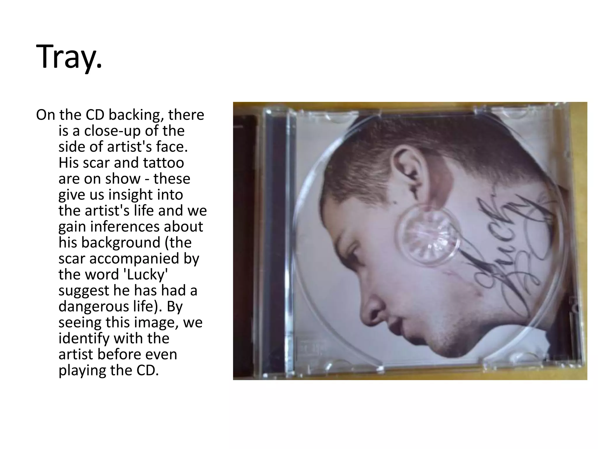
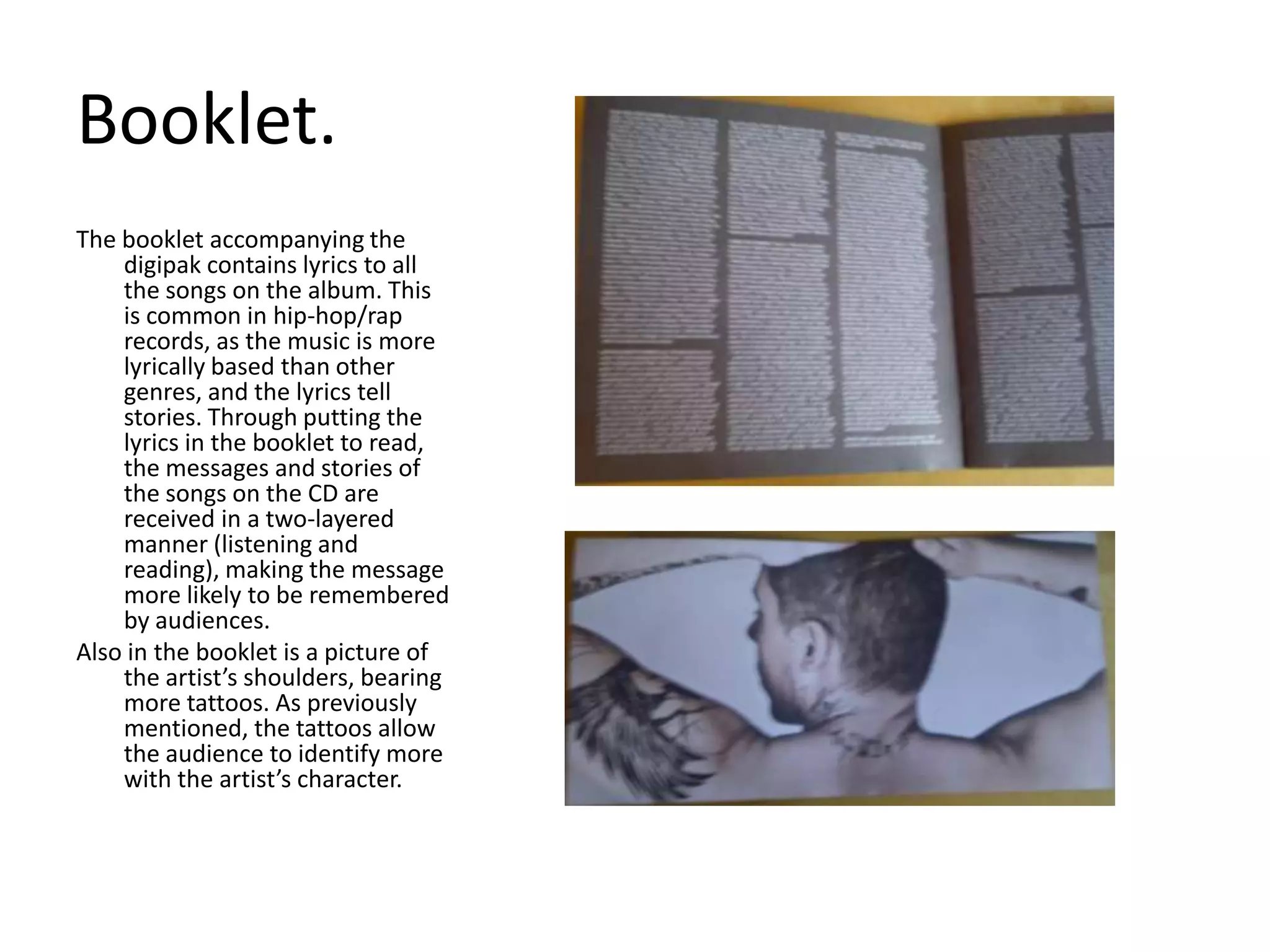
Digipak AnalysisProfessor Green’s ‘Alive Till I’m Dead
Front. The front cover for 'Alive Till I'm Dead' is a simple one. The main commodity is a close-up of Professor Green's head and shoulder. He is facing away from the camera, looking emotionless. However his eyes look solemn, foreshadowing the mood of the album. The image is accompanied by the artist and album name in the top left, in a simple typeface (however the artist name and album name are in different colours so they can be differentiated). The artist looks clean-cut, and the background is blank to emphasise that the focus of the cover is the artist, not his whereabouts - as the artist's first album, this is probably more important (it’s also his first album, therefore it’d be more plausible to show the artist’s face clearly so he is more easily recognised by audiences).
Back.The image on the back cover is a simple long shot, in which we see the whole of the artist's body. He is wearing simple black clothes, and he is walking towards a stool - it looks as though he is going into a photo shoot. This could infer his album has something to do with fame. Simplicity seems to be a recurring theme within this digipak.The track list is down the side of the back vertically, possibly to minimise the amount of space taken up by them. It is also not in list format, the tracks are written continuously, in order to further minimise the space used. This makes the focus of the back cover the image of the artist.
Tray. On the CD backing, there is a close-up of the side of artist's face. His scar and tattoo are on show - these give us insight into the artist's life and we gain inferences about his background (the scar accompanied by the word 'Lucky' suggest he has had a dangerous life). By seeing this image, we identify with the artist before even playing the CD.
Booklet. The booklet accompanying the digipak contains lyrics to all the songs on the album. This is common in hip-hop/rap records, as the music is more lyrically based than other genres, and the lyrics tell stories. Through putting the lyrics in the booklet to read, the messages and stories of the songs on the CD are received in a two-layered manner (listening and reading), making the message more likely to be remembered by audiences. Also in the booklet is a picture of the artist’s shoulders, bearing more tattoos. As previously mentioned, the tattoos allow the audience to identify more with the artist’s character.
CD.The CD has a simple design. The same font and colours are used from the front cover  - for unity within the entire product - and there are no images.
I HAVE LEARNT....For a first album, it is best to be able to see the artist. The closer, the better.Lots of images of the artist from different angles can be effective at portraying them to the audience (see front cover, CD tray, back cover & booklet).For the hip-hop/rap genre, it is a good idea to put the lyrics to the album’s songs in the digipak booklet.

Digipak analysis professor green

  • 1.
    Digipak AnalysisProfessor Green’s‘Alive Till I’m Dead
  • 2.
    Front. The frontcover for 'Alive Till I'm Dead' is a simple one. The main commodity is a close-up of Professor Green's head and shoulder. He is facing away from the camera, looking emotionless. However his eyes look solemn, foreshadowing the mood of the album. The image is accompanied by the artist and album name in the top left, in a simple typeface (however the artist name and album name are in different colours so they can be differentiated). The artist looks clean-cut, and the background is blank to emphasise that the focus of the cover is the artist, not his whereabouts - as the artist's first album, this is probably more important (it’s also his first album, therefore it’d be more plausible to show the artist’s face clearly so he is more easily recognised by audiences).
  • 3.
    Back.The image onthe back cover is a simple long shot, in which we see the whole of the artist's body. He is wearing simple black clothes, and he is walking towards a stool - it looks as though he is going into a photo shoot. This could infer his album has something to do with fame. Simplicity seems to be a recurring theme within this digipak.The track list is down the side of the back vertically, possibly to minimise the amount of space taken up by them. It is also not in list format, the tracks are written continuously, in order to further minimise the space used. This makes the focus of the back cover the image of the artist.
  • 4.
    Tray. On theCD backing, there is a close-up of the side of artist's face. His scar and tattoo are on show - these give us insight into the artist's life and we gain inferences about his background (the scar accompanied by the word 'Lucky' suggest he has had a dangerous life). By seeing this image, we identify with the artist before even playing the CD.
  • 5.
    Booklet. The bookletaccompanying the digipak contains lyrics to all the songs on the album. This is common in hip-hop/rap records, as the music is more lyrically based than other genres, and the lyrics tell stories. Through putting the lyrics in the booklet to read, the messages and stories of the songs on the CD are received in a two-layered manner (listening and reading), making the message more likely to be remembered by audiences. Also in the booklet is a picture of the artist’s shoulders, bearing more tattoos. As previously mentioned, the tattoos allow the audience to identify more with the artist’s character.
  • 6.
    CD.The CD hasa simple design. The same font and colours are used from the front cover - for unity within the entire product - and there are no images.
  • 7.
    I HAVE LEARNT....Fora first album, it is best to be able to see the artist. The closer, the better.Lots of images of the artist from different angles can be effective at portraying them to the audience (see front cover, CD tray, back cover & booklet).For the hip-hop/rap genre, it is a good idea to put the lyrics to the album’s songs in the digipak booklet.