This document analyzes and summarizes the album artwork and packaging of three different albums:
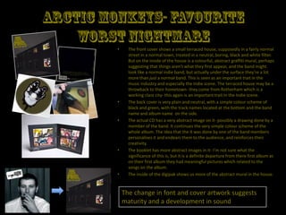
1) Arctic Monkeys' album shows a colorful graffiti mural inside a plain house, suggesting the band has more depth than their normal appearance.
2) Jehst's album features amateur photos of a child in a Superman costume and family photos, reflecting themes of childhood and nostalgia.
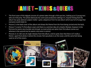
3) Jamie T's album shows two men jumping through a distorted lens, hinting at more abstract subject matter compared to his last accessible album.


![Jehst- Dragon Of An Ordinary Family
• This digipak is very simple, the front cover consists 1.
of a amateurish, playful photo of a child in an old-
school superman costume- provoking a sense of 3.
nostalgia, which reflects the general theme of the
album which is about domestic life in Britain and
looking back on past experiences. The photo is set
on a plain background, with no titles and no artist
name on the front.
• Picture 2 is the front and back cover, and the 4.
simplicity from the front is carried onto the back
cover, with the photo being continued. Here we
see the artist name and album title, and a simple
tracklist which appears to be handwritten.
• On the inside cover [picture 3] we see a collection
of old family photos and pictures of toys, set out in 2.
quite a random way- possibly signifying childhood
or a childish mindset, and this reflects the artists
own mindset as he is known for being quite playful
in his lyrics and wordplay.
• Pictures 4, 5 & 6 are Jehst’s past 3 releases these
all have a simple cover, a theme that runs though 5.
all of his album artworks.
6.](https://image.slidesharecdn.com/digipakexamples-111125070143-phpapp01/85/Digipak-Examples-3-320.jpg)