80 Best Prompts for AI Art like Midjourney, Bing, DALL-E, and Limewire.pdf
Weekly reflection (auto recovered)
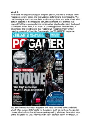
1. Week 1:
This week we began working on the print project, we had to analyse some
magazine covers, pages and the websites belonging to the magazine. We
had to analyze and compare them to other magazines and write about what
certain aspects of the magazine conventions meant. For example we
learned that lowercase and more conservative Mastheads meant the brand
is confident within itself, if an object is covering parts of the masthead it
also means the brand knows that readers will recognize them without
needing to see all of the title. For example the 'PC GAMER' magazine.
We also learned that often magazine will have so called 'blobs and stars'
which often include little 'treats' for the reader such as maybe a free poster
or an exclusive interview with an expert regarding whatever the main theme
of the magazine is. (e.g. interview with peter Jackson about the Hobbit.) I
2. learned quite a few things about magazine design that will come in very
useful when designing my own magazine. I also learned a fair bit about
website design which will also come in very useful when designing my
website, the common themes are that there are lots of social links, ways to
easily and quickly access newer and popular magazines and some way to
subscribe to the magazine.
3. Later on in the week we then had to design a test magazine cover. I
thought it would do the magazine on PUBG a game I play a lot and know
fairly well. I thoroughly enjoyed this, as I had to replace the sky which I
hadn't properly done before and the colours were always way of. But i think
this sky replacement turned out quite well. to make the image look less like
a poster and more like a magazine cover, I added a bar code in the bottom
left and text with relevant images, e.g. 'Player Unknown's
battlegrounds now available on xbox' with a mini Xbox next to it. or the
headphones that encase the text 'Best headphones for gaming' I think that
images can quickly help piece things together. You see the word
headphones and around it an outline of headphones with a question mark,
all this in a tech directed magazine is quite evident it is going to be about
what headphones are good. Even if you don't read the full text.
4.
5. I think the test turned out quite good, I think I will do my full magazine I am
planning on doing a Photoshop magazine, a magazine that will offer tips
tricks tutorials etc. These tutorials (in the magazine) can be linked as video
tutorials with the website so that the product could create more revenue as
there will be lots of cross traffic.
Researching and looking at magazines and websites has certainly helped
me understand why magazines are designed the way they are. What some
of the most eye catching traits are and how to tailor the magazine cover so
that you can attract the people you would like to attract. After all a
magazine is the advertisement and the product all in one.
Week 2:
This week I did not do an awful lot of work as York college was closed due
to heavy snow, I mainly carried on writing the research for my final product
and did other bits and bobs, though dude only having 5 lessons the whole
week there isn’t much to reflect on, however I did wish I had done some
more work at home but in all honesty I was more excited about the snow
and the days off, this did cause me to fall behind slightly so I will just need
to catch-up over the coming weeks.
Week 3:
This week we also missed quite a few days of college due to new student
days, this meant I again was only In college for 5 lessons. I began creating
some test cover images, most of them I wasn’t too keen on as they were
not well edited and often had too much going on, finally I made a design
that looked both ‘impressive’ in the sense that you could tell it was
photoshopped and simplistic enough to use as a cover image. The problem
with my other cover images was that there wasn’t any ‘dead space’ areas
6. on the image which had no content and therefore I could easily place text
or images over it without taking away from the picture.
First attempts:
7. Final image:
The image only has interest in its centre leaving lots of real estate for
masthead text cover story’s etc. I think the image looks nice and clean and
8. since I learned this form of photoshop (double exposure images) I still need
to get better at creating these images, I will probably work on the image
over the weekend and next week in order to make sure it is the best I can
produce.
Week 4:
During this week I finished of my work from last week and began my
website. I started and finished the Magazine cover and double page
spread. For the magazine cover I created a double exposure image in
Photoshop using stock images. I think the result was quite good and in my
opinion looked quite professional. Though the magazine looks very
minimalist I think it works in cohesion with the image, the image itself isn't
'simple' however the colour scheme is very 'monotone' and therefore the
minimalist style works I also scaled the image up so it filled more of the
screen. Especially in comparison to the first attempt which had a lot of text
and it was somewhat overwhelming. I think the simpler version is
overseeable and draws more attention to the Photoshop work which is
ultimately the attraction of the magazine.
The second piece of original work I did was for the double page spread
This was an image I took myself of a friend of mine, It was again a double
exposure image except this time I added in smoke to give the image
another level of 'complexion' I was very pleased with the outcome of this
image, though it may not have looked as clean as the first one it looked
more original and authentic, I also thought that the foggy forest worked
extremely well with the smoke coming of the head to look like he was
evaporating.
9. I create a good portion of the double page spread using Photoshop as it
wouldn't have been possible in In Design, The main things is of course the
page image itself and the text above it, I erased parts of the text to make it
look as though it was missing, and the text was filling it in. I also had to add
the Instagram trademark on Photoshop, I didn't need to add the page
number but for some reason i did.
The double page spread looks good, however unfortunately I wouldn't say
it is my best work however I do believe it conveys the idea of the product
quite well. I added a step by step image guide at the side of the double
page spread, with the steps written out to the left-hand side. I think if I had
more time I would have re jigged a lot within the image I think maybe I
would have placed the image in the centre of the page and had text go
around it on either side. Which would have made it more difficult to add the
10. picture guide and could have resulted in quite a messy look. So perhaps
this way was better.
Week 5:
This week I finished of my website and wrote my evaluation. There was not
a lot of creative work going on as it as mostly just writing and uploading
images or videos I had made/recorded previously. Though I didn’t
necessarily enjoy the process of creating the website I did enjoy the
concept of creating the website and trying to fit together all the necessary
pieces to make a functioning website that can fully represent the product it
is about. I think my website represents its product quite well but the content
lacks more than I would like it too. I spent a fair amount of time on the
design and flow of the website however the actual written content is not at
the level it should be and if you read it, it is very evident that it is not a
professional website. As always, I struggled with the evaluation as I find it
hard to take an objective look at my work rather I tend to look at it
subjectively and completely dismantle the things I dislike while ignoring
their pros and praise the things I like while ignoring their cons. I need to
improve on this as it will help me create better work in the future and also
it’ll help me realise better what I don’t need to improve and what I can sort
of keep on the backburner while focusing on other areas that do need the
improvement.