3. Genre
• This magazine takes the genre of pop as we can see by the bright
colours, and the name which clearly says ‘Top of the Pops’.
• It a very youth orientated magazine, with the use of cheesy lyrics
and puns, and catchy rhymes used throughout.
• ‘Pop music’ derives from the term ‘popular music’, and ‘Top of the
Pops’ magazine is all about keeping it’s readers up to date with all
the popular music, and latest celebrity news.
• Bright colours are used to make the appearance friendly to the
young readers, and so it draws attention to the magazine.
• Male artists are portrayed and viewed as an object of desire, and
female artists are portrayed and viewed as an object of inspiration,
for example ‘you could be like Cheryl’.
• Abbreviations are used frequently like ‘OMG’ and ‘HOTTIE!’, to
relate to the young target audience.
4. Pop artists
• Pop artists are usually photographed smiling, and most
of the time look directly at the camera to give a friendly
feel.
• They are usually young, and look youthful, linking to the
genre.
• Females tend to wear pinks and other feminine colours,
whereas males dress fairly casually.
• There music tends to avoid swearing, reference to drugs,
sex and alcohol; this is because the target audience
would not be able to relate to the songs they write.
5.
6. Background
• ‘Top of the pops’ was first launched in February 1995, and a new
issue is published every month to keep its readers thoroughly
informed with everything they need to know from music to
celebrities.
• It is priced at £2.30, and includes 42 pages, however freebies are
included so the price is reasonable for what you’re getting.
• ‘BBC Top of the Pops’ magazine is published by ‘Immediate Media
Company London Limited’ under licence from ‘BBC Worldwide’, and
so within the magazine there are articles which direct the
readerships' attention to BBC productions, such as Tracy Beaker on
the CBBC channel. The BBC logo below is placed in the top left
corner of some of the most recent issues, and the logo is usually
placed in the magazine on some pages also.
7. Background
• ‘Top of the Pops’ was originally a supplementary
magazine for the TV show ‘Top of the Pops’, until the
show was cancelled in 2006, when the magazine
continued independently.
• Alongside this revamp of the TV show, it was originally
marketed as the missing link between Smash Hits and
NME, but its gradually changed; with less music content,
and a demographic shift to young girls.
• ‘Top of the Pops’ has now become online based, with
social networking sites like twitter in use, and also has a
website.
8. This is a screenshot from the Top of the Pops twitter page; brand identity is
maintained through the bright pinks and yellows being used, and the
abbreviations like ‘Hot’ being used.
9. This is the Top of the Pops website, with close resemblance to magazine,
showing brand identity, for example, the swirly symbol, the fonts and
colours used.
10. Ownership
• The magazine has had several editors over the years including
Peter Lorraine, Corinna Schaffer and Rosalie Snaith. The current
owner of ‘Top of the Pops’ is Peter Hart.
• Peter Hart summarises the magazine by saying “We bring our
readers closest to their idols, because we’re the magazine that
knows celebs the best. Every issue is packed with exclusive
interviews and photos, as well as brilliant star advice and affordable
fashion and beauty. We’re the friend our readers can rely on to give
them confidence, make them laugh, and share all the juiciest gossip.
And that’s why BBC Top of the Pops Magazine is the biggest selling
teen title”.
11. Content
• ‘Top of the Pops’ features a wide variety of different articles, such as:
• ‘Gossip2Go’ – This is the month’s newest celebrity gossip.
• ‘Don’t Miss!’ – The magazine promotes latest films and TV programmes that
are suitable for its target audience.
• ‘Shameful Celeb Muck Ups’ – This is a page on ‘cringy’ celebrity images,
with a witty quote for each of them. With this is a page, ‘Your Oops’ which is
stories that readers have sent in that have embarrassed them; this makes
the readership feel like friends with the magazine.
• ‘Real life’ situations from the world, to help inform young girls of the threats
in the real world.
• ‘Your letters’ to help keep in touch with the readers.
• Posters of celebrities are included in every magazine for readers to cut/pull
out.
• Fashion and Beauty advice.
• Games and Quizzes to do alone or with friends.
• ‘Agony Aunt’ section to help reader’s with their problems.
• Interviews with celebrities within the pop genre
• And much more..!
12.
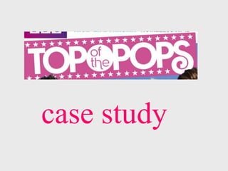
13. The ‘Top of the Pops’ masthead
• ‘Top of the Pops’ has had different mastheads since the magazine
first started.
• This is the current masthead of ‘Top of the Pops’ magazine.
• This masthead was being used in the first few years of publication.
14. These are all the different styles of mastheads that have been used
since the magazine was published, and each different style has been
used in various colours, ranging from pinks, blues and yellows.
15. ‘Top of the Pops’ – June 1997
This issue was published in
June 1997 with green and
purple being the dominant
colours on the magazine. The
colours used are less feminine,
and the magazine doesn’t
really stand out.
Compared to the quality on
more frequent magazines, the
graphics are poor.
The images on this magazine
appear to be less ‘poppy’
compared to those you would see
on a more recent pop magazine.
16. ‘Top of the Pops’ – March 2013
This issue was published in
March 2013, and pink, white, red
and yellow are the dominant
colours; these colours stand out,
and reflect the more feminine
audience.
The quality has improved
drastically, and the magazine is
more visually attractive
compared to how it used to be.
The images are also more
attractive; mode of address is
used because every celebrity is
making eye contact, and
appears smiling.
17. Inside ‘Top of the Pops’
• Bright colours are used on
all pages, and lots of
images to make it more
visually attractive.
• Alliteration is used to make
the title more interesting
• Subheading type writing is
written in a different colour
so the page does not look
full of writing, which would
bore the young reader.
• All the artists are smiling
and looking directly at the
camera.
18. Target audience
• 10- 15 year old girls.
• Interested in pop music, fashion and boys.
• Still in education; higher years of primary school – lower
years of high school.
• Likes to be in style with her outfits, and loves getting a
bargain when possible.
• Hardworking, friendly, and trustable, she likes reading
pop magazines and getting the best advice from the
advice section.
• Shares her love of pop magazines with her close friends,
and talks about it with them at school and on the
weekends.
19. Mode of address
• Abbreviations and ‘slang’ words are often used like ‘OMG’ to relate
to the audience, and make the magazine feel like a friend to its
reader.
• The artists on the cover, and in the magazine, usually appear
smiling and looking directly at its reader, inviting them to read the
magazine.
• It is friendly and down to earth, suggesting a friend-to-friend
relationship between the magazine and the reader.
• The words ‘you’ and ‘we’ are used frequently.
• Exclamation marks are used throughout to show a sense of
excitement that the readers can share with the magazine.
• Examples of Mode of Address used:
• ‘OMG’
• ‘make boys fancy you!’