1. Salford City College
Eccles Centre
AS Media Studies
Foundation Portfolio
House Style
In this page it has used colours such
as pink and black. These colours are
related to the artist in the magazine.
The colour of her hair and what she
wears is the trademark of her band
revealing to us that this is mainly
aimed for young women who are
into electronica’s or rock type of
music. The colour pink is made to be
stereotypical but with the black
going on we can tell the type of
genre music this artist focuses on.
Masthead
The masthead is made to be thin
bold and very big. The internal area
of the text of the colour pink is
made for us readers to feel that we
deserve to read the magazine. The
external areas of the masthead are
thick blocks on each letters that
creates an illusion which emphasises
this to attract the readers.
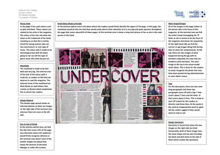
Main Image/Images
All of the images in this page relates to
the person who is the focus of this
magazine. At the terminal area we find
the artist’s head overlapping the ‘R’
letter as she is meant to be the focus of
the magazine and shows her popularity.
At the right hand side we find the
concert or gig images being held during
then to show her achievements. At the
top, there are also images of what
happened during the gig with its
members especially the ones that are
shaded in pink and black. The main
image at the top is the actual model
shoot taken. This is done for the readers
to easily recognise the photo that may
have been posted during advertisements
or even album covers.
Guttenberg design principle
At the primary optical area is the place where the readers would firstly identify the aspect of the page. In this page, the
masthead would be the one that they would easily attract their attention as it is very big and quite spacious throughout
the page that covers about25% of these pages. At the terminal area it shows a long shot picture of her as she is the main
person in the band.
Text
For the description, there are two main
long paragraphs and these two
paragraphs starts off with a big ‘I’ that
covers about 7 lines and the letter ‘A’
that covers about 3 lines. This is made to
start off a point for the readers to
directly read those lines. At the quote it
has used an inappropriate word to again
tell the reader suggest if they would
want to read or not.
Design Balance
This double page spread shows an
informal balance as there are images
on the right side of the terminal area
whereas there are none at the left
side.
Design Symmetry
Symmetry is found from when the two
images on the right side are lined
horizontally. Both of these image have
the same shape and size also including
the black and pink brick on the side of
them which creates the symmetry.
Use of rule of thirds
At the primary optical area, we find
the title that covers 25% of the page
very attractive where the audiences
would firstly recognise whereas at
the terminal area where most of the
smaller images are placed that
shows the pictures of the band
offstage or under the curtains.
2. Salford City College
Eccles Centre
AS Media Studies
Foundation Portfolio
Guttenberg design principle
Guttenberg design principle is used in this page of the image, at the primary optical area this is allocated around the
boys who are kicking the rabbit as this is the main focus of the magazine with also at the terminal area we find the girl
who is also part of the boys being uncontrollable.
Main Image/Images
The main image covers up the whole
page on the left. This shows these boys
and a girl beating up a mascot. This
indicates rebellion as we can see how
they are kicking their legs to the mascot
and the girl stopping this from moving.
This main image is very attractive
towards the particular niche audiences
as it may relate to teenagers who want
to feel freedom. The boys’ expressions
are very contented even though this
looks like a stolen shot. The girl also
looks stubborn especially looking
towards the readers.
House Style
It has mainly used white, black and
red colours in order to fit in with the
bands masthead. The colour of red
and white suggests innocence and
rebellion. Also suggests that the
target audiences for this are teen
boys and girls and in what we can
see them as of today.
Text
The text font is very informal, especially
the quote laid out in the middle is very
tall and thin similarly with the masthead
font. Also the way of them using phrases
such as ‘arty’ is informal as many
teenagers use improper words especially
when they speak. The word ‘teen’ also
suggests telling the readers this
magazine are for teenagers.
Design Symmetry
Design symmetry is found from the text
description were this is splitted into 3
columns. This is done for the audience to
easy read the writing when aligned
properly. Throughout this page we do
not find symmetry as this page is laid to
be very informal and should be messy
referring to rebellious teenagers.
Use of rule of thirds
Rule of thirds is seen in this page in
where we can see the large
masthead andboy’s eye level at the
top where this makes an eye-
contact not to us but the rabbit. At
the third row we find the girl to be
eye-contacting towards the readers.
This may suggests how the girl is
also rebellious corporates with the
boys who would be more violent.
Design Balance
This page is informally imbalanced
of the way they put a large image on
the left side and text on the right
side. The text column is laid out in
three columns which gives a good
balance as these are aligned well.
Masthead
The masthead is very white, capital
and bold. Also the T and the S looks
like it’s ripped out and again
represents rebellion towards
people. The dabbed paint that
overlay the main image suggests
that the masthead is very important
for people to look at.