
Recommended
More Related Content
What's hot
What's hot (20)
Viewers also liked
Similar to Question 5
Similar to Question 5 (20)
Recently uploaded
Recently uploaded (20)
Question 5
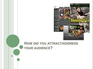
- 1. HOW DID YOU ATTRACT/ADDRESS YOUR AUDIENCE?
- 2. • In order to attract the audience from the first glance at the magazine. I used a single protagonist which appeal to both genders. This is where I put the male gaze into focus. The attractive model would make the males more interested. The male gaze enables women to be a commodity that helps the products to get sold. Females would also look up to the model on the front cover for inspirations or even see her as a role model. The female audience will also be attracted to the fact that an Asian model is on the front of this cultural magazine and will be attracted to the sense of power and independency. The cultural fitted attire and soft make up will appeal to the audience as well as they majority tend to have an interest in fashion and make-up as well. • The greyscale background effect, fashioned cultural clothing, and soft scale make over creates a perfect image to portray the magazine as a cultural music one. It creates an impression that magazine is going to give that cultural buzz. Combined with that the body language and facial expressions on the model gives off an persuasive and engaging vibe. All these aspects therefore intrigues and entices the audience to purchase the product so that they can read more throughout the magazine.
- 3. ESSENTIAL INFORMATION The use of this feature in particular on the front cover allows the audience to be aware of what issue they are reading and which ones the may have missed so its easier to find. It also suggest to the audience that the magazine is worth buying with it being the tenth issue. This clearly suggest the people are interested in a cultural music magazine and so far it has been a great success within the music magazine industry. It also makes them more aware of which publication will be next available. After carrying out my audience research, it clearly made me aware that readers are more encouraged to buy a magazine when the price is reasonable. Therefore, after taking this into consideration, I believed that £2.00 was affordable for a wide range of people. Having the price in bold thus gains there attention and reels them into buying the media production.
- 4. COVERLINES/SUBHEADINGS/SELL-LINES. All magazine have typical features which included coverlines, subheading and sell lines. These are used to engage the audience and reel them into buying it. The inclusion of sell lines make the audience feel like they get easy access to news and good value for their money. A particular name for example a big musical pop star or a specific piece of content like exclusive images may encourage the audience into buying the magazine. For potential readers to be attracted more quicker i decided to add bright colours to stand on the greyscale. This allowed the audience to see it easier on a shelf and made the main story line available to all customer making them want to buy the magazine.
- 5. EXTRA FEATURES Many of the expected audience will most likely be in the age group of 16-30, therefore, the majority of my readers will be active with the internet and have the latest technology. Because of this I decided to add information about the magazines, Twitter page, Facebook page, Instagram and YouTube channel. I believe this is a great feature to have within a magazine because it will address and fulfil my regulars needs as they will be able to explore other news through these links. I think this is a great feature that will attract many due to our technology driven society.
- 6. OTHER INFORMATION •Colour Scheme- one of this things I took into consideration was the very bizarre colour scheme I used. The colours consisted of either really dull shades or really bright. To attract my expected audience I used unusual colours so it would be more appealing. •Language- to address all readers I used standard English so that the majority of readers could understand what was being said. •Use of ‘Cultural Music Celebs’- to appeal to the my target audience, I added these celebs into the magazine so that it indulges them. •Use of Images- I have used a wide range of images all from different angles so that each image will have some sort of appeal on the audience. I addition, I have edited so that they look better. E.g. On the front cover I made the background darker so that the protagonist stands out more. This will allow the magazine to stand out more. •Editors Note- makes it personal
- 7. All of the previous features I have mentioned and explained, discuss how my magazine ‘CultureShock’ addressed and attracted the audience in different ways which enabled me to marketise my magazine correctly and increase the popularity.