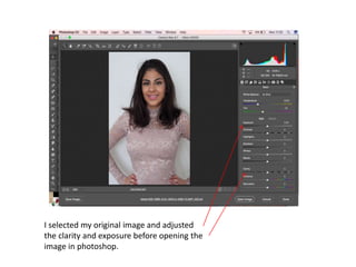
1. I selected my original image and adjusted
the clarity and exposure before opening the
image in photoshop.
2. First thing I did was use the burn tool
to darken the models hair as well as
using the dodge tool to lighten her
eyes and teeth. I also soften the
models skin using a tutorial I followed
from YouTube.
3. I transformed the image of the model to fit my cover
page. I then brought in my masthead from ‘da fonts’
and added a barcode which I took from the internet. I
created an arrow and added text to it within
Photoshop.
4. Using the text tool in Photoshop I brought in my main
cover line. The cover line was made large and in a font I
felt fit the conventions of a pop magazine.
5. I opened a secondary image for my cover page
and again adjusted the clarity and vibrance
before adding to my cover page.
6. I go on to add in clothes fro another cover line
on my cover page
7. I next added secondary cover lines related to what will be in
the magazine. I added two puffs to my magazine to address
what is further to come within the magazine.
8. I then took out the yellow puff as I felt it was too related to fashion
rather than music. I then added a stroke to my main cover line to
help it lift off the page.
9. I then added in a rectangle box to place another cover line
in. I added a celebrity artists name to ensure to the
audience that this is a music magazine.
10. I opened another secondary image to bring onto the cover of
my magazine.
11. I now begin to soften the subjects skin. I start by
selecting filter; high pass; and selecting 24 pixels.
14. I created an layer mask and using the brush tool I
painted over the areas of the skin I wanted to
soften. Then lowered the opacity and the process
was complete.
15. Next I brought in a colourful background from
the internet.
16. I brought it into my secondary image which I had cut
away from the previous background. I resized the
background and placed it behind the model.
17. I brought in another secondary image and did
the same softening of the skin process and
then brought it straight into my cover page.
18. I added a stroke to both of the added secondary
images to help lift them off the page.
20. I then felt by having clothes on my pop music
magazine that it was more of a fashion magazine so I
chose to remove the clothes and bring in CD covers.
For my first CD cover I brought in a sunset back
ground
21. I then brought in a triangle and filled the
colours in to contrast with the background
colours.
22. I then brought in a circle and also filled
the colour to contrast well with the
background and then I added text to
label the album and call it ‘Divided’ by
Beth Coal
23. I then dragged it onto my cover page and transformed
the CD cover to a smaller size.
24. For my next cover I used a CD template and
covered it with a flower pattern then again
added text and called the CD ‘Dangerous
Love’. I then dragged it on to my cover and
transformed to a smaller size.
25. My final CD cover was a filled purple background with
a drawn heart and the CD name ‘Fantasy’ in the
centre. I again dragged the CD cover on to my cover
page and transformed to a smaller size.
27. The first image I use for my contents page was
the one above , this time I selected just the
model and the guitar using the quick selection
tool and cut away the background.
28. After bringing the image onto
my contents page. I then added
text using the text tool and
changed the font.
29. Again using the text tool I added in page numbers
and what to expect within the magazine. As well
as adding a puff to advertise the posters within
the magazine.
43. I added a stroke similar to the other cover
lines to help the text stand out on the page
rather than appearing flat.
44. I then added my editors text to fill in a white space.
45. My last step was to bring in the final
two secondary images.
46. To create my double page spread in InDesign I opened a
new document. The first step I did was create a text box
using the text tool and added my headline, by
highlighting the text I was able to adjust the size od my
text.
47. By selecting the ‘swatches’ panel I was able to
change the colour of my text to fit with my
colour scheme.
48. Again using the text tool I brought in a stand first and resized
it to be smaller than the headline and placed it just
underneath it. I next created a new text box underneath the
standfirst and copied my article over from word.
49. I highlighted the questions within my article and
using the swatches I managed to change the
colour to pink, so the questions standout against
the answers.
50. From Photoshop I brought in a rectangular
shape, I copied and pasted it onto my
InDesign document.
51. Using the swatches again I was able to change the colour of the rectangle
to the same as the headline. I resized the rectangle by holding down ctrl
alt shift and dragging. I placed it behind the drop cap I had just created by
selecting the letter and resizing it. I also managed to change my questions
to a purple colour by searching through the swatches.
52. I created another small shape and
placed It in the corner of the page I
filled the shape with the same pink as
the headline.
53. Using the text tool I brought in a
page number and changed the font.
54. I brought in another shape from Photoshop this time
I changed the colour of the shape in Photoshop to
match the colour scheme of my cover and contents
page.
55. I brought in the shape and resized it after doing
so I used the text tool to add the name of the
artist.
56. I resized the text and placed it in front
of the shape.
57. I opened my double page spread image in Photoshop and
edited the blacks temperature, clarity and vibrance to get a
better image.
58. Using the clone stamp tool I filled in the
background to be completely white.
60. I saved the Photoshop image then went back to
InDesign and placed the image and dragged it to
the size I wanted. I then brought in another shape
from Photoshop and placed it at the bottom of the
page just for effect.
61. I brought in a secondary image which I first opened in
Photoshop and edited I again used the clone stamp
tool to fill in the background to be completely white.
62. I again placed the image into my InDesign document
and dragged it to the size I wanted. I created a wrap
around the image so the text moved around it.
63. I created a caption for my image and again put a
wrap around it and placed it just underneath the
image.
64. My final steps were to make the image larger and add a
stroke to it to lift it off the page and make it fit in with the
colour scheme more, I curve to the outline of the image was
also added. I also changed the colour of the caption to
match the colour scheme.