
Recommended
More Related Content
What's hot
What's hot (18)
Similar to Magazine Editing
Similar to Magazine Editing (20)
Recently uploaded
Recently uploaded (20)
Magazine Editing
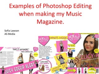
- 1. Examples of Photoshop Editing when making my Music Magazine. Sofia Lawson AS Media
- 3. To change the colour of the eyes and the lips I used the lasso tool to select the areas I wanted to change. I decided to change these colours as they brought colour to my models face and fit with the pop genre. I used the colour tool to select the colours I wanted. For the lips I chose a bright pink and for the eyes I used a blue. BEFORE AFTER
- 4. Since pop singers generically have a perfect blemish free complexion, I used Photoshop to remove a spot on Lucy’s chin. I did this by using the spot healing brush tool and selecting the place on her chin were the blemish was to remove it. This makes her skin look a lot better and makes her face look more ‘flawless’.
- 5. Since my model was wearing a crop top, the side of her bra and bra strap was showing on the photos. To get rid of this I used the healing brush tool to get rid of the bra strap by simply clicking on the strap for it to blend to the colour of her skin. I used the same tool to get rid of the side of her bra by clicking on it and duplicating the pattern of her top and also pieces of her hair. BEFORE AFTER
- 6. The first thing I did was use the Free Transform tool to re-size the heart that I was using as my logo as it was too big. Next, I used the ‘layer style’ function to add a drop shadow on to the heart as it created more depth and looked more professional. For the text of my logo I downloaded the font ‘Cutie Pop’ off dafont.com as it my genre really well as it had hearts in and looked really girly.
- 7. The original colour for the font was black. I decided to change this as it looked bland and didn’t pop out against the pink colour. I again used the ‘Free Transform’ tool to change the size of the text so it fit in the heart.
- 8. To make different shapes on my front cover I used several tools such as the ellipse tool to make a circle, rectangle tool to make the boxes and the custom shape tool to make the arrows. I used these and changed the colour so that I could add text on top so you could see the feature stories.
- 9. To make my tag line stand out I used the ‘Warp Text’ tool to make it arched and curvy. I did this so it would fit around the logo and was easier to see. There were many different options of the different arc tools you could use such as ‘Arc Upper’ and ‘Flag’. I decided to use ‘Arc Lower’ as it fit around my logo best.
- 10. As some of my photos were taken against a wall I edited out the background by using the magic eraser which deleted the background. Using the magic eraser around the leg area proved tricky as It was getting rid of some of her legs and shoes. I used the Magnetic lasso tool to carefully go around the legs and shoes and then filled it with the magic background eraser tool.
- 11. BEFORE AFTER
- 14. Ito get rid of the white background I used the magic eraser tool. I edited the photo so I could put it against a yellow box, so therefore I had to get rid of the photo. 1 2 3
- 15. Again using the Rectangle and the Ellipse tool I used squares and circles to put information in for my contents page. I also layered the squares and circles on top of each other so they would pop out.
- 16. I decided to include some social media usernames on my contents page. I did this as my target age group are linked strongly with social media and can access it off their devices. I also included a Twitter username for the Editor (me). I did this so the readers could keep up to date with any new gossip and get exclusive information about the new magazine.
- 17. To add text to my contents page I used Microsoft Publisher as it enables you to use the tool of putting the text in to columns, which looks better as it looks like a professional article. I then copied and pasted it in to Photoshop and then changed the font and made some words bolder using the text tools.
- 18. On my Contents page I wanted to add a photo of the magazine cover in the ‘Subscribe’ plug. I wanted to do this so it would draw the readers attention and want to subscribe. Since the original cover was a Photoshop document I changed it in to a JPEG image file so I could add it to my Contents page. I then used the transform tool to make it smaller and fit in the circle.
- 19. DPS Editing
- 20. Since the story in the Double Page Spread is the most important as its featured on the Front Cover I used publisher to use the two collumn tool as it fits more words in therefore allowing me to have a longer story. I also used the Drop Cap tool to make the letter of the first word bigger as its conventional and stands out.
- 21. I used the Rectangle tool to make a rectangle and spread it across the page. I then edited and resized a photo of Lucy and duplicated them on either side of the rectangle using the free transform tool. I then added the text by downloading a font off Dafont.com and then added a drop shadow so it contrasted against the pink colour.
- 22. To make the photos to add to the rectangle across the page I decided to use a photo were Lucy has her mouth open and her hands to her mouth as it fits with the text which says ‘Juicy Gossip Alert’ as It looks like she's shouting. I again used the magic background eraser tool to get rid of the background. I also used the contrast tool to make her skin lighter and even out her skin tone.
- 23. To make the corners of the page I used the line tool to separate the page from the corner. I then used the paint bucket tool to fill it in with the pink colour Id been using throughout the magazine. I then added a page number which I put on the contents page so the readers knew they were at the correct page.
- 24. When I first uploaded my DPS photo It went in front of the text which meant you couldn’t read it. To fix this I went to- Layer/Arrange/Send Backward. This put the picture behind the text making It readable.
- 25. Since the story is an article, as the title I decided to use a quote from the story ,which Lucy had stated. I did this by using the Text function and then changed the colours so it wouldn’t look boring.