
Recommended
Recommended
More Related Content
Similar to Creating and Using a Gannt Chart A Gantt chart is a t.docx
Similar to Creating and Using a Gannt Chart A Gantt chart is a t.docx (20)
More from willcoxjanay
More from willcoxjanay (20)
Recently uploaded
Recently uploaded (20)
Creating and Using a Gannt Chart A Gantt chart is a t.docx
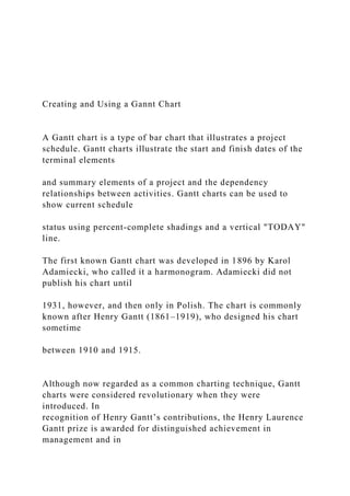
- 1. Creating and Using a Gannt Chart A Gantt chart is a type of bar chart that illustrates a project schedule. Gantt charts illustrate the start and finish dates of the terminal elements and summary elements of a project and the dependency relationships between activities. Gantt charts can be used to show current schedule status using percent-complete shadings and a vertical "TODAY" line. The first known Gantt chart was developed in 1896 by Karol Adamiecki, who called it a harmonogram. Adamiecki did not publish his chart until 1931, however, and then only in Polish. The chart is commonly known after Henry Gantt (1861–1919), who designed his chart sometime between 1910 and 1915. Although now regarded as a common charting technique, Gantt charts were considered revolutionary when they were introduced. In recognition of Henry Gantt’s contributions, the Henry Laurence Gantt prize is awarded for distinguished achievement in management and in
- 2. community service. This chart is used also in Information Technology to represent data that has been collected. (first three paragraphs appear in Wikipedia Gantt chart entry, citing these three sources: H.L. Gantt, Work, Wages and Profit, published by The Engineering Magazine, New York, 1910; republished as Work, Wages and Profits, Easton, Pennsylvania, Hive Publishing Company, 1974, ISBN 0879600489. Blokdijk, Gerard (2007). Project Management 100 Success Secrets. Lulu.com. p. 76. ISBN HYPERLINK "http://en.wikipedia.org/wiki/Special:BookSources/0980459907 " 0980459907. http://books.google.com/books?id=dgB- QWHlnrUC&pg=PA76&dq=Adamiecki+Gantt&as_brr=3&sig=J p- mgVODNRJpxqBRM1PYJbs7mOU. Peter W. G. Morris, The Management of Projects, Thomas Telford, 1994, ISBN 0727725939, Google Print, p.18) There are two easy ways to create a Gantt chart to incorporate in the status report for a project in this class: (1) use free software, or (2) create a table in MS Word or Corel WordPerfect. http://en.wikipedia.org/wiki/Special:BookSources/0879600489 http://en.wikipedia.org/wiki/International_Standard_Book_Num ber
- 3. http://books.google.com/books?id=dgB- QWHlnrUC&pg=PA76&dq=Adamiecki+Gantt&as_brr=3&sig=J p-mgVODNRJpxqBRM1PYJbs7mOU http://books.google.com/books?id=dgB- QWHlnrUC&pg=PA76&dq=Adamiecki+Gantt&as_brr=3&sig=J p-mgVODNRJpxqBRM1PYJbs7mOU http://books.google.com/books?id=dgB- QWHlnrUC&pg=PA76&dq=Adamiecki+Gantt&as_brr=3&sig=J p-mgVODNRJpxqBRM1PYJbs7mOU http://en.wikipedia.org/wiki/Special:BookSources/0727725939 http://books.google.com/books?id=5ekyoWaeZ1UC&pg=PA18- IA7&dq=Adamiecki+Gantt&as_brr=3&sig=xe_RAipoqlvhnu0xL kIsxx-8OAQ CREATING A GANTT CHART USING FREE SOFTWARE: One free Gantt chart creator can be found on http://www.ganttproject.biz/ and an example of its output appears below: This chart depicts milestones in completing “The Johnson Genealogy Project.” The goal of the project is “to provide a
- 4. written history and genealogy of the Johnson family from 1730 to the present for sale and distribution to family and historical organizations.” official sources or verified by at least one other source to be considered “firm” rather than “tentative.” WHO said WHAT about an ancestor, WHEN it was said, and HOW it was known. “Traditional” stories may be used if labeled as such, but every effort must be made to identify the SOURCE of the story. generation should be developed for the book. For example, the flu epidemic of 1917 impacted most Americans—did any Johnson contractor die from the flu? jects of photographs, portraits, and related graphic items must be documented. The time period and circumstances surrounding the picture should be described wherever possible. Note that the entire project is addressed in this depiction – not merely the collection, processing, and verification of the information involved. Note
- 5. also that the actual Gantt chart for a complex project would have many more elements and the resulting interdependences would also be included. This depiction of a project leads to a NETWORK DIAGRAM, also called a PERT CHART (Program Evaluation Review Technique) or CRITICAL PATH chart. All of these techniques are used in Project Management, together with Lean Manufacturing concepts, including Six Sigma. If you are writing for managers using any of these applications, you should become thoroughly familiar with them. To insert a Gantt chart from this program into your text file, export the completed chart as a JPG file and paste it in as a picture. http://www.ganttproject.biz/ CREATING A GANTT CHART USING TABLE TOOLS: You can create a simple Gantt chart by creating a table in MS Word or Corel WordPerfect. Because this involves creating a cell for each unit of time, we will reduce the detail to weeks and create a 13 by 9 cell table (which is NOT as precise as the Gantt Project software, but will do for your proposal to produce a researched proposal for a company or community).
- 6. Now we will adjust the cell width and fill in the X and Y axes information: Johnson Family Book Dec Jan Feb Week 1 2 3 4 1 2 3 4 1 2 Research Family Get Pictures Anecdotes Verify Draft Review Publish
- 7. Finally, we can adjust lines, color cells to distinguish different activities and their specific durations, and remove the lines between the cells that are colored to represent the activities (using the “merge cells” command). Here is the finished product: OHNSON AMILY OOK Dec Jan Feb Week 1 2 3 4 1 2 3 4 1 2 Research Family Get Pictures Anecdotes Verify
- 8. Draft Review Publish Note that the activities that take less time than the time period selected (in this example, one week) lose their accuracy in this scale (note the Review and Publish time lines); however, using a cell to represent a day would create a 76-cell width which, if reduced, would result in a Gantt chart that would be too small to read. The number of steps required to explain the sequence and relationship of tasks you will need to complete to turn in your researched proposal on time are small and the time can be expressed accurately enough in whole weeks, so the table version is adequate as a planning effort for this assignment. The Gantt Chart is a very useful planning and status checking tool that can keep a manager on track in completing a complex project on time. A good Gantt Chart (one that includes all of the key steps needed to complete a project) can avert disaster as you complete a complex project bounded by non-negotiable time constraints (such as a paper
- 9. due on a specific day). PERT CHARTS A PERT chart is a project management tool used to schedule, organize, and coordinate tasks within a project. PERT stands for Program Evaluation Review Technique, a methodology developed by the U.S. Navy in the 1950s to manage the Polaris submarine missile program. A similar methodology, the Critical Path Method (CPM) was developed for project management in the private sector at about the same time. A PERT chart presents a graphic illustration of a project as a network diagram consisting of numbered nodes (either circles or rectangles) representing events, or milestones in the project linked by labeled vectors (directional lines) representing tasks in the project. The direction of the arrows on the lines indicates the sequence of tasks. In the diagram, for example, the tasks between nodes 1, 2, 4, 8, and 10 must be completed in sequence. These are called dependent or serial tasks. The tasks between nodes 1 and 2, and nodes 1 and 3 are not dependent on the completion of one to start the other
- 10. and can be undertaken simultaneously. These tasks are called parallel or concurrent tasks. Tasks that must be completed in sequence but that don't require resources or completion time are considered to have event dependency. These are represented by dotted lines with arrows and are called dummy activities. For example, the dashed arrow linking nodes 6 and 9 indicates that the system files must be converted before the user test can take place, but that the resources and time required to prepare for the user test (writing the user manual and user training) are on another path. Numbers on the opposite sides of the vectors indicate the time allotted for the task. The PERT chart is sometimes preferred over the Gantt Chart, another popular project management charting method, because it clearly illustrates task dependencies. On the other hand, the PERT chart can be much more difficult to interpret, especially on complex projects. Frequently, project managers use both techniques. ( http://searchsoftwarequality.techtarget.com/definition/PERT- chart) APPLICATION EXAMPLE:
- 11. At the CIA, Strategic Arms Limitation Treaty (SALT) compliance verification required analysis of overhead photography to discover any alteration to Soviet missile silos (nuclear warheads were larger, requiring visible construction modifications). Discrepancies spotted then required a check of millions of photographs by six analysts requiring at least 72 hours (432 analyst hours). I developed a PERT program that allowed one analyst to recover critical stage photos in less than two hours. This chart depicted visible stages in the construction process, the time required for each stage, with other factors including weather and holiday stand- downs. One analyst could search backwards from the date of the photo depicting the current stage of modifications to the silo by searching only the dozen or so photos from the most likely date for the preceding identifiable stage. While it could be argued by the Soviets that a single photo did not represent a violation; an aggregate of photos showing the stages of modifying the silo could not be contested. http://searchsoftwarequality.techtarget.com/definition/PERT- chart Statistics Using Technology By Kathryn Kozak
- 12. Photo taken by Richard Kozak at Dorrigo National Park in NSW, Australia Creative Commons Attribution Sharealike. This license is considered to be some to be the most open license. It allows reuse, remixing, and distribution (including commercial), but requires any remixes use the same license as the original. This limits where the content can be remixed into, but on the other hand ensures that no-one can remix the content then put the remix under a more restrictive license. 2014 Kathryn Kozak ISBN: 978-1-312-18519-7 Statistics Using Technology i Table of Content: Preface iii Chapter 1: Statistical Basics 1 Section 1.1: What is Statistics? 1
- 13. Section 1.2: Sampling Methods 8 Section 1.3: Experimental Design 14 Section 1.4: How Not to Do Statistics 19 Chapter 2: Graphical Descriptions of Data 25 Section 2.1: Qualitative Data 25 Section 2.2: Quantitative Data 36 Section 2.3: Other Graphical Representations of Data 56 Chapter 3: Numerical Descriptions of Data 71 Section 3.1: Measures of Center 71 Section 3.2: Measures of Spread 83 Section 3.3: Ranking 99 Chapter 4: Probability 111 Section 4.1: Empirical Probability 111 Section 4.2: Theoretical Probability 114 Section 4.3: Conditional Probability 130 Section 4.4: Counting Techniques 142 Chapter 5: Discrete Probability Distributions 147 Section 5.1: Basics of Probability Distributions 147 Section 5.2: Binomial Probability Distribution 156 Section 5.3: Mean and Standard Deviation of Binomial Distribution 169 Chapter 6: Continuous Probability Distributions 175 Section 6.1: Uniform Distribution 175 Section 6.2: Graphs of the Normal Distribution 178 Section 6.3: Finding Probabilities for the Normal Distribution 181
- 14. Section 6.4: Assessing Normality 190 Section 6.5: Sampling Distribution and the Central Limit Theorem 202 Statistics Using Technology ii Chapter 7: One-Sample Inference 215 Section 7.1: Basics of Hypothesis Testing 215 Section 7.2: One-Sample Proportion Test 228 Section 7.3: One-Sample Test for the Mean 234 Chapter 8: Estimation 247 Section 8.1: Basics of Confidence Intervals 247 Section 8.2: One-Sample Interval for the Proportion 250 Section 8.3: One-Sample Interval for the Mean 255 Chapter 9: Two-Sample Inference 265 Section 9.1: Paired Samples for Two Means 265 Section 9.2: Independent Samples for Two Means 284 Section 9.3: Two Proportions 306 Chapter 10: Regression and Correlation 317 Section 10.1: Regression 317 Section 10.2: Correlation 336
- 15. Section 10.3: Inference for Regression and Correlation 344 Chapter 11: Chi-Square and ANOVA Tests 359 Section 11.1: Chi-Square Test for Independence 359 Section 11.2: Chi-Square Goodness of Fit 375 Section 11.3: Analysis of Variance (ANOVA) 382 Appendix: Critical Value Tables 395 Table A.1: Normal Critical Values for Confidence Levels 396 Table A.2: Critical Values for t-Interval 397 Index 398 Statistics Using Technology iii Preface: I hope you find this book useful in teaching statistics. When writing this book, I tried to follow the GAISE Standards (GAISE recommendations. (2014, January 05). Retrieved from http://www.amstat.org/education/gaise/GAISECollege_Recomm endations.pdf ), which are 1.) Emphasis statistical literacy and develop statistical understanding.
- 16. 2.) Use real data. 3.) Stress conceptual understanding, rather than mere knowledge of procedure. 4.) Foster active learning in the classroom. 5.) Use technology for developing concepts and analyzing data. To this end, I ask students to interpret the results of their calculations. I incorporated the use of technology for most calculations. Because of that you will not find me using any of the computational formulas for standard deviations or correlation and regression since I prefer students understand the concept of these quantities. Also, because I utilize technology you will not find the standard normal table, Student’s t-table, binomial table, chi-square distribution table, and F-distribution table in the book. The only tables I provided were for critical values for confidence intervals since they are more difficult to find using technology. Another difference between this book and other statistics books is the order of hypothesis testing and confidence intervals. Most books present confidence intervals first and then hypothesis tests. I find that presenting hypothesis testing first and then confidence intervals is more understandable for students. Lastly, I have de- emphasized the use of the z-test. In fact, I only use it to introduce hypothesis testing, and never utilize it again. You may also notice that when I introduced hypothesis testing and confidence intervals, proportions were introduced before means. However, when two sample tests and confidence intervals are introduced I switched
- 17. this order. This is because usually many instructors do not discuss the proportions for two samples. However, you might try assigning problems for proportions without discussing it in class. After doing two samples for means, the proportions are similar. Lastly, to aid student understanding and interest, most of the homework and examples utilize real data. Again, I hope you find this book useful for your introductory statistics class. I want to make a comment about the mathematical knowledge that I assumed the students possess. The course for which I wrote this book has a higher prerequisite than most introductory statistics books. However, I do feel that students can read and understand this book as long as they have had basic algebra and can substitute numbers into formulas. I do not show how to create most of the graphs, but most students should have been exposed to them in high school. So I hope the mathematical level is appropriate for your course. The technology that I utilized for creating the graphs was Microsoft Excel, and I utilized the TI-83/84 graphing calculator for most calculations, including hypothesis testing, confidence intervals, and probability distributions. This is because these tools are readily available to my students. Please feel free to use any other technology that is more appropriate for your students. Do make sure that you use some technology.
- 18. Statistics Using Technology iv Acknowledgments: I would like to thank the following people for taking their valuable time to review the book. Their comments and insights improved this book immensely. Jane Tanner, Onondaga Community College Rob Farinelli, College of Southern Maryland Carrie Kinnison, retired engineer Sean Simpson, Westchester Community College Kim Sonier, Coconino Community College Jim Ham, Delta College I also want to thank Coconino Community College for granting me a sabbatical so that I would have the time to write the book. Lastly, I want to thank my husband Rich and my son Dylan for supporting me in this project. Without their love and support, I would not have been able to complete the book. Chapter 1: Statistical Basics 1
- 19. Chapter 1: Statistical Basics Section 1.1: What is Statistics? You are exposed to statistics regularly. If you are a sports fan, then you have the statistics for your favorite player. If you are interested in politics, then you look at the polls to see how people feel about certain issues or candidates. If you are an environmentalist, then you research arsenic levels in the water of a town or analyze the global temperatures. If you are in the business profession, then you may track the monthly sales of a store or use quality control processes to monitor the number of defective parts manufactured. If you are in the health profession, then you may look at how successful a procedure is or the percentage of people infected with a disease. There are many other examples from other areas. To understand how to collect data and analyze it, you need to understand what the field of statistics is and the basic definitions. Statistics is the study of how to collect, organize, analyze, and interpret data collected from a group. There are two branches of statistics. One is called descriptive statistics, which is where you collect and organize data. The other is called inferential statistics, which is where you analyze and interpret data. First you need to look at descriptive statistics since you will use the descriptive statistics when making inferences.
- 20. To understand how to create descriptive statistics and then conduct inferences, there are a few definitions that you need to look at. Note, many of the words that are defined have common definitions that are used in non-statistical terminology. In statistics, some have slightly different definitions. It is important that you notice the difference and utilize the statistical definitions. The first thing to decide in a statistical study is whom you want to measure and what you want to measure. You always want to make sure that you can answer the question of whom you measured and what you measured. The who is known as the individual and the what is the variable. Individual – a person or object that you are interested in finding out information about. Variable (also known as a random variable) – the measurement or observation of the individual. If you put the individual and the variable into one statement, then you obtain a population. Population – set of all values of the variable for the entire group of individuals. Notice, the population answers who you want to measure and what you want to measure. Make sure that your population always answers both of these questions. If it doesn’t, then you haven’t given someone who is reading your study the
- 21. entire picture. As an example, if you just say that you are going to collect data from the senators in the U.S. Chapter 1: Statistical Basics 2 Congress, you haven’t told your reader want you are going to collect. Do you want to know their income, their highest degree earned, their voting record, their age, their political party, their gender, their marital status, or how they feel about a particular issue? Without telling what you want to measure, your reader has no idea what your study is actually about. Sometimes the population is very easy to collect. Such as if you are interested in finding the average age of all of the current senators in the U.S. Congress, there are only 100 senators. This wouldn’t be hard to find. However, if instead you were interested in knowing the average age that a senator in the U.S. Congress first took office for all senators that ever served in the U.S. Congress, then this would be a bit more work. It is still doable, but it would take a bit of time to collect. But what if you are interested in finding the average diameter of breast height of all of the Ponderosa Pine trees in the Coconino National Forest? This would be impossible to
- 22. actually collect. What do you do in these cases? Instead of collecting the entire population, you take a smaller group of the population, kind of a snap shot of the population. This smaller group is called a sample. Sample – a subset from the population. It looks just like the population, but contains less data. How you collect your sample can determine how accurate the results of your study are. There are many ways to collect samples. Some of them create better samples than others. No sampling method is perfect, but some are better than others. Sampling techniques will be discussed later. For now, realize that every time you take a sample you will find different data values. The sample is a snapshot of the population, and there is more information than is in the picture. The idea is to try to collect a sample that gives you an accurate picture, but you will never know for sure if your picture is the correct picture. Unlike previous mathematics classes where there was always one right answer, in statistics there can be many answers, and you don’t know which are right. Once you have your data, either from a population or a sample, you need to know how you want to summarize the data. As an example, suppose you are interested in finding the proportion of people who like a candidate, the average height a plant grows to using a
- 23. new fertilizer, or the variability of the test scores. Understanding how you want to summarize the data helps to determine the type of data you want to collect. Since the population is what we are interested in, then you want to calculate a number from the population. This is known as a parameter. As mentioned already, you can’t really collect the entire population. Even though this is the number you are interested in, you can’t really calculate it. Instead you use the number calculated from the sample, called a statistic, to estimate the parameter. Since no sample is exactly the same, the statistic values are going to be different from sample to sample. They estimate the value of the parameter, but again, you do not know for sure if your answer is correct. Chapter 1: Statistical Basics 3 Parameter – a number calculated from the population. Usually denoted with a Greek letter. This number is a fixed, unknown number that you want to find. Statistic – a number calculated from the sample. Usually denoted with letters from the Latin alphabet, though sometimes there is a Greek letter with a ^ (called a hat) above it. Since you can find samples, it is readily known, though it changes depending on the
- 24. sample taken. It is used to estimate the parameter value. One last concept to mention is that there are two different types of variables – qualitative and quantitative. Each type of variable has different parameters and statistics that you find. It is important to know the difference between them. Qualitative or categorical variable – answer is a word or name that describes a quality of the individual. Quantitative or numerical variable – answer is a number, something that can be counted or measured from the individual. Example #1.1.1: Stating Definitions for Qualitative Variable In 2010, the Pew Research Center questioned 1500 adults in the U.S. to estimate the proportion of the population favoring marijuana use for medical purposes. It was found that 73% are in favor of using marijuana for medical purposes. State the individual, variable, population, and sample. Solution : Individual – a U.S. adult Variable – the response to the question “should marijuana be used for medical
- 25. purposes?” This is qualitative data since you are recording a person’s response – yes or no. Population – set of all responses of adults in the U.S. Sample – set of 1500 responses of U.S. adults who are questioned. Parameter – percentage who favor marijuana for medical purposes calculated from population Statistic– percentage who favor marijuana for medical purposes calculated from sample Example #1.1.2: Stating Definitions for Qualitative Variable A parking control officer records the manufacturer of every 5th car in the college parking lot in order to guess the most common manufacturer.