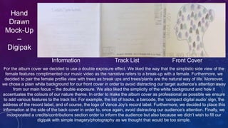
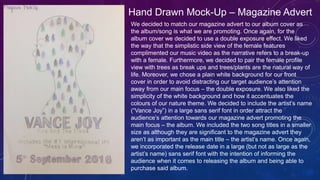
2. Hand
Drawn
Mock-Up
–
Digipak
Information Track List Front Cover
For the album cover we decided to use a double exposure effect. We liked the way that the simplistic side view of the
female features complimented our music video as the narrative refers to a break-up with a female. Furthermore, we
decided to pair the female profile view with trees as break ups and trees/plants are the natural way of life. Moreover,
we chose a plain white background for our front cover in order to avoid distracting our target audience’s attention away
from our main focus – the double exposure. We also liked the simplicity of the white background and how it
accentuates the colours of our nature theme. In order to make the album cover as professional as possible we ensure
to add various features to the track list. For example, the list of tracks, a barcode, the ‘compact digital audio’ sign, the
address of the record label, and of course, the logo of Vance Joy’s record label. Furthermore, we decided to place this
information at the side of the back cover in order to, once again, avoid distracting our audience’s attention. Finally, we
incorporated a credits/contributions section order to inform the audience but also because we didn’t wish to fill our
digipak with simple imagery/photography as we thought that would be too simple.
3. Hand
Drawn
Mock-Up
–
Digipak
Inspirational Quote Lyrics CD Insert
As our digipak includes a sufficient amount of information we decided to include a small section with a laid back
image of a trickling waterfall as well as an inspirational quote in order to relate to our audience and almost
encourage them to ‘carry on’ if they are ever being low. Furthermore, we decided to incorporate a waterfall as it
almost reflects the naturistic/natural atmosphere of the album as well as to encourage the audience to relate to the
album and take in the lyrics. Moreover, we included a lyrics page with the intention of, once again, making the
album as professional as possible. We thought we would also include a plain and simple background in order to
focus our audience’s attention towards the lyrics rather than the pretty photography. We also included this section
in order to inform and entertain our audience, if they choose to sing along/interact with the album and do not know
the lyrics. Additionally, we appended a CD insert where you place add the CD, we also decided to keep this inner
section plain and simple in order to avoiding diverting the audience’s attention from the main focus – the CD.
4. Hand Drawn Mock-Up – Magazine Advert
We decided to match our magazine advert to our album cover as
the album/song is what we are promoting. Once again, for the
album cover we decided to use a double exposure effect. We liked
the way that the simplistic side view of the female features
complimented our music video as the narrative refers to a break-up
with a female. Furthermore, we decided to pair the female profile
view with trees as break ups and trees/plants are the natural way of
life. Moreover, we chose a plain white background for our front
cover in order to avoid distracting our target audience’s attention
away from our main focus – the double exposure. We also liked the
simplicity of the white background and how it accentuates the
colours of our nature theme. We decided to include the artist’s name
(“Vance Joy”) in a large sans serif font in order attract the
audience’s attention towards our magazine advert promoting the
main focus – the album. We included the two song titles in a smaller
size as although they are significant to the magazine advert they
aren’t as important as the main title – the artist’s name. Once again,
we incorporated the release date in a large (but not as large as the
artist’s name) sans serif font with the intention of informing the
audience when it comes to releasing the album and being able to
purchase said album.