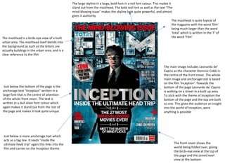
1. The masthead is a birds-eye view of a built
urban area. The masthead itself blends into
the background as such as the letters are
actually buildings in the urban area, and is a
clear reference to the film
Just below the bottom of the page is the
anchorage text "Inception" written in a
large font that is the centre of attention
of the whole front cover. The text is
written in a dull silver font colour which
again makes it stand out from the rest of
the page and makes it look quite unique
Just below is more anchorage text which
acts as a tag line. It reads "inside the
ultimate head trip" again this links into the
film and carries on the Inception theme.
The large skyline in a large, bold font in a red font colour. This makes it
stand out from the masthead. The bold red font as well as the text "The
mind-blowing issue" makes the skyline look quite powerful, and almost
gives it authority
The masthead is quite typical of
the magazine with the word 'film'
being much larger than the word
'total' which is written in the 'F' of
the word 'Film'
The main image includes Leonardo de'
Caprio as the character Dominic Cobb in
the centre of the front cover. The whole
main image and anchorage text is based
on the film 'Inception'. Towards the
bottom of the page Leonardo de' Caprio
is walking on a street in a built up area.
To stick with the theme of Inception the
bottom of the page and the top are both
as one. This gives the audience an insight
into the world of Inception, were
anything is possible
The front cover shows the
world being folded over, giving
the birds-eye view at the top of
the page and the street level
view at the bottom
2. The main image is positioned
above the masthead, this
indicates to the audience that
the actor is well known and also
that the magazine is well known
aswell
The main image characterisation gives
the audience a little bit of an insight on
the character as his facial expression
informs the audience that he looks
confused, and isn’t ready for the task
ahead
The main image is dress sense is
sophisticated indicating that he is
about his business and also could show
a mysterious side to the character, as
nowadays men with suit only wear
suits to cover up for something and
look smart so that their identity isn’t
too suspicious
The picture looks like it was taken
during the film, this indicates a sense
of realism, and also portrays the
main image in action
The closer to the bottom the text
gets the smaller it becomes. To
make the text more exiting the
words "Mind-blowing" are
written in red text, which could
connote love, blood and danger,
furthermore this also makes
them stand out from the rest of
the text.
Just below the anchorage text are sell
lines that are separated by the words
"plus" as well as "and". To separate
the text from the anchorage text and
sell likes it is 'held' as such in
decorative bars. The use of the words
"plus" and "and" helps to keep the text
flowing and draws the reader to read
the anchorage text and sell lines as
one chunk of text.
The last piece of text towards the bottom of the page reads "meet the master of mind flicks". However upon looking more
closely at the word "flicks" it appears to look like the swear word "fucks" so that the text appears to say "mind fucks" which is
slang for something that messes with your mind and that confuses you. This may very well be a reference to the film Inception
itself as it is a film that can at times be very confusing.
3. The colour scheme is red, grey and white. Red connoting danger, blood and maybe even
love. Grey connoting mystery. And white connoting purity or innocence
Viewers who have seen Di Caprio's work before
are likely to pick up the magazine and read
about an actor they like to see and follow. This
is because Leonardo Di Caprio has been in many
big hit films such as 'Titanic', 'Shutter Island',
and 'The Departed'.
The Unique Selling Point (USP) of this edition of
Total Film has to be the fact that Leonardo Di’
Caprio is the cover star. Leonardo Di’ Caprio
has huge box office appeal and is an extremely
well known Hollywood actor and would
therefore be easily recognisable to any
audience. Having an A-list star on the cover is
always a guaranteed way to draw in potential
buyers, as many people are obsessed with
celebrity culture
The red colour of the fonts makes some
things stand out more, this draws your eye
into all the different things. The magazine
cover also shows the conventions of every
magazine.
The first sell line reads: "Predators Reboot of the year?". The word
'Predators' is written is the same font
and font colour as the masthead, but
a smaller font size. This makes it stand
out slightly more towards the
audience
The image of the front cover looks
like it was taken during the film,
however edited, as there is a contrast
font the top half of the magazine to
the bottom half of the magazine
The red font brings out the main
image more, as the main image and
the background is quite dark, which
could connote danger
The background image is used with backlighting which makes the main image
seem like he is confused and doesn’t know where his going, almost like a
nightmare