
Recommended
More Related Content
What's hot
What's hot (20)
Similar to Question 2
Similar to Question 2 (20)
Recently uploaded
Recently uploaded (20)
Question 2
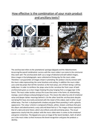
- 1. How effective is the combination of your main product and ancillary texts? The ancillary text refers to the promotional package (digipak) and the Advertisement. Assessing the overall combination success with the music video I can come to the conclusion they work well. The ancillary texts both use a range of detailed and well edited images, these images in fact photographs were collected on filming day for the music video. Therefore I can guarantee all images shown in promoting the product closely connect with the music video representing the same locations and setting. In addition the music video uses some key props that tell the narrative as the track plays, one of them being a soft toy teddy bear. In order to reinforce the props value to the narrative the front cover of both ancillary texts gives us a clear image showing the prop hanging from a scraggy rope in the forest. The music video tackles serious life issues that come in the forms of, relationships, revenge, social collapse and psychological issues. This means the video has alot of emotional value and deeper darker meanings behind it. On the other hand the ancillary texts despite not being film have also really connected with the mood of this videos style in other visual edited ways. The Font is displayed with shadow and glow filters providing it with a ghostly appearance. The colour scheme is composed of blacks, whites, browns and blues that give the album and advertisement a very cold and bleak feel to it. The images chosen represent that of a dark and eerie forest, which also reflects and cold and damp place. The visual appearance clearly links this product with the music video when it comes to the emotional and genre similarities. The digipak also uses an image of the band members, both of which are in the music video so that increases the brand recognition and gives the products a identity.
- 2. Regarding public interest and desire the ancillary texts standout for various reasons. Firstly all important information is backed on Solid black sections in white font. This means it stands out more at a distance and these texts include the band’s name, date of release, and the artist’s logo. It’s important for people to develop a sense of interest and desire before they take action in buying the product. The price and web links and track list are all in smaller text therefore meaning the viewer has to open up into the product before getting into these areas of the product. This gets them more interested and engaged, meaning they have more time to develop a liking to the bangs merchandise and ultimate buy. Similarly the digipak had 3 flaps that need to be opened to explore the package. More flaps mean more room for information and more time to catch your reader into purchasing the product. Taking into account everything covered, the public should be able to really understand what this band is about and know how the products link together.