The magazine addressed its young audience in three main ways:
1) By featuring models in the magazine that represented the youthful audience in terms of age and dress sense, making readers feel more comfortable and relatable.
2) By using informal, friendly language throughout the interviews that created a calm, welcoming tone for readers to feel included. Quotes from artists were also included to motivate and catch readers' eyes.
3) By employing a color scheme of red, black, and white that was inspired by other magazines and feedback confirmed engaged well with the genre. This scheme helped attract the intended audience.
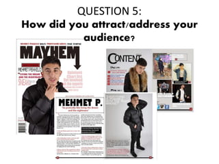
2. Magazine models
The models in my magazine are all young which represents the age group for the
audience reading my magazine. The dress sense of my models are quite representative of
the youthful audience which will make the readers feel more comfortable and relatable
to the models. There is direct eye contact from the model on the front cover, double
page spread and few models from the contents page which will make the readers feel
warm and welcomed, as if they are being directly addressed at.
3. Language
I used middle/ low lexi to address my audience and this was done by the use of informal
language through out the interview. The tone of language is very calm and the conversation
between the music artist and the journalist is quite friendly which also makes the other
readers feel welcomed and feel to read the full interview. I included motivational quotes
from the artist which was pulled out to motivate and catch the eyes of the younger readers
as some people may not read the full article however they may take a quick glance at the
pull quote.
The interviewer regarded to the artist to his nickname ‘Met’ throughout the interview
which creates a friendly atmosphere and makes the reader feel as if they personally know
the artist. The audience may feel quite up personal with the music artists as he shares some
of his experiences that people may have never heard about before and this is reassured by
the phrase ‘ exclusive interview up close’ which is at the top of the double page spread.
4. Colour scheme
The colour scheme which I used included red, black and white. I took this inspiration from
my case study XXL magazine which also uses similar colours. At the beginning of the
process I picked several colours which I though would work well with my magazine. The
feedback which I received from my presentation to my peers then helped me narrow it
down to the final colours which I used. The audience told me that my colour scheme
‘works well and engages with the genre’.