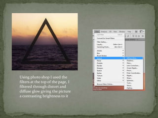
Using photo shop I used the
filters at the top of the page, I
filtered through distort and
diffuse glow giving the picture
a contrasting brightness to it
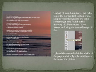
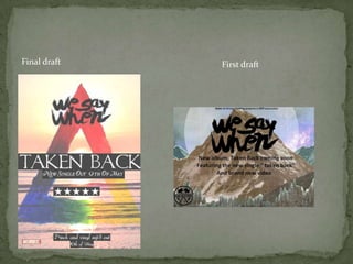
On half of my album sleeve, I decided
to use the normal text tool on photo
shop to write the lyrics to the song,
something I have found in the
majority of album covers I have
looked at during the research stage of
this.


I placed the down the left hand side of
the page and simply –placed this over
the top of the picture
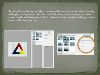
By using these effect i9 can take a layer out of the work and work 0n it separately
to the piece, using the artistic effects on Photoshop you can change the balance,
stroke length and sharpness, I u8sed this to make the triangle see though to over
lap on to the sleeve picture.
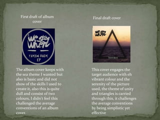
First draft of album          Final draft cover
          cover


The album cover keeps with      This cover engages the
the sea theme I wanted but      target audience with eh
also is basic and did not       vibrant colour and the
show of the skills I used to    serenity of the picture
create it, also this is quite   used, the theme of unity
dull and consist of two         and triangles is carried
colours, I didn't feel this     through this, it challenges
challenged the average          the average conventions
conventions of an album         by being simplistic yet
cover.                          effective
Final draft   First draft
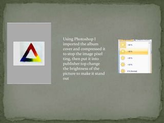
Using Photoshop I
imported the album
cover and compressed it
to stop the image pixel
ting, then put it into
publisher top change
the brightness of the
picture to make it stand
out
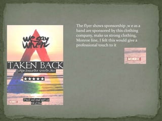
The flyer shows sponsorship ,w e as a
band are sponsored by this clothing
company, make us strong clothing,
Monroe line, I felt this would give a
professional touch to it
research

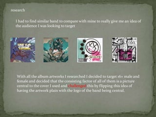
  I had to find similar band to compare with mine to really give me an idea of
  the audience I was looking to target


   With all the album artworks I researched I decided to target 16+ male and
   female and decided that the consisting factor of all of them is a picture
   central to the cover I used and challenged this by flipping this idea of
   having the artwork plain with the logo of the band being central.
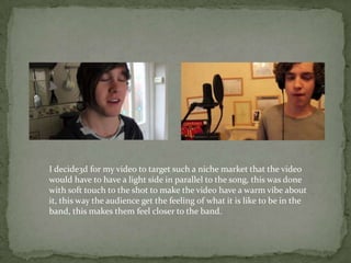
I decide3d for my video to target such a niche market that the video
would have to have a light side in parallel to the song, this was done
with soft touch to the shot to make the video have a warm vibe about
it, this way the audience get the feeling of what it is like to be in the
band, this makes them feel closer to the band.

Media part 5

  • 2.
    Using photo shopI used the filters at the top of the page, I filtered through distort and diffuse glow giving the picture a contrasting brightness to it
  • 3.
    On half ofmy album sleeve, I decided to use the normal text tool on photo shop to write the lyrics to the song, something I have found in the majority of album covers I have looked at during the research stage of this. I placed the down the left hand side of the page and simply –placed this over the top of the picture
  • 4.
    By using theseeffect i9 can take a layer out of the work and work 0n it separately to the piece, using the artistic effects on Photoshop you can change the balance, stroke length and sharpness, I u8sed this to make the triangle see though to over lap on to the sleeve picture.
  • 5.
    First draft ofalbum Final draft cover cover The album cover keeps with This cover engages the the sea theme I wanted but target audience with eh also is basic and did not vibrant colour and the show of the skills I used to serenity of the picture create it, also this is quite used, the theme of unity dull and consist of two and triangles is carried colours, I didn't feel this through this, it challenges challenged the average the average conventions conventions of an album by being simplistic yet cover. effective
  • 6.
    Final draft First draft
  • 7.
    Using Photoshop I importedthe album cover and compressed it to stop the image pixel ting, then put it into publisher top change the brightness of the picture to make it stand out
  • 8.
    The flyer showssponsorship ,w e as a band are sponsored by this clothing company, make us strong clothing, Monroe line, I felt this would give a professional touch to it
  • 10.
    research Ihad to find similar band to compare with mine to really give me an idea of the audience I was looking to target With all the album artworks I researched I decided to target 16+ male and female and decided that the consisting factor of all of them is a picture central to the cover I used and challenged this by flipping this idea of having the artwork plain with the logo of the band being central.
  • 11.
    I decide3d formy video to target such a niche market that the video would have to have a light side in parallel to the song, this was done with soft touch to the shot to make the video have a warm vibe about it, this way the audience get the feeling of what it is like to be in the band, this makes them feel closer to the band.