
Recommended
More Related Content
What's hot
What's hot (20)
Viewers also liked
Viewers also liked (20)
Similar to Deconstructions
Similar to Deconstructions (20)
Recently uploaded
Recently uploaded (20)
Deconstructions
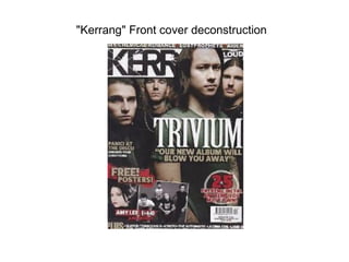
- 1. "Kerrang" Front cover deconstruction
- 2. • This is a “kerrang's” masthead's font that is used very much representative of harsh sound. The text is broken and cracked implying it has been shattered by something, that something probably being sound. The main singer of the band is located to the front of the text and in front of the title, this shows his importance and role in the band. There is no real indication to show that this magazine is for a younger audience however the advertisement of posters does seem to give the indication that its target audience is that of an teenage age. The writing “our new album will blow you away” is written on top of all else on the text, this makes the words stand out and feel like they are in your face ready to “blow you away”. The mail dominated front cover also gives us the indication that this magazine is one for males not females. The rule of thirds has been used in this front cover, Masthead and characters faces (which are giving eye contact to make that connections between the user and the magazine itself), then the selling line and then the lure located at the
- 3. "Metal Hammer" contents d deconstruction
- 4. • The contents of this magazine “metal hammer” does not have a unique layout. The page is split in 3 parts. Upper left, upper right and bottom. The upper let consists of the contents itself, and upper right consist of a segment of information which is there persuade to want to look at the pages shown in the contents and the lower part of the image is potentially the add segmentation of the contents page. The contents page also fits the theme of what will be found later ahead and is correlates the type of metal to be found. The font of the contents also fits its subject and has a metal arty style to it. The main image seen is the one of the bottom right, the main point of it is the devil horn sign shown by his hand which again relates to the contents of the magazine.
- 5. "Kerrang" Contents deconstruction
- 6. • The contents page to the “kerrang” magazine follows a very generic layout. A large image on the right with the primary information for the contents on the left. The colour scheme for this contents page is not as dark as other metal magazines contents page, this is because kerrang tend to have a much broader audience. The colour scheme is white, black and blue. It is primarily white which is seen much morally nicer colour to black. This will appeal to a much larger audience. There is also blue on the text. This colour has no resemblance to metal so my only assumption could be to appeal to that larger audience. The text stays true to fitting the metal “scene”. The main image on he right is also giving direct eye contact to the user. Engaging them like the front cover would do.
- 7. "Metal Hammer" contents deconstruction
- 8. • This “metal hammer” contents page like the last is split into three rather than just the generic two. The left is the contents, the right are images relating to the contents and the bottom like the other metal hammer contents are ads which not only promote metal bands etc. but persuade the user further to want to look deeper into the magazine. The contents page fits the target audience well, it uses an verbal insult image to emphasise the musics stereotypical genre which is aggressive. It also uses a some what attractive female at the bottom right not as as sex appeal but to possibly show that this magazine is some what targeted at females also. The contents text font remains a metal style, jagged and spiky etc. The colour scheme again is white, black and red.
- 10. • This is a double page spread for a kerrang magazine. The first major denotation of this double page spread is the colour scheme. It is all black and white. This connotes the stereo typical genre colours that metal represent of which being dark. • The images are also very cluttered around the page as opposed to being structured like various other non metal magazines. This could be to show that this magazine along with its genre of music is “different” and unique to others. Under the assumption that this magazine is primarily designed for a younger teen audience the uniqueness of the magazine should be found more appealing to them as often at a teenage age people are looking to be different thus this magazine fits the target audience of that.
- 11. • Another point in this double page spread is that most of the images consist of the guitarist, Not the drummer. I feel that the reasoning for this is because an electric guitar is mainly found in metal genres and rock as a pose to pop, If they showed of the drummer more it may give a connection between other genres of music as drums are heard in most genres of music which would give the opposite effect of what the magazine wants to en tale, uniqueness and would be counter productive for that reason. • A basic point about this double page spread is the main article writing is located around the outside of the magazine rather than in-between the pictures. This does not necessary connote anything but does make it much easier for the reader to read and allows them to locate the text almost without having to even search for it, which brings me to the second point of the colour of the text being white. It is a complete contrast in colour to its background which cause it to stand out. • None of the text overlays pages and each section of text remains on either one side or another. This improves the ease of use for the reader.
- 12. DPS deconstruction "Rock Sound"
- 13. • This is a double page spread from the magazine Rock Sound. The genre of metal shown in this double page spread is metal core, one of the most modern versions of metals since its creation. This band is a a popular band world wide and this genre of metal is becoming increasingly popular. Unlike many other bands this band is liked by a much larger majority of females than others. It is shown that this is realized by the magazine company and as such its dps is not as dark or “harsh” or brutal as many others. The facial expression is much more appealing to woman as it is men. However the magazine still follows the stereo typical conventions of the metal genre which is of being against the majority. The body tattoos of the character use a good half a page which in itself is not necessary frowned upon in modern day culture but is defiantly seen as different. • The magazine still tires to engage a large majority of metal fans although being meal core by using traditional conventions such as showing blood on the page, something used in black metal and death metal since the 90's however has gone for a more modern contemporary design.
- 15. • For my next Double page spread deconstruction I have chosen a dps from the Kerrang magazine. • I feel this one itself although not as stereo typical in fitting the metal genre it is still easy to make this distinction. I feel this dps is better than the first as the image itself connects one page to another by the use of the characters arm however I can image reading the text that crosses over the page may be hard for the user to read. However its slanted layout does seem to fit the personality of the main singer of metalica and thus the reason behind the cross over. It does make it seem much more personal to him rather than something written up by the general media.
- 16. • As the dps is heavily imaged based there is not much room for a colour scheme , this is not to say there is not one. The colours used in this are white, black and red. All three colours are very stereotypically representative of metal. Along with this the body language of all the characters is made to seem powerful or aggressive. The guitarist located top left has a very aggressive look on his face which again fits the metal stereotype. The singers centre left of the dps again also have aggressive facial expressions. The main singer dominating the page has his arm raised, not only to point at the text but to use up more area of the page. This means most attention is focused on him as it should be provided you are a metalica fan as for most he should be the most popular. The magazine always wants to appeal to majority which is why they would of done that. Also, there dress code is all black, this fits the colour scheme of magazine and genre. • A prop is also being used in the dps, a guitar. This guitar is what generally represents rock and metal. The main title on the page reads “whiplash”. This is clever as It is not only the name of one of their songs but also an injury sustainable to the neck. In exaggeration could be used to imply the amount of “headbanging” done which is commonly associated with metal.
- 17. "Decible" contents deconstruction
- 18. • This is the front cover for a “decibel”magazine. The reader is instantly engaged with the character as he is giving direct eye contact. His facial expression looks mean and his hair style, or lack of hairstyle is very stereo typical of someone who thinks they are tough. Both of these things including the addition of his folded arms and tattoos denote the music his band puts out. This suggests the kind of music that the magazine is discussing. The burning ropes behind him denote the aggression that is in his head as we often associate aggression with fire and heat. The fire can also be seen to represent hell in some aspects which is very stereo typically fitting of the genre of music. The banner at the bottom of the page looks like burnt parchment. This shows destruction within that one piece of paper which could lead back to the point about aggression of the music. There are scatters of the colour gold located throughout the page, however only in small chunks. This gold colour could be shown to represent the colour of money, and the corruption that money creates. There is little of It on the metal front cover suggesting this is for the most part good. Target audience? Men. There are no women or feminine objects located on the front cover.
- 19. "Metal Hammer" front cover deconstruction
- 20. • This front cover is from a “metal hamer” magazine. This really stands out for me, not only in comparison to other music genres but in the metal genre itself. By using a blue neon colour it has separated itself from nearly all kerang magazine front covers and decibels. It would normally be argued that the colour of blue is none representative of metal. However the way the blue is used in this image suggests that the character (lead singer/guitarist from bfmv) is god like and powerful. Which could also alternately seen to represent his guitar playing skills. The blue is also what the catch line suggests, its showing metal in the future suggesting that if anything this is not a ding genre. The font used for bullet for my valentine in this text is unique and very representative of what the bands music stands for. The “v” for valentine is shaped like a cracked heart which represent what many of there songs mean and the letter “e” not only gives symmetry to the front cover but as it is very sharp like shaped (like a blade) it shows the musics harder side. This means a greater larger audience as it fits those who want to listen to meaning full songs and those that just want to listen to something hard. The front cover also uses a yellow font which again, is not common in most metal magazines. It could be suggest that this genre of metal Is different from others and to appeal to a new audience rather than an old.