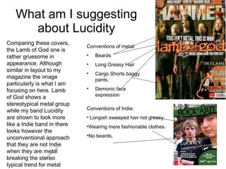
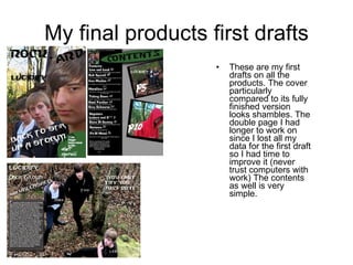
The document summarizes the design choices made for a mock magazine cover and contents page. Key points include:
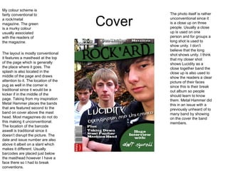
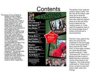
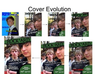
- The cover uses a close-up photo of three band members, which is unconventional for a group but shows unity.
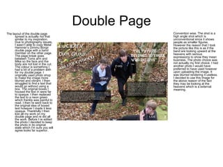
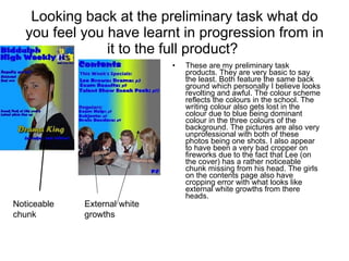
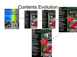
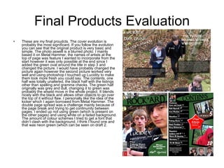
- The contents page lists articles and uses photos of band members in a "film strip" style, with some unconventional design choices.
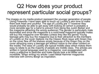
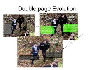
- The double-page spread photo shows the band looking upward, meant to convey they "mean business," and required some editing for clarity.
- The magazine is aimed at representing younger rock/metal fans and breaking conventions of stereotypical metal magazine covers.