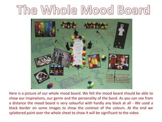
1. Here is a picture of our whole mood board. We felt the mood board should be able to
show our inspirations, our genre and the personality of the band. As you can see from
a distance the mood board is very colourful with hardly any black at all - We used a
black border on some images to show the contrast of the colours. At the end we
splattered paint over the whole sheet to show It will be significant to the video.
2. Here are the bands inspirations and idols. We decided that the groups idols would be
other indie/alternative rock bands such as; Madness, Supergrass, Blur and Two door
cinema club. We feel these kind of bands are very similar to how Young mistakes’
would perform and compose their songs. We also feel that most of their videos appeal
to a younger audience and therefore share the same audience as us.
3. We named the band ‘Young mistakes’ as the name sounds fresh, young and
would appeal to a 15-21 year old audience. We decided that the typography for
the logo of the band will be magazine cut out writing to connote how the band
don’t care if things are wrote about them, as long as there what they love and
what they think is right that is all that matters. They want to appear to the public
to be their self not what the media or anyone else wants them to be.
4. Here is how we plan on the band to be dressed. We don’t want them to
exaggerate their look to try and stand out, we want them to remain original
and dress like their audience so it can appeal to them. We will have the band
wearing skinny jeans and converse to represent the typical indie look and sun
glasses to create a sense of mystery.
5. Here are the lyrics to Supergrass – Alright
which the band will be covering. We decided
to have the lyrics in the center of the board as
the bands motto is that music is the most
important thing. We made the lyrics stand out
the most with different coloured paint balls
and splattered paint. Some pictures overlap a
little on to the lyrics showing how the band is
all connected. We decided to keep the text
formal as we wanted to show that the band is
not only young and fun but they do like to
take things seriously and will act like mature
adults when needed.
6. Here are silhouettes of three men which represent the three boys in ‘Young
Mistakes’. These silhouettes have maybe inspired us to have something similar for
the cover of our digipack. We also decided to keep two members of the band
unidentified and this is a way or symbolising this – the band wants to be loved for
their music, not for what they looks like.
7. Here are images of balloons and self created paper balls
which represent paint balls. This portrays the Bands
personalities as it shows they are young and carefree. It
shows they like to be creative and productive and also
lively due to the multicolour. We decided to put the
paint balls on our mood board as we will be featuring
this within our music video.