Eye-Catching Magazine Cover Design Elements and Techniques
•Download as DOCX, PDF•
0 likes•217 views


Recommended
More Related Content
What's hot
What's hot (20)
Viewers also liked
Viewers also liked (20)
Similar to Eye-Catching Magazine Cover Design Elements and Techniques
Similar to Eye-Catching Magazine Cover Design Elements and Techniques (20)
Recently uploaded
Recently uploaded (20)
Eye-Catching Magazine Cover Design Elements and Techniques
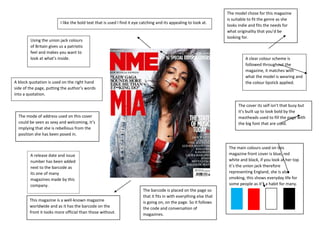
- 1. I like the bold text that is used I find it eye catching and its appealing to look at. Using the union jack colours of Britain gives us a patriotic feel and makes you want to look at what’s inside. A clear colour scheme is followed throughout the magazine, it matches with what the model is wearing and the colour lipstick applied. A block quotation is used on the right hand side of the page, putting the author’s words into a quotation. The cover its self isn’t that busy but it’s built up to look bold by the mastheads used to fill the page with the big font that are used. The mode of address used on this cover could be seen as sexy and welcoming, it’s implying that she is rebellious from the position she has been posed in. The main colours used on this magazine front cover is blue, red white and black, if you look at her top it’s the union jack therefore representing England, she is also smoking, this shows everyday life for some people as it’s a habit for many. A release date and issue number has been added next to the barcode as its one of many magazines made by this company. This magazine is a well-known magazine worldwide and as it has the barcode on the front it looks more official than those without. The model chose for this magazine is suitable to fit the genre as she looks indie and fits the needs for what originality that you’d be looking for. The barcode is placed on the page so that it fits in with everything else that is going on, on the page. So it follows the code and conversation of magazines.