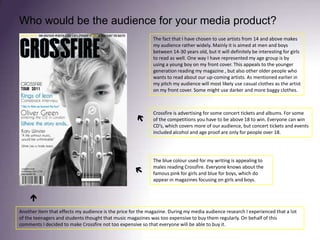
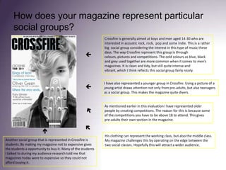
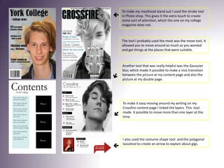
SlideShare a Scribd company logo
1 of 19
AS Media Studies Evaluation Music Magazine Adine Wenner
In what way does your media product use, develop or challenge forms and conventions of real media products?  A lot of music magazines use props on their photo shots and I have done the same. I included an acoustic guitar to show the audience what kind of magazine it is. Furthermore it also suits my artist and the way he wants to present himself.  Every magazine have a masthead. I fallowed this convention by using one myself.   All magazines needs a barcode usually it is placed down left or right. I did not want to challenge this because Crossfire is a magazine that likes things to be clean, but tough. Instead of having the text about price and issue number underneath the header of Crossfire it is placed just above the barcode. This is done by the same reason. Crossfire’s front cover picture is taken in a way that makes him present. Making him stare straight into the lens does this. Looking at many magazines in my genre I decided to do the same because it creates tension between the artist and the audience and attracts attention. On our left side you can see that NME have done the same and it makes the picture very intense. Crossfire is less gloomy than NME’s front cover. The reason for this is that this issue of Crossfire is not very rough.  
Above the header of Crossfire you will find some advertising. I have chosen words that both explain and drags attention to it. The text explaining is black while the words dragging attention are yellow. Rock Sound is a magazine that often uses this. This was chosen to be on the magazine’s front cover because it might be better selling if you got some competition in it. A thing I did challenge was not having other pictures on the front cover. Since Crossfire is supposed to be a clean and simple magazine it was decided to not put any more pictures on it. Usually magazines have more than one picture, although as you see on the cover of Rock Sound they only have one photo.   I chose  to use black and white on my photo of Oliver Green because his music is very  pure and simple. He does not edit his music, but only use his voice and acoustic guitar. A black and white photo is for a lot of people more real and express emotions better than a coloured one. The colours can sometimes be a distraction, which I thought was unnecessary because of my artist’s style of behaving and music. Many of the regular rock magazines put writing on top of the cover’s image. My picture have a nice plain background which made it more natural to type my writing there instead of covering the photo.    As you can see the writing on the front cover is in both black and blue. It is one reason in particular why I chose to use blue as my colour for my typing. If you look close fully at the performers eye on this picture you will se it is more blue than usual. I have used two tools called Eye- polygon lasso and thenhue and saturation which made it possible to emphasize his blue colour in his eye. To make it not look chaotic I then chose to use a blue colour for my writing as well. The reason for changing his eye colour was to create tension between the audience and the artist. This will drag attention towards it without making it to obvious. To create attention is very important for a magazine and have also been important for my magazine.  
When it comes to the writing I have chosen to use different fonts. The one saying Crossfire and issue number is downloaded from www.dafont.com . This makes it easier to find the correct font for your magazine because you get more choices. Using different fonts also divide different sections at my content page. Changing the fonts in your magazine is very normal to indicate what is what.  As many other magazines Crossfire use more than one picture. Since my other photography have a red background I chose to use red for my writing and  the arrow. This made it not untidy and follow Crossfire’s conventions.    The arrow at the bottom right is showing where you can find information about UK’a top gigs coming up. A indicator like this is often used because a lot of the audience is interested in knowing where they can listen to their favourite bands and artists.   As you can see I have not used any black and white editing on the women posing in my magazine. This is done because she is different type of artist. She present herself more like a lady, which made it natural to use a red background and also red lipstick to match it. The photo of Oliver Green is again black and white and the reason doing this is already mentioned. What can be added is that  using black and white images is not unusual. A lot of music magazines find it nice using  this.     To section the different parts of your magazine is something that makes it easy and effortless for the reader to look up what they want. Making categories help to organize and is normally used by every magazine.
Various photos of your magazine’s main artist is important because your audience wants to see different sides of your artist. Practising is a huge part of an artist’s life so that using a guitar as a prop and take a photo of him practising is likely to be seen. Using different poses of an artist is standard to both make them and your magazine look more manifoldly. An other interesting challenge is the fact that my picture is set through both of the pages. This makes it flow nicely between the pages.    In both the left and the right corner it is possible to see page numbers. Using page numbers on your double page is not unusual. This gives the audience a simple indication about where and about they are in the magazine. It is also essential considering how to find a page fast if you are not looking though the whole magazine at that time. Many magazines have page numbers on each side of the page, but you can also find someone only using it on one of them. This sometimes depends on if your page number fits the photography. It might be better to not have it.     When it comes to the magazine’s writing style it is slightly different from the one I analysed during my research. I did not use as heavy language as some of the magazines I looked at used. This is mainly done because Crossfire is not as dark and gloomy as some of the magazines I did my research on. My article is something everyone can read, even the one who is not that into the depth of music language.  A long with my article I also have a quote. This is something many magazines use too drag attention towards the article. It should tell something about the feeling and what  is in the article. Crossfire decided to use this for the same reason as the other magazines.  There is only used one colour on my double page. This little touch really stands out when there is not other colour around. It is a nice simple touch, which draw awareness towards my double page. To not use many colours are not that usual, but it creates a nice and tidy product.  Leftcorner
Who would be the audience for your media product? The fact that I have chosen to use artists from 14 and above makes my audience rather widely. Mainly it is aimed at men and boys between 14-30 years old, but it will definitely be interesting for girls to read as well. One way I have represented my age group is by using a young boy on my front cover. This appeals to the younger generation reading my magazine , but also other older people who wants to read about our up-coming artists. As mentioned earlier in my pitch my audience will most likely use casual clothes as the artist on my front cover. Some might use darker and more baggy clothes.  Crossfire is advertising for some concert tickets and albums. For some of the competitions you have to be above 18 to win. Everyone can win CD’s, which covers more of our audience, but concert tickets and events included alcohol and age proof are only for people over 18.   The blue colour used for my writing is appealing to males reading Crossfire. Everyone knows about the famous pink for girls and blue for boys, which do appear in magazines focusing on girls and boys.     Another item that effects my audience is the price for the magazine. During my media audience research I experienced that a lot of the teenagers and students thought that music magazines was too expensive to buy them regularly. On behalf of this comments I decided to make Crossfire not too expensive so that everyone will be able to buy it.
How did you attract/address your audience? I offered a signed CD and concert tickets, which will draw attention towards it. This will make my magazine up-to-date, which my audience can relate to, because they are modern as well.   Using a large masthead attracts attention from the audience and I also used a brighter colour around “CROSSFIRE”, which makes it easier to see. My masthead is simple, but the blue colour around it makes it vibrant, which can reflect my audience.   I wrote about what was in my magazine, which was directly targeted towards my audience. With their favourite bands and artists.   On my front cover I have used a picture of a young artist. His eyes are really intense, which creates tension between him and the audience. This might make them want to look closer at it.    Making my magazine not to expensive will make it more attractive considering that they do not have much money. A lot of them are students and obviously do not have the same economy as an adult.  
The male’s eyes on the picture at my content page draws attention towards it because you get curious about his look and he look straight into your eyes.   Having a photo of a lady at my content page makes the magazine diverse and the fact that she is famous might lead to curiosity. Crossfire have with intentions not used to many pictures. Doing my research I noticed that many of the magazines look untidy. It was decided that Crossfire was going to be simple and neat.  I have not used a lot of colours in my magazine, but kept it to the minimal. That makes it stand out when you see it. Many in my audience wants to stand out. This makes it easy for them to relate to my colour choices.    When it comes to my double page I have done the same thing as on the others, but even more specific. I have used purple colour just underneath the “Back”, which really creates a nice tension between the page and audience. As many other magazines I chose to have a quote on my double page. This draws attention towards it and also explain a little about what the article is about. 
Crossfire’s picture is not very formal as you can see on my double page. He is practising and he seems relaxed. The other pictures are more intense, but still not formal. This is done because the audience themselves are not especially formal. Some of the writing will obviously be informal because it is an interview. Using a quote might appeal to the audience since they get to know how he feels.     Also used is words like “hottest”. This is a modern word, which is used a lot between young people. As explained earlier my target audience is rather young, which makes it natural using words that they can feel comfortable with. The example above is from the beginning of the article in Crossfire. Here you can see some of the words I have been using. Musical words as voice, guitar, rock and stage is normal to find in music magazines. This gives the audience the chance to relate to the magazine in that way that they recognize the words.
How does your magazine represent particular social groups? Crossfire is generally aimed at boys and men aged 14-30 who are interested in acoustic rock, rock,  pop and some indie. This is a rather big  social group considering the interest in this type of music these days. The way Crossfire represent this group is through colours, pictures and competitions. The cold colours as blue, black and grey used together are more common when it comes to men’s magazines. It is clean and tidy, but still quite intense and vibrant, which I think reflects this social group fairly nicely.   I have also represented a younger group in Crossfire. Using a picture of a young artist draws attention not only from pre-adults, but also teenagers as a social group. This makes the magazine quite divers.   As mentioned earlier in this evaluation I have represented older people by creating competitions. The reason for this is because some of the competitions you have to be above 18 to attend. This gives pre-adults their own section in the magazine.     His clothing can represent the working class, but also the middle class. My magazine challenges this by operating on the edge between the two social classes. Hopefully this will attract a wider audience. Another social group that is represented in Crossfire is students. By making my magazine not to expensive gives the students a opportunity to buy it. Many of the students I talked to during my audience research told me that magazines today were to expensive so they could not afford buying it.
Crossfire does not only represent men, but also women. As you can see there is a  picture of a woman down in the left corner. This attracts also younger women to buy this magazine.  Diversity is good because it might make you sell more.   My magazine does mainly present white artists. As you can see there is only white artists. This is because of where the magazine is exists, which is in Northern Europe where you find more white than dark skinned people.    The type of writing appeal to people who enjoys reading about music. It is not used as many rough words as in Rock Sound and other magazines within that category. This writing do not represent one social group, but many sharing the same interest.  
What kind of media institution might distribute your media product and why? Looking at different publishing companies I have come to a conclusion that Bauer Media Group is the right institution to distribute my music magazine. They do not only focus on music magazines, but a range of themes. This shows that they are trying to reach as many as possible. This is good considering that Crossfire have something new to present to the company. Although they already have Q and Rock Sound they still do not distribute any magazine that also focuses on younger people from the age from 14 and above. Crossfire includes also this part, which will be beneficial for Bauer Media because this will make their range of magazines even wider. Another important reason why Bauer Media Group would like to distribute Crossfire is that they most likely do not want any competition. The reason to state this is, although Crossfire includes younger people they still present famous artists. Ultimately this company will be the one who gets the benefits of having an extra magazine.  Bauer Media Group is a German publishing company based in Hamburg. It is privately owned and managed by the Bauer family. It is the largest privately publishing company in Europe. The group is a multi-platform UK-based media group and consist of many companies and focus mainly on magazines and radio. Among the Bauer Media Group are some of the biggest music magazines in the UK as Q, Karrang! and Mojo.
What have you learnt about technologies from the process of constructing this product?  During the process of making magazines I learned different ways of using technologies. Some I already knew how to use and while some of them I had to learn from scratch and explore. One of the software’s I had to learn was photo shop. I had no previously experience with this programme. Throughout the production I learned different types of editing. I wanted to create tension between the audience and the artist on my front cover that is why I chose to use a tool called Eye- polygon lasso and then hue and saturation to make his eye stand out. Another important tool I learned how to use in Photoshop was how to make a picture black and white. Using the tool black and white and then adjust levels made it easy to find the right level of black and white for my photo.   A nicely adjustment for my masthead was using the tool stroke to make it stand out . Some of the artists hair is black, which made it somehow more difficult to see the masthead. That is why I chose to just use a small level of stroke to draw attention and awareness towards it.   Using a professional camera improved my magazine. If it is good quality on the photographs is is easier to edit them. I experienced this while I was trying to learn about photo shop. I found a not so good photo and tried to edit it. The lesson learned was that you can not make a bad picture good. The amount of pixels with a professional camera made it simple to edit without ruin the photo.     To make this photography suit the A4 shape of a magazine I needed to crop and shape the picture. A tool that was used a lot was the free transform. This made it easy to adjust the shape of the photo. Along with the move tool
This was one of my original pictures used at the content page. As you can see the background is not completely straight. Fortunately photo shop had a solution for this. Using the healing brush made the background nice and straight. This can easily be seen on my content page. Although the background is not perfect it is still a good enough photo to edit so that the background looks nice.
During this period of making a media magazine there has been used one software in particular. Considering all the writing we had to do, Word was essential to me. As I have presented on my blog English is not my first language, but Norwegian. I do not have the same vocabulary as the English students and I sometimes struggle finding synonyms and using the correct grammar. This is why Word has been a very useful tool for me and helped me a lot using appropriate writing. I learned different things using Word. Some already knew and some things I learned during this process. That I could find synonyms was something I actually did not know I could do. This made it a lot easier for me to use various vocabulary.  I have made a video of how I used the different tools on my blog. There you can see the rest of my process about Word.   A long with Word I have used a lot of Power Points to present my work. This software makes it simple to present your research and evaluation in a tidy way. I knew a little about Power Point before I started, but I have learned a lot making my music magazine. I did know how to make boxes for my writing and how adjust lines around them. Making arrows is also something I have not done before, which made it easy to indicate what I am writing about.  
Bearing in mind all the technologies I have been using throughout this period I can not see any possibilities how I could have made it without it. Underneath you can see the range of technologies I have been using during the time producing my magazine. Still there are some of the technology I could do without. Instead of making my questionnaire electronically I could have walked around with a piece of paper and asked. This would take a lot longer and you might not get as many to answer as well. I used Facebook to publish my questionnaire, which also gave me a lot of answers. Instead of using a blog I could have done all by hand. This would make it much more difficult, because with electronics you can add pictures, use slid share and other software's, which makes it fast and simple. IMovie made it easy for me to cut and put together my interview and also the video about Word. Again this is something I could have done different, but I chose not to. The rest of my software's and hardware's was essential to finish up my product.  Software's  Hardware's
I have experienced both negative and positive things using technology. In general the technology made it easy to present your work and also easier to find information. What I struggled with was my blog. Two times during the process it decided to delete itself. I had to use quite a lot of time getting it together. As a conclusion I would say that technology made everything easier.  Although some things went wrong it is still a good experience. You learn how to handle things if the same problem appear.
Looking back at your preliminary task, what do you feel you have learnt in the progression from it to the full production? Due to my preliminary research I found it a lot easier to place the different elements on my music magazine. When I made my college magazine I did not know anything about making magazines. After doing my research and looking in depth at conventions of a music magazine I knew better what to do. When doing my college magazine I used a poorly camera considering the one I used for my music magazine. I leaned how to use different settings  on the camera I used. It was a Nikon D90 with a Nikon 18-200 lens, with the ISO set at 200, Shutterspeed at 1/200 sek and an aperture at f7.1. To get the most natural light I also used a Nikon Speedlight SB-200 flashgun with a reflector card. This improved the quality of my pictures.  I have learned that planning your magazine really pays off. Without researching your market you do not know what your aiming for. This makes it a lot harder making a magazine and the result is also poorly.  Looking at my music magazine it is obvious that I have used  more editing than on the college magazine. When I designed my college magazine I did not know about many tools. Therefore it is quite plain and simple.  A lot of the tools I have been using I have mentioned earlier on in this evaluation so I will not explain this again, but there is still some to go.
To make my masthead stand out I used the stroke tool in Photo shop. This gives it the extra touch to create some sort of attention, which the one on my college magazine does not.   The tool I probably used the most was the move tool. It allowed you to move around as much as you wanted and get things at the places that were suitable.  Another tool that was really helpful was the Gaussian blur, which made it possible to make a nice transition between the picture at my content page and also the picture at my double page.   To make it easy moving around my writing on my Crossfire content page I linked the layers. This  tool made  it possible to move more than one layer at the time.   I also used the costume shape tool  and the polygonal lassotool to create an arrow to explain about gigs.  

More Related Content

What's hot

Evaluation Power Point
Evaluation Power PointEvaluation Power Point
Evaluation Power PointMcyuzuzo
 
How did I attract/address my audience?
How did I attract/address my audience?How did I attract/address my audience?
How did I attract/address my audience?tashaay27
 
Analysis of music magazine
Analysis of music magazineAnalysis of music magazine
Analysis of music magazineCharlotte Dobson
 
Evaluation for media 1
Evaluation for media 1Evaluation for media 1
Evaluation for media 1ShaniRoss
 
How did I attract/address my audience?
How did I attract/address my audience?How did I attract/address my audience?
How did I attract/address my audience?tashaay27
 
Signs & Signifiers Textual Analysis of Music Magazines
Signs & Signifiers Textual Analysis of Music MagazinesSigns & Signifiers Textual Analysis of Music Magazines
Signs & Signifiers Textual Analysis of Music MagazinesBetsyEGR
 
Evaluation of my own music magazine product
Evaluation of my own music magazine productEvaluation of my own music magazine product
Evaluation of my own music magazine productASmediastudies12
 
Evaluation:
Evaluation:Evaluation:
Evaluation:07tjames
 
Media evaluation
Media evaluationMedia evaluation
Media evaluationguest278914
 
Music Magazine (Soundcheck) Evaluation
Music Magazine (Soundcheck) EvaluationMusic Magazine (Soundcheck) Evaluation
Music Magazine (Soundcheck) Evaluationkerryanne1995
 
Media music magazine evaluation
Media music magazine evaluationMedia music magazine evaluation
Media music magazine evaluationagreen1994
 
Media music magazine evaluation
Media music magazine evaluationMedia music magazine evaluation
Media music magazine evaluationMoulayMiziroj
 

What's hot (18)

Media Evaluation
Media Evaluation Media Evaluation
Media Evaluation
 
Evaluation Power Point
Evaluation Power PointEvaluation Power Point
Evaluation Power Point
 
How did I attract/address my audience?
How did I attract/address my audience?How did I attract/address my audience?
How did I attract/address my audience?
 
Analysis of music magazine
Analysis of music magazineAnalysis of music magazine
Analysis of music magazine
 
Evaluation for media 1
Evaluation for media 1Evaluation for media 1
Evaluation for media 1
 
How did I attract/address my audience?
How did I attract/address my audience?How did I attract/address my audience?
How did I attract/address my audience?
 
Signs & Signifiers Textual Analysis of Music Magazines
Signs & Signifiers Textual Analysis of Music MagazinesSigns & Signifiers Textual Analysis of Music Magazines
Signs & Signifiers Textual Analysis of Music Magazines
 
My evaluation
My evaluationMy evaluation
My evaluation
 
My evaluation
My evaluationMy evaluation
My evaluation
 
Evaluation
EvaluationEvaluation
Evaluation
 
Evaluation
EvaluationEvaluation
Evaluation
 
Evaluation of my own music magazine product
Evaluation of my own music magazine productEvaluation of my own music magazine product
Evaluation of my own music magazine product
 
Evaluation:
Evaluation:Evaluation:
Evaluation:
 
Media evaluation
Media evaluationMedia evaluation
Media evaluation
 
Music Magazine (Soundcheck) Evaluation
Music Magazine (Soundcheck) EvaluationMusic Magazine (Soundcheck) Evaluation
Music Magazine (Soundcheck) Evaluation
 
Evaluation
EvaluationEvaluation
Evaluation
 
Media music magazine evaluation
Media music magazine evaluationMedia music magazine evaluation
Media music magazine evaluation
 
Media music magazine evaluation
Media music magazine evaluationMedia music magazine evaluation
Media music magazine evaluation
 

Viewers also liked

The election of photos
The election of photos The election of photos
The election of photos adinewenner
 
Accumuli Presentation Feb 2012
Accumuli Presentation Feb 2012Accumuli Presentation Feb 2012
Accumuli Presentation Feb 2012Nick Kingsbury
 
My magazine research
My magazine research My magazine research
My magazine research adinewenner
 
My magazine research
My magazine researchMy magazine research
My magazine researchadinewenner
 
My magazine research
My magazine research My magazine research
My magazine research adinewenner
 
Selection of pictures
Selection of picturesSelection of pictures
Selection of picturesadinewenner
 
My SurveyMonkey result
My SurveyMonkey resultMy SurveyMonkey result
My SurveyMonkey resultadinewenner
 
2014318102739955734 morocco economic challenges
2014318102739955734 morocco economic challenges2014318102739955734 morocco economic challenges
2014318102739955734 morocco economic challengesYounes Belfellah
 
Corruption challenges in_morocco
Corruption challenges in_moroccoCorruption challenges in_morocco
Corruption challenges in_moroccoYounes Belfellah
 
Academic Search Complete
Academic Search CompleteAcademic Search Complete
Academic Search Completewaleed ali
 

Viewers also liked (13)

Evaluation
EvaluationEvaluation
Evaluation
 
The election of photos
The election of photos The election of photos
The election of photos
 
Accumuli Presentation Feb 2012
Accumuli Presentation Feb 2012Accumuli Presentation Feb 2012
Accumuli Presentation Feb 2012
 
My magazine research
My magazine research My magazine research
My magazine research
 
My magazine research
My magazine researchMy magazine research
My magazine research
 
My magazine research
My magazine research My magazine research
My magazine research
 
Selection of pictures
Selection of picturesSelection of pictures
Selection of pictures
 
Iss.ppt
Iss.pptIss.ppt
Iss.ppt
 
My SurveyMonkey result
My SurveyMonkey resultMy SurveyMonkey result
My SurveyMonkey result
 
2014318102739955734 morocco economic challenges
2014318102739955734 morocco economic challenges2014318102739955734 morocco economic challenges
2014318102739955734 morocco economic challenges
 
Corruption challenges in_morocco
Corruption challenges in_moroccoCorruption challenges in_morocco
Corruption challenges in_morocco
 
Emerald
EmeraldEmerald
Emerald
 
Academic Search Complete
Academic Search CompleteAcademic Search Complete
Academic Search Complete
 

Similar to AS Media Studies Evaluation Music Magazine

Similar to AS Media Studies Evaluation Music Magazine (20)

Evaluation[1]
Evaluation[1]Evaluation[1]
Evaluation[1]
 
Main Task All My Planning x
Main Task All My Planning xMain Task All My Planning x
Main Task All My Planning x
 
Evaluation
EvaluationEvaluation
Evaluation
 
Evaluation q1
Evaluation q1Evaluation q1
Evaluation q1
 
Evaluation
EvaluationEvaluation
Evaluation
 
Evalutaion powerpont
Evalutaion powerpontEvalutaion powerpont
Evalutaion powerpont
 
Eval q5
Eval q5Eval q5
Eval q5
 
Evaluation question 1 fin
Evaluation question 1  finEvaluation question 1  fin
Evaluation question 1 fin
 
Ryan lock
Ryan lockRyan lock
Ryan lock
 
Ryan lock
Ryan lockRyan lock
Ryan lock
 
Media evaluation proper
Media evaluation properMedia evaluation proper
Media evaluation proper
 
Media evaluation proper
Media evaluation properMedia evaluation proper
Media evaluation proper
 
Media Evaluation Lewis Cooke
Media Evaluation Lewis CookeMedia Evaluation Lewis Cooke
Media Evaluation Lewis Cooke
 
Media evaluation
Media evaluationMedia evaluation
Media evaluation
 
Media Presentation
Media PresentationMedia Presentation
Media Presentation
 
Evaluation 1
Evaluation 1Evaluation 1
Evaluation 1
 
Evaluation
EvaluationEvaluation
Evaluation
 
Music mag evaluation
Music mag evaluationMusic mag evaluation
Music mag evaluation
 
How did you attract
How did you attractHow did you attract
How did you attract
 
Evaluation
EvaluationEvaluation
Evaluation
 

More from adinewenner

More from adinewenner (7)

Testvideo
TestvideoTestvideo
Testvideo
 
Stylesheet
StylesheetStylesheet
Stylesheet
 
Style sheet
Style sheetStyle sheet
Style sheet
 
Style sheet
Style sheetStyle sheet
Style sheet
 
Style sheet
Style sheetStyle sheet
Style sheet
 
Flat plan of cover and content
Flat plan of cover and content Flat plan of cover and content
Flat plan of cover and content
 
My SurveyMonkey result
My SurveyMonkey resultMy SurveyMonkey result
My SurveyMonkey result
 

Recently uploaded

Class 11 Legal Studies Ch-1 Concept of State .pdf
Class 11 Legal Studies Ch-1 Concept of State .pdfClass 11 Legal Studies Ch-1 Concept of State .pdf
Class 11 Legal Studies Ch-1 Concept of State .pdfakmcokerachita
 
Introduction to ArtificiaI Intelligence in Higher Education
Introduction to ArtificiaI Intelligence in Higher EducationIntroduction to ArtificiaI Intelligence in Higher Education
Introduction to ArtificiaI Intelligence in Higher Educationpboyjonauth
 
mini mental status format.docx
mini    mental       status     format.docxmini    mental       status     format.docx
mini mental status format.docxPoojaSen20
 
A Critique of the Proposed National Education Policy Reform
A Critique of the Proposed National Education Policy ReformA Critique of the Proposed National Education Policy Reform
A Critique of the Proposed National Education Policy ReformChameera Dedduwage
 
ECONOMIC CONTEXT - LONG FORM TV DRAMA - PPT
ECONOMIC CONTEXT - LONG FORM TV DRAMA - PPTECONOMIC CONTEXT - LONG FORM TV DRAMA - PPT
ECONOMIC CONTEXT - LONG FORM TV DRAMA - PPTiammrhaywood
 
Contemporary philippine arts from the regions_PPT_Module_12 [Autosaved] (1).pptx
Contemporary philippine arts from the regions_PPT_Module_12 [Autosaved] (1).pptxContemporary philippine arts from the regions_PPT_Module_12 [Autosaved] (1).pptx
Contemporary philippine arts from the regions_PPT_Module_12 [Autosaved] (1).pptxRoyAbrique
 
Organic Name Reactions for the students and aspirants of Chemistry12th.pptx
Organic Name Reactions  for the students and aspirants of Chemistry12th.pptxOrganic Name Reactions  for the students and aspirants of Chemistry12th.pptx
Organic Name Reactions for the students and aspirants of Chemistry12th.pptxVS Mahajan Coaching Centre
 
18-04-UA_REPORT_MEDIALITERAСY_INDEX-DM_23-1-final-eng.pdf
18-04-UA_REPORT_MEDIALITERAСY_INDEX-DM_23-1-final-eng.pdf18-04-UA_REPORT_MEDIALITERAСY_INDEX-DM_23-1-final-eng.pdf
18-04-UA_REPORT_MEDIALITERAСY_INDEX-DM_23-1-final-eng.pdfssuser54595a
 
MENTAL STATUS EXAMINATION format.docx
MENTAL     STATUS EXAMINATION format.docxMENTAL     STATUS EXAMINATION format.docx
MENTAL STATUS EXAMINATION format.docxPoojaSen20
 
Accessible design: Minimum effort, maximum impact
Accessible design: Minimum effort, maximum impactAccessible design: Minimum effort, maximum impact
Accessible design: Minimum effort, maximum impactdawncurless
 
How to Make a Pirate ship Primary Education.pptx
How to Make a Pirate ship Primary Education.pptxHow to Make a Pirate ship Primary Education.pptx
How to Make a Pirate ship Primary Education.pptxmanuelaromero2013
 
Call Girls in Dwarka Mor Delhi Contact Us 9654467111
Call Girls in Dwarka Mor Delhi Contact Us 9654467111Call Girls in Dwarka Mor Delhi Contact Us 9654467111
Call Girls in Dwarka Mor Delhi Contact Us 9654467111Sapana Sha
 
Enzyme, Pharmaceutical Aids, Miscellaneous Last Part of Chapter no 5th.pdf
Enzyme, Pharmaceutical Aids, Miscellaneous Last Part of Chapter no 5th.pdfEnzyme, Pharmaceutical Aids, Miscellaneous Last Part of Chapter no 5th.pdf
Enzyme, Pharmaceutical Aids, Miscellaneous Last Part of Chapter no 5th.pdfSumit Tiwari
 
SOCIAL AND HISTORICAL CONTEXT - LFTVD.pptx
SOCIAL AND HISTORICAL CONTEXT - LFTVD.pptxSOCIAL AND HISTORICAL CONTEXT - LFTVD.pptx
SOCIAL AND HISTORICAL CONTEXT - LFTVD.pptxiammrhaywood
 
CARE OF CHILD IN INCUBATOR..........pptx
CARE OF CHILD IN INCUBATOR..........pptxCARE OF CHILD IN INCUBATOR..........pptx
CARE OF CHILD IN INCUBATOR..........pptxGaneshChakor2
 
Sanyam Choudhary Chemistry practical.pdf
Sanyam Choudhary Chemistry practical.pdfSanyam Choudhary Chemistry practical.pdf
Sanyam Choudhary Chemistry practical.pdfsanyamsingh5019
 
Crayon Activity Handout For the Crayon A
Crayon Activity Handout For the Crayon ACrayon Activity Handout For the Crayon A
Crayon Activity Handout For the Crayon AUnboundStockton
 
“Oh GOSH! Reflecting on Hackteria's Collaborative Practices in a Global Do-It...
“Oh GOSH! Reflecting on Hackteria's Collaborative Practices in a Global Do-It...“Oh GOSH! Reflecting on Hackteria's Collaborative Practices in a Global Do-It...
“Oh GOSH! Reflecting on Hackteria's Collaborative Practices in a Global Do-It...Marc Dusseiller Dusjagr
 

Recently uploaded (20)

Class 11 Legal Studies Ch-1 Concept of State .pdf
Class 11 Legal Studies Ch-1 Concept of State .pdfClass 11 Legal Studies Ch-1 Concept of State .pdf
Class 11 Legal Studies Ch-1 Concept of State .pdf
 
Introduction to ArtificiaI Intelligence in Higher Education
Introduction to ArtificiaI Intelligence in Higher EducationIntroduction to ArtificiaI Intelligence in Higher Education
Introduction to ArtificiaI Intelligence in Higher Education
 
mini mental status format.docx
mini    mental       status     format.docxmini    mental       status     format.docx
mini mental status format.docx
 
9953330565 Low Rate Call Girls In Rohini Delhi NCR
9953330565 Low Rate Call Girls In Rohini  Delhi NCR9953330565 Low Rate Call Girls In Rohini  Delhi NCR
9953330565 Low Rate Call Girls In Rohini Delhi NCR
 
A Critique of the Proposed National Education Policy Reform
A Critique of the Proposed National Education Policy ReformA Critique of the Proposed National Education Policy Reform
A Critique of the Proposed National Education Policy Reform
 
ECONOMIC CONTEXT - LONG FORM TV DRAMA - PPT
ECONOMIC CONTEXT - LONG FORM TV DRAMA - PPTECONOMIC CONTEXT - LONG FORM TV DRAMA - PPT
ECONOMIC CONTEXT - LONG FORM TV DRAMA - PPT
 
Contemporary philippine arts from the regions_PPT_Module_12 [Autosaved] (1).pptx
Contemporary philippine arts from the regions_PPT_Module_12 [Autosaved] (1).pptxContemporary philippine arts from the regions_PPT_Module_12 [Autosaved] (1).pptx
Contemporary philippine arts from the regions_PPT_Module_12 [Autosaved] (1).pptx
 
Organic Name Reactions for the students and aspirants of Chemistry12th.pptx
Organic Name Reactions  for the students and aspirants of Chemistry12th.pptxOrganic Name Reactions  for the students and aspirants of Chemistry12th.pptx
Organic Name Reactions for the students and aspirants of Chemistry12th.pptx
 
18-04-UA_REPORT_MEDIALITERAСY_INDEX-DM_23-1-final-eng.pdf
18-04-UA_REPORT_MEDIALITERAСY_INDEX-DM_23-1-final-eng.pdf18-04-UA_REPORT_MEDIALITERAСY_INDEX-DM_23-1-final-eng.pdf
18-04-UA_REPORT_MEDIALITERAСY_INDEX-DM_23-1-final-eng.pdf
 
MENTAL STATUS EXAMINATION format.docx
MENTAL     STATUS EXAMINATION format.docxMENTAL     STATUS EXAMINATION format.docx
MENTAL STATUS EXAMINATION format.docx
 
Accessible design: Minimum effort, maximum impact
Accessible design: Minimum effort, maximum impactAccessible design: Minimum effort, maximum impact
Accessible design: Minimum effort, maximum impact
 
How to Make a Pirate ship Primary Education.pptx
How to Make a Pirate ship Primary Education.pptxHow to Make a Pirate ship Primary Education.pptx
How to Make a Pirate ship Primary Education.pptx
 
Staff of Color (SOC) Retention Efforts DDSD
Staff of Color (SOC) Retention Efforts DDSDStaff of Color (SOC) Retention Efforts DDSD
Staff of Color (SOC) Retention Efforts DDSD
 
Call Girls in Dwarka Mor Delhi Contact Us 9654467111
Call Girls in Dwarka Mor Delhi Contact Us 9654467111Call Girls in Dwarka Mor Delhi Contact Us 9654467111
Call Girls in Dwarka Mor Delhi Contact Us 9654467111
 
Enzyme, Pharmaceutical Aids, Miscellaneous Last Part of Chapter no 5th.pdf
Enzyme, Pharmaceutical Aids, Miscellaneous Last Part of Chapter no 5th.pdfEnzyme, Pharmaceutical Aids, Miscellaneous Last Part of Chapter no 5th.pdf
Enzyme, Pharmaceutical Aids, Miscellaneous Last Part of Chapter no 5th.pdf
 
SOCIAL AND HISTORICAL CONTEXT - LFTVD.pptx
SOCIAL AND HISTORICAL CONTEXT - LFTVD.pptxSOCIAL AND HISTORICAL CONTEXT - LFTVD.pptx
SOCIAL AND HISTORICAL CONTEXT - LFTVD.pptx
 
CARE OF CHILD IN INCUBATOR..........pptx
CARE OF CHILD IN INCUBATOR..........pptxCARE OF CHILD IN INCUBATOR..........pptx
CARE OF CHILD IN INCUBATOR..........pptx
 
Sanyam Choudhary Chemistry practical.pdf
Sanyam Choudhary Chemistry practical.pdfSanyam Choudhary Chemistry practical.pdf
Sanyam Choudhary Chemistry practical.pdf
 
Crayon Activity Handout For the Crayon A
Crayon Activity Handout For the Crayon ACrayon Activity Handout For the Crayon A
Crayon Activity Handout For the Crayon A
 
“Oh GOSH! Reflecting on Hackteria's Collaborative Practices in a Global Do-It...
“Oh GOSH! Reflecting on Hackteria's Collaborative Practices in a Global Do-It...“Oh GOSH! Reflecting on Hackteria's Collaborative Practices in a Global Do-It...
“Oh GOSH! Reflecting on Hackteria's Collaborative Practices in a Global Do-It...
 

AS Media Studies Evaluation Music Magazine

  • 1. AS Media Studies Evaluation Music Magazine Adine Wenner
  • 2. In what way does your media product use, develop or challenge forms and conventions of real media products? A lot of music magazines use props on their photo shots and I have done the same. I included an acoustic guitar to show the audience what kind of magazine it is. Furthermore it also suits my artist and the way he wants to present himself. Every magazine have a masthead. I fallowed this convention by using one myself.   All magazines needs a barcode usually it is placed down left or right. I did not want to challenge this because Crossfire is a magazine that likes things to be clean, but tough. Instead of having the text about price and issue number underneath the header of Crossfire it is placed just above the barcode. This is done by the same reason. Crossfire’s front cover picture is taken in a way that makes him present. Making him stare straight into the lens does this. Looking at many magazines in my genre I decided to do the same because it creates tension between the artist and the audience and attracts attention. On our left side you can see that NME have done the same and it makes the picture very intense. Crossfire is less gloomy than NME’s front cover. The reason for this is that this issue of Crossfire is not very rough.  
  • 3. Above the header of Crossfire you will find some advertising. I have chosen words that both explain and drags attention to it. The text explaining is black while the words dragging attention are yellow. Rock Sound is a magazine that often uses this. This was chosen to be on the magazine’s front cover because it might be better selling if you got some competition in it. A thing I did challenge was not having other pictures on the front cover. Since Crossfire is supposed to be a clean and simple magazine it was decided to not put any more pictures on it. Usually magazines have more than one picture, although as you see on the cover of Rock Sound they only have one photo.   I chose to use black and white on my photo of Oliver Green because his music is very pure and simple. He does not edit his music, but only use his voice and acoustic guitar. A black and white photo is for a lot of people more real and express emotions better than a coloured one. The colours can sometimes be a distraction, which I thought was unnecessary because of my artist’s style of behaving and music. Many of the regular rock magazines put writing on top of the cover’s image. My picture have a nice plain background which made it more natural to type my writing there instead of covering the photo.   As you can see the writing on the front cover is in both black and blue. It is one reason in particular why I chose to use blue as my colour for my typing. If you look close fully at the performers eye on this picture you will se it is more blue than usual. I have used two tools called Eye- polygon lasso and thenhue and saturation which made it possible to emphasize his blue colour in his eye. To make it not look chaotic I then chose to use a blue colour for my writing as well. The reason for changing his eye colour was to create tension between the audience and the artist. This will drag attention towards it without making it to obvious. To create attention is very important for a magazine and have also been important for my magazine. 
  • 4. When it comes to the writing I have chosen to use different fonts. The one saying Crossfire and issue number is downloaded from www.dafont.com . This makes it easier to find the correct font for your magazine because you get more choices. Using different fonts also divide different sections at my content page. Changing the fonts in your magazine is very normal to indicate what is what. As many other magazines Crossfire use more than one picture. Since my other photography have a red background I chose to use red for my writing and the arrow. This made it not untidy and follow Crossfire’s conventions.   The arrow at the bottom right is showing where you can find information about UK’a top gigs coming up. A indicator like this is often used because a lot of the audience is interested in knowing where they can listen to their favourite bands and artists.  As you can see I have not used any black and white editing on the women posing in my magazine. This is done because she is different type of artist. She present herself more like a lady, which made it natural to use a red background and also red lipstick to match it. The photo of Oliver Green is again black and white and the reason doing this is already mentioned. What can be added is that using black and white images is not unusual. A lot of music magazines find it nice using this.    To section the different parts of your magazine is something that makes it easy and effortless for the reader to look up what they want. Making categories help to organize and is normally used by every magazine.
  • 5. Various photos of your magazine’s main artist is important because your audience wants to see different sides of your artist. Practising is a huge part of an artist’s life so that using a guitar as a prop and take a photo of him practising is likely to be seen. Using different poses of an artist is standard to both make them and your magazine look more manifoldly. An other interesting challenge is the fact that my picture is set through both of the pages. This makes it flow nicely between the pages.   In both the left and the right corner it is possible to see page numbers. Using page numbers on your double page is not unusual. This gives the audience a simple indication about where and about they are in the magazine. It is also essential considering how to find a page fast if you are not looking though the whole magazine at that time. Many magazines have page numbers on each side of the page, but you can also find someone only using it on one of them. This sometimes depends on if your page number fits the photography. It might be better to not have it.    When it comes to the magazine’s writing style it is slightly different from the one I analysed during my research. I did not use as heavy language as some of the magazines I looked at used. This is mainly done because Crossfire is not as dark and gloomy as some of the magazines I did my research on. My article is something everyone can read, even the one who is not that into the depth of music language. A long with my article I also have a quote. This is something many magazines use too drag attention towards the article. It should tell something about the feeling and what is in the article. Crossfire decided to use this for the same reason as the other magazines. There is only used one colour on my double page. This little touch really stands out when there is not other colour around. It is a nice simple touch, which draw awareness towards my double page. To not use many colours are not that usual, but it creates a nice and tidy product. Leftcorner
  • 6. Who would be the audience for your media product? The fact that I have chosen to use artists from 14 and above makes my audience rather widely. Mainly it is aimed at men and boys between 14-30 years old, but it will definitely be interesting for girls to read as well. One way I have represented my age group is by using a young boy on my front cover. This appeals to the younger generation reading my magazine , but also other older people who wants to read about our up-coming artists. As mentioned earlier in my pitch my audience will most likely use casual clothes as the artist on my front cover. Some might use darker and more baggy clothes. Crossfire is advertising for some concert tickets and albums. For some of the competitions you have to be above 18 to win. Everyone can win CD’s, which covers more of our audience, but concert tickets and events included alcohol and age proof are only for people over 18.  The blue colour used for my writing is appealing to males reading Crossfire. Everyone knows about the famous pink for girls and blue for boys, which do appear in magazines focusing on girls and boys.   Another item that effects my audience is the price for the magazine. During my media audience research I experienced that a lot of the teenagers and students thought that music magazines was too expensive to buy them regularly. On behalf of this comments I decided to make Crossfire not too expensive so that everyone will be able to buy it.
  • 7. How did you attract/address your audience? I offered a signed CD and concert tickets, which will draw attention towards it. This will make my magazine up-to-date, which my audience can relate to, because they are modern as well.  Using a large masthead attracts attention from the audience and I also used a brighter colour around “CROSSFIRE”, which makes it easier to see. My masthead is simple, but the blue colour around it makes it vibrant, which can reflect my audience.  I wrote about what was in my magazine, which was directly targeted towards my audience. With their favourite bands and artists.  On my front cover I have used a picture of a young artist. His eyes are really intense, which creates tension between him and the audience. This might make them want to look closer at it.  Making my magazine not to expensive will make it more attractive considering that they do not have much money. A lot of them are students and obviously do not have the same economy as an adult. 
  • 8. The male’s eyes on the picture at my content page draws attention towards it because you get curious about his look and he look straight into your eyes.  Having a photo of a lady at my content page makes the magazine diverse and the fact that she is famous might lead to curiosity. Crossfire have with intentions not used to many pictures. Doing my research I noticed that many of the magazines look untidy. It was decided that Crossfire was going to be simple and neat.  I have not used a lot of colours in my magazine, but kept it to the minimal. That makes it stand out when you see it. Many in my audience wants to stand out. This makes it easy for them to relate to my colour choices.   When it comes to my double page I have done the same thing as on the others, but even more specific. I have used purple colour just underneath the “Back”, which really creates a nice tension between the page and audience. As many other magazines I chose to have a quote on my double page. This draws attention towards it and also explain a little about what the article is about. 
  • 9. Crossfire’s picture is not very formal as you can see on my double page. He is practising and he seems relaxed. The other pictures are more intense, but still not formal. This is done because the audience themselves are not especially formal. Some of the writing will obviously be informal because it is an interview. Using a quote might appeal to the audience since they get to know how he feels.    Also used is words like “hottest”. This is a modern word, which is used a lot between young people. As explained earlier my target audience is rather young, which makes it natural using words that they can feel comfortable with. The example above is from the beginning of the article in Crossfire. Here you can see some of the words I have been using. Musical words as voice, guitar, rock and stage is normal to find in music magazines. This gives the audience the chance to relate to the magazine in that way that they recognize the words.
  • 10. How does your magazine represent particular social groups? Crossfire is generally aimed at boys and men aged 14-30 who are interested in acoustic rock, rock, pop and some indie. This is a rather big social group considering the interest in this type of music these days. The way Crossfire represent this group is through colours, pictures and competitions. The cold colours as blue, black and grey used together are more common when it comes to men’s magazines. It is clean and tidy, but still quite intense and vibrant, which I think reflects this social group fairly nicely.  I have also represented a younger group in Crossfire. Using a picture of a young artist draws attention not only from pre-adults, but also teenagers as a social group. This makes the magazine quite divers.  As mentioned earlier in this evaluation I have represented older people by creating competitions. The reason for this is because some of the competitions you have to be above 18 to attend. This gives pre-adults their own section in the magazine.    His clothing can represent the working class, but also the middle class. My magazine challenges this by operating on the edge between the two social classes. Hopefully this will attract a wider audience. Another social group that is represented in Crossfire is students. By making my magazine not to expensive gives the students a opportunity to buy it. Many of the students I talked to during my audience research told me that magazines today were to expensive so they could not afford buying it.
  • 11. Crossfire does not only represent men, but also women. As you can see there is a picture of a woman down in the left corner. This attracts also younger women to buy this magazine. Diversity is good because it might make you sell more.  My magazine does mainly present white artists. As you can see there is only white artists. This is because of where the magazine is exists, which is in Northern Europe where you find more white than dark skinned people.   The type of writing appeal to people who enjoys reading about music. It is not used as many rough words as in Rock Sound and other magazines within that category. This writing do not represent one social group, but many sharing the same interest. 
  • 12. What kind of media institution might distribute your media product and why? Looking at different publishing companies I have come to a conclusion that Bauer Media Group is the right institution to distribute my music magazine. They do not only focus on music magazines, but a range of themes. This shows that they are trying to reach as many as possible. This is good considering that Crossfire have something new to present to the company. Although they already have Q and Rock Sound they still do not distribute any magazine that also focuses on younger people from the age from 14 and above. Crossfire includes also this part, which will be beneficial for Bauer Media because this will make their range of magazines even wider. Another important reason why Bauer Media Group would like to distribute Crossfire is that they most likely do not want any competition. The reason to state this is, although Crossfire includes younger people they still present famous artists. Ultimately this company will be the one who gets the benefits of having an extra magazine. Bauer Media Group is a German publishing company based in Hamburg. It is privately owned and managed by the Bauer family. It is the largest privately publishing company in Europe. The group is a multi-platform UK-based media group and consist of many companies and focus mainly on magazines and radio. Among the Bauer Media Group are some of the biggest music magazines in the UK as Q, Karrang! and Mojo.
  • 13. What have you learnt about technologies from the process of constructing this product? During the process of making magazines I learned different ways of using technologies. Some I already knew how to use and while some of them I had to learn from scratch and explore. One of the software’s I had to learn was photo shop. I had no previously experience with this programme. Throughout the production I learned different types of editing. I wanted to create tension between the audience and the artist on my front cover that is why I chose to use a tool called Eye- polygon lasso and then hue and saturation to make his eye stand out. Another important tool I learned how to use in Photoshop was how to make a picture black and white. Using the tool black and white and then adjust levels made it easy to find the right level of black and white for my photo.   A nicely adjustment for my masthead was using the tool stroke to make it stand out . Some of the artists hair is black, which made it somehow more difficult to see the masthead. That is why I chose to just use a small level of stroke to draw attention and awareness towards it.  Using a professional camera improved my magazine. If it is good quality on the photographs is is easier to edit them. I experienced this while I was trying to learn about photo shop. I found a not so good photo and tried to edit it. The lesson learned was that you can not make a bad picture good. The amount of pixels with a professional camera made it simple to edit without ruin the photo. To make this photography suit the A4 shape of a magazine I needed to crop and shape the picture. A tool that was used a lot was the free transform. This made it easy to adjust the shape of the photo. Along with the move tool
  • 14. This was one of my original pictures used at the content page. As you can see the background is not completely straight. Fortunately photo shop had a solution for this. Using the healing brush made the background nice and straight. This can easily be seen on my content page. Although the background is not perfect it is still a good enough photo to edit so that the background looks nice.
  • 15. During this period of making a media magazine there has been used one software in particular. Considering all the writing we had to do, Word was essential to me. As I have presented on my blog English is not my first language, but Norwegian. I do not have the same vocabulary as the English students and I sometimes struggle finding synonyms and using the correct grammar. This is why Word has been a very useful tool for me and helped me a lot using appropriate writing. I learned different things using Word. Some already knew and some things I learned during this process. That I could find synonyms was something I actually did not know I could do. This made it a lot easier for me to use various vocabulary. I have made a video of how I used the different tools on my blog. There you can see the rest of my process about Word.  A long with Word I have used a lot of Power Points to present my work. This software makes it simple to present your research and evaluation in a tidy way. I knew a little about Power Point before I started, but I have learned a lot making my music magazine. I did know how to make boxes for my writing and how adjust lines around them. Making arrows is also something I have not done before, which made it easy to indicate what I am writing about. 
  • 16. Bearing in mind all the technologies I have been using throughout this period I can not see any possibilities how I could have made it without it. Underneath you can see the range of technologies I have been using during the time producing my magazine. Still there are some of the technology I could do without. Instead of making my questionnaire electronically I could have walked around with a piece of paper and asked. This would take a lot longer and you might not get as many to answer as well. I used Facebook to publish my questionnaire, which also gave me a lot of answers. Instead of using a blog I could have done all by hand. This would make it much more difficult, because with electronics you can add pictures, use slid share and other software's, which makes it fast and simple. IMovie made it easy for me to cut and put together my interview and also the video about Word. Again this is something I could have done different, but I chose not to. The rest of my software's and hardware's was essential to finish up my product. Software's Hardware's
  • 17. I have experienced both negative and positive things using technology. In general the technology made it easy to present your work and also easier to find information. What I struggled with was my blog. Two times during the process it decided to delete itself. I had to use quite a lot of time getting it together. As a conclusion I would say that technology made everything easier. Although some things went wrong it is still a good experience. You learn how to handle things if the same problem appear.
  • 18. Looking back at your preliminary task, what do you feel you have learnt in the progression from it to the full production? Due to my preliminary research I found it a lot easier to place the different elements on my music magazine. When I made my college magazine I did not know anything about making magazines. After doing my research and looking in depth at conventions of a music magazine I knew better what to do. When doing my college magazine I used a poorly camera considering the one I used for my music magazine. I leaned how to use different settings on the camera I used. It was a Nikon D90 with a Nikon 18-200 lens, with the ISO set at 200, Shutterspeed at 1/200 sek and an aperture at f7.1. To get the most natural light I also used a Nikon Speedlight SB-200 flashgun with a reflector card. This improved the quality of my pictures. I have learned that planning your magazine really pays off. Without researching your market you do not know what your aiming for. This makes it a lot harder making a magazine and the result is also poorly. Looking at my music magazine it is obvious that I have used more editing than on the college magazine. When I designed my college magazine I did not know about many tools. Therefore it is quite plain and simple. A lot of the tools I have been using I have mentioned earlier on in this evaluation so I will not explain this again, but there is still some to go.
  • 19. To make my masthead stand out I used the stroke tool in Photo shop. This gives it the extra touch to create some sort of attention, which the one on my college magazine does not.  The tool I probably used the most was the move tool. It allowed you to move around as much as you wanted and get things at the places that were suitable. Another tool that was really helpful was the Gaussian blur, which made it possible to make a nice transition between the picture at my content page and also the picture at my double page.  To make it easy moving around my writing on my Crossfire content page I linked the layers. This tool made it possible to move more than one layer at the time.  I also used the costume shape tool and the polygonal lassotool to create an arrow to explain about gigs. 