
Recommended
More Related Content
What's hot
What's hot (20)
Similar to Vivid album covers grab attention
Similar to Vivid album covers grab attention (20)
Recently uploaded
Recently uploaded (20)
Vivid album covers grab attention
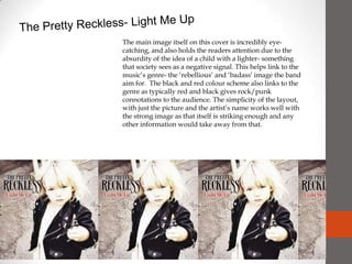
- 1. The Pretty Reckless- Light Me Up The main image itself on this cover is incredibly eye-catching, and also holds the readers attention due to the absurdity of the idea of a child with a lighter- something that society sees as a negative signal. This helps link to the music’s genre- the ‘rebellious’ and ‘badass’ image the band aim for. The black and red colour scheme also links to the genre as typically red and black gives rock/punk connotations to the audience. The simplicity of the layout, with just the picture and the artist’s name works well with the strong image as that itself is striking enough and any other information would take away from that.
- 2. Hit The Lights- Skip School, Start Fights This cover, though of a similar genre, instead uses bright colours in a creative way to capture the eye of the potential buyer. The layout itself is quite sparse and simple but still manages to look fun and interesting. The ‘paint splash’ effect with the colours still gives a ‘rebellious’ feel- hinting at a graffiti and paint throwing type idea but also adds connotations of entertainment and a hint of immaturity (which normally links to a enjoyable type idea). The handwritten/graffiti style writing is also incredibly attention-grabbing and makes the band name the main focus- effectively capturing fans and potential fans attention and probably selling more albums.
- 3. New Found Glory – Head On Collision For New Found Glory, instead of a variety of colours, only one colour is used- but is incredibly noticeable due to it’s vividness and striking quality. Unlike the others, this cover features a picture of the band itself which would immediate grab the attention of fans that would recognize the band or even people who had seen photos of them before. The black and white quality of the picture makes it stand out well against the bright colour, making the picture look strong and outstanding. The layout again is not too complicated, with just a photo of the band and then the bands logo and name above it- again in black and white so as to stand out against the background. Overall the layout effectively makes the band and music that would be on the album look interesting and intriguing without too much complicated information on the front.