Spotify AI DJ Deck - The Agency at University of Florida
Marinela Evaluation Q1
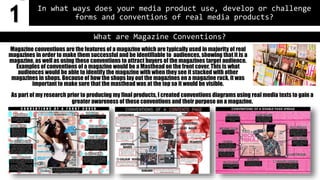
1. In what ways does your media product use, develop or challenge
forms and conventions of real media products?
As part of my research prior to producing my final products, I created conventions diagrams using real media texts to gain a
greater awareness of these conventions and their purpose on a magazine.
What are Magazine Conventions?
Magazine conventions are the features of a magazine which are typically used in majority of real
magazines in order to make them successful and be identifiable to audiences, showing that it is a
magazine, as well as using these conventions to attract buyers of the magazines target audience.
Examples of conventions of a magazine would be a Masthead on the front cover. This is what
audiences would be able to identify the magazine with when they see it stacked with other
magazines in shops. Because of how the shops lay out the magazines on a magazine rack, it was
important to make sure that the masthead was at the top so it would be visible.
1
2. Front Page: Masthead
COMPOSITION
With the typical placement of the top left corner of
the front page , as well as being placed behind the
subject’s head in the main image. Like I have
previously mentioned, the placement of the
masthead is important and should always be at the
top because of how shops place magazines on a rack
in order to sell them. The masthead is also large and
stands out.
Mine: Real media text examples:
COLOUR SCHEME
My colour scheme that was determined through my
audience research is as follows:
My dominant colour in my colour scheme is red. Most
of the conventions on my front cover is in red,
because the subject in the main image is dressed in
yellow so the red stands out more against the image.
This is why I chose my masthead colour to be in red,
with a black stroke in order to make it stand out even
more. The colour red is also quite conventional in the
urban musical genre magazines which my magazine
follows.
TYPOGRAPHY
The font that I chose for my masthead is called ‘Built
Titling’. This font is convention as most magazine
use a sans serif font for the mastheadas it gives it a
more modern appearance.Because my masthead
was initials and was only 3 letters, it suited the font
written in all capitals, making it stand out and easy
to identify.
3. Front Page: Main Cover Line
Mine: Real media text examples:
Examples of main cover lines in existing
magazines appear to be bold and stand out on the
page. The design used on my front cover main
cover line follows these conventions as it also
stands out on the page and is large, occupying a
lot of space on the page, unlike all over the other
smaller cover lines.
COMPOSITION
The main cover line on my front page follows
typical placement of a main cover line, which is on
the middle/bottom of the left side of the page.
Thus, making it conventional. However I could’ve
been more creative and challenged this
composition by placing it elsewhere, such as the
TYPOGRAPHY
The font used is quite simple and is similar to the font used for my masthead,This
challenges the conventional type of fonts used for a main cover line as it is usually
a unique and a font that is differentto the of the text on the page, which makes it
stand out even more. However I think the stroke used and the shadow effect,along
with the size, makes it stand out regardless.
Also, I also challenged the colours I used as it is usually a bright colour, as shown in
all of the real media text examples, however I decided not to make it too bright (e.g.
use red or yellow) as it would’ve made the front cover look too busy as the rest of the
page is alreadyvery colourful.
4. Front Page: Cover Lines
Mine: Real media text examples:
COMPOSITION
My cover lines are placed on the sides of the magazine around the main image, which is conventional for cover lines on front
covers.
TYPOGRAPHY
All of the cover lines are written in the same font but in different colours. This is conventional in real magazines, ensuring it
doesn’t look too busy and it is easy to distinguish that they are all cover lines which indicate the content that will be in the
magazine. Some of the cover lines have a white stroke on them, if they overlap the main image. This allows for each cover line to
be easy to read and not confusing to the eye as the main image is quite bright and vibrant.
COLOURS
I used a variety of all the colours in my colour scheme for all over the cover lines. This allows there to be some distinction
between different cover stories. I also used the colour red to createemphasis on what is being said. This is often used in existing
magazines as emphasis on a particular word or phrase is createdthrough use of a vibrant colour, as well as a larger size of font.
5. Contents Page: Challenged the layout…
Real magazine contents pages usually use a very structured and ‘boxy’ format, whereby all the content and page
numbers are in line with each other (like the examples shown), however I have managed to challenge this
typical layout by arranging my content in a way that warps around the main image. Thus, making some of the
content unaligned and ‘curvy’.
6. Contents Page: Title
Mine: Real media text examples:
COMPOSITION
Where I have placed my ‘Contents’ title follows the conventions of a magazine contents page as it is placed at
the top with the contents below it. Although I did not make the title occupy the entire space at the top, only the
right hand corner. This is something I could’ve done in order to make it more conventional as well as stand out
more.
TYPOGRAPHY
The font I used for the title is the same I used for the numbers. This makes it tie togetherwell. I also kept it
simple by titling the page ‘CONTENTS’ instead of giving it a differenttitle such as these:
This is more typically used in Pop magazines. The font that I used is sans serif which gives it a modern look and
shows consistency in design alongside the front cover.
COLOURS
I kept the colour scheme of my contents page the same as my front cover, in order to develop a consistent
‘house style’ of my magazine. Because the font I used is the same as the colours of the page numbers, I decided
to keep the colours the same as well. It makes the title stand out which is usually the case for real magazines.
7. Contents Page: Page Numbers & Additional images
Mine: Real media text examples:
COMPOSITIONS
As previously mentioned, I have challenged the typical conventional composition of content
as I have warped them around the main image, however they are still placed togetherin an
organised manner so that it doesn’t look messy or difficult to use/read to find the page a
reader wants to get to. Next to the page numbers are titles of the stories that can be found on
that particular page, as well as a small description beneath it. This is conventional and
commonly used in real magazines (‘MIX’ Convention). The additional images are also placed
where they are all visible, with relevant page numbers attached to them.
TYPOGRAPHY
All of the page numbers are the same font, colour and size. Comparedto the content titles and
mini description beside them, they are the largest piece of text, which is conventional in real
media texts. The mini descriptions are the same font as the red titles but a smaller size,
again, is similar to the real media text examples given. I also used normal numbers which is
typical in almost every magazine contents page, instead of using alternatives such as roman
numerals.
COLOURS
The page numbers have the most vibrant colour (Yellow)
which makes it stand out which is usually the case for real
music magazine content pages.
None of the additional images I added are in black or white
which makes them more engaging, which is conventional as
it makes the audience more interested in reading about it
and going to the page its on.
8. Contents Page: Editors letter
Mine: Real media text examples:
COMPOSITIONS
The editors letter is not usually the most eye-catching part of a magazine contents page,
hence why I have placed mine at the bottomof the page. Magazines often place editors
letters in small spaces available to occupy to write a small paragraph to its readers.
TYPOGRAPHY
I have used small font to write my editors letter in order to make it fit. It is also uncommon for
real editors letter to be written in large letters. I have also used a front that looks like
handwriting to sign-off the editors letters, which is often used in editors letters of real
magazines, in order to give it a more personal touch and engage more with readers.
COLOURS
I have kept the writing very simple in just black writing as it
is not a dominant convention of a contents page. I have
added a colour picture of myself in order to have a more
personal approach.
9. Double Page Spread: Main Image
Mine: Real media text examples:
COMPOSITION
At first glance it may look like the image is only a portrait photo on the
left page, but it is actually a full photo which occupies the entire space of
the double page spread, with the other conventions just placed on top of
it. This is conventional as the main image is usually the focal point and
the dominant convention on magazine double page spreads.
This is the original photo:
This photo was taken using the
‘rule of thirds’ photographic
composition which allows for
there to be space on the left for the
article and other conventions. I
also kept the photo in colour
format in order to make it more
engaging, than if it was in black
and white.
Page number & Drop Capital:
I have used the same design of page numbers
I used in my contents page which follows the
conventions of a real magazine as it placed on
the bottomright.
The drop capital is in the beginning of the
article which is where it is conventional to be
placed on a double page spread.