
Recommended
More Related Content
What's hot
What's hot (19)
Viewers also liked
Viewers also liked (18)
Similar to Makeup Brand Billboard Deconstruction
Similar to Makeup Brand Billboard Deconstruction (20)
Recently uploaded
Recently uploaded (20)
Makeup Brand Billboard Deconstruction
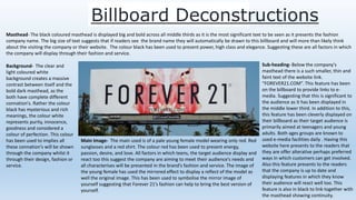
- 1. Billboard Deconstructions Masthead- The black coloured masthead is displayed big and bold across all middle thirds as it is the most significant text to be seen as it presents the fashion company name. The big size of text suggests that if readers see the brand name they will automatically be drawn to this billboard and will more than likely think about the visiting the company or their website. The colour black has been used to present power, high class and elegance. Suggesting these are all factors in which the company will display through their fashion and service. Background- The clear and light coloured white background creates a massive contrast between itself and the bold dark masthead, as the both have complete different connation's. Rather the colour black has mysterious and rich meanings, the colour white represents purity, innocence, goodness and considered a colour of perfection. This colour has been used to implies all these connation's will be shown through the company whilst it through their design, fashion or service. Sub-heading- Below the company's masthead there is a such smaller, thin and faint text of the website link. “FOREVER21.COM”. This feature has been on the billboard to provide links to e- media. Suggesting that this is significant to the audience as it has been displayed in the middle lower third. In addition to this, this feature has been cleverly displayed on their billboard as their target audience is primarily aimed at teenagers and young adults. Both ages groups are known to used e-media facilities daily . Having this website here presents to the readers that they are offer alterative perhaps preferred ways in which customers can get involved. Also this feature presents to the readers that the company is up to date and displaying features in which they know their audience will react well too. This feature is also in black to link together with the masthead showing continuity. Main Image- The main used is of a pale young female model wearing only red. Red sunglasses and a red shirt. The colour red has been used to present energy, passion, desire, and love. All factors in which teens, the target audience display and react too this suggest the company are aiming to meet their audience’s needs and all characterises will be presented in the brand’s fashion and service. The image of the young female has used the mirrored effect to display a reflect of the model as well the original image. This has been used to symbolise the mirror image of yourself suggesting that Forever 21’s fashion can help to bring the best version of yourself.
- 2. Masthead-The black coloured masthead is displayed in a bold yet thin font to the left bottom third of the billboard. The masthead displays the letters “C” and “K” which are the two initials of the brand Calvin Klein. The use of these letter has been used as a nickname as such to suggest that they company is friendly with their customers and offer a professional yet caring role as a company. The colour black has been used to symbolise power, high class and elegance. Suggesting these are all factors in which the company will display clearly in their fashion and service towards customers. Sub-heading- Below the company's masthead there is a smaller and fainter text displaying the full named brand Calvin Klein. This text in presented in a smaller form to implying it is less significant as the masthead or it would have been just as bold and big as the masthead. This suggests that the brand want to focus less on their name as a whole and more on their service and fashion they will provide for their customers. As there brand name wouldn’t be as well known or successful as they wouldn’t have got there they are without their service in the last place. Also the sub heading is black to link with the masthead and whole brand, suggesting continuity throughout the brand. Background- The clear and light coloured white background creates a massive contrast between itself and the bold dark masthead, as the both have complete different connation's. Rather the colour black has mysterious and rich meanings, the colour white represents purity, innocence, goodness and considered a colour of perfection. This colour has been used to implies all these connation's will be shown through the company whilst it through their design, fashion or service. The white background is used a border to frame the main image, suggesting it is a very significant part to the billboard. Main Image- The main used is of a tanned, sun kissed young female model wearing only sunglasses. The image used is a close shot of just the models face and hair. Her face is shiny blonde gloss to represent cleanliness and health. Her sunglasses are used to display a feature of what the company sell in a way of advertisement. Her facial expression is very serious yet mysterious in a sense they see could be confused or trying to seduce. Her lips are open slightly as if she is grasped looking at something behind the camera, this suggests to a reader that there is much more to be seen in this brand than just this billboard. The image is displayed to the right third of the billboard to imply significance to the image but not major importance otherwise it would it of been positioned in the middle third.
- 3. Masthead- The black coloured masthead is displayed in a big and bold text in the lower middle third of the billboard, the masthead displays the brands name. The size of the font suggests it is a very significant feature on this billboard and must be visible to every reader. Implying if readers see the brands name on the billboard they will instantly be drawn in and pay attention as it is a well known and successful all round brand. Suggesting they will want to hear more about/ research more into their products advertised and it is a brand that is familiar to them, so they will know the quality and class of the brand. The colour black has been used to present power, high class and elegance. Suggesting these are all factors in which the company will display through their make up and service. Sub-heading- Above the company's masthead there is a smaller and fainter text displaying the name of the individual product in which is being advertised on this billboard. This is displayed in the middle third displaying it is of major importance and the brand definitely wants every viewers to see this feature. Also suggesting that the brand want to focus less on the well know brand and more on their products and what else they can do to please their target audience. Background- The clear and light coloured beige background creates a massive contrast between itself and the bold dark masthead, as the both have complete different connation's. Rather the colour black has mysterious and rich meanings, the colour beige off white represents purity, innocence, goodness and considered a colour of perfection. This colour has been used to implies all these connation's will be shown through the company whilst it through their design, fashion or service. Instead of using a pure white the brand have used a off white, beige colour to represent the look of the make up being advertised. This suggest that they magazine will be full of continuity throughout and every feature will link. Main Image- This brand hasn’t identify a single main image in fact they have used two very similar sixed images to frame the masthead and subheading, suggesting that these two features over rule the images are seen as being more important to the company due to the positioning. One of the images is a side profile of a natural looking young girl looking serious yet pleased this implies that she is happy with the product advertised suggesting this is how all buyers will look and feel. The other image is of the product, the product being foundation displaying 3 different shades of the product, suggesting they will provide for all their audience no matter their skin colour.