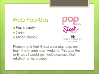
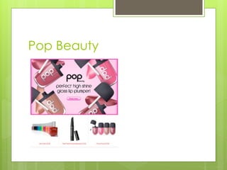
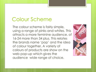
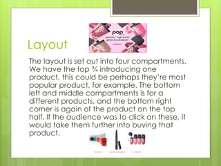
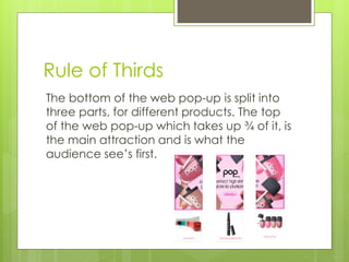
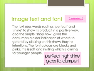
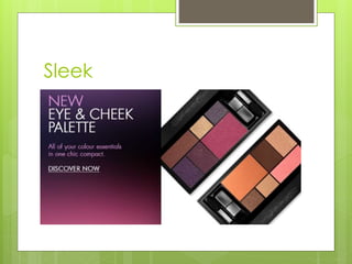
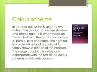
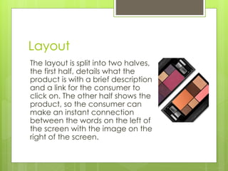
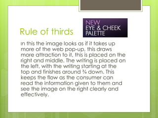
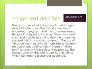
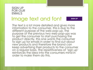
Textual 
Analysis 
By Amber Bush
Sponsorships brands 
 Rimmel 
 Barry M 
 Maybelline
Areas for analysing 
 Narrative 
 Location 
 Composition 
 Sound 
 Font 
 Text
Sponsorship Sequences 
 Rimmel London Colour Rush for Made in 
Chelsea 
http://www.theppc.com/departments/br 
ands/rimmel-sponsors-made-in-chelsea-season- 
7/15-colour-rush
Narrative 
Throughout this sponsorship, we are heavily 
shown depictions of London’s tube line map. 
Places such as Knighsbridge is shown to the 
audience which is a very attractive and well-known 
place in London. The audience will 
make links between this and the brand which in 
theory will enhance their opinion on the brand. 
The tube line runs through the heart of London, 
visually the make up replaces the map, 
therefore Rimmel is the heart of London.
Location 
In this sponsorship sequence there is no 
geographical location and is studio filmed. Graphics 
are used to make reference to location, tube line 
maps, the British flag and soldiers marching in the 
iconic uniform. This relates the brand Rimmel London 
and the actual place together. To incorporate the 
product of Colour Rush lip gloss the traditional 
colours of the flag has been replaced with pink, blue 
and yellow. The link with Made in Chelsea adds to 
the British value of this product, the people shown in 
this programme are wealthy, well-spoken, respected 
and classy. These views are reflected in the brand 
itself.
Composition 
This has taken up a montage style of editing, to 
begin the product itself is shown, we are then moved 
on to images of a model applying and then wearing 
the product with other graphics relating to the 
location of London as this is a big selling point for the 
brand, this then finishes with the product being 
shown again. Throughout the studio shots there are 
motion images of ‘x’ representing kisses. Different 
angles are used when shooting and shapes such as 
circles and squares create interest in the sponsorship 
which keeps the audience visually entertained and 
keeps their attention for the short time it is on.
Sound 
From the start there is an upbeat sound track, a 
young woman does the voice over. What she is 
saying corresponds with the visuals seen, for 
example when ‘pops with colour’ is said we are 
shown a close up of bright coloured red lips and 
when ‘destination’ is said when the tube line 
map is shown. She reinforces the name of the 
brand, the product and the show it is sponsoring 
and also not forgetting the slogan which 
accompanies this, ‘get the London look’.
Font 
The font used is the recognisable Rimmel branding 
with the crown shown above the R which relates 
instantly to London and our monarchy. The size of 
the font is not overbearing and in the audiences 
face but is understandable, it is spaced out and very 
clear this gets the message across quickly and 
efficiently. The font is in red which infers excitement 
and love which keeps the young vibe and also is an 
iconic colour in London, for example, the red buses, 
the guards uniform and he Union Jack. Also red 
infers power, this can be in relation to both the 
location and the product, trying to give the 
impression of higher status.
Text 
The text is very simple, and the basic text on 
the product itself is shown, along with the 
places on Rimmel’s depiction of the tube 
line map. Finally we see the brand’s name 
along with the programme it is sponsoring 
which is Made in Chelsea.
Sponsorship Sequences 
 Barry M for 4Music Sundays 
 http://www.nicksneath.com/DirectorVFX/ 
Director- 
1/15166968_ZKcRCh/1583445086_n3Sz5cc 
#!i=1802329093&k=hN6sjKz 
 Here there are three sponsorship 
sequences together.
Narrative 
In the various sponsorships shown, the make-up 
is heavily linked to the music and the products 
are shown moving backwards and forwards to 
the beat of the music. There is lots of emphasis 
on colour, graphics and animation. This gives a 
sense of perfection to the audience which is 
suggested to be achieved using Barry M’s 
products. This is targeted at a young audience 
of women taking in to account, the colours, the 
models, the graphics, the sound and music and 
also the channel they are sponsoring.
Location 
This sponsorship is based in a studio and is 
highly animated so there is no real sense of 
location. However the product is shown 
around musical instruments and equipment, 
for example music speakers. This relates to 
the channel they are sponsoring which is 
4Music.
Composition 
This is montage editing, and has been put 
together to create a glossy and smooth 
finish. Images of the product are shown at 
the start of each sponsorship, these are 
shown to be moving around in time with the 
music. After this at least 10 different photos 
are shown of a model wearing this make 
up, in each picture is it in a slightly different 
ways, in terms of colour. In each sponsorship 
a different model is used.
Sound 
Music is one of the main attributes, as the Barry 
M is sponsoring 4music. From the start the same 
music is playing but slightly differs in each 
sponsorship, the music is very light-hearted and 
slightly playful. The voiceover is a young woman 
who says “make everyday beautiful” this is a 
very simple phrase but will catch the attention 
of many young people as to be ‘beautiful’ is 
highly valued in the younger generation. The 
voiceover also states the brand and the 
channel they are sponsoring “4Music Sundays 
sponsored by Barry M”.
Font 
The logo of 4music if used and the use of colour is still 
carried on through. The pinks purples, and whites 
attracts a young audience. Also the colours 
correspond with what is happening on the screen 
and the font is turning the same colours. The font at 
the start is very small but is enters and disappears 
from the left had side on the screen so is noticeable, 
and is done in an animated way. Towards the end of 
the sponsorship the font is all over the screen, this is 
very big and in the audiences face, unlike the other 
sponsorships I have looked at. This reinforces the 
brand and the channel.
Text 
The text is very simple and has no 
complexity which makes this a very easy 
sponsorship to watch. The audience are 
given hardly no information through the 
text, only the brand name, who they are 
sponsoring and the text which is on the 
product. “4Music Sundays sponsored by 
Barry M” and on the product “liquid eyeliner 
by Barry M”.
Sponsorship Sequences 
 Maybelline for Gossip Girl 
 http://www.thedrum.com/news/2011/10/ 
20/maybelline-ident-gossip-girl-created-mccann- 
london
Narrative 
This sponsorship again relies on location to tell its 
narrative. The link between New York and Gossip Girl 
creates excitement, employs a modern vibe and 
incorporates fashion and trends. The fast paced 
graphics and visuals show glamorous young women in 
New York, who are seen to be the center of attention. 
The story is aimed at the younger generation of 
women, and how capturing peoples attention is 
possible even in a place like New York. This is shown by 
the shot of the woman standing in the middle of the 
road and the group of photographers. The underlining 
story is that Maybelline’s products will get you noticed 
no matter who or where you are, and is bringing the 
glamour if the catwalk to the ‘sidewalk’.
Location 
This sponsorship again, relies on a location to sell their 
product. For Maybelline they use New York. This is a 
very high profile place were ‘everything’ happens. 
Iconic views are shown of New York such as the 
yellow taxi’s, zebra crossings, and the tall buildings. In 
a place as busy as this its hard to be noticed but the 
women are shown to have all the attention on them 
for example, the paparazzi and the woman standing 
on the zebra crossing has all the cars waiting for her. 
The programme they sponsor is Gossip Girl which is 
very popular in America and is well known for 
glamorous, beautiful and fashionable girls.
Composition 
This is a montage style of editing, it is heavily 
edited with graphics, and the use of transitions 
to move images on and off the screen. Images 
of black and white contrasts with the coloured 
images, these show the difference between the 
catwalk and reality of the ‘sidewalk’ but the 
same look is seen to be achievable. Different 
shapes and colours represent the make up and 
trends, the style of montage helps to create the 
urban vibe.
Sound 
The music is a heavier beat compared to the 
first Rimmel sponsorship, it is more electronic 
beat which creates a dramatic and serious feel. 
The woman who does the voice over is a young 
woman, she first introduces the programme 
they are sponsoring which is Gossip Girl. The 
woman says ‘bringing catwalk glam to the 
sidewalk’ this matches the visuals. However the 
usual slogan heard with this make-up brand is 
not used and it is replaced with a young 
American girl saying ‘totally’, this relates the 
brand more with the programme.
Font 
The font used is the recognisable logo of 
the brand, this is all shown in capital letters 
to give importance to the brand. However, 
the size is understandable and not too big.
Text 
The only text shown in the sponsorship is the 
brand name ‘Maybelline New York’. This is 
positioned across the center of the bottom 
of the screen, which allows the audience to 
still see the background picture and see the 
text, this helps them make a link between 
the picture and the brand name.
Web Pop-Ups 
 Pop beauty 
 Sleek 
 Urban decay 
Please note that these web pop-ups, are 
from the brands own website. This was the 
only way I could get web pop-ups that 
related to my product.
Areas for analysing 
 Colour scheme 
 Layout 
 Rule of thirds 
 Image text and font
Pop Beauty
Colour Scheme 
The colour scheme is fairly simple, 
using a range of pinks and whites. This 
attracts a more feminine audience, of 
16-24 more than 34 plus. This relates 
the brands name ‘pop’ and the idea 
of colour together. A variety of 
colours of products are show on the 
web pop-up which gives the 
audience wide range of choice.
Layout 
The layout is set out into four compartments. 
We have the top ¾ introducing one 
product, this could be perhaps they’re most 
popular product, for example. The bottom 
left and middle compartments is for a 
different products, and the bottom right 
corner is again of the product on the top 
half. If the audience was to click on these, it 
would take them further into buying that 
product.
Rule of Thirds 
The bottom of the web pop-up is split into 
three parts, for different products. The top 
of the web pop-up which takes up ¾ of it, is 
the main attraction and is what the 
audience see’s first.
Image text and font 
The text uses words such as ‘perfect’ and 
‘shine’ to show its product in a positive way, 
also the simple ‘shop now’ gives the 
consumers a clear indication of where to 
go and by clicking on this shows they’re 
intentions. The font colours are blacks and 
pinks, this is soft and inviting which is aiming 
for younger people.
Sleek
Colour scheme 
In terms of colour this is split into two 
halves. The product of an eye shadow 
and cheek palette is emphasised on 
the left half with the graduated colours 
of purple, pink and black. The right half 
is a plain white background, which 
simply shows a picture of the product. 
The range of colours is visible and 
corresponds with the rest of the colour 
scheme on this web pop-up.
Layout 
The layout is split into two halves, 
the first half, details what the 
product is with a brief description 
and a link for the consumer to 
click on. The other half shows the 
product, so the consumer can 
make an instant connection 
between the words on the left of 
the screen with the image on the 
right of the screen.
Rule of thirds 
In this the image looks as if it takes up 
more of the web pop-up, this draws 
more attraction to it, this is placed on the 
right and middle. The writing is placed on 
the left, with the writing starting at the 
top and finishes around ¾ down. This 
keeps the flow as the consumer can 
read the information given to them and 
see the image on the right clearly and 
effectively.
Image text and font 
The text states what the product is, which gets 
straight to the point. The description given 
underneath suggests that the consumer needs 
this product by using the word ‘essentials’ and 
creates simplicity by stating that the consumer 
can get this ‘in one chic compact’. The use of 
‘discover now’ as a link, is more interesting from 
an audiences point of view instead of ‘shop 
now’ as seen in the previous web pop-up. The 
colours used for the font are pinks and whites, 
which connect to a younger audience.
Urban Decay
Colour scheme 
The colours used in this web pop-up 
are much more reserved compared 
to the other examples. In the image 
dark and rich colours of blacks, reds 
and purples are used. This is 
contrasted with the white 
background of the other half of the 
web pop-up, with black text, the 
colour scheme is also used with the 
purple ‘sign up’ box.
Layout 
This is spilt into to halves, the same as 
the previous web pop-up. However 
this slightly differs as the image is of a 
model with make up on, and is on the 
left of the screen, the text is shown on 
the right of the screen. There is much 
more text on this web pop-up and 
details what the want the consumer 
to do along with additional 
information.
Rule of thirds 
The image is on the left and 
therefore is what the consumer 
is forced to see first. This is 
followed by the text of the right 
of the screen, which goes 
down the whole length of the 
web pop-up. There is nothing 
directly centre of the screen 
and is split clearly onto two 
sides.
Image text and font 
The text is a lot more detailed and gives more 
information to the consumer, this is due to the 
different purpose of the web pop-up. The 
purpose of the previous two web pop-ups was 
to get the consumer to start purchasing the 
product directly, this one wants the consumer 
to sign up for emails in order to find out about 
new products and therefore the brand can 
keep advertising their products to the consumer 
on a regular basis. The repetitiveness of ‘sign up’ 
reinforces the idea into the consumers mind in 
order to make them do this.

Textual analysis

  • 1.
  • 2.
    Sponsorships brands Rimmel  Barry M  Maybelline
  • 3.
    Areas for analysing  Narrative  Location  Composition  Sound  Font  Text
  • 4.
    Sponsorship Sequences Rimmel London Colour Rush for Made in Chelsea http://www.theppc.com/departments/br ands/rimmel-sponsors-made-in-chelsea-season- 7/15-colour-rush
  • 5.
    Narrative Throughout thissponsorship, we are heavily shown depictions of London’s tube line map. Places such as Knighsbridge is shown to the audience which is a very attractive and well-known place in London. The audience will make links between this and the brand which in theory will enhance their opinion on the brand. The tube line runs through the heart of London, visually the make up replaces the map, therefore Rimmel is the heart of London.
  • 6.
    Location In thissponsorship sequence there is no geographical location and is studio filmed. Graphics are used to make reference to location, tube line maps, the British flag and soldiers marching in the iconic uniform. This relates the brand Rimmel London and the actual place together. To incorporate the product of Colour Rush lip gloss the traditional colours of the flag has been replaced with pink, blue and yellow. The link with Made in Chelsea adds to the British value of this product, the people shown in this programme are wealthy, well-spoken, respected and classy. These views are reflected in the brand itself.
  • 7.
    Composition This hastaken up a montage style of editing, to begin the product itself is shown, we are then moved on to images of a model applying and then wearing the product with other graphics relating to the location of London as this is a big selling point for the brand, this then finishes with the product being shown again. Throughout the studio shots there are motion images of ‘x’ representing kisses. Different angles are used when shooting and shapes such as circles and squares create interest in the sponsorship which keeps the audience visually entertained and keeps their attention for the short time it is on.
  • 8.
    Sound From thestart there is an upbeat sound track, a young woman does the voice over. What she is saying corresponds with the visuals seen, for example when ‘pops with colour’ is said we are shown a close up of bright coloured red lips and when ‘destination’ is said when the tube line map is shown. She reinforces the name of the brand, the product and the show it is sponsoring and also not forgetting the slogan which accompanies this, ‘get the London look’.
  • 9.
    Font The fontused is the recognisable Rimmel branding with the crown shown above the R which relates instantly to London and our monarchy. The size of the font is not overbearing and in the audiences face but is understandable, it is spaced out and very clear this gets the message across quickly and efficiently. The font is in red which infers excitement and love which keeps the young vibe and also is an iconic colour in London, for example, the red buses, the guards uniform and he Union Jack. Also red infers power, this can be in relation to both the location and the product, trying to give the impression of higher status.
  • 10.
    Text The textis very simple, and the basic text on the product itself is shown, along with the places on Rimmel’s depiction of the tube line map. Finally we see the brand’s name along with the programme it is sponsoring which is Made in Chelsea.
  • 11.
    Sponsorship Sequences Barry M for 4Music Sundays  http://www.nicksneath.com/DirectorVFX/ Director- 1/15166968_ZKcRCh/1583445086_n3Sz5cc #!i=1802329093&k=hN6sjKz  Here there are three sponsorship sequences together.
  • 12.
    Narrative In thevarious sponsorships shown, the make-up is heavily linked to the music and the products are shown moving backwards and forwards to the beat of the music. There is lots of emphasis on colour, graphics and animation. This gives a sense of perfection to the audience which is suggested to be achieved using Barry M’s products. This is targeted at a young audience of women taking in to account, the colours, the models, the graphics, the sound and music and also the channel they are sponsoring.
  • 13.
    Location This sponsorshipis based in a studio and is highly animated so there is no real sense of location. However the product is shown around musical instruments and equipment, for example music speakers. This relates to the channel they are sponsoring which is 4Music.
  • 14.
    Composition This ismontage editing, and has been put together to create a glossy and smooth finish. Images of the product are shown at the start of each sponsorship, these are shown to be moving around in time with the music. After this at least 10 different photos are shown of a model wearing this make up, in each picture is it in a slightly different ways, in terms of colour. In each sponsorship a different model is used.
  • 15.
    Sound Music isone of the main attributes, as the Barry M is sponsoring 4music. From the start the same music is playing but slightly differs in each sponsorship, the music is very light-hearted and slightly playful. The voiceover is a young woman who says “make everyday beautiful” this is a very simple phrase but will catch the attention of many young people as to be ‘beautiful’ is highly valued in the younger generation. The voiceover also states the brand and the channel they are sponsoring “4Music Sundays sponsored by Barry M”.
  • 16.
    Font The logoof 4music if used and the use of colour is still carried on through. The pinks purples, and whites attracts a young audience. Also the colours correspond with what is happening on the screen and the font is turning the same colours. The font at the start is very small but is enters and disappears from the left had side on the screen so is noticeable, and is done in an animated way. Towards the end of the sponsorship the font is all over the screen, this is very big and in the audiences face, unlike the other sponsorships I have looked at. This reinforces the brand and the channel.
  • 17.
    Text The textis very simple and has no complexity which makes this a very easy sponsorship to watch. The audience are given hardly no information through the text, only the brand name, who they are sponsoring and the text which is on the product. “4Music Sundays sponsored by Barry M” and on the product “liquid eyeliner by Barry M”.
  • 18.
    Sponsorship Sequences Maybelline for Gossip Girl  http://www.thedrum.com/news/2011/10/ 20/maybelline-ident-gossip-girl-created-mccann- london
  • 19.
    Narrative This sponsorshipagain relies on location to tell its narrative. The link between New York and Gossip Girl creates excitement, employs a modern vibe and incorporates fashion and trends. The fast paced graphics and visuals show glamorous young women in New York, who are seen to be the center of attention. The story is aimed at the younger generation of women, and how capturing peoples attention is possible even in a place like New York. This is shown by the shot of the woman standing in the middle of the road and the group of photographers. The underlining story is that Maybelline’s products will get you noticed no matter who or where you are, and is bringing the glamour if the catwalk to the ‘sidewalk’.
  • 20.
    Location This sponsorshipagain, relies on a location to sell their product. For Maybelline they use New York. This is a very high profile place were ‘everything’ happens. Iconic views are shown of New York such as the yellow taxi’s, zebra crossings, and the tall buildings. In a place as busy as this its hard to be noticed but the women are shown to have all the attention on them for example, the paparazzi and the woman standing on the zebra crossing has all the cars waiting for her. The programme they sponsor is Gossip Girl which is very popular in America and is well known for glamorous, beautiful and fashionable girls.
  • 21.
    Composition This isa montage style of editing, it is heavily edited with graphics, and the use of transitions to move images on and off the screen. Images of black and white contrasts with the coloured images, these show the difference between the catwalk and reality of the ‘sidewalk’ but the same look is seen to be achievable. Different shapes and colours represent the make up and trends, the style of montage helps to create the urban vibe.
  • 22.
    Sound The musicis a heavier beat compared to the first Rimmel sponsorship, it is more electronic beat which creates a dramatic and serious feel. The woman who does the voice over is a young woman, she first introduces the programme they are sponsoring which is Gossip Girl. The woman says ‘bringing catwalk glam to the sidewalk’ this matches the visuals. However the usual slogan heard with this make-up brand is not used and it is replaced with a young American girl saying ‘totally’, this relates the brand more with the programme.
  • 23.
    Font The fontused is the recognisable logo of the brand, this is all shown in capital letters to give importance to the brand. However, the size is understandable and not too big.
  • 24.
    Text The onlytext shown in the sponsorship is the brand name ‘Maybelline New York’. This is positioned across the center of the bottom of the screen, which allows the audience to still see the background picture and see the text, this helps them make a link between the picture and the brand name.
  • 25.
    Web Pop-Ups Pop beauty  Sleek  Urban decay Please note that these web pop-ups, are from the brands own website. This was the only way I could get web pop-ups that related to my product.
  • 26.
    Areas for analysing  Colour scheme  Layout  Rule of thirds  Image text and font
  • 27.
  • 28.
    Colour Scheme Thecolour scheme is fairly simple, using a range of pinks and whites. This attracts a more feminine audience, of 16-24 more than 34 plus. This relates the brands name ‘pop’ and the idea of colour together. A variety of colours of products are show on the web pop-up which gives the audience wide range of choice.
  • 29.
    Layout The layoutis set out into four compartments. We have the top ¾ introducing one product, this could be perhaps they’re most popular product, for example. The bottom left and middle compartments is for a different products, and the bottom right corner is again of the product on the top half. If the audience was to click on these, it would take them further into buying that product.
  • 30.
    Rule of Thirds The bottom of the web pop-up is split into three parts, for different products. The top of the web pop-up which takes up ¾ of it, is the main attraction and is what the audience see’s first.
  • 31.
    Image text andfont The text uses words such as ‘perfect’ and ‘shine’ to show its product in a positive way, also the simple ‘shop now’ gives the consumers a clear indication of where to go and by clicking on this shows they’re intentions. The font colours are blacks and pinks, this is soft and inviting which is aiming for younger people.
  • 32.
  • 33.
    Colour scheme Interms of colour this is split into two halves. The product of an eye shadow and cheek palette is emphasised on the left half with the graduated colours of purple, pink and black. The right half is a plain white background, which simply shows a picture of the product. The range of colours is visible and corresponds with the rest of the colour scheme on this web pop-up.
  • 34.
    Layout The layoutis split into two halves, the first half, details what the product is with a brief description and a link for the consumer to click on. The other half shows the product, so the consumer can make an instant connection between the words on the left of the screen with the image on the right of the screen.
  • 35.
    Rule of thirds In this the image looks as if it takes up more of the web pop-up, this draws more attraction to it, this is placed on the right and middle. The writing is placed on the left, with the writing starting at the top and finishes around ¾ down. This keeps the flow as the consumer can read the information given to them and see the image on the right clearly and effectively.
  • 36.
    Image text andfont The text states what the product is, which gets straight to the point. The description given underneath suggests that the consumer needs this product by using the word ‘essentials’ and creates simplicity by stating that the consumer can get this ‘in one chic compact’. The use of ‘discover now’ as a link, is more interesting from an audiences point of view instead of ‘shop now’ as seen in the previous web pop-up. The colours used for the font are pinks and whites, which connect to a younger audience.
  • 37.
  • 38.
    Colour scheme Thecolours used in this web pop-up are much more reserved compared to the other examples. In the image dark and rich colours of blacks, reds and purples are used. This is contrasted with the white background of the other half of the web pop-up, with black text, the colour scheme is also used with the purple ‘sign up’ box.
  • 39.
    Layout This isspilt into to halves, the same as the previous web pop-up. However this slightly differs as the image is of a model with make up on, and is on the left of the screen, the text is shown on the right of the screen. There is much more text on this web pop-up and details what the want the consumer to do along with additional information.
  • 40.
    Rule of thirds The image is on the left and therefore is what the consumer is forced to see first. This is followed by the text of the right of the screen, which goes down the whole length of the web pop-up. There is nothing directly centre of the screen and is split clearly onto two sides.
  • 41.
    Image text andfont The text is a lot more detailed and gives more information to the consumer, this is due to the different purpose of the web pop-up. The purpose of the previous two web pop-ups was to get the consumer to start purchasing the product directly, this one wants the consumer to sign up for emails in order to find out about new products and therefore the brand can keep advertising their products to the consumer on a regular basis. The repetitiveness of ‘sign up’ reinforces the idea into the consumers mind in order to make them do this.