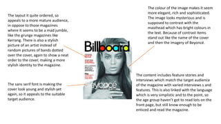
Task 4 – Target Audience
Appeal.
Billboard magazine appeals to a young target audience of around 16 –
young adults of around 26. This is due to the content of the magazine,
which includes the charts, and interview and feature stories of bands,
appealing to a vast audience who like different musical genres. The
magazine appeals to these, as it widens the audience of the magazine,
so people who like genres like RnB, Rock, pop and others, buy the
magazine, so overall they make more money.
The layout it quite ordered, so
appeals to a more mature audience,
in oppose to those magazines
where it seems to be a mad jumble,
like the grunge magazines like
Kerrang. There is also a stylish
picture of an artist instead of
random pictures of bands dotted
over the cover, again to show a neat
order to the cover, making a more
stylish identity to the magazine.
The colour of the image makes it seem
more elegant, rich and sophisticated.
The image looks mysterious and is
supposed to contrast with the
masthead which has bright colours in
the text. Because of contrast items
stand out like the name of the cover
and then the imagery of Beyoncé.
The sans serif font is making the
cover look young and stylish yet
again, so it appeals to the suitable
target audience.
The content includes feature stories and
interviews which match the target audience
of the magazine with varied interviews s and
features. This is also linked with the language
which is very simplistic and to the point, so
the age group haven’t got to read lots on the
front page, but still know enough to be
enticed and read the magazine.
The layout is split in sections, all of
which are split into 3s. The ordered
page shows the target audience a
page which is easily readable.
The colours are neutral and
plain, which help to stand out
from the white background, but
still stay with the colour scheme
so there isn’t a strong colour
change, with a series of messy
colours.
The contents is in the far left
third. This is of course the
primary optical area, so will
be seen first before the other
sections. The contents is in a
coloured bar, so again stands
out above the rest of the
page, as it is important on
the contents page to know
what is shown through out
the magazine.
The white background
denotes the neutral effect,
so everything around It,
stands out, as focus isn’t
pulled in to the
background. Further this is
so your eyes focus mainly
on the images of the artists
instead.
The image of Beyonce
dominates the right hand
page of the magazine, this
shows that she is superior
and should be look at as the
main thing on the spread.
She is wearing a gold
casing around her face
like a futuristic collar
which a queen would
have worn. She is also
wearing thick eye
shadow above her eyes
to make them stand
out.
The strong sans serif font, seem also quite future like.
The Writing is very big and white, so contrasts with
the background colour showing the importance of the
phrase
The phrase ‘Fiercely
Creative’ describes the
artist as some one great
and powerful, using
very strong words to
describe her. The word
fierce can describe a
powerful animal like a
lion, which is perceived
as a scary being. This is
the effect that wants to
be used to describe this
woman
The layout is in columns,
which is conventional for
magazines, as it is made
easier to read, especially
for the target audience in
the magazine

Task 4 – target audience appeal

  • 1.
    Task 4 –Target Audience Appeal.
  • 2.
    Billboard magazine appealsto a young target audience of around 16 – young adults of around 26. This is due to the content of the magazine, which includes the charts, and interview and feature stories of bands, appealing to a vast audience who like different musical genres. The magazine appeals to these, as it widens the audience of the magazine, so people who like genres like RnB, Rock, pop and others, buy the magazine, so overall they make more money.
  • 3.
    The layout itquite ordered, so appeals to a more mature audience, in oppose to those magazines where it seems to be a mad jumble, like the grunge magazines like Kerrang. There is also a stylish picture of an artist instead of random pictures of bands dotted over the cover, again to show a neat order to the cover, making a more stylish identity to the magazine. The colour of the image makes it seem more elegant, rich and sophisticated. The image looks mysterious and is supposed to contrast with the masthead which has bright colours in the text. Because of contrast items stand out like the name of the cover and then the imagery of Beyoncé. The sans serif font is making the cover look young and stylish yet again, so it appeals to the suitable target audience. The content includes feature stories and interviews which match the target audience of the magazine with varied interviews s and features. This is also linked with the language which is very simplistic and to the point, so the age group haven’t got to read lots on the front page, but still know enough to be enticed and read the magazine.
  • 4.
    The layout issplit in sections, all of which are split into 3s. The ordered page shows the target audience a page which is easily readable. The colours are neutral and plain, which help to stand out from the white background, but still stay with the colour scheme so there isn’t a strong colour change, with a series of messy colours. The contents is in the far left third. This is of course the primary optical area, so will be seen first before the other sections. The contents is in a coloured bar, so again stands out above the rest of the page, as it is important on the contents page to know what is shown through out the magazine. The white background denotes the neutral effect, so everything around It, stands out, as focus isn’t pulled in to the background. Further this is so your eyes focus mainly on the images of the artists instead.
  • 5.
    The image ofBeyonce dominates the right hand page of the magazine, this shows that she is superior and should be look at as the main thing on the spread. She is wearing a gold casing around her face like a futuristic collar which a queen would have worn. She is also wearing thick eye shadow above her eyes to make them stand out. The strong sans serif font, seem also quite future like. The Writing is very big and white, so contrasts with the background colour showing the importance of the phrase The phrase ‘Fiercely Creative’ describes the artist as some one great and powerful, using very strong words to describe her. The word fierce can describe a powerful animal like a lion, which is perceived as a scary being. This is the effect that wants to be used to describe this woman The layout is in columns, which is conventional for magazines, as it is made easier to read, especially for the target audience in the magazine