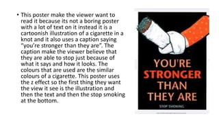
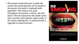
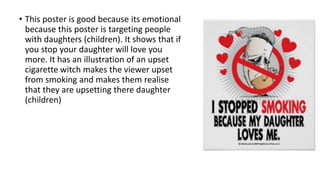
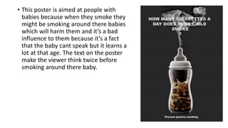
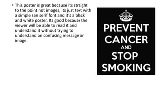
Why these posters work
By Karan Singh
• This poster make the viewer want to
read it because its not a boring poster
with a lot of text on it instead it is a
cartoonish illustration of a cigarette in a
knot and it also uses a caption saying
“you’re stronger than they are”. The
caption make the viewer believe that
they are able to stop just because of
what it says and how it looks. The
colours that are used are the similar
colours of a cigarette. This poster uses
the z effect so the first thing they want
the view it see is the illustration and
then the text and then the stop smoking
at the bottom.
• This poster works because it make the
viewer discussed because of he mouth in
the poster, the teeth is replaced with
cigarettes. The colours are used
throughout the poster is white, red and
black. The red represents the death and it
also uses the same lipstick colour (red). In
the word smoking the I is replaced with a
cigarette to show hummer.
• This poster is good because its emotional
because this poster is targeting people
with daughters (children). It shows that if
you stop your daughter will love you
more. It has an illustration of an upset
cigarette witch makes the viewer upset
from smoking and makes them realise
that they are upsetting there daughter
(children)
• This poster is aimed at people with
babies because when they smoke they
might be smoking around there babies
which will harm them and it’s a bad
influence to them because it’s a fact
that the baby cant speak but it learns a
lot at that age. The text on the poster
make the viewer think twice before
smoking around there baby.
• This poster is great because its straight
to the point not images, its just text with
a simple san serif font and it’s a black
and white poster. Its good because the
viewer will be able to read it and
understand it without trying to
understand an confusing message or
image.

Why these posters work

  • 1.
    Why these posterswork By Karan Singh
  • 2.
    • This postermake the viewer want to read it because its not a boring poster with a lot of text on it instead it is a cartoonish illustration of a cigarette in a knot and it also uses a caption saying “you’re stronger than they are”. The caption make the viewer believe that they are able to stop just because of what it says and how it looks. The colours that are used are the similar colours of a cigarette. This poster uses the z effect so the first thing they want the view it see is the illustration and then the text and then the stop smoking at the bottom.
  • 3.
    • This posterworks because it make the viewer discussed because of he mouth in the poster, the teeth is replaced with cigarettes. The colours are used throughout the poster is white, red and black. The red represents the death and it also uses the same lipstick colour (red). In the word smoking the I is replaced with a cigarette to show hummer.
  • 4.
    • This posteris good because its emotional because this poster is targeting people with daughters (children). It shows that if you stop your daughter will love you more. It has an illustration of an upset cigarette witch makes the viewer upset from smoking and makes them realise that they are upsetting there daughter (children)
  • 5.
    • This posteris aimed at people with babies because when they smoke they might be smoking around there babies which will harm them and it’s a bad influence to them because it’s a fact that the baby cant speak but it learns a lot at that age. The text on the poster make the viewer think twice before smoking around there baby.
  • 6.
    • This posteris great because its straight to the point not images, its just text with a simple san serif font and it’s a black and white poster. Its good because the viewer will be able to read it and understand it without trying to understand an confusing message or image.