Download to read offline

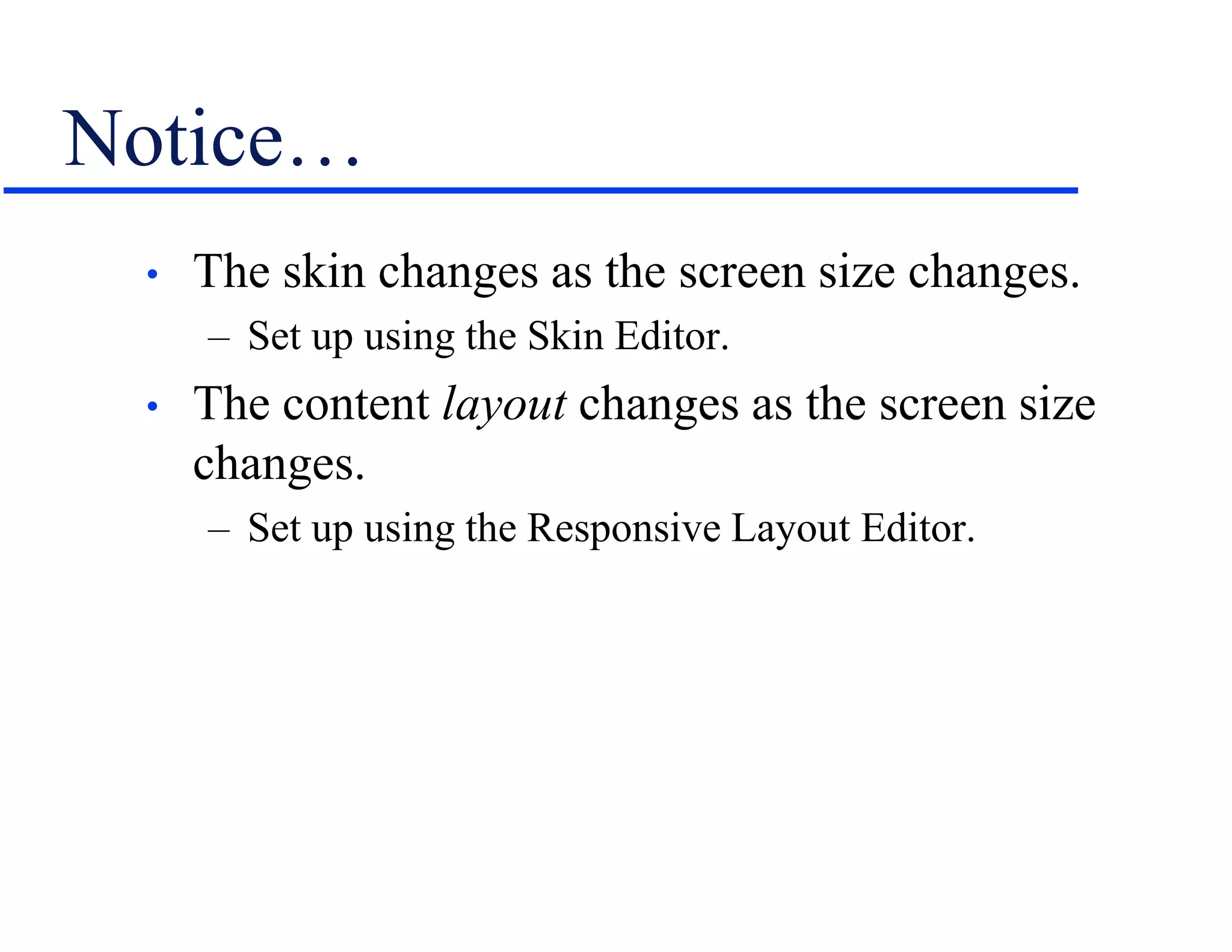
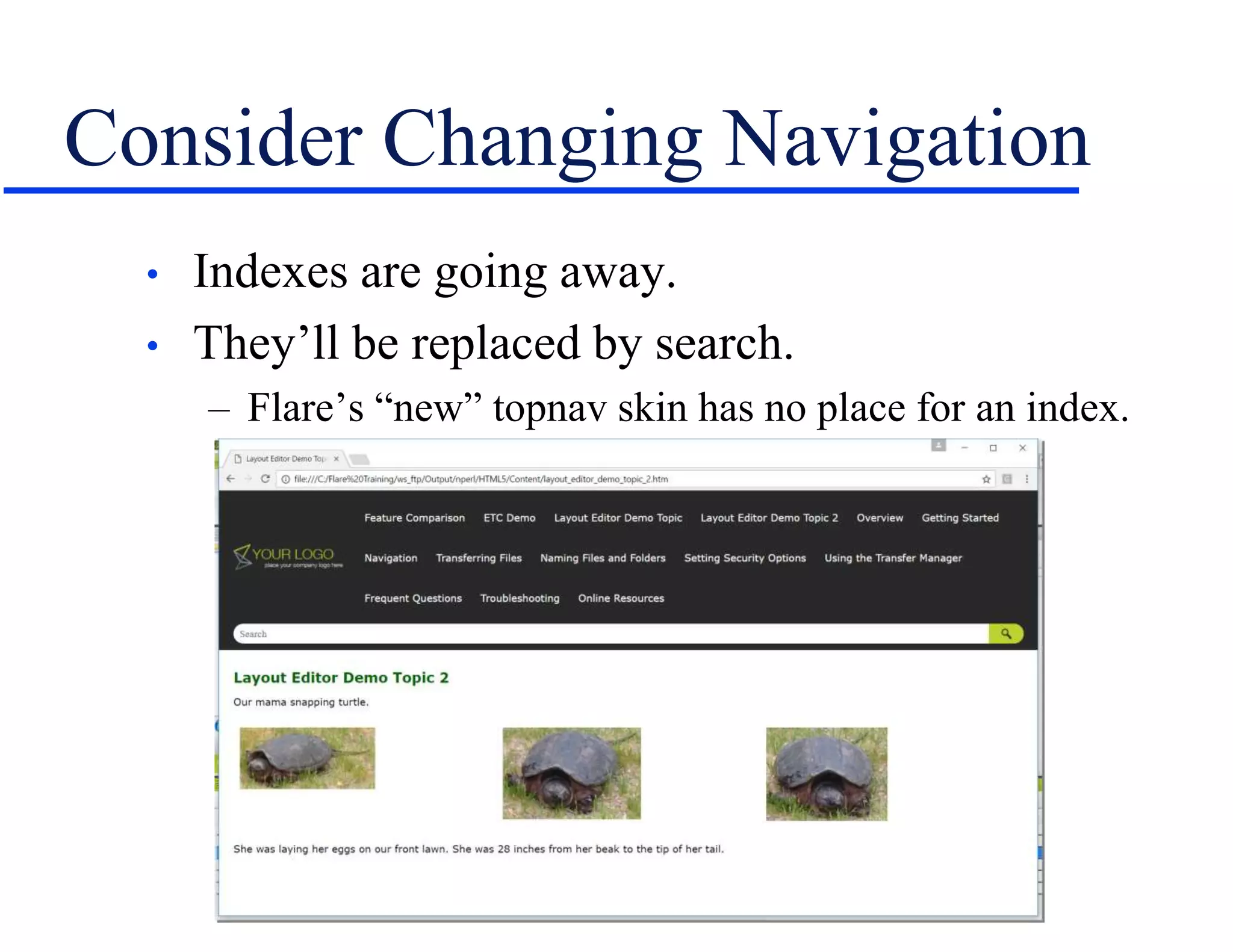

The document discusses strategies for transitioning to mobile content creation, emphasizing the importance of responsive design, 'appified' help, and traditional 'true' apps. It outlines best practices for development, such as writing for mobile first, eliminating hacks and excess content, and considering new navigation methods. Additionally, Neil Perlin offers training and consulting services for effective content management across various platforms.


