Download as PDF, PPTX
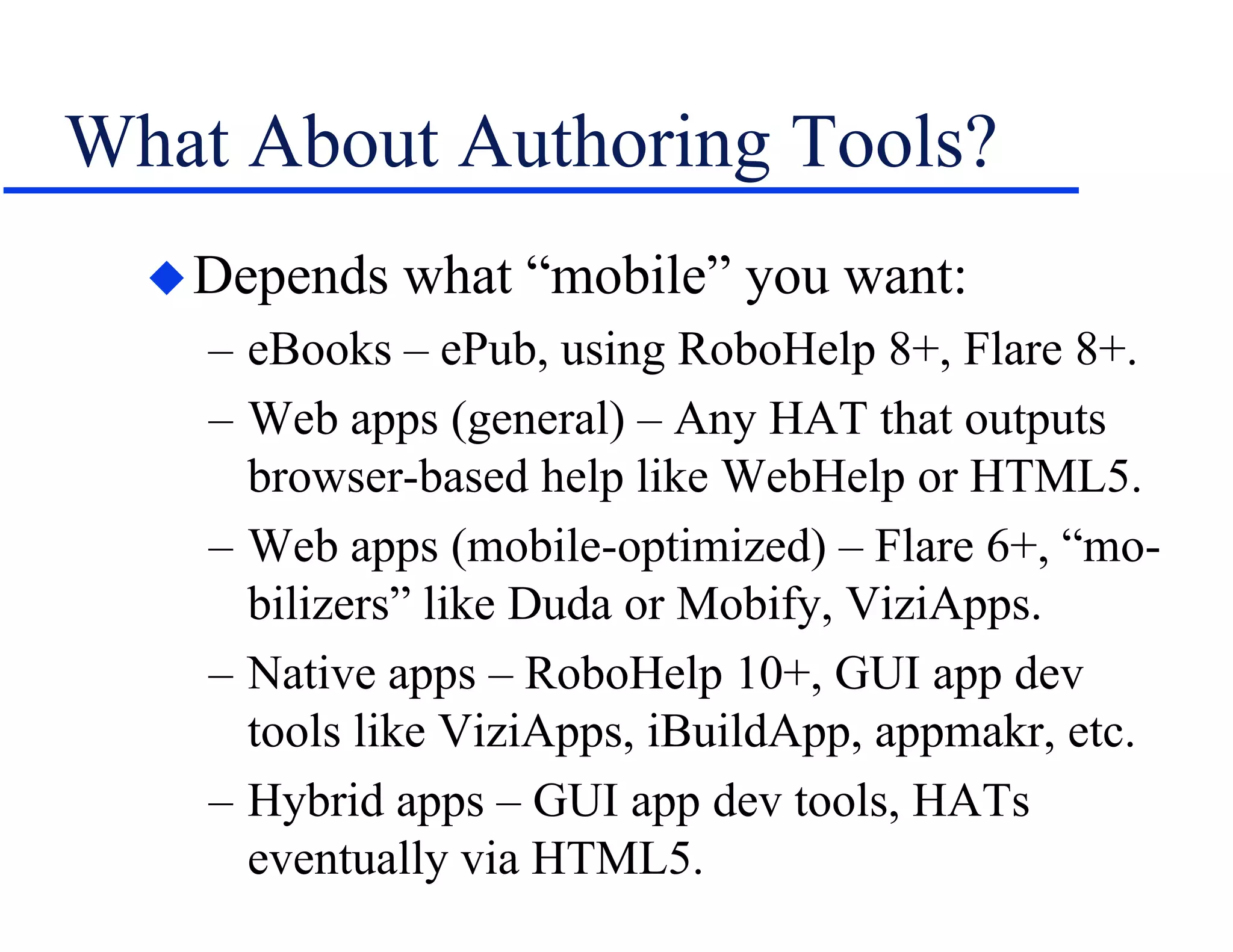
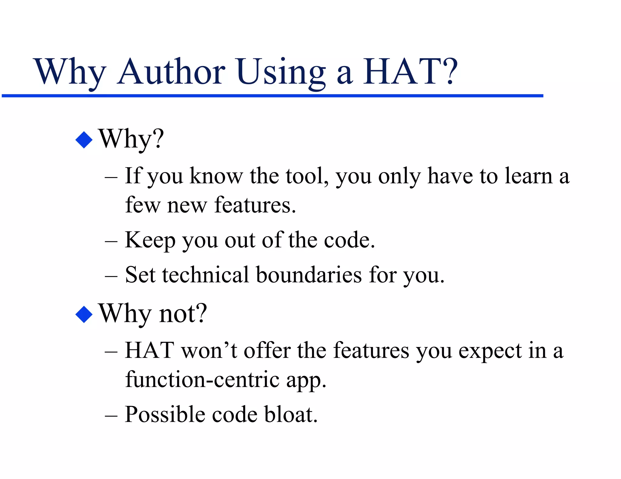
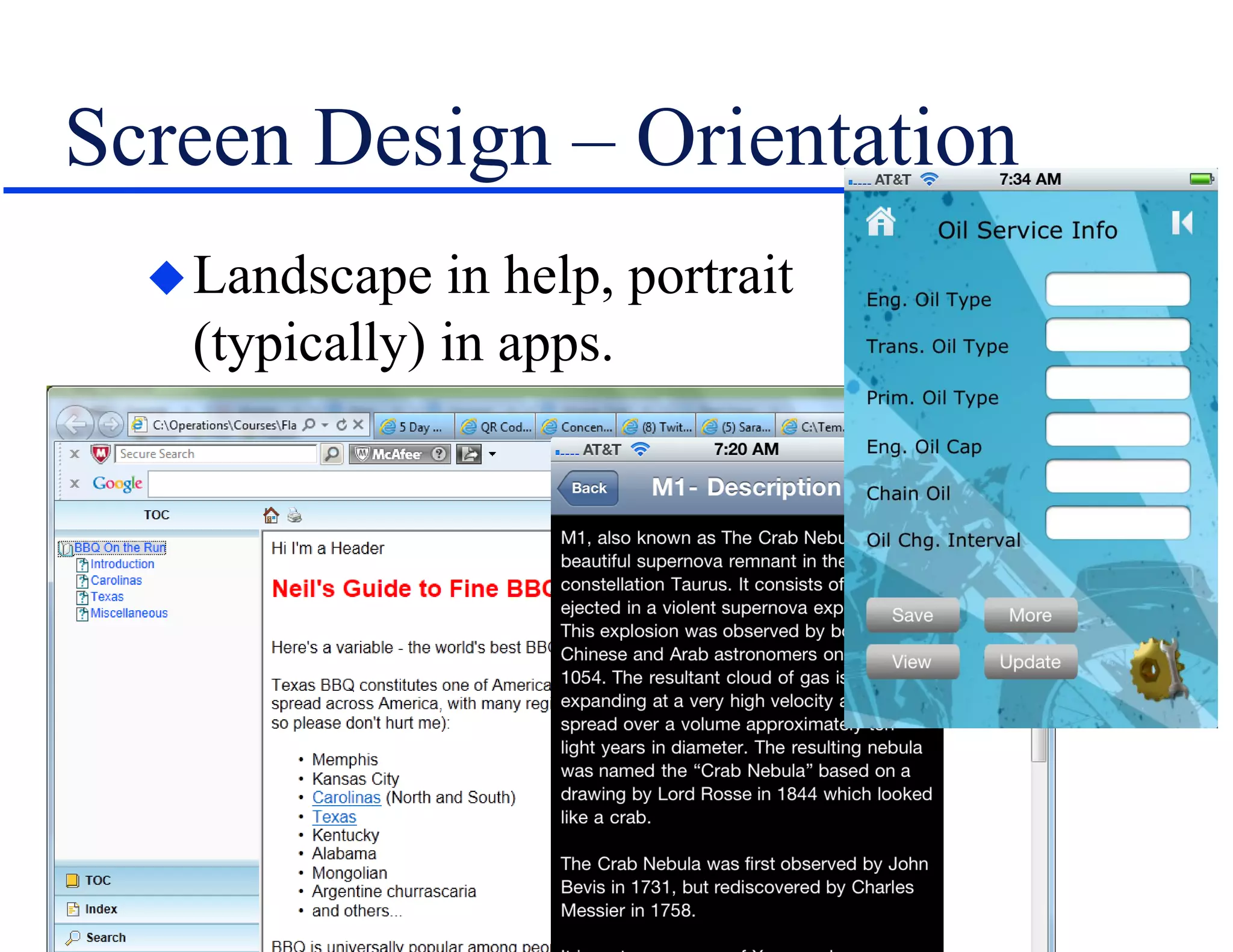
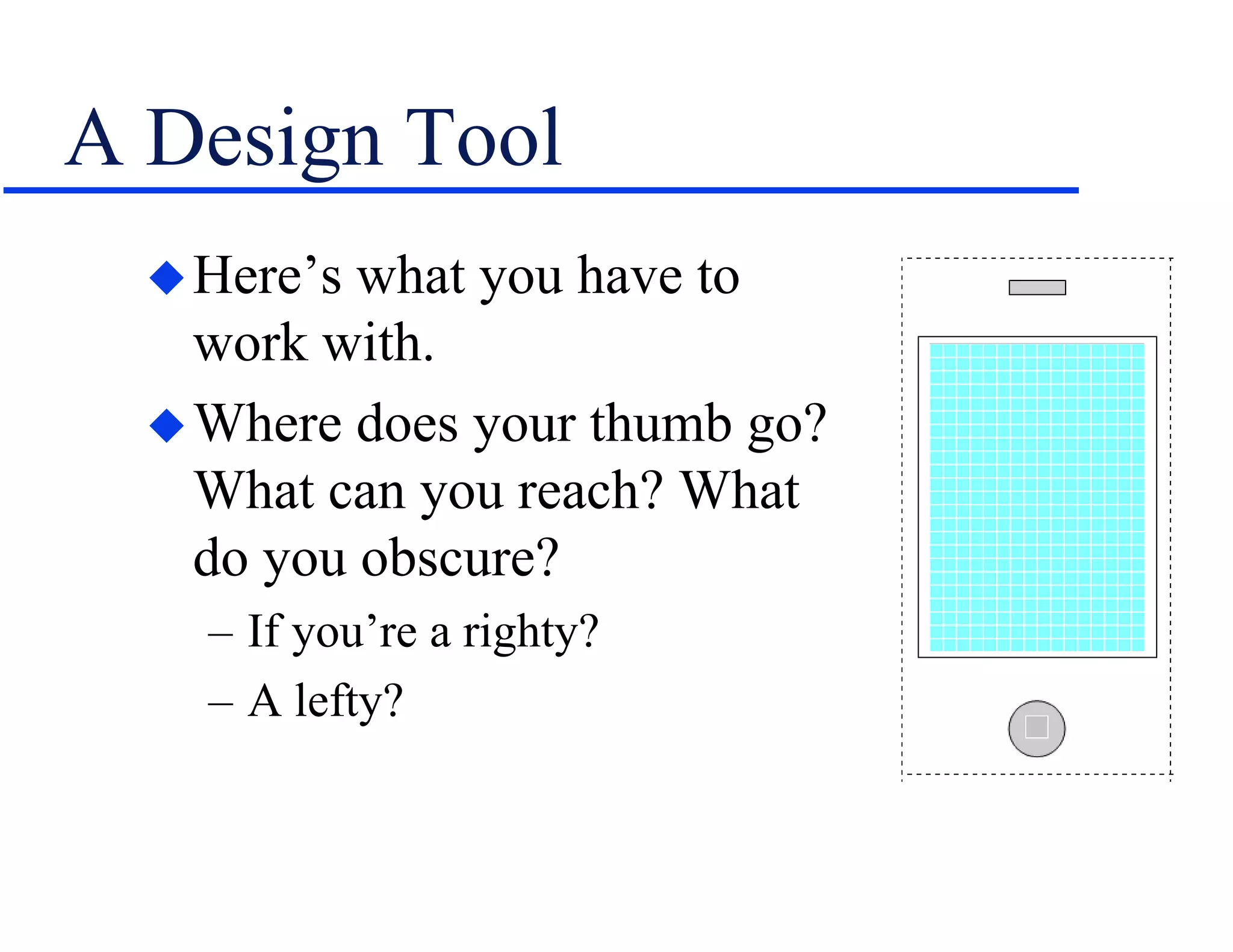

The document discusses the involvement of technical communication (tech comm) in mobile publishing, addressing the need to convert conventional help systems into mobile-friendly formats. It outlines the distinctions between ebooks, apps, and various authoring tools suitable for mobile content creation, while highlighting design challenges like screen orientation, content density, and platform compatibility. The author emphasizes the importance of planning for mobile integration from the outset of a project to effectively adapt content for multichannel publishing.