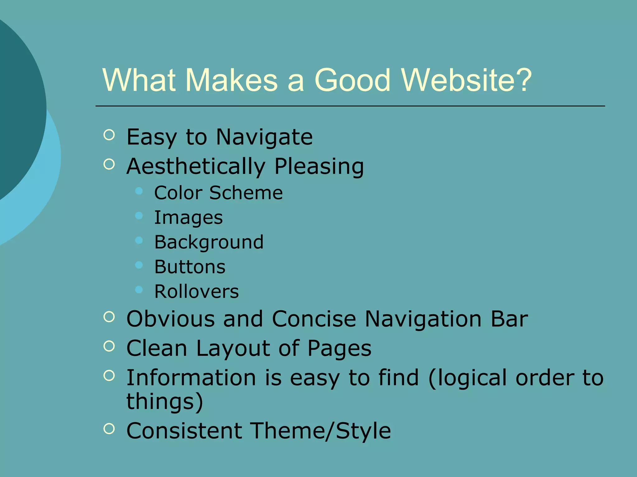
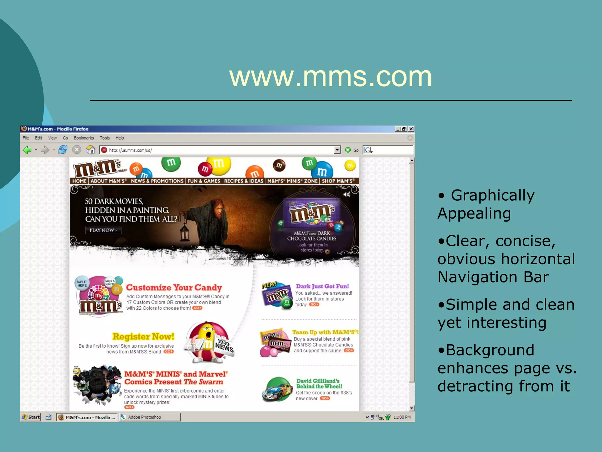
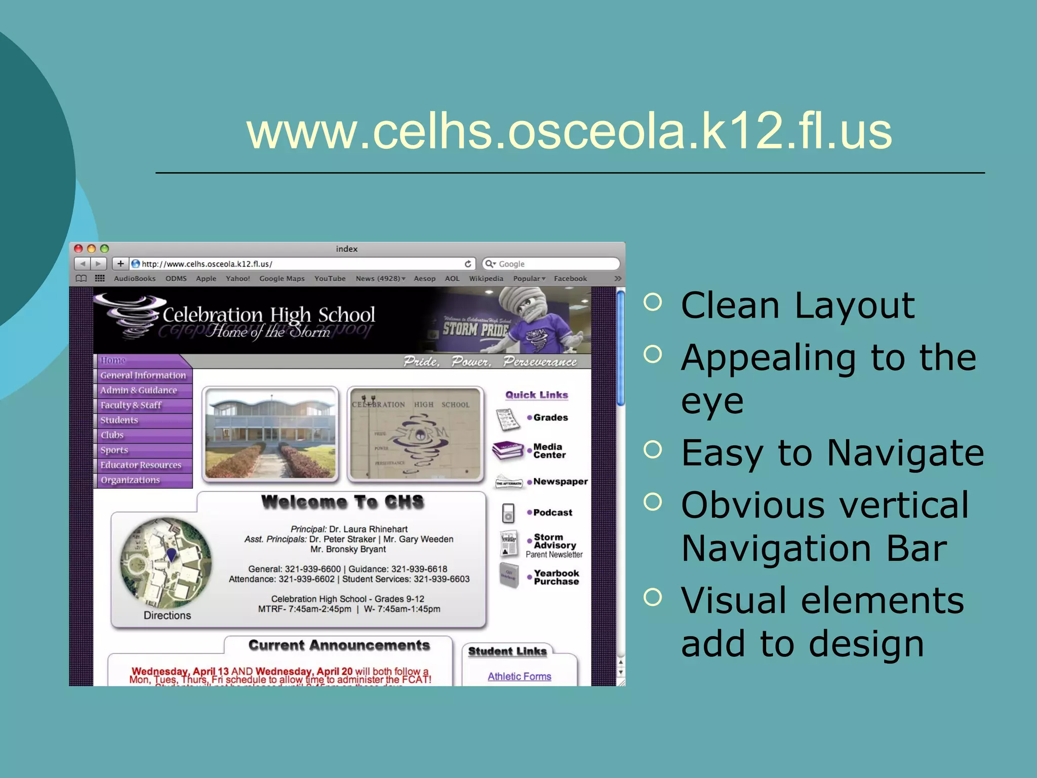
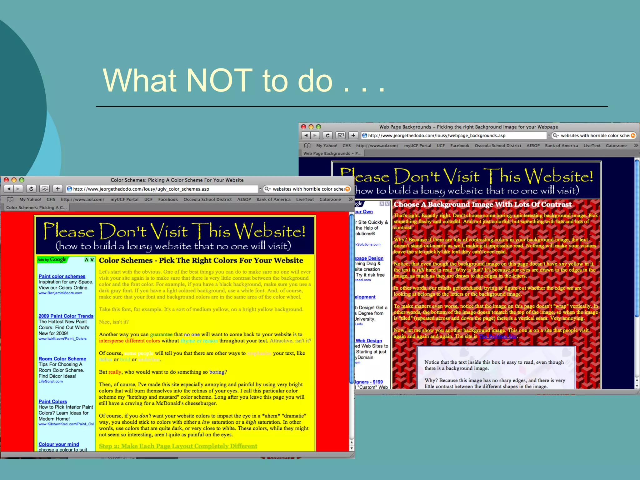
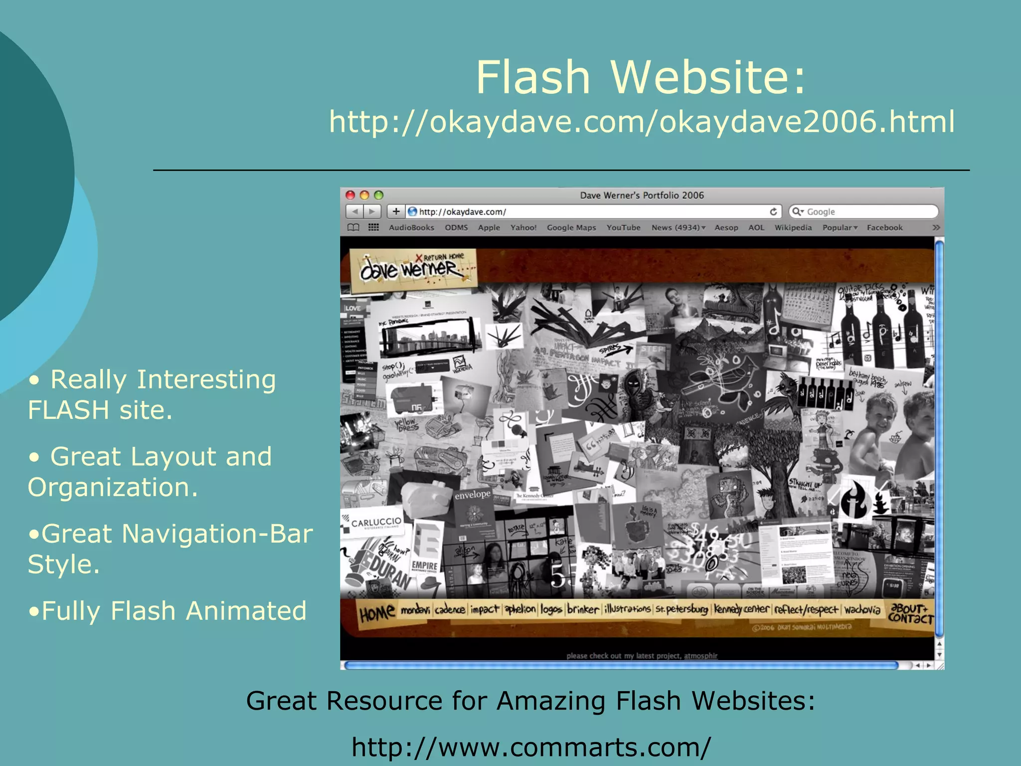
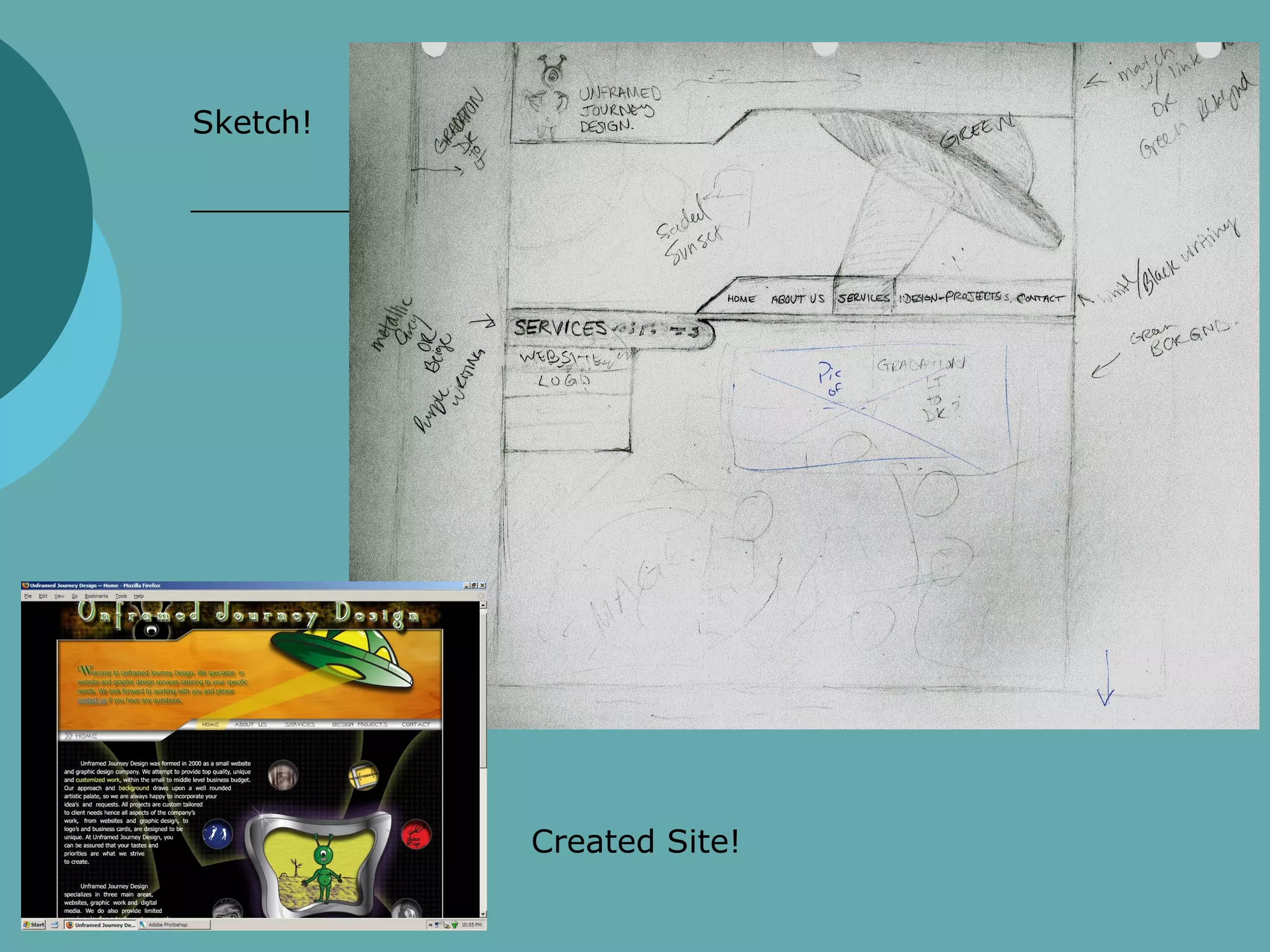
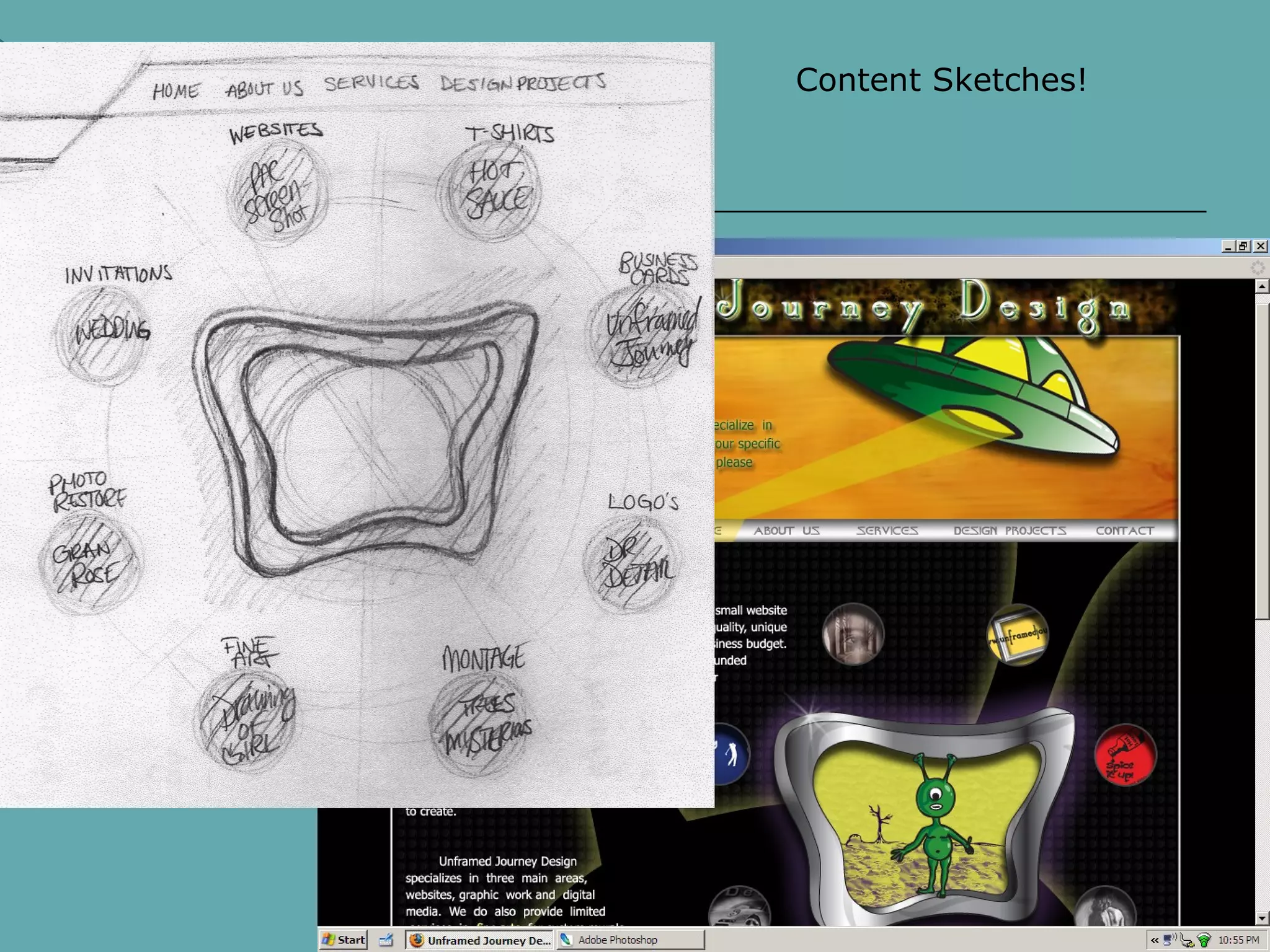
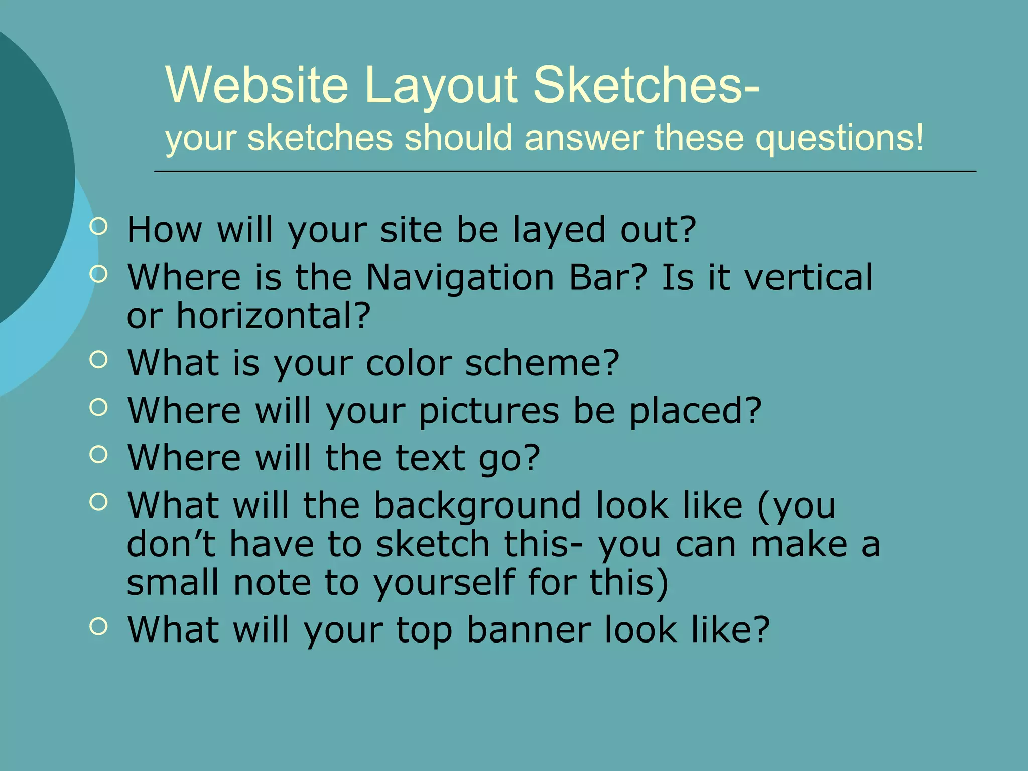
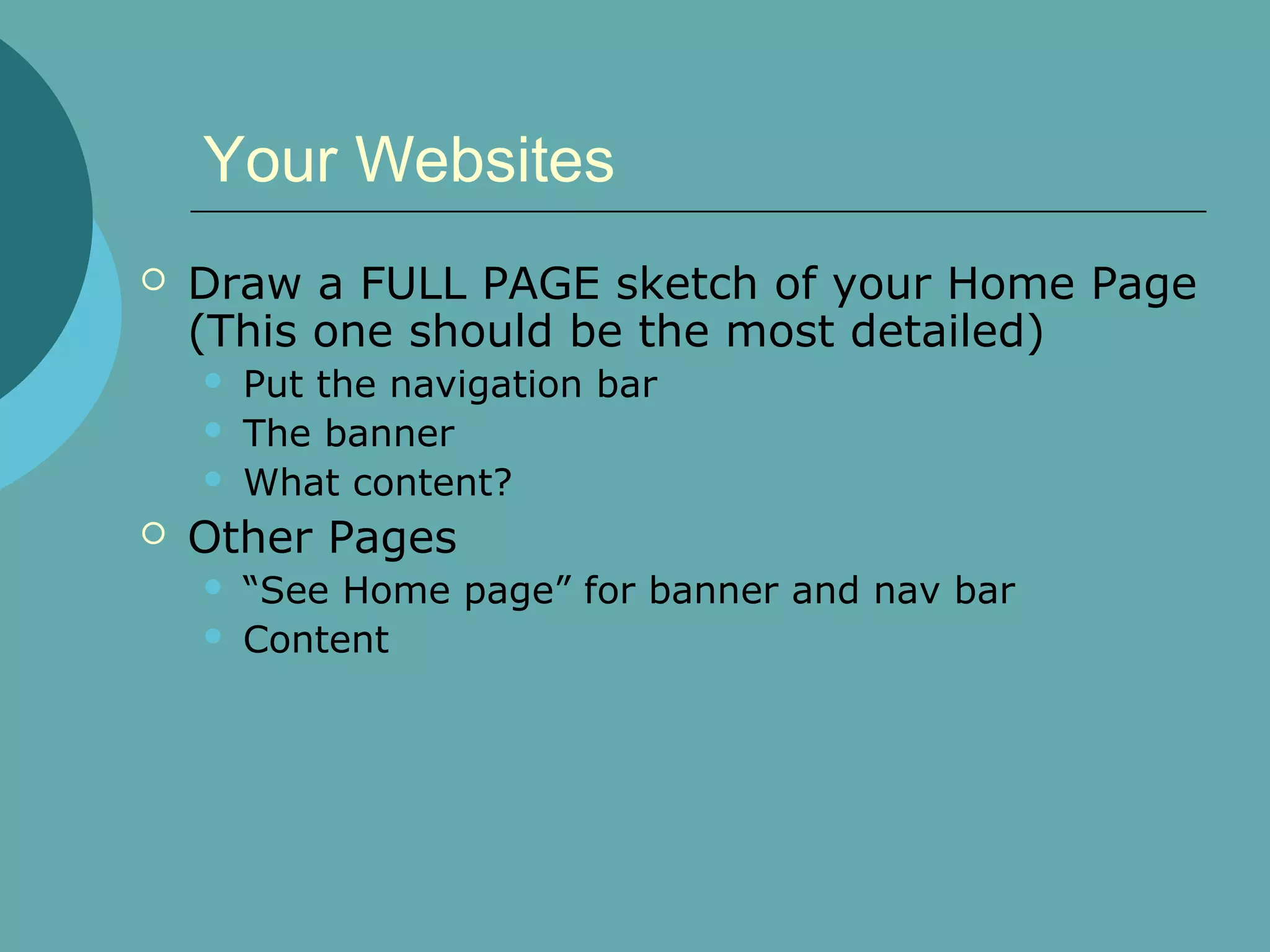
Websites!!


Introduction to Websites
ITGS Internal Assessment Project
What Makes a Good Website?
   Easy to Navigate
   Aesthetically Pleasing
       Color Scheme
       Images
       Background
       Buttons
       Rollovers
   Obvious and Concise Navigation Bar
   Clean Layout of Pages
   Information is easy to find (logical order to
    things)
   Consistent Theme/Style
www.mms.com


              • Graphically
              Appealing
              •Clear, concise,
              obvious horizontal
              Navigation Bar
              •Simple and clean
              yet interesting
              •Background
              enhances page vs.
              detracting from it
www.celhs.osceola.k12.fl.us


                   Clean Layout
                   Appealing to the
                    eye
                   Easy to Navigate
                   Obvious vertical
                    Navigation Bar
                   Visual elements
                    add to design
Color Scheme:
   Color Scheme: Be aware
   Colors should enhance, not take
    over
   Text color vs. background color
What NOT to do . . .
Static Website Vs. Flash Website:
           Static (standard html)
   Static Websites (standard html):
       May contain Flash elements
       No animation
       Rollovers
            Rollover = One image switches to a different image
       Load faster
       Easier to create
       More Common
Static Website Vs. Flash Website:
            Adobe Flash Website

   Flash is:
       an animation program
       Popular with Website designers.
       Can include animated rollovers, repetitive
        animation in background, and musical options.
       Can be included as a small insert in a static
        site.
Flash Website:
                        http://okaydave.com/okaydave2006.html


• Really Interesting
FLASH site.
• Great Layout and
Organization.
•Great Navigation-Bar
Style.
•Fully Flash Animated


                 Great Resource for Amazing Flash Websites:
                         http://www.commarts.com/
Now that we can recognize a great
website . . .

   You will create your own!

   Remember:
     Your Audience
     Your Color Scheme

     SCREEN SHOTS- DO CONSTANTLY!!
          Every single day you should have at least
           12 Screen shots (even if you don’t use
           them!)
Photoshop Layout
   Your Website will be created using
    PHOTOSHOP (No, this is not negotiable.)
   Your entire page layout, for both pages
    must be sketched out and APPROVED
    before beginning on computer.
   Size:
       800px X 700px (or more)
       Resolution: 72 ppi
   Navigation should be consistent, you will
    create 1 Photoshop file with different
    Folders (within Photoshop) for the pages.
Example of a Sketchbook Layout
    for a Website:
       www.unframedjourney.com


(Mrs.
Model’s
Website)
Sketch!


          Created Site!
Content Sketches!
Website Layout Sketches-
      your sketches should answer these questions!

   How will your site be layed out?
   Where is the Navigation Bar? Is it vertical
    or horizontal?
   What is your color scheme?
   Where will your pictures be placed?
   Where will the text go?
   What will the background look like (you
    don’t have to sketch this- you can make a
    small note to yourself for this)
   What will your top banner look like?
You can add things in Photoshop
     to make your website “Pop”

Images &
Design Element
Ideas:
•“Post-It” Notes
• Polaroid's
• Thumbtacks
• Cork Board.
Your Websites
   Draw a FULL PAGE sketch of your Home Page
    (This one should be the most detailed)
       Put the navigation bar
       The banner
       What content?
   Other Pages
       “See Home page” for banner and nav bar
       Content

Website Introduction

  • 1.
    Websites!! Introduction to Websites ITGSInternal Assessment Project
  • 2.
    What Makes aGood Website?  Easy to Navigate  Aesthetically Pleasing  Color Scheme  Images  Background  Buttons  Rollovers  Obvious and Concise Navigation Bar  Clean Layout of Pages  Information is easy to find (logical order to things)  Consistent Theme/Style
  • 3.
    www.mms.com • Graphically Appealing •Clear, concise, obvious horizontal Navigation Bar •Simple and clean yet interesting •Background enhances page vs. detracting from it
  • 4.
    www.celhs.osceola.k12.fl.us  Clean Layout  Appealing to the eye  Easy to Navigate  Obvious vertical Navigation Bar  Visual elements add to design
  • 5.
    Color Scheme:  Color Scheme: Be aware  Colors should enhance, not take over  Text color vs. background color
  • 6.
    What NOT todo . . .
  • 7.
    Static Website Vs.Flash Website: Static (standard html)  Static Websites (standard html):  May contain Flash elements  No animation  Rollovers  Rollover = One image switches to a different image  Load faster  Easier to create  More Common
  • 8.
    Static Website Vs.Flash Website: Adobe Flash Website  Flash is:  an animation program  Popular with Website designers.  Can include animated rollovers, repetitive animation in background, and musical options.  Can be included as a small insert in a static site.
  • 9.
    Flash Website: http://okaydave.com/okaydave2006.html • Really Interesting FLASH site. • Great Layout and Organization. •Great Navigation-Bar Style. •Fully Flash Animated Great Resource for Amazing Flash Websites: http://www.commarts.com/
  • 10.
    Now that wecan recognize a great website . . .  You will create your own!  Remember:  Your Audience  Your Color Scheme  SCREEN SHOTS- DO CONSTANTLY!!  Every single day you should have at least 12 Screen shots (even if you don’t use them!)
  • 11.
    Photoshop Layout  Your Website will be created using PHOTOSHOP (No, this is not negotiable.)  Your entire page layout, for both pages must be sketched out and APPROVED before beginning on computer.  Size:  800px X 700px (or more)  Resolution: 72 ppi  Navigation should be consistent, you will create 1 Photoshop file with different Folders (within Photoshop) for the pages.
  • 12.
    Example of aSketchbook Layout for a Website:  www.unframedjourney.com (Mrs. Model’s Website)
  • 13.
    Sketch! Created Site!
  • 14.
  • 15.
    Website Layout Sketches- your sketches should answer these questions!  How will your site be layed out?  Where is the Navigation Bar? Is it vertical or horizontal?  What is your color scheme?  Where will your pictures be placed?  Where will the text go?  What will the background look like (you don’t have to sketch this- you can make a small note to yourself for this)  What will your top banner look like?
  • 16.
    You can addthings in Photoshop to make your website “Pop” Images & Design Element Ideas: •“Post-It” Notes • Polaroid's • Thumbtacks • Cork Board.
  • 17.
    Your Websites  Draw a FULL PAGE sketch of your Home Page (This one should be the most detailed)  Put the navigation bar  The banner  What content?  Other Pages  “See Home page” for banner and nav bar  Content