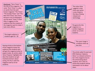
Deconstructions
Masthead: “Term Times” is
 the title of this magazine. The   The colour blue
 name ‘Term Times’ is a play       suggests a new
 on words from the well            fresh start which
 known magazine “The Times”,       is also linked to
 “The Sunday Times” and “The       the idea of being
 New York Times” plus more,        relaxed and
 because a lot of newspapers       technology.
 use the word ‘Times’ in their
 titles it suggests to the
 audience that the creators of
 the magazine want to make it      The genre for this
 look more official..              magazine is a
                                   London magazine
                                   aimed at current
                                   students.
   The target audience is
   students aged 16 - 20


                                        The cover image is
                                        a medium close up
Having articles at the bottom           two shot
of the magazine shows the
audience (the students who
will get this magazine) what to
                                   The article called ‘A Level and
expect inside. An article called
                                   BTEC National Diploma
‘Actor Prepares’ highlights the
                                   Glory’ is a relevant article to
idea that students can get
                                   be in this magazine due to
involved and learn about
                                   the article being about
acting, this fits in with the
                                   students, this is also an
magazine well as its for
                                   article that students will be
students.
                                   interested in as its about
                                   them.
Mast Head                        The target audience for
The mast head is big and         this college magazine is
bold, this instantly catches     16 – 20 year olds who are
the readers attention and        interested in music
also distinguishes the genre     and/or who wants to/is
and concept of the over all      doing music as a college
magazine. The way that the       course.
background behind the title
is black makes the title           This magazine looks
stand out even more.               very American from
                                   how the woman in the
 This magazine looks like          cover picture is posing
 its well made and looks           and the feel from the
 like it has a glossy effect       cover of the magazine
 to the front cover, this          seems to be very
 genuinely means that it is        Americanised.
 made to a better quality
 which makes the price         The cover image is a medium
 rise.                         shot, by having a light
                               background and a dark dress it
                               makes the person stand out
     The main article          more on the front cover, the
     shows how the             way that the women is holding
     college is bringing in    an orchestra stick and a music
     more rewards for          stand with music sheets helps
     students, this is an      show that this is a magazine for
     article that students     music students. Also having the
     will be interested in     background as a picture of a
     as its apart of their     music room with instruments
     life.                     in it helps show that this is a
                               music college magazine and
                               will stand out for students that
                               take music or are interested in
                               music.
The mast head is plan and
 boring , the bold white          The logo of this front
 writing on the black             cover tells the
 boarder makes the mast           audience the who the
 head stand out but it            makers of this
 wouldn’t grab the readers        magazine is, for
 attention if it was amongst      example ‘Chichester
 another school magazines.        high school for girls’

                                This school magazine is
                                quite plain and doesn’t
                                have that much colour on
                                it, the design of the front
 The lead article of            cover is average with
 this magazine is               everything placed in the
 relevant to the                general way and the
 readers of this                completely white
 magazine because its           background suggests that
 about what's been              this is just made out of
 happening in their             paper which is low quality
 school recently. The           and looks cheaply made.
 cover image links to
 the lead article and is
                                 The target audience for
 a wide angle long shot
                                 this school magazine is
 image.
                                 11 – 16 year olds and
                                 also parents, this is so
                                 students knew what
By having pictures on which      has been going on
articles are on which page it    recently in their school
doesn’t really give the          and also for parents to
readers an insight as they       read so they know what
can’t look forward to a          has been going on as
certain article as they don’t    well.
know what is on which page.

Deconstructing Print Task

  • 1.
  • 2.
    Masthead: “Term Times”is the title of this magazine. The The colour blue name ‘Term Times’ is a play suggests a new on words from the well fresh start which known magazine “The Times”, is also linked to “The Sunday Times” and “The the idea of being New York Times” plus more, relaxed and because a lot of newspapers technology. use the word ‘Times’ in their titles it suggests to the audience that the creators of the magazine want to make it The genre for this look more official.. magazine is a London magazine aimed at current students. The target audience is students aged 16 - 20 The cover image is a medium close up Having articles at the bottom two shot of the magazine shows the audience (the students who will get this magazine) what to The article called ‘A Level and expect inside. An article called BTEC National Diploma ‘Actor Prepares’ highlights the Glory’ is a relevant article to idea that students can get be in this magazine due to involved and learn about the article being about acting, this fits in with the students, this is also an magazine well as its for article that students will be students. interested in as its about them.
  • 3.
    Mast Head The target audience for The mast head is big and this college magazine is bold, this instantly catches 16 – 20 year olds who are the readers attention and interested in music also distinguishes the genre and/or who wants to/is and concept of the over all doing music as a college magazine. The way that the course. background behind the title is black makes the title This magazine looks stand out even more. very American from how the woman in the This magazine looks like cover picture is posing its well made and looks and the feel from the like it has a glossy effect cover of the magazine to the front cover, this seems to be very genuinely means that it is Americanised. made to a better quality which makes the price The cover image is a medium rise. shot, by having a light background and a dark dress it makes the person stand out The main article more on the front cover, the shows how the way that the women is holding college is bringing in an orchestra stick and a music more rewards for stand with music sheets helps students, this is an show that this is a magazine for article that students music students. Also having the will be interested in background as a picture of a as its apart of their music room with instruments life. in it helps show that this is a music college magazine and will stand out for students that take music or are interested in music.
  • 4.
    The mast headis plan and boring , the bold white The logo of this front writing on the black cover tells the boarder makes the mast audience the who the head stand out but it makers of this wouldn’t grab the readers magazine is, for attention if it was amongst example ‘Chichester another school magazines. high school for girls’ This school magazine is quite plain and doesn’t have that much colour on it, the design of the front The lead article of cover is average with this magazine is everything placed in the relevant to the general way and the readers of this completely white magazine because its background suggests that about what's been this is just made out of happening in their paper which is low quality school recently. The and looks cheaply made. cover image links to the lead article and is The target audience for a wide angle long shot this school magazine is image. 11 – 16 year olds and also parents, this is so students knew what By having pictures on which has been going on articles are on which page it recently in their school doesn’t really give the and also for parents to readers an insight as they read so they know what can’t look forward to a has been going on as certain article as they don’t well. know what is on which page.