
Recommended
More Related Content
Similar to Website homepage analysis
Similar to Website homepage analysis (20)
More from stellafensome
More from stellafensome (20)
Recently uploaded
Recently uploaded (20)
Website homepage analysis
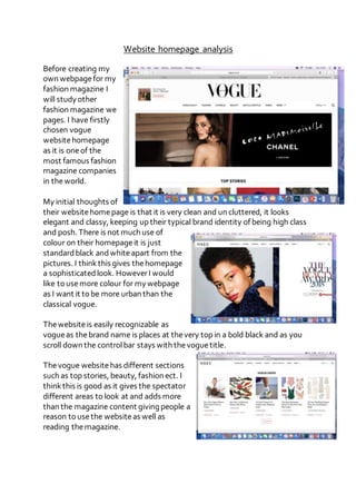
- 1. Website homepage analysis Before creating my own webpagefor my fashion magazine I will study other fashion magazine we pages. I have firstly chosen vogue websitehomepage as it is oneof the most famous fashion magazine companies in theworld. My initial thoughts of their websitehomepage is that it is very clean and un cluttered, it looks elegant and classy, keeping up their typical brand identity of being high class and posh. There is not much use of colour on their homepageit is just standardblack andwhiteapart from the pictures. I thinkthis gives thehomepage a sophisticatedlook. HoweverI would like to usemore colour for my webpage as I want it to be more urban than the classical vogue. Thewebsiteis easily recognizable as vogueas thebrand name is places at thevery top in a bold black and as you scroll down the controlbar stays with thevoguetitle. Thevogue websitehas different sections such as top stories, beauty, fashion ect. I thinkthis is good as it gives the spectator different areas to look at and adds more than the magazine content giving people a reason to usethe websiteas well as reading themagazine.