Download to read offline


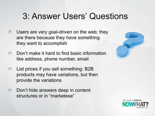
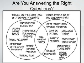
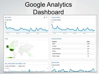
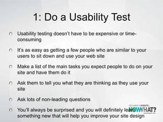

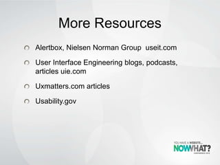

This document provides 5 ways to improve the usability of a website: 1) Conduct usability testing to understand how real users interact with the site. 2) Look at web metrics from analytics tools to understand user behavior. 3) Ensure the site answers common user questions clearly. 4) Use meaningful link text instead of vague phrases. 5) Write content for online reading behavior, using headings, short paragraphs and lists. Following these recommendations can help satisfy users and increase profits through higher conversion rates and reduced support costs.


![Community Sector Provincial Forum - St. John's [2010-10-01]](https://cdn.slidesharecdn.com/ss_thumbnails/communitysectorprovincialforum-st-johns-2010-10-01-101001144925-phpapp02-thumbnail.jpg?width=640&height=640&fit=bounds)


![Directions - Council for Vocational Services Society - Halifax [2010-10-07]](https://cdn.slidesharecdn.com/ss_thumbnails/directions-councilforvocationalservicessociety-halifax2010-10-07-101007084802-phpapp02-thumbnail.jpg?width=640&height=640&fit=bounds)


