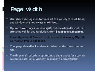
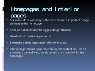
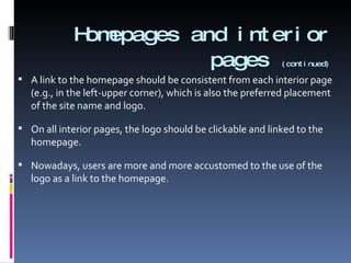
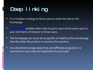
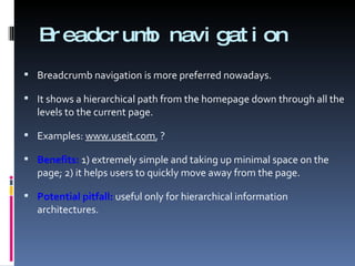
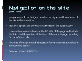
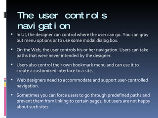
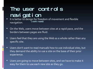
Site design Page design sometimes gets the most attention. With current web browsers, you see only one page at a time. The site is never explicitly represented on the screen.  From usability perspective, site design is more challenging and usually also more important than page design.
General guidelines “ Under construction” sings (construction worker digging away). These still could be found on the Web. Don’t tell users what you don’t have! That’s only frustrating.  Don’t release a partially finished website.  Although, it is acceptable to have a small article talking about future plans or upcoming attractions. The main entry to the site should focus on what a user can do here and now!
Site usability Once users arrive at a page, they can usually figure out what to do there, if only they would take a little time. Web usability suffers dramatically as soon as we take users off the home page and start them navigating or problem solving. Site design must be aimed at simplicity with a very clear information architecture and matching navigation tools.
Homepage The homepage should be designed differently from the remaining pages, but they should share the same style. Homepage should not have “Home” button, should typically have a larger logo and a more visible placement of company name or site name. The main goals of a homepage are to answer the questions: “Where am I?” and “What does this site do?” The answers to the questions should not be in the form of the scaring mission statements.
Homepage  (continued) It should be obvious from the design what purpose the site would serve for a first-time user. Homepage should also serve as the entry point to the site’s navigation scheme. For example, people visiting a travel site will often want to make an airline reservation. Mostly people come to your site in order to accomplish something specific.  Only rarely they are interested in simply checking out what might be happening in your company.
Homepage  (continued) The news area should be relatively restrained and leave a large part of the page available for navigation (the exception being the news sites). Most homepages need a visible search feature because many users are search-dominant and don’t want to bother navigating to their destination link-by-link. In summary, homepage should offer 3 features: Directory of the site’s main content area (navigation) Summary of the most important news or promotions Search feature
Page width Users have varying monitor sizes set to a variety of resolutions, and windows are not always maximized. Optimize Web pages for  1024x768 , but use a liquid layout that stretches well for any resolution, from  800x600  to  1280x1024 .  Currently, about  60%  of all monitors are set at  1024x768  pixels. Only about  17%  use  800x600 . Your page should look and work the best at the most common size. The three main criteria in optimizing a page layout for a certain screen size are: initial visibility, readability, and aesthetics.
Homepages and interior pages The name of the company or the site is the most important design element on the homepage. It should not necessarily be biggest design element.  Usually it is in the left-upper corner. Site name is to be repeated on all interior pages. Interior pages should focus more on specific content and less on providing a general welcome statement or an overview for the homepage.
Homepages and interior pages   (continued) A link to the homepage should be consistent from each interior page (e.g., in the left-upper corner), which is also the preferred placement of the site name and logo. On all interior pages, the logo should be clickable and linked to the homepage. Nowadays, users are more and more accustomed to the use of the logo as a link to the homepage.
Deep linking It is mistaken strategy to force users to enter the site on the homepage.  Deep linking  enables other sites to point users to the exact spot on your site that is of interest to those users. The homepage can never be as specific or helpful as the actual page that describes the product or answers the question. You should encourage deep links, and affiliates programs in e-commerce is one mean to implement this principle.
Affiliates programs An affiliates program   is a way to pay for incoming traffic. If Site A links to Site B, then B will pay a small referral fee for those users who follow the link. Most current affiliates programs pay commissions only for users who end up buying something on the destination site. In principle it would be possible to have a layered commission structure and pay more for users who actually purchase and less for users who simply visit bit don’t buy anything.
Metaphor The greatest weakness of metaphors is that they seem clever to designers, but users do not understand them. It is usually better to be explain something by text than to use a metaphor which is not totally clear to everyone.  Metaphor could be useful when it: provides a unifying framework for the design; facilitates learning by allowing users to draw upon the knowledge they already have.
“ Shopping cart” metaphor “ Shopping cart” is a good example of established well-known metaphor in e-commerce.  You can place products in the shopping cart where they are kept ready for purchase but have not been bought. Weakness of the “shopping cart”: often users do not know how to remove products from the cart. One site selling sport products tried to use “shopping sled”. Then, 50% of users did not understand the concept; 50% said they figured out what it meant because it was in the same location as a shopping cart would be.  Don’t use vague concepts if well-known ones exist!
Navigation The Web is a navigational system. The basic user interaction is to click on hypertext links. It is necessary to provide users with navigational support. Navigation interfaces need to help users answer the fundamental questions of navigation: Where am I? Where have I been? Where can I go?
Where am I? This is the most important navigational question. Users will never have a chance to understand the site’s structure if they don’t understand where they are. The user’s location needs to be shown at two different levels: relative to the Web as a whole; relative to the site’s structure.
Where am I?  (continued) You need to identify your site on all of your pages because they form a subset of the Web. Users will not know what site they are one unless you tell them. Users usually are not happy when a site uses navigation interfaces that are drastically different from others.  Navigation rule:  include your logo on every page. It should have a consistent placement and be made into a hypertext link to the homepage.
Where have I been? A site doesn’t know where have you been without resorting to cookies or other user-tracking measures. Navigational mechanisms in browsers:  “ Back” button; history list; hypertext links shown in different colour. Knowing what links lead to visited pages is useful:  1) it helps users learn the structure of the site, and  2) it prevents them from wasting time going to the same page many times.
Where can I go? The question is answered by the visible navigational options and any other links on the page.  A good site structure is a major benefit in helping users answer this question. Represent links as underlined text, keeping the standard link colours. Three types of hypertext links that can be used: embedded links structural links associative links
Types of links Embedded links  are the traditional underlined text that “more stuff” is available about some topic that is discussed in the body text. Structural links  are links that systematically point to other levels of the site structure. It is important to have the same structural links on all pages. Associative links  are used to give users “see also” hints about pages that may be of interest to them if they are similar to the current page.
Site structure Navigation visualizes the user’s current location relative to the structure of the underlying information. If the information is a mess, then no navigation design can rescue it. Poor information architecture will always lead to poor usability. The two most important rules about site structure are: to have one  to make it reflect the user’s view of the site, info or services. Unfortunately, many sites evolve without any planned structure and end up in total chaos as a collection of random directories.
Site structure  (continued) Site structure should not mirror the organizational structure instead of reflecting user’s view. Users should not care how your company is organized. Distributing responsibility for the site to divisions and departments results in an internally centred site rather than a customer-focused site. The site structure should be determined by the task users want to perform on your site , even if that means having a single page for info from two very different departments.
Site structure  (continued) A typical example of poorly managed website is when the homepage has a button for each of the senior vice presidents in the company.  A corporate site may be divided into high-level categories such as product information, employment information, and information for investors.  Then, the product information might again be divided into different product families, e.g.,  www.sony.com
Navigation on the site One common design is to list all the top levels of the site, often in a column on the left. Example ? Benefit:  users are constantly reminded of the full scope of services available on the site.  This is particularly useful for users who go directly to a page deep within the site. Pitfall:  up to 20% of valuable screen space is always dedicated to the same information, all of which can be accessed from the homepage at the cost of a single additional click.
Breadcrumb navigation Breadcrumb navigation is more preferred nowadays.  It shows a hierarchical path from the homepage down through all the levels to the current page. Examples:  www.useit.com , ? Benefits:  1) extremely simple and taking up minimal space on the page; 2) it helps users to quickly move away from the page. Potential pitfall:  useful only for hierarchical information architectures.
Navigation on the site  (continued) Navigation could be designed also for the higher and lower levels of the site at the same time. Top-level options are shown across the top of the page usually.  Low-level options are shown at the left side of the page and include the links to all the content at the level of the current page, including “see also” materials. This type of design might be necessary for very large sites (including about 10,000 pages). Example: www.edu.tokem.fi
The user controls navigation In UI, the designer can control where the user can go. You can gray out menu options or to use some modal dialog box. On the Web, the user controls his or her navigation. Users can take paths that were never intended by the designer. Users also control their own bookmark menu and can use it to create a customized interface to a site. Web designers need to accommodate and support user-controlled navigation.  Sometimes you can force users to go through predefined paths and prevent them from linking to certain pages, but users are not happy about such sites.
The user controls navigation     (continued) It is better to design for freedom of movement and flexible navigation. On the Web, users move between sites at a rapid pace, and the borders between pages are fluid.  Users feel that they are using the Web as a whole rather than any specific site. Users don’t want to read manuals how to use individual sites, but they demand the ability to use a site on the base of their prior experience. Users are going to move between sites, and we have to make it easy for them to use each new site as they go.
Comparison tables Users always request easy ways of comparing products or other items discussed on a site.  As long as information is restricted to individual pages, it is hard for users to form an overview of the space and to understand where to go. A comparison table is a nice way to reduce the amount of navigation and allow users to go straight to the one or two products they are really interested in. Example: www.gigantti.fi, www.sony.com, www.toshiba.com
Sitemaps All users say they want sitemaps. But many current sitemaps do not seem to help users much.  One feature could be added there: “you are here” indicator. Many sites design their sitemaps as a simple list of all their stuff.  A better solution would be a dynamic sitemap indicating the page from which it was accessed and highlighting information of interest to specific user. Example: www.metso.com
Reducing navigational mess Aggregation .  Showing a single unit that represents a collection of smaller ones. Summarization .  Representing large amount of data by a smaller amount (the use of smaller images, the use of abstract to represent documents). Filtering .  For example, only show stuff that other people have found to be valuable ( www.amazon.com ). Truncation .  Cut off everything except the first initial parts of the info and let users click “More…” link for the rest. Example-based representations .  Instead of showing everything, show some representative examples and say something like “100 more objects”.
Subsites Subsite is a collection of web pages within a larger site having a common style and navigation.  It a way of handling the complexity of large websites with thousands of pages. There should be a single page serving as a homepage for the subsite.  Each of the pages within the subsite should have a link to the subsite homepage and the homepage of the entire site. Example:  www.toshiba.com
Search capabilities About 50% of users are  search-dominant , about 20% are  link-dominant , and the rest of users exhibit  mixed behavior . Search should be easily available from every single page on the site. Advanced search is a good choice in the case of the search space including thousands of pages. Examples:  www.metso.com ,  www.bn.com
Searching the Web from the site For unknown reasons, many websites offer a search-engine feature allowing users to chose between searching the current site and the Web. This option has very little utility. People perfectly know where to find a web-wide search engines; these sites are the most used on the Web. In most cases, there is no need to clutter up your interface with this option.
References Chapter 4 from Nielsen, J., 2000, Designing Web Usability: The Practice of Simplicity, New Riders Publishing.   Nielsen, J. and Loranger, H., 2006, Prioritizing Web Usability, New Riders Press. www.useit.com
Exercise Select one web-site and evaluate its usability.  www.tokem.fi www.aa.com www.united.com www.csmonitor.com www.jaguar.com

Web Usability Site Design

  • 1.
  • 2.
    Site design Pagedesign sometimes gets the most attention. With current web browsers, you see only one page at a time. The site is never explicitly represented on the screen. From usability perspective, site design is more challenging and usually also more important than page design.
  • 3.
    General guidelines “Under construction” sings (construction worker digging away). These still could be found on the Web. Don’t tell users what you don’t have! That’s only frustrating. Don’t release a partially finished website. Although, it is acceptable to have a small article talking about future plans or upcoming attractions. The main entry to the site should focus on what a user can do here and now!
  • 4.
    Site usability Onceusers arrive at a page, they can usually figure out what to do there, if only they would take a little time. Web usability suffers dramatically as soon as we take users off the home page and start them navigating or problem solving. Site design must be aimed at simplicity with a very clear information architecture and matching navigation tools.
  • 5.
    Homepage The homepageshould be designed differently from the remaining pages, but they should share the same style. Homepage should not have “Home” button, should typically have a larger logo and a more visible placement of company name or site name. The main goals of a homepage are to answer the questions: “Where am I?” and “What does this site do?” The answers to the questions should not be in the form of the scaring mission statements.
  • 6.
    Homepage (continued)It should be obvious from the design what purpose the site would serve for a first-time user. Homepage should also serve as the entry point to the site’s navigation scheme. For example, people visiting a travel site will often want to make an airline reservation. Mostly people come to your site in order to accomplish something specific. Only rarely they are interested in simply checking out what might be happening in your company.
  • 7.
    Homepage (continued)The news area should be relatively restrained and leave a large part of the page available for navigation (the exception being the news sites). Most homepages need a visible search feature because many users are search-dominant and don’t want to bother navigating to their destination link-by-link. In summary, homepage should offer 3 features: Directory of the site’s main content area (navigation) Summary of the most important news or promotions Search feature
  • 8.
    Page width Usershave varying monitor sizes set to a variety of resolutions, and windows are not always maximized. Optimize Web pages for 1024x768 , but use a liquid layout that stretches well for any resolution, from 800x600 to 1280x1024 . Currently, about 60% of all monitors are set at 1024x768 pixels. Only about 17% use 800x600 . Your page should look and work the best at the most common size. The three main criteria in optimizing a page layout for a certain screen size are: initial visibility, readability, and aesthetics.
  • 9.
    Homepages and interiorpages The name of the company or the site is the most important design element on the homepage. It should not necessarily be biggest design element. Usually it is in the left-upper corner. Site name is to be repeated on all interior pages. Interior pages should focus more on specific content and less on providing a general welcome statement or an overview for the homepage.
  • 10.
    Homepages and interiorpages (continued) A link to the homepage should be consistent from each interior page (e.g., in the left-upper corner), which is also the preferred placement of the site name and logo. On all interior pages, the logo should be clickable and linked to the homepage. Nowadays, users are more and more accustomed to the use of the logo as a link to the homepage.
  • 11.
    Deep linking Itis mistaken strategy to force users to enter the site on the homepage. Deep linking enables other sites to point users to the exact spot on your site that is of interest to those users. The homepage can never be as specific or helpful as the actual page that describes the product or answers the question. You should encourage deep links, and affiliates programs in e-commerce is one mean to implement this principle.
  • 12.
    Affiliates programs Anaffiliates program is a way to pay for incoming traffic. If Site A links to Site B, then B will pay a small referral fee for those users who follow the link. Most current affiliates programs pay commissions only for users who end up buying something on the destination site. In principle it would be possible to have a layered commission structure and pay more for users who actually purchase and less for users who simply visit bit don’t buy anything.
  • 13.
    Metaphor The greatestweakness of metaphors is that they seem clever to designers, but users do not understand them. It is usually better to be explain something by text than to use a metaphor which is not totally clear to everyone. Metaphor could be useful when it: provides a unifying framework for the design; facilitates learning by allowing users to draw upon the knowledge they already have.
  • 14.
    “ Shopping cart”metaphor “ Shopping cart” is a good example of established well-known metaphor in e-commerce. You can place products in the shopping cart where they are kept ready for purchase but have not been bought. Weakness of the “shopping cart”: often users do not know how to remove products from the cart. One site selling sport products tried to use “shopping sled”. Then, 50% of users did not understand the concept; 50% said they figured out what it meant because it was in the same location as a shopping cart would be. Don’t use vague concepts if well-known ones exist!
  • 15.
    Navigation The Webis a navigational system. The basic user interaction is to click on hypertext links. It is necessary to provide users with navigational support. Navigation interfaces need to help users answer the fundamental questions of navigation: Where am I? Where have I been? Where can I go?
  • 16.
    Where am I?This is the most important navigational question. Users will never have a chance to understand the site’s structure if they don’t understand where they are. The user’s location needs to be shown at two different levels: relative to the Web as a whole; relative to the site’s structure.
  • 17.
    Where am I? (continued) You need to identify your site on all of your pages because they form a subset of the Web. Users will not know what site they are one unless you tell them. Users usually are not happy when a site uses navigation interfaces that are drastically different from others. Navigation rule: include your logo on every page. It should have a consistent placement and be made into a hypertext link to the homepage.
  • 18.
    Where have Ibeen? A site doesn’t know where have you been without resorting to cookies or other user-tracking measures. Navigational mechanisms in browsers: “ Back” button; history list; hypertext links shown in different colour. Knowing what links lead to visited pages is useful: 1) it helps users learn the structure of the site, and 2) it prevents them from wasting time going to the same page many times.
  • 19.
    Where can Igo? The question is answered by the visible navigational options and any other links on the page. A good site structure is a major benefit in helping users answer this question. Represent links as underlined text, keeping the standard link colours. Three types of hypertext links that can be used: embedded links structural links associative links
  • 20.
    Types of linksEmbedded links are the traditional underlined text that “more stuff” is available about some topic that is discussed in the body text. Structural links are links that systematically point to other levels of the site structure. It is important to have the same structural links on all pages. Associative links are used to give users “see also” hints about pages that may be of interest to them if they are similar to the current page.
  • 21.
    Site structure Navigationvisualizes the user’s current location relative to the structure of the underlying information. If the information is a mess, then no navigation design can rescue it. Poor information architecture will always lead to poor usability. The two most important rules about site structure are: to have one to make it reflect the user’s view of the site, info or services. Unfortunately, many sites evolve without any planned structure and end up in total chaos as a collection of random directories.
  • 22.
    Site structure (continued) Site structure should not mirror the organizational structure instead of reflecting user’s view. Users should not care how your company is organized. Distributing responsibility for the site to divisions and departments results in an internally centred site rather than a customer-focused site. The site structure should be determined by the task users want to perform on your site , even if that means having a single page for info from two very different departments.
  • 23.
    Site structure (continued) A typical example of poorly managed website is when the homepage has a button for each of the senior vice presidents in the company. A corporate site may be divided into high-level categories such as product information, employment information, and information for investors. Then, the product information might again be divided into different product families, e.g., www.sony.com
  • 24.
    Navigation on thesite One common design is to list all the top levels of the site, often in a column on the left. Example ? Benefit: users are constantly reminded of the full scope of services available on the site. This is particularly useful for users who go directly to a page deep within the site. Pitfall: up to 20% of valuable screen space is always dedicated to the same information, all of which can be accessed from the homepage at the cost of a single additional click.
  • 25.
    Breadcrumb navigation Breadcrumbnavigation is more preferred nowadays. It shows a hierarchical path from the homepage down through all the levels to the current page. Examples: www.useit.com , ? Benefits: 1) extremely simple and taking up minimal space on the page; 2) it helps users to quickly move away from the page. Potential pitfall: useful only for hierarchical information architectures.
  • 26.
    Navigation on thesite (continued) Navigation could be designed also for the higher and lower levels of the site at the same time. Top-level options are shown across the top of the page usually. Low-level options are shown at the left side of the page and include the links to all the content at the level of the current page, including “see also” materials. This type of design might be necessary for very large sites (including about 10,000 pages). Example: www.edu.tokem.fi
  • 27.
    The user controlsnavigation In UI, the designer can control where the user can go. You can gray out menu options or to use some modal dialog box. On the Web, the user controls his or her navigation. Users can take paths that were never intended by the designer. Users also control their own bookmark menu and can use it to create a customized interface to a site. Web designers need to accommodate and support user-controlled navigation. Sometimes you can force users to go through predefined paths and prevent them from linking to certain pages, but users are not happy about such sites.
  • 28.
    The user controlsnavigation (continued) It is better to design for freedom of movement and flexible navigation. On the Web, users move between sites at a rapid pace, and the borders between pages are fluid. Users feel that they are using the Web as a whole rather than any specific site. Users don’t want to read manuals how to use individual sites, but they demand the ability to use a site on the base of their prior experience. Users are going to move between sites, and we have to make it easy for them to use each new site as they go.
  • 29.
    Comparison tables Usersalways request easy ways of comparing products or other items discussed on a site. As long as information is restricted to individual pages, it is hard for users to form an overview of the space and to understand where to go. A comparison table is a nice way to reduce the amount of navigation and allow users to go straight to the one or two products they are really interested in. Example: www.gigantti.fi, www.sony.com, www.toshiba.com
  • 30.
    Sitemaps All userssay they want sitemaps. But many current sitemaps do not seem to help users much. One feature could be added there: “you are here” indicator. Many sites design their sitemaps as a simple list of all their stuff. A better solution would be a dynamic sitemap indicating the page from which it was accessed and highlighting information of interest to specific user. Example: www.metso.com
  • 31.
    Reducing navigational messAggregation . Showing a single unit that represents a collection of smaller ones. Summarization . Representing large amount of data by a smaller amount (the use of smaller images, the use of abstract to represent documents). Filtering . For example, only show stuff that other people have found to be valuable ( www.amazon.com ). Truncation . Cut off everything except the first initial parts of the info and let users click “More…” link for the rest. Example-based representations . Instead of showing everything, show some representative examples and say something like “100 more objects”.
  • 32.
    Subsites Subsite isa collection of web pages within a larger site having a common style and navigation. It a way of handling the complexity of large websites with thousands of pages. There should be a single page serving as a homepage for the subsite. Each of the pages within the subsite should have a link to the subsite homepage and the homepage of the entire site. Example: www.toshiba.com
  • 33.
    Search capabilities About50% of users are search-dominant , about 20% are link-dominant , and the rest of users exhibit mixed behavior . Search should be easily available from every single page on the site. Advanced search is a good choice in the case of the search space including thousands of pages. Examples: www.metso.com , www.bn.com
  • 34.
    Searching the Webfrom the site For unknown reasons, many websites offer a search-engine feature allowing users to chose between searching the current site and the Web. This option has very little utility. People perfectly know where to find a web-wide search engines; these sites are the most used on the Web. In most cases, there is no need to clutter up your interface with this option.
  • 35.
    References Chapter 4from Nielsen, J., 2000, Designing Web Usability: The Practice of Simplicity, New Riders Publishing. Nielsen, J. and Loranger, H., 2006, Prioritizing Web Usability, New Riders Press. www.useit.com
  • 36.
    Exercise Select oneweb-site and evaluate its usability. www.tokem.fi www.aa.com www.united.com www.csmonitor.com www.jaguar.com