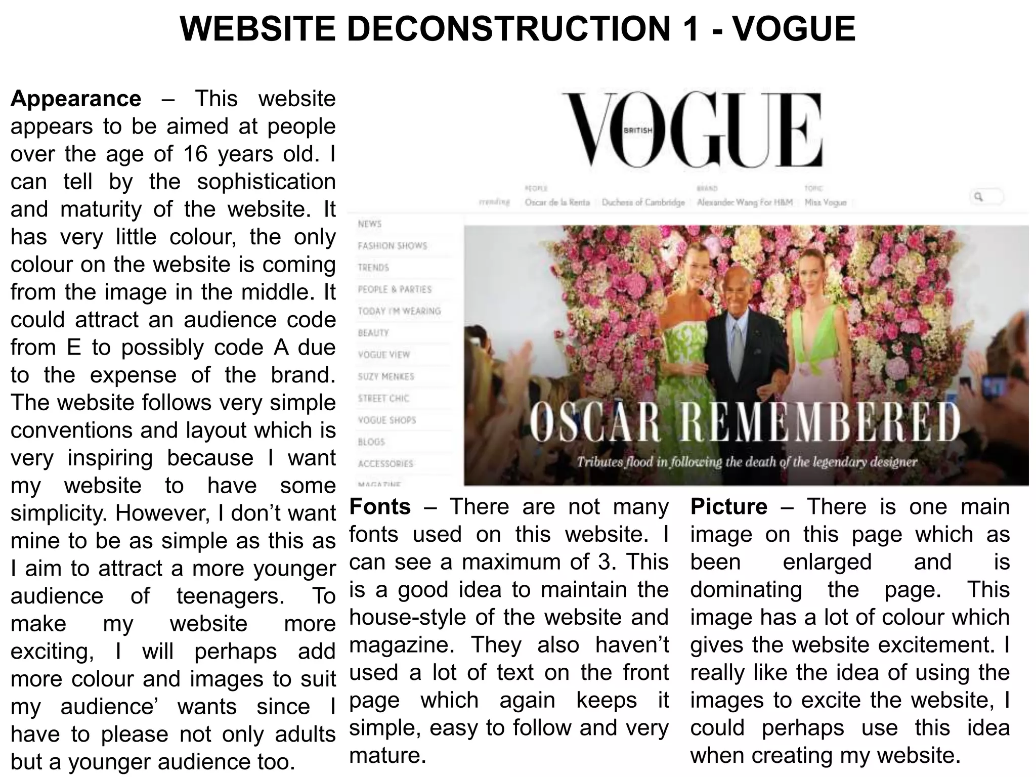
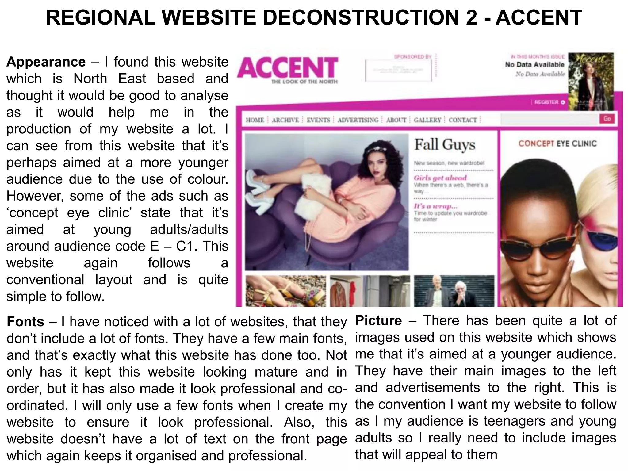
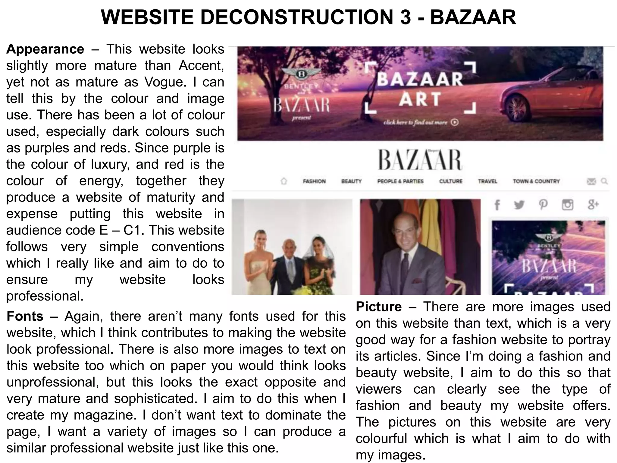
WEBSITE DECONSTRUCTION 1 - VOGUE 
Appearance – This website 
appears to be aimed at people 
over the age of 16 years old. I 
can tell by the sophistication 
and maturity of the website. It 
has very little colour, the only 
colour on the website is coming 
from the image in the middle. It 
could attract an audience code 
from E to possibly code A due 
to the expense of the brand. 
The website follows very simple 
conventions and layout which is 
very inspiring because I want 
my website to have some 
simplicity. However, I don’t want 
mine to be as simple as this as 
I aim to attract a more younger 
audience of teenagers. To 
make my website more 
exciting, I will perhaps add 
more colour and images to suit 
my audience’ wants since I 
have to please not only adults 
but a younger audience too. 
Fonts – There are not many 
fonts used on this website. I 
can see a maximum of 3. This 
is a good idea to maintain the 
house-style of the website and 
magazine. They also haven’t 
used a lot of text on the front 
page which again keeps it 
simple, easy to follow and very 
mature. 
Picture – There is one main 
image on this page which as 
been enlarged and is 
dominating the page. This 
image has a lot of colour which 
gives the website excitement. I 
really like the idea of using the 
images to excite the website, I 
could perhaps use this idea 
when creating my website.
REGIONAL WEBSITE DECONSTRUCTION 2 - ACCENT 
Appearance – I found this website 
which is North East based and 
thought it would be good to analyse 
as it would help me in the 
production of my website a lot. I 
can see from this website that it’s 
perhaps aimed at a more younger 
audience due to the use of colour. 
However, some of the ads such as 
‘concept eye clinic’ state that it’s 
aimed at young adults/adults 
around audience code E – C1. This 
website again follows a 
conventional layout and is quite 
simple to follow. 
Fonts – I have noticed with a lot of websites, that they 
don’t include a lot of fonts. They have a few main fonts, 
and that’s exactly what this website has done too. Not 
only has it kept this website looking mature and in 
order, but it has also made it look professional and co-ordinated. 
I will only use a few fonts when I create my 
website to ensure it look professional. Also, this 
website doesn’t have a lot of text on the front page 
which again keeps it organised and professional. 
Picture – There has been quite a lot of 
images used on this website which shows 
me that it’s aimed at a younger audience. 
They have their main images to the left 
and advertisements to the right. This is 
the convention I want my website to follow 
as I my audience is teenagers and young 
adults so I really need to include images 
that will appeal to them
WEBSITE DECONSTRUCTION 3 - BAZAAR 
Appearance – This website looks 
slightly more mature than Accent, 
yet not as mature as Vogue. I can 
tell this by the colour and image 
use. There has been a lot of colour 
used, especially dark colours such 
as purples and reds. Since purple is 
the colour of luxury, and red is the 
colour of energy, together they 
produce a website of maturity and 
expense putting this website in 
audience code E – C1. This website 
follows very simple conventions 
which I really like and aim to do to 
ensure my website looks 
professional. 
Fonts – Again, there aren’t many fonts used for this 
website, which I think contributes to making the website 
look professional. There is also more images to text on 
this website too which on paper you would think looks 
unprofessional, but this looks the exact opposite and 
very mature and sophisticated. I aim to do this when I 
create my magazine. I don’t want text to dominate the 
page, I want a variety of images so I can produce a 
similar professional website just like this one. 
Picture – There are more images used 
on this website than text, which is a very 
good way for a fashion website to portray 
its articles. Since I’m doing a fashion and 
beauty website, I aim to do this so that 
viewers can clearly see the type of 
fashion and beauty my website offers. 
The pictures on this website are very 
colourful which is what I aim to do with 
my images.

Website deconstructions

  • 1.
    WEBSITE DECONSTRUCTION 1- VOGUE Appearance – This website appears to be aimed at people over the age of 16 years old. I can tell by the sophistication and maturity of the website. It has very little colour, the only colour on the website is coming from the image in the middle. It could attract an audience code from E to possibly code A due to the expense of the brand. The website follows very simple conventions and layout which is very inspiring because I want my website to have some simplicity. However, I don’t want mine to be as simple as this as I aim to attract a more younger audience of teenagers. To make my website more exciting, I will perhaps add more colour and images to suit my audience’ wants since I have to please not only adults but a younger audience too. Fonts – There are not many fonts used on this website. I can see a maximum of 3. This is a good idea to maintain the house-style of the website and magazine. They also haven’t used a lot of text on the front page which again keeps it simple, easy to follow and very mature. Picture – There is one main image on this page which as been enlarged and is dominating the page. This image has a lot of colour which gives the website excitement. I really like the idea of using the images to excite the website, I could perhaps use this idea when creating my website.
  • 2.
    REGIONAL WEBSITE DECONSTRUCTION2 - ACCENT Appearance – I found this website which is North East based and thought it would be good to analyse as it would help me in the production of my website a lot. I can see from this website that it’s perhaps aimed at a more younger audience due to the use of colour. However, some of the ads such as ‘concept eye clinic’ state that it’s aimed at young adults/adults around audience code E – C1. This website again follows a conventional layout and is quite simple to follow. Fonts – I have noticed with a lot of websites, that they don’t include a lot of fonts. They have a few main fonts, and that’s exactly what this website has done too. Not only has it kept this website looking mature and in order, but it has also made it look professional and co-ordinated. I will only use a few fonts when I create my website to ensure it look professional. Also, this website doesn’t have a lot of text on the front page which again keeps it organised and professional. Picture – There has been quite a lot of images used on this website which shows me that it’s aimed at a younger audience. They have their main images to the left and advertisements to the right. This is the convention I want my website to follow as I my audience is teenagers and young adults so I really need to include images that will appeal to them
  • 3.
    WEBSITE DECONSTRUCTION 3- BAZAAR Appearance – This website looks slightly more mature than Accent, yet not as mature as Vogue. I can tell this by the colour and image use. There has been a lot of colour used, especially dark colours such as purples and reds. Since purple is the colour of luxury, and red is the colour of energy, together they produce a website of maturity and expense putting this website in audience code E – C1. This website follows very simple conventions which I really like and aim to do to ensure my website looks professional. Fonts – Again, there aren’t many fonts used for this website, which I think contributes to making the website look professional. There is also more images to text on this website too which on paper you would think looks unprofessional, but this looks the exact opposite and very mature and sophisticated. I aim to do this when I create my magazine. I don’t want text to dominate the page, I want a variety of images so I can produce a similar professional website just like this one. Picture – There are more images used on this website than text, which is a very good way for a fashion website to portray its articles. Since I’m doing a fashion and beauty website, I aim to do this so that viewers can clearly see the type of fashion and beauty my website offers. The pictures on this website are very colourful which is what I aim to do with my images.