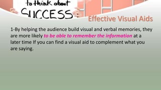
Visual Aids
Chapter 9
LEARNING OBJECTIVES
• After reading this chapter, you should be able to:
• • Identify when and how visual aids will enhance a
presentation
• • Identify the different types of visual aids
• • Identify effective and ineffective use of visual aids
• • Identify best practices to incorporating visual aids
in a presentation
Introduction
• A visual image is a simple thing, a picture that enters the
eyes. ~ Roy H. Williams
• You Learning how to create effective visuals that resonate
with your audience is important for a quality presentation
• Understanding basic principles of how visual information is
processed alone and in combination with audio information
can make or break your visuals’ effectiveness and impact
Definition
• Visual Media can be a very powerful tool to enhance
the impact of your presentations. Words and images
presented in different formats can appeal directly to
your audience's imagination, adding power to your
spoken words.
Effective Visual Aids
1-By helping the audience build visual and verbal memories, they
are more likely to be able to remember the information at a
later time If you can find a visual aid to complement what you
are saying.
2-help your audience understand the information you
are presenting and remember your message.
3-Visuals should be used to make concepts easier to
understand and to reinforce your message.
Question to you
If we are talking about the danger of global warming
what the image we can use ?
May be that,,,,,what can you understand ?
Types of Visual Aids
• Types of Visual Media:
• 1. Posters:
• 2. Charts
• 3. Photos
• 4. Bulletin Board
• 5. Power Point Slides
• 6. Graphs
The strategy used for each type
• 1. Posters:
This guide presents a strategy for producing poster
presentations that encourages clarity as well as creativity
Used by -------Many seminar or workshops organizers supply
guidelines suggesting suitable typeface styles and sizes, along
with conventions for titles and subheadings. Use these to guide
your basic poster design
The strategy used for each type
• 2. charts :A chart is a graphical representation of data,
in which "the data is represented by symbols, such as
bars in a bar chart, lines in a line chart, or slices in a pie
chart".
• Used by :
• A chart can represent tabular numeric data, functions or
some kinds of qualitative structure and provides
different info
The strategy used for each type
• If you want to choose the most suitable chart type,
generally, you should consider the total number of
variables, data points, and the time period of your
data.
The strategy used for each type
• 3. photos :
• What you can conclude
• From each photo →
• 4. Bulletin Board
is a surface intended for the posting of public messages, for
example, to advertise items wanted or for sale, announce events,
or provide information.
Used to :
to facilitate addition and removal of messages, as well as a
writing surface such as blackboard or whiteboard. A bulletin
board which combines a pin board (corkboard) and writing
surface is known as a combination
bulletin board.
• 4.A PowerPoint presentation is a presentation
created using Microsoft PowerPoint software.
• The presentation is a collection of individual
slides that contain information on a topic.
PowerPoint
• Used by
• presentations are commonly used in business
meetings and for training and educational
purposes.
• 5-. Graphs: A graph is a flow structure
that represents the relationship between
various objects
Types of graphs
• Bar graph
• is a way to visually represent qualitative
data. information is displayed either
horizontally or vertically and allows
viewers to compare items.
Types of graphs
• A histogram is a type of graph that has
wide applications in statistics.
• Histograms provide a visual
interpretation of numerical data by
indicating the number of data points that
lie within a range of values.
• Time Series Grapes
• To construct a time series graph, you must look at both
pieces of the paired data set. Start with a standard
Cartesian coordinate system
Guideline for successful presentation
• Keep it simple. It is easier for the audience if
you use three
simple visuals than a single complex one.
• • Keep your audience in mind when designing
your visual aids.
What terminology will they understand? What
examples have
meaning for them?
• • Proofread very carefully.
• Try to have someone else proof in
addition to yourself. It is hard to overlook
errors when they are magnified in front
of an audience. Remember, even a small
error in such a focal part of your program
can undermine the credibility of your
entire presentation.
• Fonts should be clear and easy to read.
Use Helvetica or similar sans serif fonts.
• Colored fonts should have a dark
background (dark blue is best) with
primary titles in either yellow or white
and secondary titles in the remaining
color.
How do you decide?
• It depends on:
• Your content
• Your audience
• The requirements of your boss/teacher
• Your genre
• The resources available
• How you want to be viewed/ judged
Top 3 Things to Avoid
• Too much text, including outlining/bullet points – it’s
a sign that the slide is doing the work FOR you.
• Relying on the screen (or reading directly off of it
instead of speaking to the crowd)
• Distracting, flashing, or illegible designs
Now…….what you see wrong ??
Thankss
• Any questions ??

visaul aid.pptx

  • 1.
  • 2.
    LEARNING OBJECTIVES • Afterreading this chapter, you should be able to: • • Identify when and how visual aids will enhance a presentation • • Identify the different types of visual aids • • Identify effective and ineffective use of visual aids • • Identify best practices to incorporating visual aids in a presentation
  • 3.
    Introduction • A visualimage is a simple thing, a picture that enters the eyes. ~ Roy H. Williams • You Learning how to create effective visuals that resonate with your audience is important for a quality presentation • Understanding basic principles of how visual information is processed alone and in combination with audio information can make or break your visuals’ effectiveness and impact
  • 4.
    Definition • Visual Mediacan be a very powerful tool to enhance the impact of your presentations. Words and images presented in different formats can appeal directly to your audience's imagination, adding power to your spoken words.
  • 5.
    Effective Visual Aids 1-Byhelping the audience build visual and verbal memories, they are more likely to be able to remember the information at a later time If you can find a visual aid to complement what you are saying.
  • 6.
    2-help your audienceunderstand the information you are presenting and remember your message. 3-Visuals should be used to make concepts easier to understand and to reinforce your message.
  • 7.
    Question to you Ifwe are talking about the danger of global warming what the image we can use ?
  • 8.
    May be that,,,,,whatcan you understand ?
  • 9.
    Types of VisualAids • Types of Visual Media: • 1. Posters: • 2. Charts • 3. Photos • 4. Bulletin Board • 5. Power Point Slides • 6. Graphs
  • 11.
    The strategy usedfor each type • 1. Posters: This guide presents a strategy for producing poster presentations that encourages clarity as well as creativity Used by -------Many seminar or workshops organizers supply guidelines suggesting suitable typeface styles and sizes, along with conventions for titles and subheadings. Use these to guide your basic poster design
  • 13.
    The strategy usedfor each type • 2. charts :A chart is a graphical representation of data, in which "the data is represented by symbols, such as bars in a bar chart, lines in a line chart, or slices in a pie chart". • Used by : • A chart can represent tabular numeric data, functions or some kinds of qualitative structure and provides different info
  • 14.
    The strategy usedfor each type • If you want to choose the most suitable chart type, generally, you should consider the total number of variables, data points, and the time period of your data.
  • 15.
    The strategy usedfor each type • 3. photos : • What you can conclude • From each photo →
  • 16.
    • 4. BulletinBoard is a surface intended for the posting of public messages, for example, to advertise items wanted or for sale, announce events, or provide information. Used to : to facilitate addition and removal of messages, as well as a writing surface such as blackboard or whiteboard. A bulletin board which combines a pin board (corkboard) and writing surface is known as a combination bulletin board.
  • 18.
    • 4.A PowerPointpresentation is a presentation created using Microsoft PowerPoint software. • The presentation is a collection of individual slides that contain information on a topic. PowerPoint • Used by • presentations are commonly used in business meetings and for training and educational purposes.
  • 19.
    • 5-. Graphs:A graph is a flow structure that represents the relationship between various objects
  • 20.
    Types of graphs •Bar graph • is a way to visually represent qualitative data. information is displayed either horizontally or vertically and allows viewers to compare items.
  • 22.
    Types of graphs •A histogram is a type of graph that has wide applications in statistics. • Histograms provide a visual interpretation of numerical data by indicating the number of data points that lie within a range of values.
  • 24.
    • Time SeriesGrapes • To construct a time series graph, you must look at both pieces of the paired data set. Start with a standard Cartesian coordinate system
  • 25.
    Guideline for successfulpresentation • Keep it simple. It is easier for the audience if you use three simple visuals than a single complex one. • • Keep your audience in mind when designing your visual aids. What terminology will they understand? What examples have meaning for them?
  • 26.
    • • Proofreadvery carefully. • Try to have someone else proof in addition to yourself. It is hard to overlook errors when they are magnified in front of an audience. Remember, even a small error in such a focal part of your program can undermine the credibility of your entire presentation.
  • 27.
    • Fonts shouldbe clear and easy to read. Use Helvetica or similar sans serif fonts. • Colored fonts should have a dark background (dark blue is best) with primary titles in either yellow or white and secondary titles in the remaining color.
  • 28.
    How do youdecide? • It depends on: • Your content • Your audience • The requirements of your boss/teacher • Your genre • The resources available • How you want to be viewed/ judged
  • 29.
    Top 3 Thingsto Avoid • Too much text, including outlining/bullet points – it’s a sign that the slide is doing the work FOR you. • Relying on the screen (or reading directly off of it instead of speaking to the crowd) • Distracting, flashing, or illegible designs
  • 30.
  • 33.