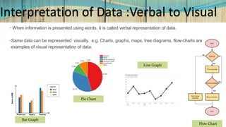
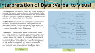
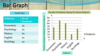
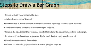
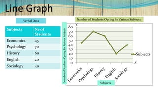
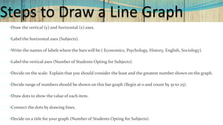
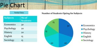
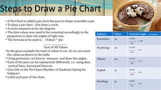
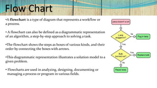
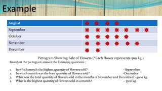
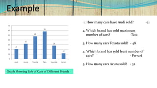
Interpretation of Data :
Verbal to Visual
Gokhale Education Society’s
S.M.R.K. B.K. A.K Mahila Mahavidyalaya, Nasik-5.
CC English (HL)
S.Y.B.Com. Sem III
Unit 1
Ms.Geetanjali Gitay
Assistant Professor
Dept. of English
Interpretation of Data :Verbal to Visual
• When information is presented using words, it is called verbal representation of data.
•Same data can be represented visually. e.g. Charts, graphs, maps, tree diagrams, flow-charts are
examples of visual representation of data.
Bar Graph
Pie Chart
Line Graph
Flow Chart
Interpretation of Data :Verbal to Visual
The Vasanta is the first season of the year and roughly corresponds
to spring. The season, however , does not fully coincide with the the
English months of March and April as it extends over the period mid-
February to mid-April. The Vasanta is replaced by Grishma(Summer)
occurring during the months of April , May ,June.
The Sharada Ritu occurs in Asvina-Kartika (mid-September to mid-
November). However, there is no clear distinction between the
Sharada and following Hemanta (Margasirsa- Pausa) except that
the cold weather is rigorous during the latter. The Sharada is clearly
a transition between the Varsha and Hemanta.
The Hemanta is followed by the Shishir in Jyeshtha and Ashad
(mid- April to Mid-June). The Varsha Ritu or the rainy season of the
Indian tradition extends over Sravana- Bhadrapada (July- august).
The rainy season may, however set in by middle of June and May
anf continue upto middle of September with marginal variations and
occurs in Magha and Phalgun (January –February). During Shishir,
the cold weather graduallyGives way to spring (vasanta) itself
transitional to summer (Grishma).It is interesting to note that this
view of seasons holds good in north and central parts of India.
Verbal
Visual
Bar Graph
0
10
20
30
40
50
60
70
80
Subjects
Subjects No of
Students
Economics 45
Psychology 70
History 60
English 20
Sociology 40
x
y
Number of Students Opting for Various SubjectsVerbal Data
NumberofStudentsOptingforVariousSubjects
Subjects
Steps to Draw a Bar Graph
•Draw the vertical (y) and horizontal (x) axes.
•Label the horizontal axes (Subjects).
•Write the names of labels where the bars will be ( Economics, Psychology, History, English, Sociology).
•Label the vertical axes (Number of Students Opting for Subjects).
•Decide on the scale. Explain that you should consider the least and the greatest number shown on the graph.
•Decide range of numbers should be shown on this bar graph (Begin at 0 and count by 5s to 25).
•Draw a bar to show the value for each item.
•Decide on a title for your graph (Number of Students Opting for Subjects).
Line Graph
0
10
20
30
40
50
60
70
80
Subjects
Subjects
Verbal Data
Subjects No of
Students
Economics 45
Psychology 70
History 60
English 20
Sociology 40
Number of Students Opting for Various Subjects
y
xNumberofStudentsOptingforVariousSubjects
Steps to Draw a Line Graph
•Draw the vertical (y) and horizontal (x) axes.
•Label the horizontal axes (Subjects).
•Write the names of labels where the bars will be ( Economics, Psychology, History, English, Sociology).
•Label the vertical axes (Number of Students Opting for Subjects).
•Decide on the scale. Explain that you should consider the least and the greatest number shown on the graph.
•Decide range of numbers should be shown on this bar graph (Begin at 0 and count by 5s to 25).
•Draw dots to show the value of each item.
•Connect the dots by drawing lines.
•Decide on a title for your graph (Number of Students Opting for Subjects).
Pie Chart
30
2020
15
15
Number of Students Opting for Subjects
Economics
Psychology
History
English
Sociology
Verbal Data
Subjects No of
Students
Economics 30
Psychology 20
History 20
English 15
Sociology 15
Steps to Draw a Pie Chart
• A Pie Chart is called a pie chart because its shape resembles a pie.
• To draw a pie chart , first draw a circle.
• A circle measures to be 360 degrees.
• The data values now need to be converted accordingly in the
proportion to draw the angles of right size.
• The formula to be used is : (Value) * 360
_______________
Sum of All Values
•In the given example the total of values is 100. So we can count
the values as shown in the table.
• Using protractor, we have to measure and draw the angles.
• Each of the part can be represented differently .i.e. using dots,
vertical lines, horizontal lines etc.
• Give title to the Pie Chart.(Number of Students Opting for
Subjects)
• Label each part of the chart.
Subject Value Central Angle (in Degrees)
Economics 30 30*360
_______ = 108
100
Psychology 20 20*360
_______ = 72
100
History 20 20*360
_______ = 72
100
English 15 15*360
_______ = 54
100
Sociology 15 15*360
_______ = 54
100
Flow Chart
•A flowchart is a type of diagram that represents a workflow or
a process.
• A flowchart can also be defined as a diagrammatic representation
of an algorithm, a step-by-step approach to solving a task.
•The flowchart shows the steps as boxes of various kinds, and their
order by connecting the boxes with arrows.
•This diagrammatic representation illustrates a solution model to a
given problem.
• Flowcharts are used in analyzing, designing, documenting or
managing a process or program in various fields.
Interpretation of Data : Visual to Verbal
•When information is presented using words, it is called verbal representation of data.
•Same data can be represented visually. e.g. Charts, graphs, maps, tree diagrams, flow-charts are examples
of visual representation of data.
•After looking at the visual representations of data one can interpret it verbally.
•One can write a note or a paragraph based on a graph, chart or diagram or answer
questions based on it.
• This is called verbal interpretation of visual data.
Example
August
September
October
November
December
Pictogram Showing Sale of Flowers (*Each flower represents 500 kg.)
Based on the pictogram answer the following questions :
1. In which month the highest quantity of flowers sold? - September
2. In which month was the least quantity of flowers sold? -December
3. What was the total quantity of flowers sold in the months of November and December? -4000 kg.
4. What is the highest quantity of flowers sold in a month? – 3500 kg.
Example
Graph Showing Sale of Cars of Different Brands
1. How many cars have Audi sold? -21
2. Which brand has sold maximum
number of cars? -Tata
3. How many cars Toyota sold? - 48
4. Which brand has sold least number of
cars? - Ferrari
5. How many cars Acura sold? - 32
Conclusion
In this presentation, we discussed :
• Interpretation of Data : from Verbal to Visual and Visual to Verbal
• Verbal to Visual interpretation of Data
1. Tree Diagram
2. Bar Graph
3. Line Graph
4. Pie Chart
5. Flow Chart
Unit.1.2.interpretation of data . verbal to visual

Unit.1.2.interpretation of data . verbal to visual

  • 1.
    Interpretation of Data: Verbal to Visual Gokhale Education Society’s S.M.R.K. B.K. A.K Mahila Mahavidyalaya, Nasik-5. CC English (HL) S.Y.B.Com. Sem III Unit 1 Ms.Geetanjali Gitay Assistant Professor Dept. of English
  • 2.
    Interpretation of Data:Verbal to Visual • When information is presented using words, it is called verbal representation of data. •Same data can be represented visually. e.g. Charts, graphs, maps, tree diagrams, flow-charts are examples of visual representation of data. Bar Graph Pie Chart Line Graph Flow Chart
  • 3.
    Interpretation of Data:Verbal to Visual The Vasanta is the first season of the year and roughly corresponds to spring. The season, however , does not fully coincide with the the English months of March and April as it extends over the period mid- February to mid-April. The Vasanta is replaced by Grishma(Summer) occurring during the months of April , May ,June. The Sharada Ritu occurs in Asvina-Kartika (mid-September to mid- November). However, there is no clear distinction between the Sharada and following Hemanta (Margasirsa- Pausa) except that the cold weather is rigorous during the latter. The Sharada is clearly a transition between the Varsha and Hemanta. The Hemanta is followed by the Shishir in Jyeshtha and Ashad (mid- April to Mid-June). The Varsha Ritu or the rainy season of the Indian tradition extends over Sravana- Bhadrapada (July- august). The rainy season may, however set in by middle of June and May anf continue upto middle of September with marginal variations and occurs in Magha and Phalgun (January –February). During Shishir, the cold weather graduallyGives way to spring (vasanta) itself transitional to summer (Grishma).It is interesting to note that this view of seasons holds good in north and central parts of India. Verbal Visual
  • 4.
    Bar Graph 0 10 20 30 40 50 60 70 80 Subjects Subjects Noof Students Economics 45 Psychology 70 History 60 English 20 Sociology 40 x y Number of Students Opting for Various SubjectsVerbal Data NumberofStudentsOptingforVariousSubjects Subjects
  • 5.
    Steps to Drawa Bar Graph •Draw the vertical (y) and horizontal (x) axes. •Label the horizontal axes (Subjects). •Write the names of labels where the bars will be ( Economics, Psychology, History, English, Sociology). •Label the vertical axes (Number of Students Opting for Subjects). •Decide on the scale. Explain that you should consider the least and the greatest number shown on the graph. •Decide range of numbers should be shown on this bar graph (Begin at 0 and count by 5s to 25). •Draw a bar to show the value for each item. •Decide on a title for your graph (Number of Students Opting for Subjects).
  • 6.
    Line Graph 0 10 20 30 40 50 60 70 80 Subjects Subjects Verbal Data SubjectsNo of Students Economics 45 Psychology 70 History 60 English 20 Sociology 40 Number of Students Opting for Various Subjects y xNumberofStudentsOptingforVariousSubjects
  • 7.
    Steps to Drawa Line Graph •Draw the vertical (y) and horizontal (x) axes. •Label the horizontal axes (Subjects). •Write the names of labels where the bars will be ( Economics, Psychology, History, English, Sociology). •Label the vertical axes (Number of Students Opting for Subjects). •Decide on the scale. Explain that you should consider the least and the greatest number shown on the graph. •Decide range of numbers should be shown on this bar graph (Begin at 0 and count by 5s to 25). •Draw dots to show the value of each item. •Connect the dots by drawing lines. •Decide on a title for your graph (Number of Students Opting for Subjects).
  • 8.
    Pie Chart 30 2020 15 15 Number ofStudents Opting for Subjects Economics Psychology History English Sociology Verbal Data Subjects No of Students Economics 30 Psychology 20 History 20 English 15 Sociology 15
  • 9.
    Steps to Drawa Pie Chart • A Pie Chart is called a pie chart because its shape resembles a pie. • To draw a pie chart , first draw a circle. • A circle measures to be 360 degrees. • The data values now need to be converted accordingly in the proportion to draw the angles of right size. • The formula to be used is : (Value) * 360 _______________ Sum of All Values •In the given example the total of values is 100. So we can count the values as shown in the table. • Using protractor, we have to measure and draw the angles. • Each of the part can be represented differently .i.e. using dots, vertical lines, horizontal lines etc. • Give title to the Pie Chart.(Number of Students Opting for Subjects) • Label each part of the chart. Subject Value Central Angle (in Degrees) Economics 30 30*360 _______ = 108 100 Psychology 20 20*360 _______ = 72 100 History 20 20*360 _______ = 72 100 English 15 15*360 _______ = 54 100 Sociology 15 15*360 _______ = 54 100
  • 10.
    Flow Chart •A flowchartis a type of diagram that represents a workflow or a process. • A flowchart can also be defined as a diagrammatic representation of an algorithm, a step-by-step approach to solving a task. •The flowchart shows the steps as boxes of various kinds, and their order by connecting the boxes with arrows. •This diagrammatic representation illustrates a solution model to a given problem. • Flowcharts are used in analyzing, designing, documenting or managing a process or program in various fields.
  • 11.
    Interpretation of Data: Visual to Verbal •When information is presented using words, it is called verbal representation of data. •Same data can be represented visually. e.g. Charts, graphs, maps, tree diagrams, flow-charts are examples of visual representation of data. •After looking at the visual representations of data one can interpret it verbally. •One can write a note or a paragraph based on a graph, chart or diagram or answer questions based on it. • This is called verbal interpretation of visual data.
  • 12.
    Example August September October November December Pictogram Showing Saleof Flowers (*Each flower represents 500 kg.) Based on the pictogram answer the following questions : 1. In which month the highest quantity of flowers sold? - September 2. In which month was the least quantity of flowers sold? -December 3. What was the total quantity of flowers sold in the months of November and December? -4000 kg. 4. What is the highest quantity of flowers sold in a month? – 3500 kg.
  • 13.
    Example Graph Showing Saleof Cars of Different Brands 1. How many cars have Audi sold? -21 2. Which brand has sold maximum number of cars? -Tata 3. How many cars Toyota sold? - 48 4. Which brand has sold least number of cars? - Ferrari 5. How many cars Acura sold? - 32
  • 14.
    Conclusion In this presentation,we discussed : • Interpretation of Data : from Verbal to Visual and Visual to Verbal • Verbal to Visual interpretation of Data 1. Tree Diagram 2. Bar Graph 3. Line Graph 4. Pie Chart 5. Flow Chart