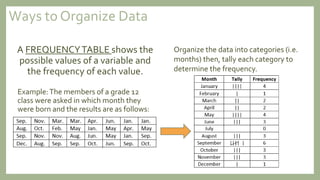
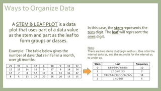
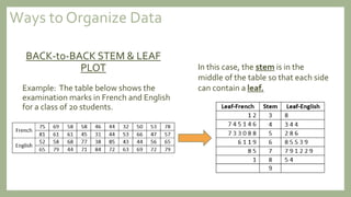
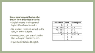
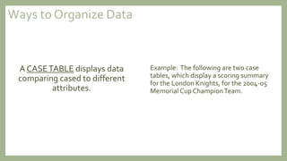
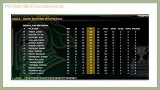
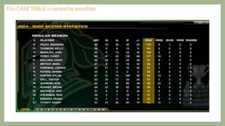
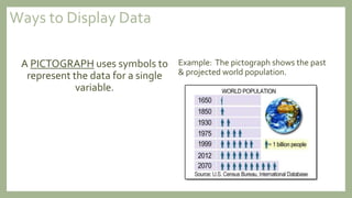
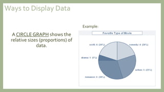
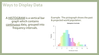
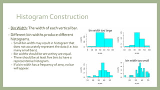
DATA ANALYSISWITH GRAPHS
In order to draw conclusions, information must be gathered,
organized, and displayed clearly.When information is gathered
from all people in a population it is called a census.
For example, Statistics Canada takes a census of the population
every 5 years.The most recent census was conducted on May 10,
2011 (previously May 16, 2006, May 15, 2001 and May 21, 1996).
A poll is a method of collecting data from a sample of a
population by asking people to give their answers to a set
of questions. Once collected, the data are then organized
in a meaningful way so that conclusion can be made.
Ways to Organize Data
A FREQUENCYTABLE shows the
possible values of a variable and
the frequency of each value.
Example:The members of a grade 12
class were asked in which month they
were born and the results are as follows:
Organize the data into categories (i.e.
months) then, tally each category to
determine the frequency.
A STEM & LEAF PLOT is a data
plot that uses part of a data value
as the stem and part as the leaf to
form groups or classes.
Example: The table below gives the
number of days that rain fell in a month,
over 36 months:
In this case, the stem represents the
tens digit.The leaf will represent the
ones digit.
Note:
There are two stems that begin with a 1. One is for the
interval 10 to 15, and the second is for the interval 15
to under 20.
Ways to Organize Data
BACK-to-BACK STEM & LEAF
PLOT
Example: The table below shows the
examination marks in French and English
for a class of 20 students.
In this case, the stem is in the
middle of the table so that each side
can contain a leaf.
Ways to Organize Data
Some conclusions that can be
drawn from this data include:
• English marks are in general
higher than French marks.
• No student received a mark in the
90’s, in either subject.
• More students got a mark in the
80’s in English that in French.
• Four students failed English.
A CASETABLE displays data
comparing cased to different
attributes.
Example: The following are two case
tables, which display a scoring summary
for the London Knights, for the 2004-05
Memorial CupChampionTeam.
Ways to Organize Data
Ways to organize Data
This CASETABLE is sorted by points.
Ways to organize Data
This CASETABLE is sorted by penalties.
A BAR GRAPH displays the
relationship among a set of
numerical values using bars.
Example: The bar graph shown shows
the birth months of when grade 12
students were born
(see previous example for frequency chart).
The numerical scale should start at 0 and
accommodate the magnitude of the
numbers involved. Bar graphs are used
for comparing the values of several
categories of a variable (i.e. months)
Note:
Vertical bars are generally used when time is the
independent variable, while horizontal bars are used
when time is not a factor.
0
1
2
3
4
5
6
7
Frequency
Month
BIRTH MONTH BAR GRAPH
Ways to Display Data
A PICTOGRAPH uses symbols to
represent the data for a single
variable.
Example: The pictograph shows the past
& projected world population.
Ways to Display Data
A CIRCLE GRAPH shows the
relative sizes (proportions) of
data.
Example:
Ways to Display Data
A HISTOGRAM is a vertical bar
graph which contains
continuous data, grouped into
frequency intervals.
Example: The pictograph shows the past
& projected world population.
Ways to Display Data
Histogram Construction
• BinWidth:The width of each vertical bar.
• Different bin widths produce different
histograms.
• Small bin width may result in histogram that
does not accurately represent the data (i.e. too
many small bars).
• Bin widths should be set so they are equal.
• There should be at least five bins to have a
representative histogram.
• If a bin width has a frequency of zero, no bar
will appear.
bin width too large
bin width too small

Lesson 1 data analysis with graphs

  • 1.
  • 2.
    In order todraw conclusions, information must be gathered, organized, and displayed clearly.When information is gathered from all people in a population it is called a census. For example, Statistics Canada takes a census of the population every 5 years.The most recent census was conducted on May 10, 2011 (previously May 16, 2006, May 15, 2001 and May 21, 1996).
  • 3.
    A poll isa method of collecting data from a sample of a population by asking people to give their answers to a set of questions. Once collected, the data are then organized in a meaningful way so that conclusion can be made.
  • 4.
    Ways to OrganizeData A FREQUENCYTABLE shows the possible values of a variable and the frequency of each value. Example:The members of a grade 12 class were asked in which month they were born and the results are as follows: Organize the data into categories (i.e. months) then, tally each category to determine the frequency.
  • 5.
    A STEM &LEAF PLOT is a data plot that uses part of a data value as the stem and part as the leaf to form groups or classes. Example: The table below gives the number of days that rain fell in a month, over 36 months: In this case, the stem represents the tens digit.The leaf will represent the ones digit. Note: There are two stems that begin with a 1. One is for the interval 10 to 15, and the second is for the interval 15 to under 20. Ways to Organize Data
  • 6.
    BACK-to-BACK STEM &LEAF PLOT Example: The table below shows the examination marks in French and English for a class of 20 students. In this case, the stem is in the middle of the table so that each side can contain a leaf. Ways to Organize Data
  • 7.
    Some conclusions thatcan be drawn from this data include: • English marks are in general higher than French marks. • No student received a mark in the 90’s, in either subject. • More students got a mark in the 80’s in English that in French. • Four students failed English.
  • 8.
    A CASETABLE displaysdata comparing cased to different attributes. Example: The following are two case tables, which display a scoring summary for the London Knights, for the 2004-05 Memorial CupChampionTeam. Ways to Organize Data
  • 9.
    Ways to organizeData This CASETABLE is sorted by points.
  • 10.
    Ways to organizeData This CASETABLE is sorted by penalties.
  • 11.
    A BAR GRAPHdisplays the relationship among a set of numerical values using bars. Example: The bar graph shown shows the birth months of when grade 12 students were born (see previous example for frequency chart). The numerical scale should start at 0 and accommodate the magnitude of the numbers involved. Bar graphs are used for comparing the values of several categories of a variable (i.e. months) Note: Vertical bars are generally used when time is the independent variable, while horizontal bars are used when time is not a factor. 0 1 2 3 4 5 6 7 Frequency Month BIRTH MONTH BAR GRAPH Ways to Display Data
  • 12.
    A PICTOGRAPH usessymbols to represent the data for a single variable. Example: The pictograph shows the past & projected world population. Ways to Display Data
  • 13.
    A CIRCLE GRAPHshows the relative sizes (proportions) of data. Example: Ways to Display Data
  • 14.
    A HISTOGRAM isa vertical bar graph which contains continuous data, grouped into frequency intervals. Example: The pictograph shows the past & projected world population. Ways to Display Data
  • 15.
    Histogram Construction • BinWidth:Thewidth of each vertical bar. • Different bin widths produce different histograms. • Small bin width may result in histogram that does not accurately represent the data (i.e. too many small bars). • Bin widths should be set so they are equal. • There should be at least five bins to have a representative histogram. • If a bin width has a frequency of zero, no bar will appear. bin width too large bin width too small