PRODUCTION LOG


  CONTENTS PAGE
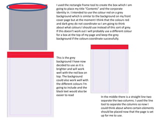
I used the rectangle frame tool to create the box which I am
going to place my title “Contents” and the corporate
identity in. I intended to use the colour red on a grey
background which is similar to the background on my front
cover page but at the moment I think that the colours red
and dark grey do not coordinate so I am going to think
about what colours I should use instead of this sort of grey.
If this doesn’t work out I will probably use a different colour
for a box at the top of my page and keep the grey
background if the colours coordinate successfully.


This is the grey
background I have now
decided to use as it is
brighter and will work
well with the red box on
top. The background
could also work well with
the different colours I'm
going to include and the
black text would also be
easier to read
                                     In the middle there is a straight line two
                                     separate the two columns. I used the line
                                     tool to separate the columns so now I
                                     could think about where certain elements
                                     should be placed now that the page is set
                                     up for me to use.
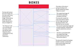
BOXES
                                 The colour of this box is
                                 going to be black and
                                 would marked the words
                                 “What’s to come”
This box will contain
the main image and                 The supporting image of
the main cover story               the D.O.N.S would be
would sit on the                   included in this box
image. A folio will be           This box will include the
quite large so the               cover story which relates
reader would find it             to the image containing
easy to navigate to.             the group D.O.N.S. The
                                 folio will also be included
The “features” will               The second supporting image will
sit in this box and               include the group “cheetah girls”
the colour of this                and this would also contain a
box will be red to                folio
keep the colour
                                  This box is associated with
coordination of red,
                                  the supporting image
grey black
                                  above and the story and
continuous
                                  folio will be filled in.

                                 This box will include the heading
                                 marked “reviews” and the box
                                 colour will be black with text
                                 colour being white
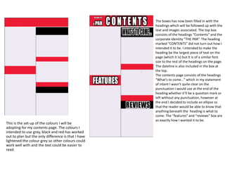
The boxes has now been filled in with the
                                                     headings which will be followed up with the
                                                     text and images associated. The top box
                                                     consists of the headings “Contents” and the
                                                     corporate identity “THE PAR”. The heading
                                                     marked “CONTENTS” did not turn out how I
                                                     intended it to be. I intended to make the
                                                     heading be the largest piece of text on the
                                                     page (which it is) but It is of a similar font
                                                     size to the rest of the headings on the page.
                                                     The dateline is also included in the box at
                                                     the top.
                                                     The contents page consists of the headings
                                                     “What’s to come…” which in my statement
                                                     of intent I wasn’t quite clear on the
                                                     punctuation I would use at the end of the
                                                     heading whether it’ll be a question mark or
                                                     left without any punctuation, however at
                                                     the end I decided to include an ellipse so
                                                     that the reader would be able to know that
                                                     anything beneath the heading is what to
                                                     come. The “features” and “reviews” box are
                                                     as exactly how I wanted it to be.
This is the set-up of the colours I will be
adopting for my contents page. The colours I
intended to use grey, black and red has worked
out to plan but the only difference is that I have
lightened the colour grey so other colours could
work well with and the text could be easier to
read.
FONT TYPE
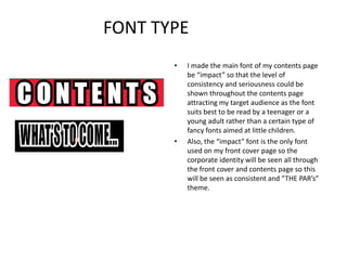
       •   I made the main font of my contents page
           be “impact” so that the level of
           consistency and seriousness could be
           shown throughout the contents page
           attracting my target audience as the font
           suits best to be read by a teenager or a
           young adult rather than a certain type of
           fancy fonts aimed at little children.
       •   Also, the “impact” font is the only font
           used on my front cover page so the
           corporate identity will be seen all through
           the front cover and contents page so this
           will be seen as consistent and “THE PAR’s”
           theme.
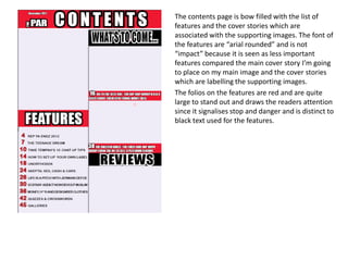
The contents page is bow filled with the list of
features and the cover stories which are
associated with the supporting images. The font of
the features are “arial rounded” and is not
“impact” because it is seen as less important
features compared the main cover story I’m going
to place on my main image and the cover stories
which are labelling the supporting images.
The folios on the features are red and are quite
large to stand out and draws the readers attention
since it signalises stop and danger and is distinct to
black text used for the features.
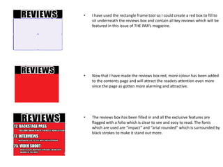
•   I have used the rectangle frame tool so I could create a red box to fill to
    sit underneath the reviews box and contain all key reviews which will be
    featured in this issue of THE PAR’s magazine.


•   Now that I have made the reviews box red, more colour has been added
    to the contents page and will attract the readers attention even more
    since the page as gotten more alarming and attractive.


•   The reviews box has been filled in and all the exclusive features are
    flagged with a folio which is clear to see and easy to read. The fonts
    which are used are “impact” and “arial rounded” which is surrounded by
    black strokes to make it stand out more.
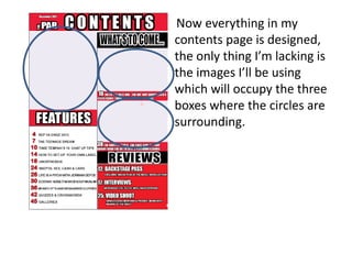
Now everything in my
contents page is designed,
the only thing I’m lacking is
the images I’ll be using
which will occupy the three
boxes where the circles are
surrounding.
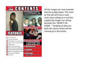
All the images are now inserted
into the empty boxes. The main
on the left will have a main
cover story sitting on it and the
supporting images are sitting
beneath the “WHAT’S TO
COME…” heading so they are
both the stories which will be
coming up in the article.
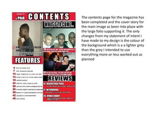
The contents page for the magazine has
been completed and the cover story for
the main image as been into place with
the large folio supporting it. The only
changes from my statement of intent I
have made to my design is the colour of
the background which is a a lighter grey
than the grey I intended to use
everything more-or-less worked out as
planned

Contents page production log

  • 1.
    PRODUCTION LOG CONTENTS PAGE
  • 2.
    I used therectangle frame tool to create the box which I am going to place my title “Contents” and the corporate identity in. I intended to use the colour red on a grey background which is similar to the background on my front cover page but at the moment I think that the colours red and dark grey do not coordinate so I am going to think about what colours I should use instead of this sort of grey. If this doesn’t work out I will probably use a different colour for a box at the top of my page and keep the grey background if the colours coordinate successfully. This is the grey background I have now decided to use as it is brighter and will work well with the red box on top. The background could also work well with the different colours I'm going to include and the black text would also be easier to read In the middle there is a straight line two separate the two columns. I used the line tool to separate the columns so now I could think about where certain elements should be placed now that the page is set up for me to use.
  • 3.
    BOXES The colour of this box is going to be black and would marked the words “What’s to come” This box will contain the main image and The supporting image of the main cover story the D.O.N.S would be would sit on the included in this box image. A folio will be This box will include the quite large so the cover story which relates reader would find it to the image containing easy to navigate to. the group D.O.N.S. The folio will also be included The “features” will The second supporting image will sit in this box and include the group “cheetah girls” the colour of this and this would also contain a box will be red to folio keep the colour This box is associated with coordination of red, the supporting image grey black above and the story and continuous folio will be filled in. This box will include the heading marked “reviews” and the box colour will be black with text colour being white
  • 4.
    The boxes hasnow been filled in with the headings which will be followed up with the text and images associated. The top box consists of the headings “Contents” and the corporate identity “THE PAR”. The heading marked “CONTENTS” did not turn out how I intended it to be. I intended to make the heading be the largest piece of text on the page (which it is) but It is of a similar font size to the rest of the headings on the page. The dateline is also included in the box at the top. The contents page consists of the headings “What’s to come…” which in my statement of intent I wasn’t quite clear on the punctuation I would use at the end of the heading whether it’ll be a question mark or left without any punctuation, however at the end I decided to include an ellipse so that the reader would be able to know that anything beneath the heading is what to come. The “features” and “reviews” box are as exactly how I wanted it to be. This is the set-up of the colours I will be adopting for my contents page. The colours I intended to use grey, black and red has worked out to plan but the only difference is that I have lightened the colour grey so other colours could work well with and the text could be easier to read.
  • 5.
    FONT TYPE • I made the main font of my contents page be “impact” so that the level of consistency and seriousness could be shown throughout the contents page attracting my target audience as the font suits best to be read by a teenager or a young adult rather than a certain type of fancy fonts aimed at little children. • Also, the “impact” font is the only font used on my front cover page so the corporate identity will be seen all through the front cover and contents page so this will be seen as consistent and “THE PAR’s” theme.
  • 6.
    The contents pageis bow filled with the list of features and the cover stories which are associated with the supporting images. The font of the features are “arial rounded” and is not “impact” because it is seen as less important features compared the main cover story I’m going to place on my main image and the cover stories which are labelling the supporting images. The folios on the features are red and are quite large to stand out and draws the readers attention since it signalises stop and danger and is distinct to black text used for the features.
  • 7.
    I have used the rectangle frame tool so I could create a red box to fill to sit underneath the reviews box and contain all key reviews which will be featured in this issue of THE PAR’s magazine. • Now that I have made the reviews box red, more colour has been added to the contents page and will attract the readers attention even more since the page as gotten more alarming and attractive. • The reviews box has been filled in and all the exclusive features are flagged with a folio which is clear to see and easy to read. The fonts which are used are “impact” and “arial rounded” which is surrounded by black strokes to make it stand out more.
  • 8.
    Now everything inmy contents page is designed, the only thing I’m lacking is the images I’ll be using which will occupy the three boxes where the circles are surrounding.
  • 9.
    All the imagesare now inserted into the empty boxes. The main on the left will have a main cover story sitting on it and the supporting images are sitting beneath the “WHAT’S TO COME…” heading so they are both the stories which will be coming up in the article.
  • 10.
    The contents pagefor the magazine has been completed and the cover story for the main image as been into place with the large folio supporting it. The only changes from my statement of intent I have made to my design is the colour of the background which is a a lighter grey than the grey I intended to use everything more-or-less worked out as planned