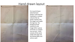
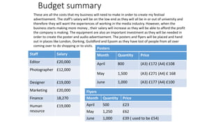
The document outlines a production plan for creating print and audio advertisements for a music festival. It includes schedules for the weeks of April 2nd through April 22nd, with tasks such as designing posters, conducting a photoshoot, editing photos and audio, and releasing the finished advertisements. It also includes budgets for staff salaries, printing costs for posters and flyers, and purchases of office equipment like chairs and tables. The goal is to promote the festival through advertisements placed in London and surrounding areas.
The document outlines the steps and components for creating a festival poster, including drafting layouts, creating mood boards, developing a campaign message, planning photography, establishing a house style with fonts and colors, taking test photos, designing the poster in Photoshop by adding images and text, and proofreading the final product. It provides descriptions and samples for elements like logo designs, photography, and the design process in Photoshop. The goal is to effectively promote an upcoming music festival through the poster design.
The document is a pitch presentation for a Disco festival poster. It includes research, draft designs, target audiences, and a production plan.
The proposal discusses the aims of promoting artists and dates at the festival. Target audiences are ages 15-18 who read Disco magazine. Test photography was taken of the landscape and a model, Grace, for the poster.
The production plan schedules creating the poster design, photo shoot, printing, and release over two weeks in April. It also includes plans for an audio advertisement, with casting and filming the following week.
The document provides details of a pitch presentation for a festival poster. It includes sections on the proposal, hand drawn and graphic layouts, mood board, campaign message, photoshoot plan, house style, target audiences, test photography, and production plan. The proposal discusses the name, dates, artists, and target demographics of the "Disco festival." Layouts include placement of elements like the masthead, logo, dates. The mood board includes fashion, attractions, and weather inspiration. The campaign aims to grab attention and raise awareness via social media. Test photos were taken of landscapes, models, and outfits to consider for the poster. The production plan schedules poster and audio design and release.
This presentation summarizes a pitch for a disco festival poster. It includes research, mood boards, test photography, and draft poster designs. The presentation shows hand-drawn layouts with elements like the masthead, logo, dates, and social media icons. Graphic layouts in blue or gray are presented. A mood board displays inspirational images. Test photos were taken of landscapes, grass, a model, and sunglasses. Draft posters include variations of elements placed on colorful backgrounds. Production plans outline the process for the poster and an audio advertisement. Budgets, risks, and legal/ethical considerations are also reviewed. The goal is to effectively promote the festival through attention-grabbing design.
In what ways does your media product use, develop or challenge form and conve...molly barker
The document describes how the media product, a music magazine, uses and develops conventions of real music magazines. It includes common magazine design elements like a cover image featuring the subject looking at the camera, a masthead with the magazine title, cover lines promoting stories, and additional images. It also uses techniques like buzzwords, numbers, and hints about inside content to attract readers. The lighting, backgrounds, and appearances of the models in the photos aim to set a natural, festival-themed scene in line with the acoustic music genre covered in the magazine.
The document describes the design choices for a digipak for an indie pop artist named Poppy. It discusses how the digipak conforms to conventions of the genre by having a simple, colorful retro design focused on the artist. The front cover features a large central image of Poppy filling the cover to emphasize that the music comes from her. Consistent fonts are used to create a recognizable brand. Bright, girly colors represent Poppy's image and appeal to her young female fans. Close-up images create a personal connection with audiences and show different sides of Poppy's personality and music. The overall design is minimalist but stylish in line with other elements promoting Poppy.
The photographer will take photos for a Jump Festival advertisement, including close-ups of hands, extreme long shots of the sunset, and full-body shots of someone jumping from an eye-level angle. The sunset and jumping photos will be heavily edited to be black shadows. A female model between 16-25 years old with long hair will be used to appeal to younger people and females. Wardrobe will be casual shorts and shirt to portray a normal festival attendee. Makeup is unnecessary as the face won't be visible. The photoshoot will take place on April 20th at the photographer's house.
The document outlines Olivia's initial plans for her project, including ideas for a band, magazine article, CD case, game, poster, and photography portfolio. Her final idea is to create her own girl band called "Olivia's Angels" and produce three products for it: a CD cover, t-shirt design, and magazine article. She will use Photoshop and friends/family as models. Her primary audience is ages 13-30 females, with 30-45 females as secondary. The mood board influences the girly pink theme and poses for the band photos.
Chloe Allenby created a digital packaging (Digi Pack) for her artist Lukatar's album. She imported and manipulated various images to design the front cover. These included a street background, leaves, circles, and other shapes layered together. Text was added identifying the artist and album. The inside pages included more manipulated images and text for track listings. Disk designs were made with flowers, graffiti text, and images of the artist. The process involved tools like lasso, brush, and layers to design a colorful, cartoon-style Digi Pack promoting Lukatar's album in a visually exciting way.
The document provides information about an advertisement for a band called COASTS. It summarizes the key elements of the advertisement. The name of the band is prominently displayed to convey its importance. The word "COASTS" connotes that the band is open to all audiences and free to perform live music as they love, linking to the seaside as a place to relax. The advertisement aims to present the band's style as warm and free through an image of them on a sunny coast. The target audience is ages 16+ since the lyrics often discuss love, and both genders can relate to and enjoy the music. Social media is used to promote the tour and allow ticket booking online.
This document summarizes the key aspects of a music magazine media product called "Poser". The magazine targets teenagers aged 16-20 and represents urban social groups interested in R&B music. It was influenced by the layout and style of Vibe magazine. Feedback from audiences helped refine the magazine to better attract its target demographic through the use of urban-styled imagery, relevant artist coverage, and consistent colors of green, white and black throughout.
This document summarizes how the media product, an R&B music magazine called "Poser", represents and targets particular social groups. The magazine targets teenagers aged 16-25 through its urban style with graffiti-inspired fonts and colors of green, white, and black. Images of black and Asian models also represent particular racial groups. Teen language in headlines helps attract teenage readers. The $1.99 price makes it affordable for students. Females are the primary audience through fashion advertisements and poses of female models. The magazine would be distributed by similar urban music magazines like Vibe to reach its target teenage demographic.
This document outlines the production plan for creating promotional materials for a music festival, including a poster, magazine advertisement, and audio-visual advertisement. It includes a schedule spanning several weeks in June 2016, with tasks such as planning photo shoots, designing layouts, and reviewing drafts. The production plan aims to carefully coordinate the various elements needed to complete the promotional campaign on time and on budget.
This document provides details on the planning and production process for a poster and flyer advertising an exclusive music festival. It includes mood boards highlighting inspiration from Glastonbury festivals, proposed designs for the house style, main headliners like Adele and Coldplay, photography plans, draft layouts, and proofreading steps. The goal is to create eye-catching advertisements that showcase the festival's music and experience through vibrant colors and prominent artist listings.
This document summarizes how a media product uses, develops, and challenges conventions of real music magazines. It discusses:
1) The music magazine "Grunge" was modeled after Kerrang! and Q magazines, using similar layouts, covers, and content types but with a unique color scheme and focus on grunge music.
2) Photographs were styled like images in Kerrang! to look professional but featured a grunge band to challenge conventions.
3) Elements like coverlines, banners, and contents pages borrowed formats from real magazines but used different colors and fonts or informal language to develop conventions.
4) The double page spread interviewed an imaginary grunge band "
To attract readers, the document summarizes techniques used for the front cover, contents page, and double-page spread of a music magazine. For the front cover, limited colors, the masthead featuring the magazine's name, and popular artist images were used. The contents page maintained the house style and featured repeating elements like the masthead and images of featured artists. The double-page spread also kept consistent colors and formatting, with a centered title overlapping letters and questions in a different color than answers within columns.
The document analyzes a magazine double page spread featuring Nicki Minaj. It notes that Minaj wears zebra print clothing that makes her stand out against the plain background, suggesting the magazine is unique. Pink is the dominant color, implying the magazine targets young female teens by representing traits like innocence. The medium-long shot of Minaj allows viewers to see her expression, outfit, and jewelry to engage the target audience. The direct camera angle and text curved around her image present Minaj as confident and the most important part of the spread.
The document provides details about creating print advertisements for a music tour. It includes mood boards, hand drawn drafts, and plans for a poster and magazine advertisement. Key points:
- The mood boards provided inspiration for font styles, bold images, and using prominent colors.
- Hand drawn drafts were created as guides for the digital versions, placing the artist name and image centrally to catch the eye.
- Colors like blue were chosen to represent the happy, free feeling of the music genre.
- Production plans included proofreading, identifying photo hazards, and using Photoshop with tools like gradients and shapes.
- Special guest artists like Coasts and Coldplay were mentioned to appeal to
The document discusses how the magazine attracts its country music audience. On the front cover, the image of a man holding a guitar conveys country connotations to draw in readers interested in the genre. Warm colors and descriptions of exclusive interviews and insider insights also attract readers. On the contents page, directly addressing the reader and using a youthful model photographed against a natural backdrop appeals to the target demographic. For the double-page spread, a full-page image allows the country props, clothing, and natural setting to appeal to readers' aspirations of becoming country musicians.
The document discusses the design choices made for various elements of a magazine cover and interior pages. For the cover, minimal text and a simple color scheme are used to create a sense of mystery around the central image of the artist. The contents page lists topics in different fonts and sizes to allow readers to easily find relevant information. A double page spread about a new artist was inspired by Rolling Stone, featuring photos of the artist in an unconventional pose to make readers feel they can relate to her. The overall goal is to attract the target audience through unique and relaxed designs that showcase new talent.
To attract readers, the document discusses using a limited color palette, consistent masthead and house style across pages, relevant images of popular artists, and interactive content like competitions. Maintaining visual continuity across the front cover, contents page, and double page spread makes the magazine look professional and appeals to the target audience's interests. Placing artist images and titles prominently helps entice readers and promote the featured content.
The document discusses the development of different media products for a pop artist named Ella Henderson. It summarizes the conventions used and how they were informed by research into Henderson's existing products and other pop genre examples.
For the digipak, magazine poster, and music video, the creator looked at Henderson's previous work and other pop artists to incorporate simple, bold designs that suit Henderson's vintage style and personality. Camera angles, lighting, colors, and fonts were chosen to connect the audience to the artist and narrative. The goal was to develop cohesive products that reflect Henderson's brand and appeal to target audiences.
The document discusses the design choices made for various elements of a magazine cover and interior pages. For the cover, minimal text and a mysterious image of the artist are used to attract the audience. Font and color choices also aim to intrigue readers and draw connections to other popular magazines. The contents page provides descriptions of topics of interest to the target audience. Inspiration is drawn from the simplicity of Clash magazine. A double page spread profile of the artist is modeled after Rolling Stone, using photos and an interview format to help readers relate to her as a new artist and feel they can connect with her emerging style and talent in the indie music genre.
The document discusses the design choices made for various elements of a magazine, including the cover, contents page, and a double page spread interview. For the cover, minimal text and a mysterious image were used to attract the audience. The contents page lists topics of interest to the target audience and was inspired by Clash magazine. A double page spread interview was modeled after a Rolling Stone interview with Lana Del Rey, aiming to make the artist relatable. Continuity of color schemes, fonts, and outfits were used to link the different elements together.
The photograph intended to show a model who had just finished getting ready to go to a festival. To convey this, the background included makeup and accessories placed around the bedroom. The model held up a festival-style outfit to seem like she was still deciding what to wear. The final image best fulfilled these intentions by showing the outfit and background details clearly. It was appropriate for the fashion spread because the outfit could be seen clearly, relating to the festival theme across all images. The meaning created was to excite viewers for the upcoming festival season and inspire outfit ideas.
The document discusses how the media product develops conventions of real media forms through using three styles: narrative, performance, and concept. It aimed to create a narrative music video for its song "bets" in the trip hop/indie genre. Inspiration was drawn from music videos like "Boy Problems" and "Runaway" to portray feelings of love/pain and the artist's intent through imagery and shots of the artist. Audience feedback helped learn that some preferred just the audio over the music video, showing honesty is valued over positivity. Key themes of lighting, artistic portraits, and color schemes were maintained across ancillary texts like the website to create a brand identity for the artist.
How effective is the combination of your main product and ancillary texts?Alice Kennedy
The combination of the main music promo video and ancillary magazine advert and digipak is effective. The products portray the same innocent yet strong female star persona of the artist Hannah MacLeod. Hannah wore the same makeup and outfit in all products so audiences would recognize her. Using the same font, black and white images, and locations across all products allowed audiences to link the pieces and recognize Hannah. Feedback showed the audience recognized the links between the video, magazine, and digipak.
The document outlines the content and structure of a presentation on planning and producing a festival poster and audiovisual materials. It includes sections on mind mapping, proposals, mood boards, design drafts, photography plans, inspiration, information on the poster, house style, production planning, budgets, equipment, locations, risk assessments, legal issues, and conclusions.
The document outlines a production plan for creating advertisements for a music festival. It includes slides covering various aspects of the advertising campaign such as a mind map, mood board, logo design, photoshoot plan, and production schedules. The production plan involves designing graphic layouts, drafting the logo, planning a photoshoot, and creating a print advertisement and audio visual to promote the festival. Launch dates for the poster and audio visual are scheduled for early-mid April to promote events happening at the end of April through early May.
The document provides a production plan for advertising an exclusive music festival over 4 weeks. It includes designing posters and flyers, printing and distributing them, and creating an audiovisual advertisement. The plan schedules tasks such as choosing headliners, designing layouts, sending materials to print, filming footage, and editing the advertisement together. The goal is to reveal information about performers and release promotional materials to publicize the festival.
The document discusses the evaluation of the student's music magazine portfolio. It addresses how the magazine uses, develops, and challenges conventions of real music magazines in the front cover, double page spread, and contents page through layout, design elements, and continuity across pages. The student also discusses how the magazine represents young adult females through imagery and color, and how it would be distributed to its target audience online and in music shops to have wide accessibility. The student reflects on technologies learned through constructing the magazine in Photoshop.
This document provides an overview and proposal for a print-based advertisement for a music festival called the "Top Dolla Festival." The summary includes:
- The festival will feature both mainstream and lesser-known hip hop/grime artists to attract different audiences. Bright colors will be used to convey fun and excitement.
- The target audience is people aged 17-30 from socioeconomic classes C1-E who enjoy music festivals as social events.
- Draft layouts show vibrant colors and complex designs with artists, dates, slogans, and a website link to provide information to potential attendees.
My music magazine represents young adult females who enjoy reggae music. It features a female model smiling and wearing bright colors to represent happiness and strength. The magazine will be digitally distributed to reach a wide audience, especially young females aged 17-24. Distributing it online allows global access and sharing on social media. Through constructing the magazine, the student learned photography and design skills in Photoshop, such as photo manipulation and layout techniques. Feedback helped them apply magazine conventions to better target their intended audience.
- The document provides an overview and proposal for a print-based advertisement for a music festival called the "Top Dolla Festival".
- The proposal discusses the target audience, which is mainly young adults aged 17-30 from socioeconomic categories C1-E.
- Bright, vibrant colors will be used along with contrasting fonts to catch attention. Popular grime and hip-hop artists like Stormzy, AJ Tracey, and Skepta will perform.
- Draft layouts showcase a mix of colors, images, and text positioning the key information and acts to attract the target audience.
The document summarizes the key design elements and choices made in constructing a magazine cover and sample interior pages. These include using large mastheads and images that grab attention without direct eye contact. Color schemes and styles are carried throughout for unity. Layout, images, and relevant information are used to attract the target audience of late teens interested in indie music. Technologies like Photoshop tools for selections, layers, and color adjustments were applied to produce high quality edited images for the magazine.
1) The document evaluates the student's music magazine project for class by addressing several questions about how it uses and develops conventions of real music magazines.
2) The student discusses how their front cover, double page spread, and contents page follow conventions in their layout, use of images, and continuity between pages.
3) The magazine represents young adult females who enjoy reggae as happy yet strong through the imagery and colors used.
4) The student proposes distributing the magazine both in music shops and online for wider reach, especially among its target teenage and young adult female audience.
5) Through creating the magazine, the student learned new Photoshop skills like using tools and layers, as well as the importance of
The proposal is for an indie rock magazine called "PLACID". It will use a monochrome color scheme with dark purple as the banner color. The front cover will feature 3 photos, the contents page 2 photos, and a double page spread up to 5 photos. The target audience is young people in education who enjoy indie rock concerts and festivals and prefer darker colors. The magazine will use large, clear text that is easy to read against the monochrome background. The contents page will be set out in columns and the double page spread will feature a photo covering both pages with band information.
The student proposes a magazine called "PLACID" focused on indie rock music. It will use a monochrome color scheme with purple as the banner color. The front cover will feature 3 photos, the contents page 2 photos, and a double page spread up to 5 photos. The target audience is young people in education who enjoy concerts and festivals and prefer darker colors. The magazine will use large, clear text that is easy to read against the monochrome background. The contents page will be set out in columns and the double page spread will feature a photo covering both pages with band information.
This document outlines Sophie Angus's plans for creating promotional materials for a music festival, including a poster, flyer, and audiovisual advertisement. It includes inspiration pieces, target audiences, logos, color schemes, layout designs, production schedules, and plans. The poster and flyer will feature main headliners like Adele and Coldplay to attract audiences. They will be designed over one week in February/March and launched 11 March. An audiovisual ad will then be filmed and edited over two weeks in March to promote the festival starting in June. The materials aim to inform audiences 7 months in advance and appeal to a wide age range through bright colors and well-known artists.
This proposal is for an indie rock music magazine called "PLACID". It will use a monochrome color scheme with dark purple as the banner color. The front cover will feature 3 photos, the contents page 2 photos, and a double page spread up to 5 photos. The target audience is young people in education who enjoy indie rock concerts and festivals and prefer darker colors. The magazine will use large, clear text that is easy to read against the monochrome background. The contents page will be set out in columns and the double page spread will feature a photo covering both pages with band information.
1) The document outlines plans for a photo shoot for a pop music magazine, including briefing the model, Heidi, on appropriate clothing, hair, and makeup.
2) Photos will be taken both indoors and outdoors at locations like Roker Beach without backdrops, relying on natural lighting and using a flash if needed.
3) The goal is to portray feelings of happiness and relatability through the photos, with a focus on Heidi, pastel and neon colors, and minimal props.
The document outlines a proposal for a music festival advertisement poster. It will advertise the PULSE festival, sponsored by PULSE magazine. The poster will be in A3 format and include the lineup of artists over the 3 day festival, as well as the date and location. The target audience is people aged 16-25 who enjoy exploring different music genres. The poster will be distributed around local towns to promote the festival.
The document discusses a student's print media product which is a magazine. It summarizes how the magazine uses conventions of real magazines in its layout and design. It represents teenage girls and the music genre of hip-hop. The magazine could be distributed in music stores, shops, or online to appeal to its target audience of 13-24 year olds interested in music. Through the process, the student learned skills with photography and design software.
The document summarizes the student's music magazine project. Some key points:
1) The student's magazine cover uses similar conventions to real magazines like pink colors and an attractive person on the cover.
2) For the contents page, the student took inspiration from two magazines they analyzed and combined designs they liked.
3) Their double page spread focuses on a pop star like the magazines they analyzed, with a picture on one page and article on the other.
4) Through this project, the student learned new skills like using Photoshop and transferring photos between devices to construct their magazine.
The document discusses the process of creating a music magazine called "Vibe" as a class project. Key points include:
- The magazine was inspired by Spin magazine and uses similar conventions like images of artists, headlines, and stories about music.
- Photoshop skills like airbrushing, adding text, and adjusting layers were used to design the magazine cover and layout.
- Research of existing magazines helped determine design elements and the target audience of teenagers aged 13-19.
- Artists like Miley Cyrus and Pixie Lott were featured to appeal to this young demographic.
This document provides details on the content, evidence, and process used to create a marketing poster for a music festival. It includes slides on pitch evidence, surveys, changes made to the poster design, safe design practices, equipment used, photos, legal/ethical considerations, and campaign message. The document outlines the design process, from selecting images and fonts to removing backgrounds and placing elements. It also covers ensuring proper permissions, representing diversity accurately, and messaging to raise awareness and convince people to attend the music festival.
This document summarizes the content and design process of a music festival poster. It includes:
- An overview of the poster content and design elements used
- A description of the selection and editing of images using tools in Photoshop
- Details on the fonts, colors, and layout chosen
- Considerations around legal and ethical issues in the design
- The goal of raising awareness of the festival through social media promotion
This document provides information about a student's coursework on print-based advertising. It includes sections analyzing a print advertisement campaign for the Glastonbury Festival, including aims and objectives, target audiences, representation, campaign messages, legal and ethical considerations, and regulatory bodies. It also covers an audiovisual advertisement for the festival and compares the two advertising methods.
This document provides information about print and audiovisual advertising for the Glastonbury Festival. It discusses the aims, target audiences, campaign messages, legal/ethical considerations, and regulatory bodies for both print and audiovisual advertisements. Print advertisements are used to promote the festival dates and lineup one month in advance, while audiovisual ads on social media showcase the experience of attending to encourage ticket sales. Both must comply with advertising standards and copyright law to effectively promote the festival while protecting intellectual property.
This document summarizes the content and process used to create a poster advertising a music festival. It includes:
- Evidence and materials used such as witness statements, surveys, and photos
- Changes made during the design process to improve readability and aesthetics
- Safe working practices like using selection tools and rulers in Photoshop
- Equipment like a computer, projector, and camera used for the presentation
- Reasons for images chosen that relate to the festival theme
- Legal and ethical considerations like permissions, accuracy, and avoiding offense
This document provides an analysis of print and audiovisual advertising for the Glastonbury Festival. It examines the aims, target audiences, messaging, legal/ethical considerations, and regulatory bodies for each type of advertising. Print advertising aims to promote the festival dates and lineup one month in advance, while audiovisual ads showcase the experience through footage of performances and attendees. Both seek to attract music fans aged 16-30 and spread awareness on social media. Legal issues include copyright and permissions when using artists' media. Regulators like ASA and Ofcom provide oversight of advertising standards. In conclusion, print and audiovisual work together to excite people for the annual music event.
The document discusses print and audiovisual advertisements for the Glastonbury Festival. It covers the aims, target audiences, messaging, legal/ethical considerations, and regulatory bodies for each type of advertisement. Both print and audiovisual ads aim to promote the festival and drive ticket sales by increasing awareness of the musical acts. The target audience is generally ages 16-30 who enjoy various music genres. Both types of ads must consider copyright and intellectual property law. Regulatory bodies like ASA and Ofcom provide oversight of advertising practices.
The document discusses draft designs for a social media app called "Imagine" including hand-drawn drafts and photo shop drafts for the homepage, profile page, and other features. It provides step-by-step guidance for writing stories, discusses popular story genres, and outlines guidelines and conditions for using the app including accessibility, licensing, and privacy policies. The conclusion restates that various features and policies for the proposed app were explored in the document.
The document outlines the content and functionality of an app called "Imagine" for creative writing. It includes sections on the product details, website functionality, a photo shop vs hand drawn comparison, a production plan, revenue sources, legal and ethical issues, and a conclusion. The production plan outlines tasks for the graphic designer, editor, and researchers from January 8-25th with a launch date of January 26th. Revenue will come from advertising, using CPM and CPI metrics. Legal/ethical considerations include terms and conditions, privacy policies, trademarks, copyright, and user security.
- The document outlines the process of designing two social media app concepts - "Imagine" and "Snap Attack".
- It includes mind maps of initial ideas, hand-drawn drafts of the app interfaces, descriptions of the final concepts including target audiences and features, and Photoshop drafts of key pages like signup and profiles.
- The document concludes by selecting the "Imagine" app concept which is a creative writing app, as it came together with a good layout and professional color scheme, and the logo fits well for a writing focused social media platform.
This document provides an overview of a unit on social media products. It discusses Instagram, Facebook, and Snapchat. For each platform, it outlines the purpose, typical content, target users, sources of revenue, legal and ethical issues, and positives and negatives. It also includes a survey on social media preferences and effects of social media like eroding social behavior, moral panic among parents, and media convergence. The document serves to analyze key aspects of several major social media platforms.
The document discusses the materials and equipment used to present a pitch to a publisher. Photos were taken of the presentation environment, which included a computer to display the presentation, an interactive whiteboard to present slides at a larger scale, and a slide changer to change slides without returning to the computer. A tripod and camera were also used to record the presentation for later review. The pitch was recorded on camera and images were provided as evidence of the presentation materials, which included PowerPoint and research from magazines like "Top of the Pops" and "Billboard" that inspired the proposed magazine concept.
The document provides step-by-step instructions for designing a magazine cover in Photoshop. It describes setting up the file size and layout, adding basic elements like the masthead, barcode, and publisher logo. It recommends placing the most important conventions first before adding additional text and a cover photo. The instructions explain how to import images, remove backgrounds, and adjust sizing and positioning of elements. Proper use of layers and blending options is suggested to keep elements linked and apply text effects.
The document discusses Courtney Anne Edwards' evidence for a project on UK media publishing. It provides an overview of the contents of Edwards' evidence, which focuses on analyzing magazines and newspapers. For magazines, it covers topics like the publisher of Top of the Pops magazine, the magazine's content, covers, readership, and production process. For newspapers, it examines genres, codes and conventions, relationships with advertisers, news selection, demographics, and advertising. The document serves as an outline and guide to Edwards' evidence analyzing different aspects of UK media publishing.
Here are a few suggestions to improve the interview draft:
1. Add follow up questions to get more details from the artist's responses. For example after she mentions being made fun of, ask a question like "How did you overcome those obstacles?"
2. Use more natural language than just question/answer format. For example say "Thanks for sharing that" after a response instead of just moving to the next question.
3. Ask questions about her music/style to give readers insight into her as an artist. For example "How would you describe your musical style?"
4. Proofread for typos like missing words or incorrect punctuation.
5. Consider including a brief bio at the start to introduce the
The document provides details on planning and designing a pop music magazine called "Disco". It includes mood boards, inspiration materials from other magazines, and proposed content such as interviews, fashion, and music charts. Design elements like colors, font styles, and layouts are explored. The target audience is identified as females aged 15-18 based on typical readers of pop magazines. A flat plan outlines the proposed content to be included in the magazine.
This document provides details about the production process of the "Top of the Pops" magazine. It discusses the roles of key staff members involved such as the editor, publisher, and sales executives. The production process includes setting a publication date, managing schedules, making editorial and budgetary decisions, and acquiring content from in-house writers and external writers. Graphics and illustrations are also created during this stage. Overall, the production process requires coordination between different teams and roles to ensure the magazine is completed on time and on budget before being distributed to readers.
The document summarizes the key steps and skills used in creating a magazine. It covers establishing deadlines, using software like Photoshop and InDesign, conducting risk assessments for images, proofreading text, maintaining consistent colors and fonts, making changes based on feedback, and concluding with a professional looking magazine that builds brand identity. Permissions were obtained for all photos and techniques like the transform tool were used to resize images without losing quality.
The document discusses the location, hazards, and ethical/legal issues related to a photoshoot. It summarizes the location, date, time, shots taken, and permissions for the shoot. It then discusses general health and safety duties and completing risk assessments for two locations. Regarding ethical and legal issues, it covers the role of regulatory bodies like IPSO in handling complaints and setting standards regarding accuracy, privacy, and harassment. It also discusses copyright, intellectual property, watermarks, the editor's code of practice, and data protection act as they relate to the magazine industry. The conclusion emphasizes the importance of health and safety, permissions, following regulations, and the editor's code to produce truthful work without offense or discrimination.
Philippine Edukasyong Pantahanan at Pangkabuhayan (EPP) CurriculumMJDuyan
(𝐓𝐋𝐄 𝟏𝟎𝟎) (𝐋𝐞𝐬𝐬𝐨𝐧 𝟏)-𝐏𝐫𝐞𝐥𝐢𝐦𝐬
𝐃𝐢𝐬𝐜𝐮𝐬𝐬 𝐭𝐡𝐞 𝐄𝐏𝐏 𝐂𝐮𝐫𝐫𝐢𝐜𝐮𝐥𝐮𝐦 𝐢𝐧 𝐭𝐡𝐞 𝐏𝐡𝐢𝐥𝐢𝐩𝐩𝐢𝐧𝐞𝐬:
- Understand the goals and objectives of the Edukasyong Pantahanan at Pangkabuhayan (EPP) curriculum, recognizing its importance in fostering practical life skills and values among students. Students will also be able to identify the key components and subjects covered, such as agriculture, home economics, industrial arts, and information and communication technology.
𝐄𝐱𝐩𝐥𝐚𝐢𝐧 𝐭𝐡𝐞 𝐍𝐚𝐭𝐮𝐫𝐞 𝐚𝐧𝐝 𝐒𝐜𝐨𝐩𝐞 𝐨𝐟 𝐚𝐧 𝐄𝐧𝐭𝐫𝐞𝐩𝐫𝐞𝐧𝐞𝐮𝐫:
-Define entrepreneurship, distinguishing it from general business activities by emphasizing its focus on innovation, risk-taking, and value creation. Students will describe the characteristics and traits of successful entrepreneurs, including their roles and responsibilities, and discuss the broader economic and social impacts of entrepreneurial activities on both local and global scales.
LAND USE LAND COVER AND NDVI OF MIRZAPUR DISTRICT, UPRAHUL
This Dissertation explores the particular circumstances of Mirzapur, a region located in the
core of India. Mirzapur, with its varied terrains and abundant biodiversity, offers an optimal
environment for investigating the changes in vegetation cover dynamics. Our study utilizes
advanced technologies such as GIS (Geographic Information Systems) and Remote sensing to
analyze the transformations that have taken place over the course of a decade.
The complex relationship between human activities and the environment has been the focus
of extensive research and worry. As the global community grapples with swift urbanization,
population expansion, and economic progress, the effects on natural ecosystems are becoming
more evident. A crucial element of this impact is the alteration of vegetation cover, which plays a
significant role in maintaining the ecological equilibrium of our planet.Land serves as the foundation for all human activities and provides the necessary materials for
these activities. As the most crucial natural resource, its utilization by humans results in different
'Land uses,' which are determined by both human activities and the physical characteristics of the
land.
The utilization of land is impacted by human needs and environmental factors. In countries
like India, rapid population growth and the emphasis on extensive resource exploitation can lead
to significant land degradation, adversely affecting the region's land cover.
Therefore, human intervention has significantly influenced land use patterns over many
centuries, evolving its structure over time and space. In the present era, these changes have
accelerated due to factors such as agriculture and urbanization. Information regarding land use and
cover is essential for various planning and management tasks related to the Earth's surface,
providing crucial environmental data for scientific, resource management, policy purposes, and
diverse human activities.
Accurate understanding of land use and cover is imperative for the development planning
of any area. Consequently, a wide range of professionals, including earth system scientists, land
and water managers, and urban planners, are interested in obtaining data on land use and cover
changes, conversion trends, and other related patterns. The spatial dimensions of land use and
cover support policymakers and scientists in making well-informed decisions, as alterations in
these patterns indicate shifts in economic and social conditions. Monitoring such changes with the
help of Advanced technologies like Remote Sensing and Geographic Information Systems is
crucial for coordinated efforts across different administrative levels. Advanced technologies like
Remote Sensing and Geographic Information Systems
9
Changes in vegetation cover refer to variations in the distribution, composition, and overall
structure of plant communities across different temporal and spatial scales. These changes can
occur natural.
A Visual Guide to 1 Samuel | A Tale of Two HeartsSteve Thomason
These slides walk through the story of 1 Samuel. Samuel is the last judge of Israel. The people reject God and want a king. Saul is anointed as the first king, but he is not a good king. David, the shepherd boy is anointed and Saul is envious of him. David shows honor while Saul continues to self destruct.
Walmart Business+ and Spark Good for Nonprofits.pdfTechSoup
"Learn about all the ways Walmart supports nonprofit organizations.
You will hear from Liz Willett, the Head of Nonprofits, and hear about what Walmart is doing to help nonprofits, including Walmart Business and Spark Good. Walmart Business+ is a new offer for nonprofits that offers discounts and also streamlines nonprofits order and expense tracking, saving time and money.
The webinar may also give some examples on how nonprofits can best leverage Walmart Business+.
The event will cover the following::
Walmart Business + (https://business.walmart.com/plus) is a new shopping experience for nonprofits, schools, and local business customers that connects an exclusive online shopping experience to stores. Benefits include free delivery and shipping, a 'Spend Analytics” feature, special discounts, deals and tax-exempt shopping.
Special TechSoup offer for a free 180 days membership, and up to $150 in discounts on eligible orders.
Spark Good (walmart.com/sparkgood) is a charitable platform that enables nonprofits to receive donations directly from customers and associates.
Answers about how you can do more with Walmart!"
This presentation was provided by Racquel Jemison, Ph.D., Christina MacLaughlin, Ph.D., and Paulomi Majumder. Ph.D., all of the American Chemical Society, for the second session of NISO's 2024 Training Series "DEIA in the Scholarly Landscape." Session Two: 'Expanding Pathways to Publishing Careers,' was held June 13, 2024.
ISO/IEC 27001, ISO/IEC 42001, and GDPR: Best Practices for Implementation and...PECB
Denis is a dynamic and results-driven Chief Information Officer (CIO) with a distinguished career spanning information systems analysis and technical project management. With a proven track record of spearheading the design and delivery of cutting-edge Information Management solutions, he has consistently elevated business operations, streamlined reporting functions, and maximized process efficiency.
Certified as an ISO/IEC 27001: Information Security Management Systems (ISMS) Lead Implementer, Data Protection Officer, and Cyber Risks Analyst, Denis brings a heightened focus on data security, privacy, and cyber resilience to every endeavor.
His expertise extends across a diverse spectrum of reporting, database, and web development applications, underpinned by an exceptional grasp of data storage and virtualization technologies. His proficiency in application testing, database administration, and data cleansing ensures seamless execution of complex projects.
What sets Denis apart is his comprehensive understanding of Business and Systems Analysis technologies, honed through involvement in all phases of the Software Development Lifecycle (SDLC). From meticulous requirements gathering to precise analysis, innovative design, rigorous development, thorough testing, and successful implementation, he has consistently delivered exceptional results.
Throughout his career, he has taken on multifaceted roles, from leading technical project management teams to owning solutions that drive operational excellence. His conscientious and proactive approach is unwavering, whether he is working independently or collaboratively within a team. His ability to connect with colleagues on a personal level underscores his commitment to fostering a harmonious and productive workplace environment.
Date: May 29, 2024
Tags: Information Security, ISO/IEC 27001, ISO/IEC 42001, Artificial Intelligence, GDPR
-------------------------------------------------------------------------------
Find out more about ISO training and certification services
Training: ISO/IEC 27001 Information Security Management System - EN | PECB
ISO/IEC 42001 Artificial Intelligence Management System - EN | PECB
General Data Protection Regulation (GDPR) - Training Courses - EN | PECB
Webinars: https://pecb.com/webinars
Article: https://pecb.com/article
-------------------------------------------------------------------------------
For more information about PECB:
Website: https://pecb.com/
LinkedIn: https://www.linkedin.com/company/pecb/
Facebook: https://www.facebook.com/PECBInternational/
Slideshare: http://www.slideshare.net/PECBCERTIFICATION
Temple of Asclepius in Thrace. Excavation resultsKrassimira Luka
The temple and the sanctuary around were dedicated to Asklepios Zmidrenus. This name has been known since 1875 when an inscription dedicated to him was discovered in Rome. The inscription is dated in 227 AD and was left by soldiers originating from the city of Philippopolis (modern Plovdiv).
2. Content
• Draft layouts ( slide 3-5)
• Moodboards ( slide 6)
• Campaign message ( slide 7)
• Plan for the images (Photo-shoot plan) ( slide 8)
• House style (fonts, colours, graphics) (slide 9)
• Test Photography ( slide 10-11)
• Step by Step on how you created advert ( slide 12-13)
• Proof-reading, sub-editing ( slide 14)
• Production Plan ( slide 15- 17)
• Budget/summary/resources/equipment and staff needed. (slide 18-19)
• Risk Assessment ( slide 20)
• Location Recce(slide 21-22)
• Photoshop work ( slide 23)
• Conclusion ( slide 24)
3. Proposal
What is the product being advertised?
For my festival poster it is going to be called “Disco” festival as I based my magazine on the name disco so it could be a sponsor, by that magazine.
What are the Aims and Objectives you are trying to achieve?
On the poster it will hold the artists that are going to play at the festival. It will also have the dates of each festival and who will be playing when,
the main aim is to get people to experience the life of the festival and make them want to come to our festival where they will get an experience
of a life time.
Target Audience
The festival will also have social media icons like twitter and instagram. The target audiences will be from ages 15-18 (Hartley) , as this is the
audience that would have read the “Disco” magazine. Due to the ages it mean that they wont have a high paying job or rank so they will have a
low ‘spending power'. Not only will the poster inform (Kats) the audiences of what the festival has to offer but also what type of music that will
be playing , as it may be directed to a certain group of people for example ‘Young alts’ or even ‘Hypebeasts’ (Maslow
What is the campaign message?
For this festival poster in will be using the slogan ‘ you only live once’ as our positive message . Due to the fact that a festival in a once
in your life experience if it is your first time , it helps you deiced if you will go to future festivals or avoided them.
Style or approach and content
The poster will be printed on a format of A4 paper , as it is the regular size a poster and will capture peoples attention when
walking along in the street. Featuring on the poster will be a girl (Grace) at the festival with her sunglasses on , the poster will be
using a green pallet
4. Hand drawn layout
For my print bases
advertisement
posters I will have the
masthead in multiple
coloures like my
poster inspired. Also
the slogan and maybe
the logo too. The
background will
consist of a min
image either a group
of friends or a teepee
not sure yet . It also
consists of the social
media sites logo and
the festival dates and
artist as well .
6. Draft logo design
As my festival will be sponsored by
disco magazine , I will be using their
logo on my poster. But I may change
the font to make it more of a festival
vibe. The font that I like the most is
the top one as it flows well and gives
of the vibe of a festival . I will try and
change the font colour to multicolor,
as it was inspired by the
‘Glastonbury’ festival poster , which
will make it stand out.
7. Mood board
I have chosen these images
because my festival poster
will not only contain the
latest music, but also the
latest fashion trends and
what works well together. I
have also added the type of
attractions that can be found
at the festival as well as what
can be expected regarding
the weather.
8. Campaign Message
The campaign message with any festival event is to grab the
attention of fellow loving music fans, to come to the festival
and see there favorite music genre and possible there favorite
artists as well. Also the campaign message to gain awareness,
by making the news of the festival travel quickly by using social
media. For example on my festival poster there are the social
medias that they use to help promote the festival is ‘Instagram ’
and ‘twitter’. By using a light background it helps the text to
stand out more , as it use contrasting colors . By raising
awareness of the festival and convincing people to go, this will
help them to distress and take a break. Also in the long run it
will help them re-socialize with people and not talk about
stressing topics.
9. Photoshoot plan
project This photo-shoot will be for a festival poster. So the main aim is to capture photos that link
back to the festival vibes and experiences.
Photographer? The photographer will be me as I need to find either ,object that hold the same purpose as a
festival or a group of people to represent the festival vibes.
Casting ? For the poster if I go with a group of people I will need to find five or six people male or
female to pose as if they are at a festival and just hanging out . If I was to go with an object I’d
have to make sure it something cute and will persuade people to come to the festival.
Model
requirements?
The model requirements was to not show her face in the picture so I will work with the back of
her head or pull her hair round to the side so it covers her face .
Wardrobe and
look?
The models would have to wear casual clothing they type they find would best suite a festival.
I would advices the my model to wear something cute but also trendy, just something she
feels comfortable inn .
Hair & Make-
up
The girls would have there hair in a up/down style or they could even have it in different types
of breading . The make- up would not be to heavy but colorful and maybe some face
decoration added on the side of the face or even the forehead.
Where & when
?
The photo-shoot will take place at a park or some type of nature inspired place . I would like it
to take place on a warm day so I could get the natural sunlight to stream down to create a light
effect , but fingers crossed for good weather if it is not on our side I’ll adapted my idea to fit
around the weather.
10. House style
The types of colors I'm considering to be using on the text will be big, bright and bold,
using colors like orange, green, yellow , blue ,purple, red and many more. The reason
why is that it follows my poster of inspiration at it helps make the poster unique to
anyone else's. The social media I am considering placing on the poster are twitter and
instagram as, many people will be using these sites when at the festival taking photos
to help remember what a great time they have had. It will also help to promote the
festival and get more people involved or persuade them to go to the festival. As for
the font which will be sponsored by disco magazine , I may change the font to make it
more of a festival vibe. The font that I like the most is the top one as it flows well and
gives of the vibe of a festival . I will try and change the font colour to multicolor, as it
was inspired by the ‘Glastonbury’ festival poster , which will make it stand out.
Colour
sample
Font
samples
12. Test photography
For my test photography I took arrange of different photos that are relevant,
to a festival poster. For the background I took a landscape photo with
featured nature scenery . I also took some close up images of the grass which
, I thought would make a good background . For my model I went with one of
my friends grace , as her hair colour is very striking and would work well on
my festival poster . I have two different photos that I can choose between ,
one of her back and the other of her side profile wearing sunglasses. She
gave me the ok with the side profile as she said before that she didn’t want
her face in the photo. I also have images of the sunglasses on it own in case I
don’t go with the image of grace with the sun glasses. The purpose of the
sun glasses if not used in the image with grace , I will place them on the
poster and make it look like they have fallen into the grass next to the image
of grace.
13. Step by Step on poster one
On photo shop I opened up an image I took before creating the
poster and used it as the back ground. I chose blurred image of
blades of grass with water droplets as it tends to rain a lot at
concerts. Before placing the other images on my background I
used the ruler tool to bring up the line which will help keep the
text and certain images in line with one another .Next I got my
image of my model who was going to represent the type of
people who would be going to these concerts. Wide big hair ,
flower crowns and sunglasses as there will be some signs of
sunshine. On the image of my model I got rid of the background
by using the ‘quick selection tool’ and went around each strand
of her hair which was out of place before place the image on the
poster. The next thing I did was open the logo images of twitter
and instagram and used the ‘quick selection tool’ again to get rid
of the white background before placing it onto my poster. Next I
used the text tool and used the fonts ‘Pony Maker’ which I used
on my magazine for ‘Disco’ and ‘ HFF Whirly Whorl’ for the
‘festival’ , artist , dates and slogan font . Around the text with the
festival artist I have placed a light green rectangle by using the
‘rectangular tool’ , ‘paint bucket tool and ‘eyedropper tool’ and
lower the opacity of the shape .On the disco font I change the
colour to an umbra colour , which follows my poster of
inspiration as it used lots of colours in its masthead. Finally I
picked an image of sunglasses that used a lighter light effect and
had a reflection in the lens to create my logo. I used the ‘ quick
selection tool’ to get rid of the background before placing it on
the poster, I then used the text tool and typed in my slogan using
the ‘HFF Whirly Whorl’ font before placing it on top of the sun
glasses .
Quick selection tool Eyedropper tool
Paint bucket tool Text tool
14. Step by Step on poster two
Quick selection tool Eyedropper tool
Paint bucket tool Text tool
On photo shop I opened up an image I took before
creating the poster and used it as the back ground. I
chose a focused image of blades of grass with the
water droplets which again helps to represents the
type of weather that will take places at the concert.
Before placing the other images on my background I
used the ruler tool again to bring up the line which
will help keep the text and certain images in line with
one another. The next thing I did was open up a
different image of sunglasses which had different
lighting, and some reflection in the glasses . To
remove the background I used the ‘quick selection
tool’ and went around the edges of the sunglasses.
Next I used the text tool and used the fonts ‘Pony
Maker’ which I used on my magazine for ‘Disco’ and ‘
HFF Whirly Whorl’ for the ‘festival’ , artist , dates and
slogan font. Around the text with the festival artist I
have placed a light green rectangle by using the
‘rectangular tool’ , ‘paint bucket tool and ‘eyedropper
tool and lower the opacity of the shape .On the disco
font I change the colour to an umbra colour , which
follows my poster of inspiration as it used lots of
colours in its masthead. Finally I picked another image
of sunglasses that used a lighter light effect and had a
reflection in the lens to create my logo. I used the ‘
quick selection tool’ to get rid of the background
before placing it on the poster, I then used the text
tool and typed in my slogan using the ‘HFF Whirly
Whorl’ font before placing it on top of the sun glasses
.
15. Proof-reading, sub-editing
For proof reading I will be looking over my work to see if there is and
incorrect grammar or spelling mistakes. I will then ask a third party to
read over my posters to make sure I have not missed anything out .
Before
After
16. Production plan : Print advertising / Audio visual
Week beginning: April 2-8 2018
Monday Tuesday Wednesday Thursday Friday Saturday Sunday
Plan the
masthead or
main headline
that will be
featured on
the poster and
also the
slogan
design the
layout of the
poster with
colour
scheme
which applies
to the target
audiences .
Also find a
model and
location for
photo-shoot
Create and
design poster
for the festival
as it will be
released
Saturday. Edit
photo-shoot
images ready for
the poster.
The poster will
be sent to
printing
companies
after being
checked over.
The poster
will be
printed
The poster
will be
released for
the public to
see the
headliners of
the festival
Complete by: Complete
by:
Complete by: Complete by: Complete by: Complete by: Complete by:
2th
April
2018
3rd
April
2018
4th
April
2018
6th
April
2018
7th
April
2018
Today
17. Production plan : Print advertising / Audio visual
Week beginning: April 9-15 2018
Monday Tuesday Wednesday Thursday Friday Saturday Sunday
Start
planning
what will be
in the audio
advertiseme
nt
Start
auditions for
the cast
Auditions Auditions Final
auditions
Get in
contact
with the
chosen cast
Complete by: Complete
by:
Complete by: Complete by: Complete by: Complete by: Complete by:
9th
April
2018
10th
April
2018
11th
April
2018
12th
April
2018
13th
April
2018
14th
April
2018
18. Production plan : Print advertising / Audio visual
Week beginning: April 16-22 2018
Monday Tuesday Wednesday Thursday Friday Saturday Sunday
Find a
location
Start
filming
Filming Start editing Editing Finish up
editing
Release audio
advertising to
the public
through the
website
Complete by: Complete
by:
Complete by: Complete by: Complete by: Complete by: Complete by:
16th
April
2018
17th
April
2018
18th
April
2018
19th
April
2018
20th
April
2018
21th
April
2018
22th
April
2018
19. Budget summary
These are all the costs that my business will need to make in order to create my festival
advertisement. The staff’s salary will be on the low end as they will all be in or out of university and
therefore they will want the experiences of working in the media industry. However, when the
business starts making more money , their salary will increase as they will be able to afford the profit
the company is making. The equipment are also an important investment as they will be needed in
order to create the poster and audio advertisement. The posters and flyers will be placed and hand
out in places like London, Dorking, Guildford and Epsom as they have lost of people from all over
coming over to do shopping or to visits.
Staff Salary
Editor £20,000
Photographer £12,000
Designer £19,000
Marketing £20,000
Finance 18,270
Human
resource
£19,000
Month Quantity Price
April 800 (A3) £172 (A4) £108
May 1,500 (A3) £271 (A4) £ 168
June 1,000 (A3) £177 (A4) £100
Posters
Month Quantity Price
April 500 £23
May 1,250 £62
June 1,000 £39 ( used to be £54)
Flyers
20. Equipment and cost
Chairs
https://www.amazon.co.uk/d/
u4f/Office-executive-computer-
Leather-function-ergonomic-
armchair/B00A64V1HQ/ref=sr_
1_17?ie=UTF8&qid=148759870
2&sr=8-
17&keywords=office+chair
£37.99 each
£341.91
(9 chairs)
Table
https://www.amazon.co.uk/Pop
amazing-Computer-Office-
Furniture-
Station/dp/B01IGNMKCS/ref=sr
_1_22?s=kitchen&ie=UTF8&qid
=1487598919&sr=1-
22&keywords=office+table
£32.99 each
£296.91
(9 tables)
Board room
https://www.amazon.co.uk/Offi
ce-Boardroom-Meeting-
2440mm-
1220mm/dp/B01M8MANO7/ref
=sr_1_20?s=kitchen&ie=UTF8&
qid=1487688628&sr=1-
20&keywords=office+table
£171.18 each
£171.18
Computer
https://www.amazon.co.uk/d/C
omputers-Accessories/APPLE-
Macbook-A1181-Wireless-
Bluetooth-Certified-
Refurbished/B01KA18618/ref=s
r_1_7?s=electronics&ie=UTF8&
qid=1487599169&sr=1-
7&keywords=computer
£199.99 each
£1,799.91
(9 computers)
Camera
https://www.parkcameras.com/
p/1010084N/bridge-
cameras/canon/powershot-
sx60-hs
£349 each
£349
Pens
http://www.theworks.co.uk/p/s
tationery/assorted-ball-point-
pens---pack-of-
12/5052089124905
£1 each
(pack of twelve)
£9
Paper
http://www.euroffice.co.uk/pro
duct/euroffice-a4-paper-ream-
wrapped-80gsm-white-ream-
%5B500-sheets%5D/ABE987
500 sheets
£2.99
£5.98
(2 packs)
Object link Amount total
21. Risk assessments
You can see that I have completed two risk assessment as I have two different locations
, as I need to make sure that the location is safe for me to shoot there and has no risks.
22. Location recce
For taking the photos I will be working in the studio with
the model , using the stage lighting and natural lighting
to see the differences . I will also be working in a park to
capture a natural background image to place my model
over it. When on location I will need to check for any
hazards that could put my model or me in danger or
cause an accident. For example in the studio lose wires ,
or another obstacles that we could trip on.
23. Location recce
Location:
Time?
Date?
Why?
The photo shoot had taken place on the 4th January
2018 and between the hours of 10 am and 4 pm .
The reason why is because it is a flexible
time for me and my photographer to
work around, and get all the photos
required for the poster in one day.
Picture needed/Required
Shot type
Props/equipment
Lighting
Costume
Person/people
Why?
The shots I used where a different arrange of close
up , mid-shots and long shots. The only prop that was
used was the flower crown and a pair of sunglasses.
We used arrange of natural lighting and studio
lighting to get the right shots . During the shoot the
model change her positions to portray her mood or
anything that made her feel comfy while being
photographed.
The reason why I am using a range of
different shots ,is because I can choose
the best images that will make the front
cover and DPS. With these different
angles you will be able to see her facial
features and outfit.
Permission needed
Contact needed to evidence
of this?
The photoshoot took place in a studio that belonged
to the artists so permission was given by the artists.
We also took some images in a park which I did a risk
assessment before letting my model onto location.
The reason why I used a studio is because
it is an environment that the artists is
comfy with. Also with shooting in the
park was the main purpose of the poster
Potential hazards/ Risks
Location specific why?
While on location the only hazards that could come
up are lose wires or any hair products, that will be
used to style the models hair e.g. curling wand.
The reason why having lose wires can be
classed as an hazard is because someone
could trip over them and hurt themselves
. Also the curling wand can be a hazard as
it can over heat or if not used and they
could burn someone.
25. Conclusion
From this LO we learned how to construct a media poster based on a
festival of our choice. Also the process of how long it would take to
make as well as audio visual at the same time.