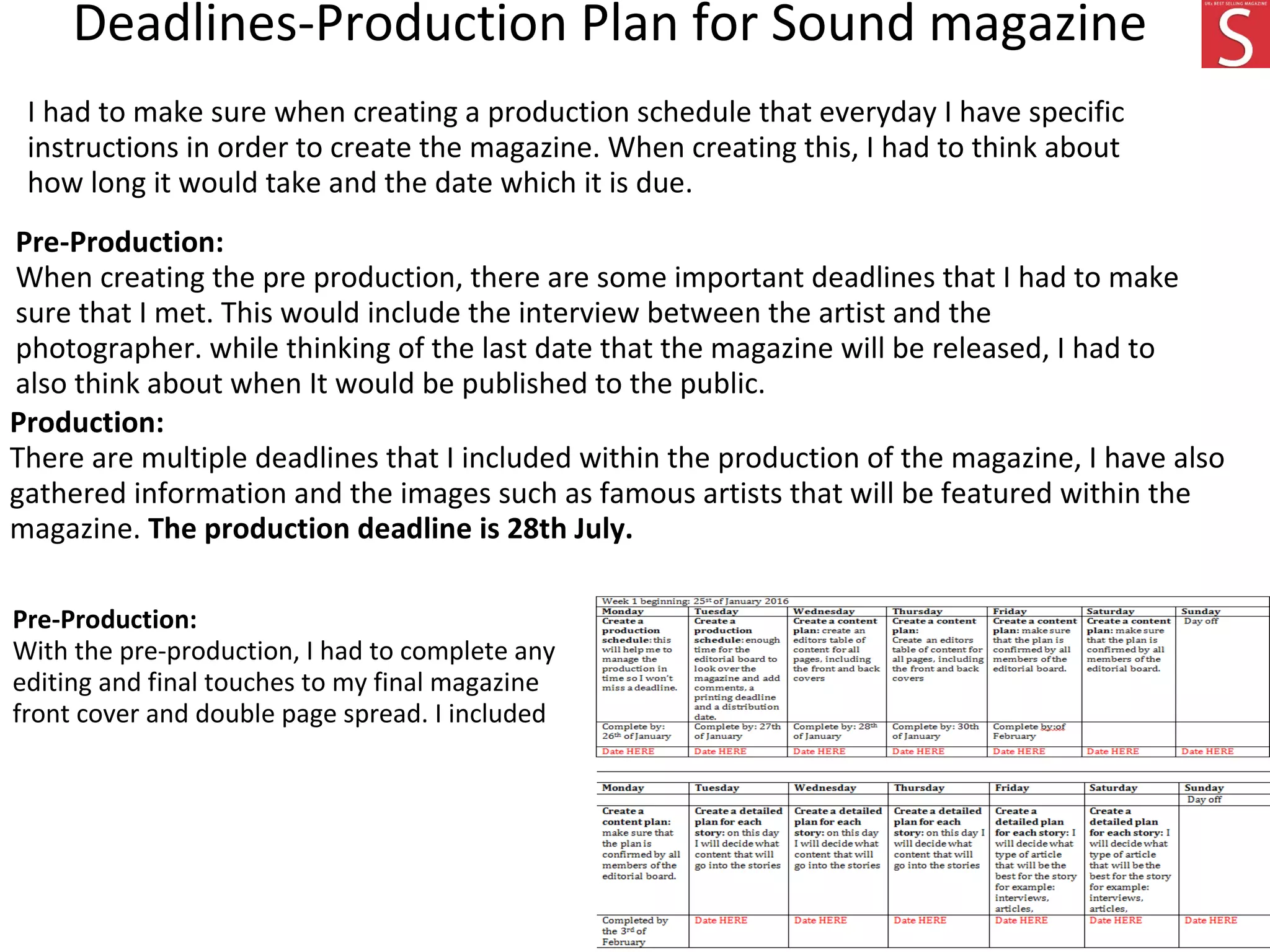
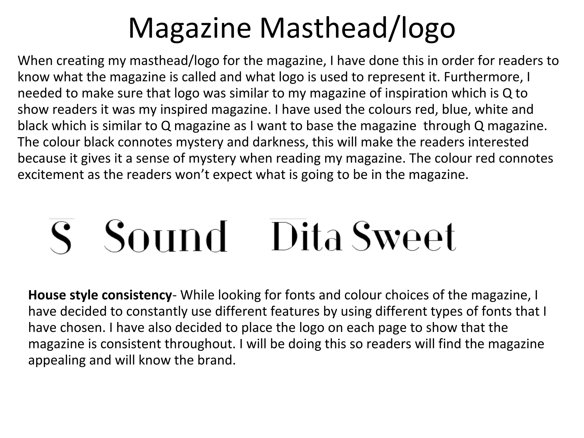
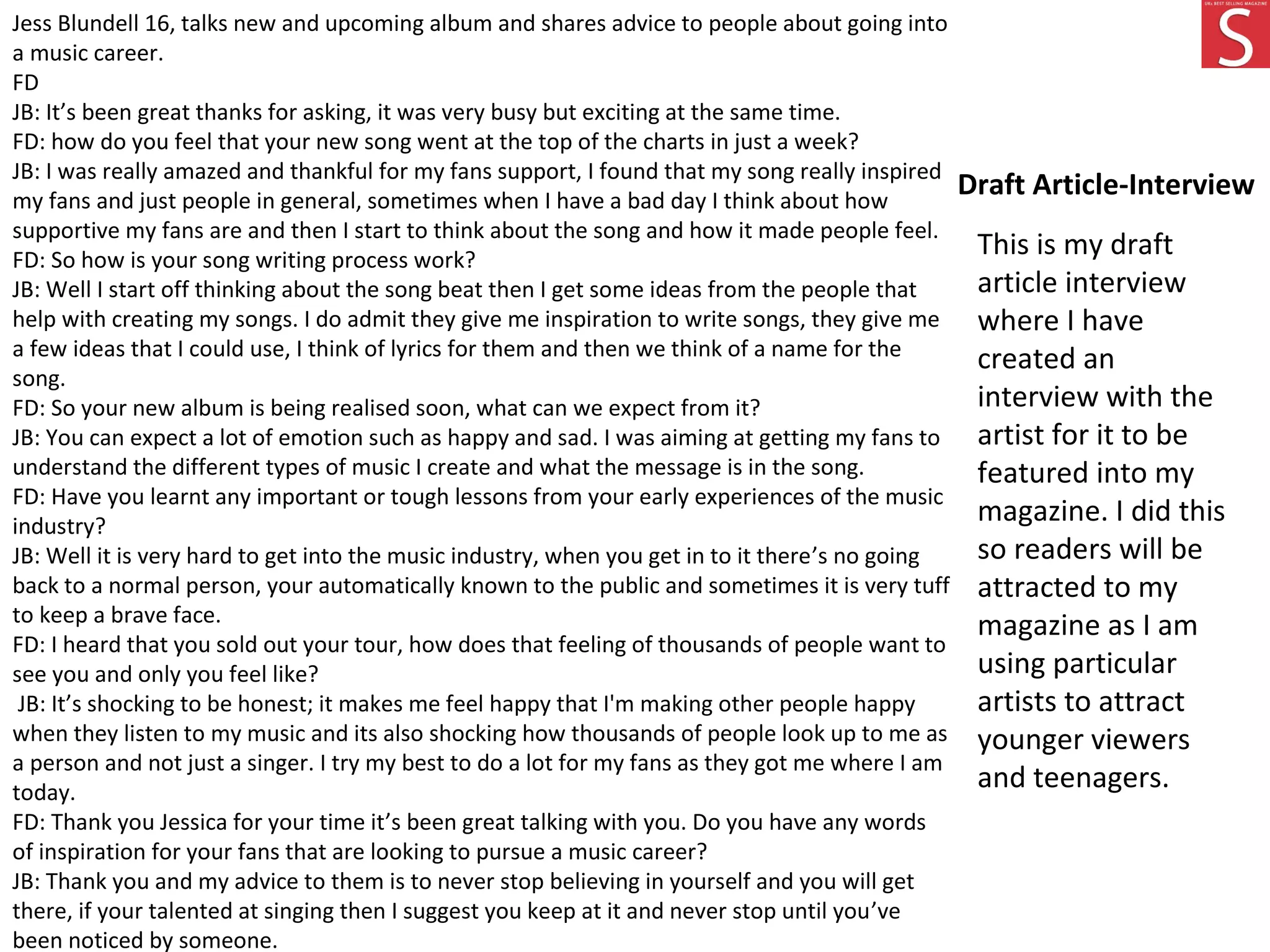
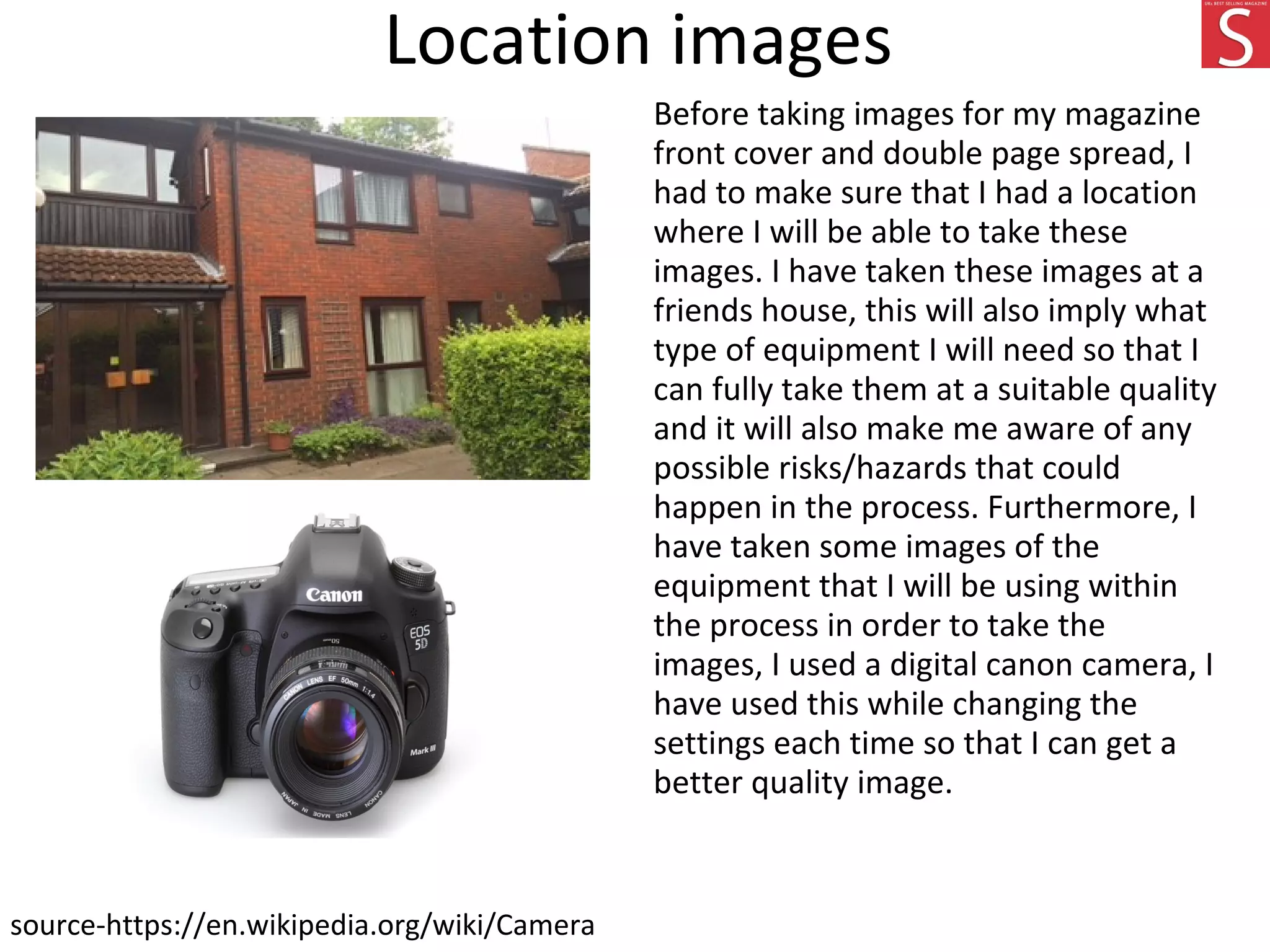
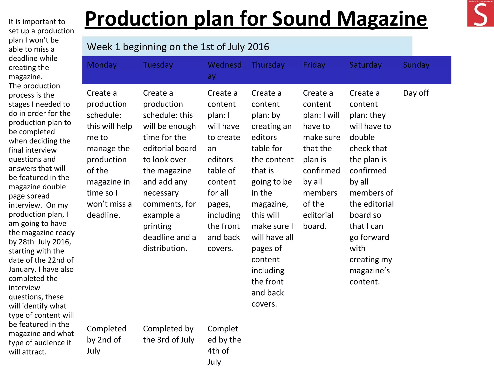
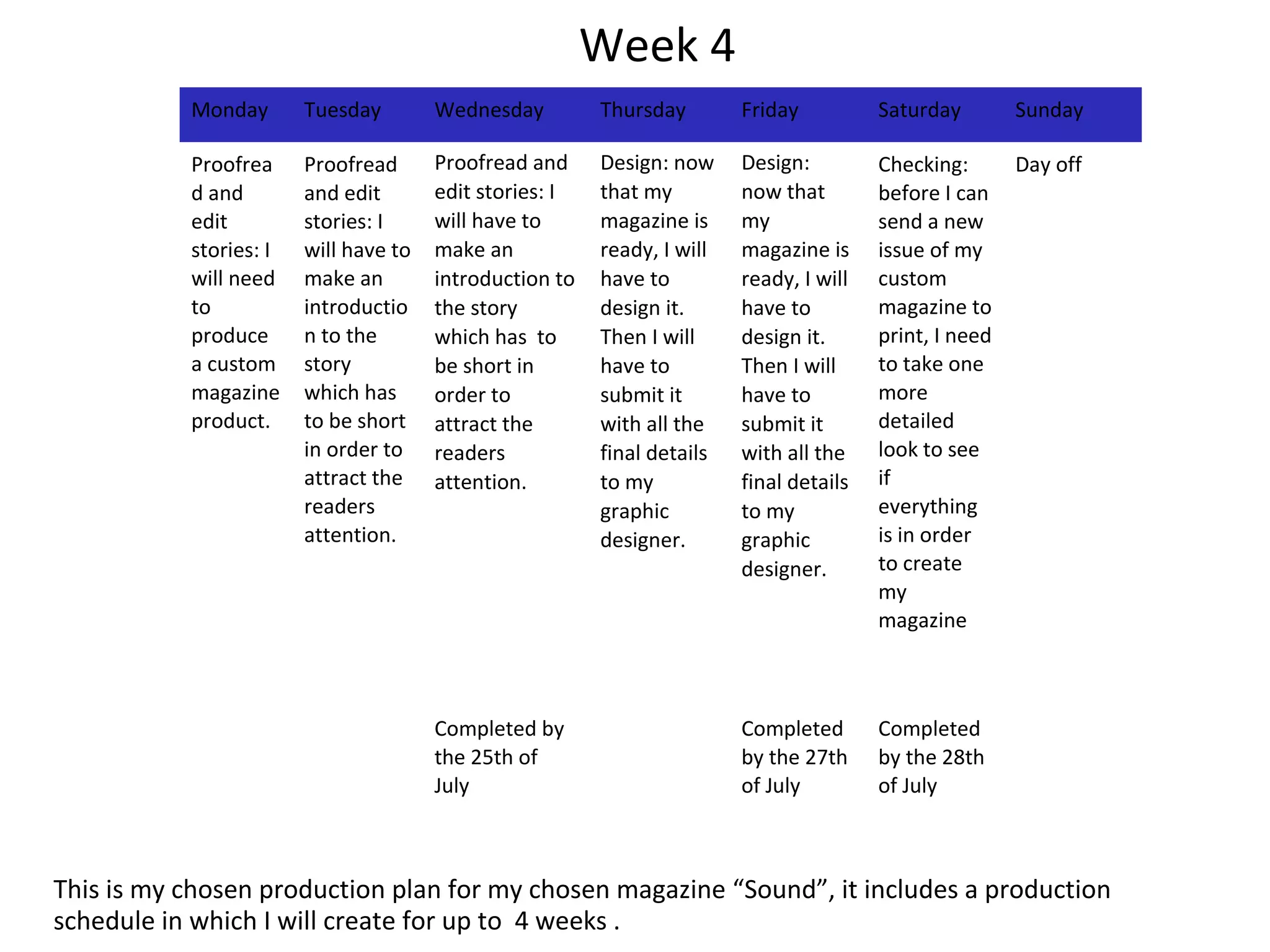
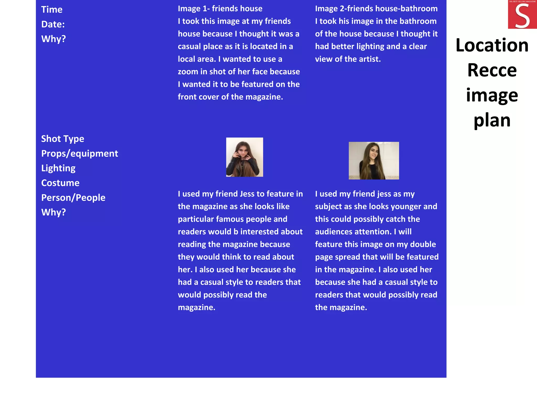
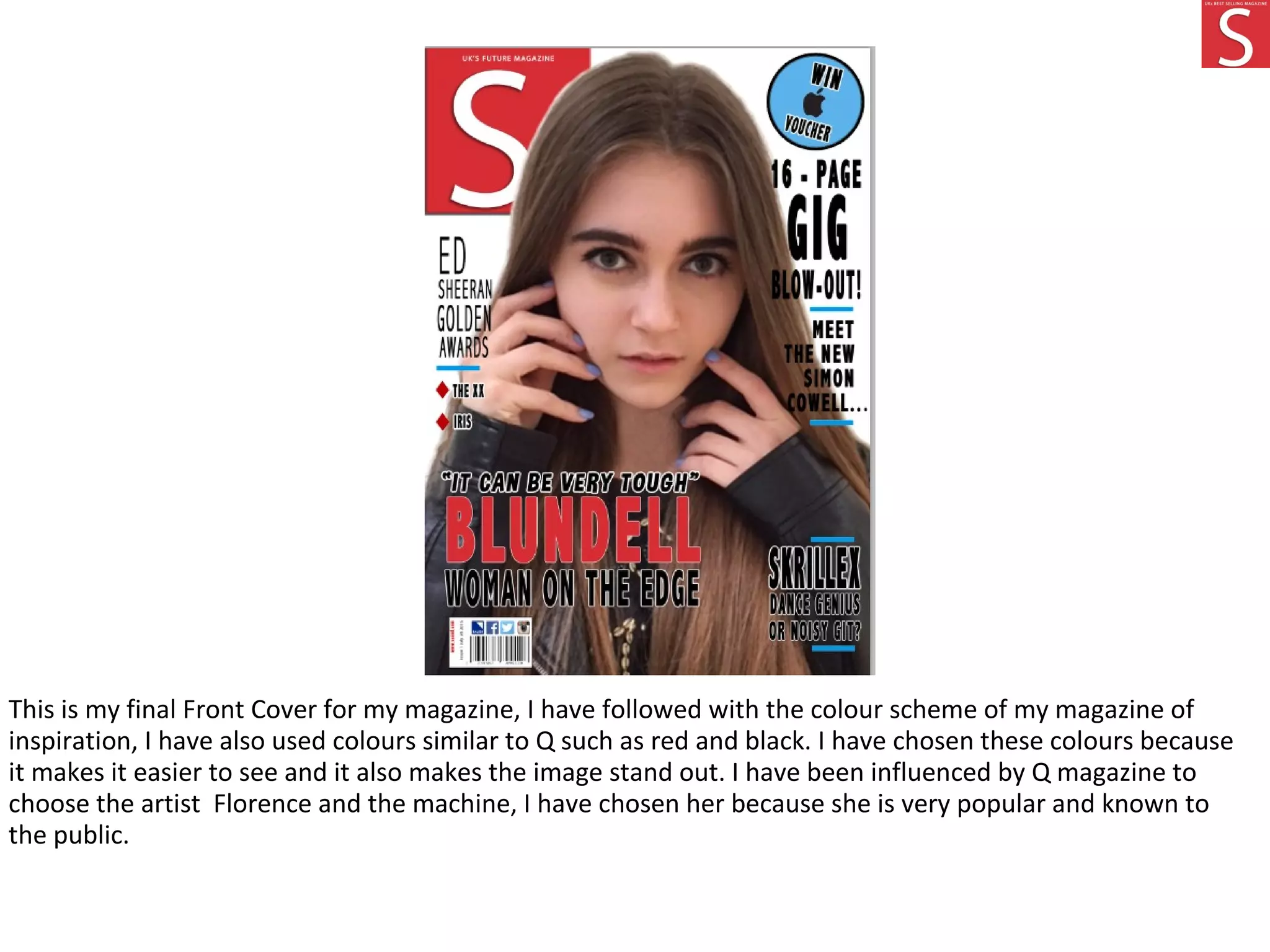
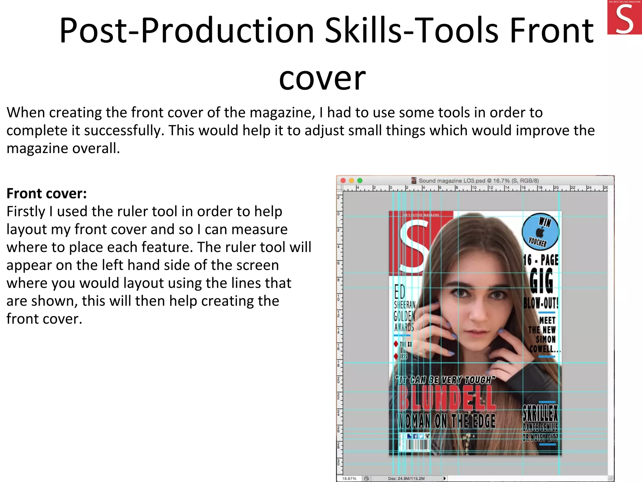
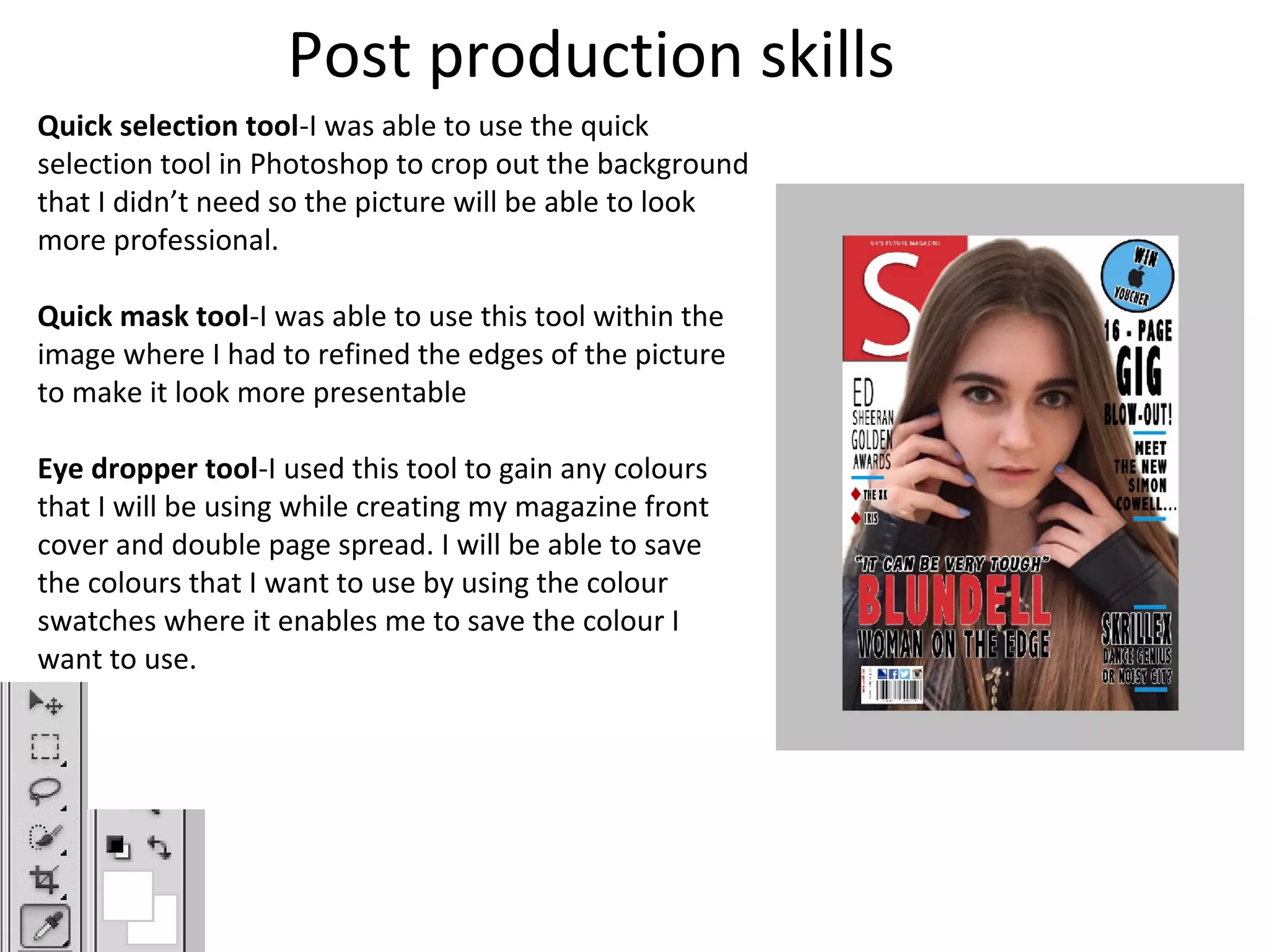
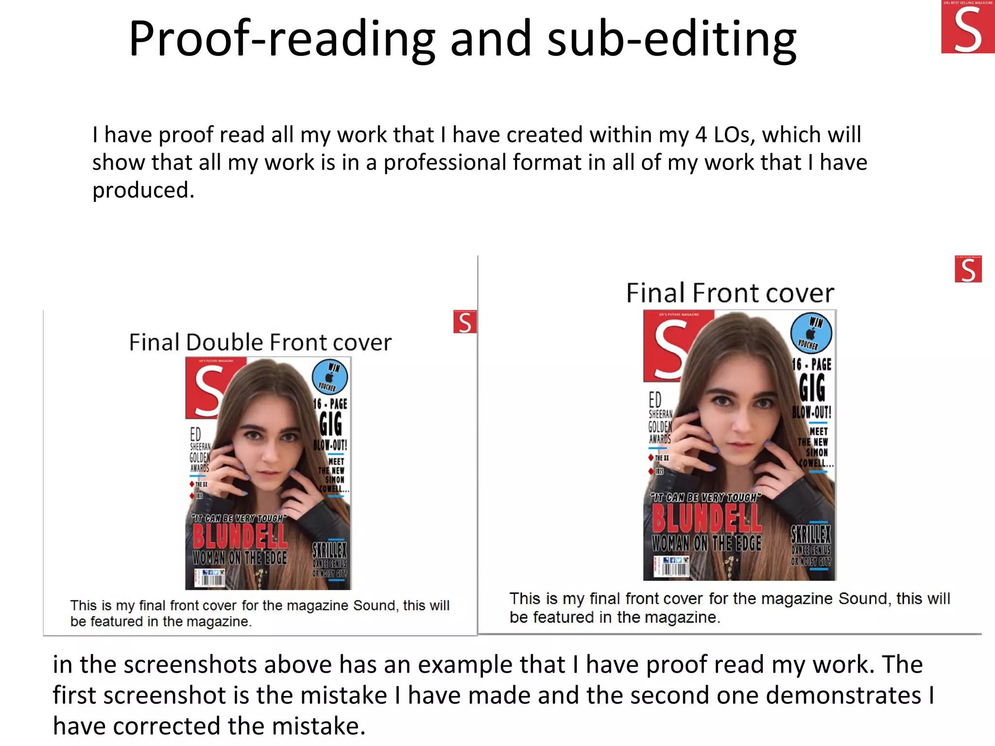
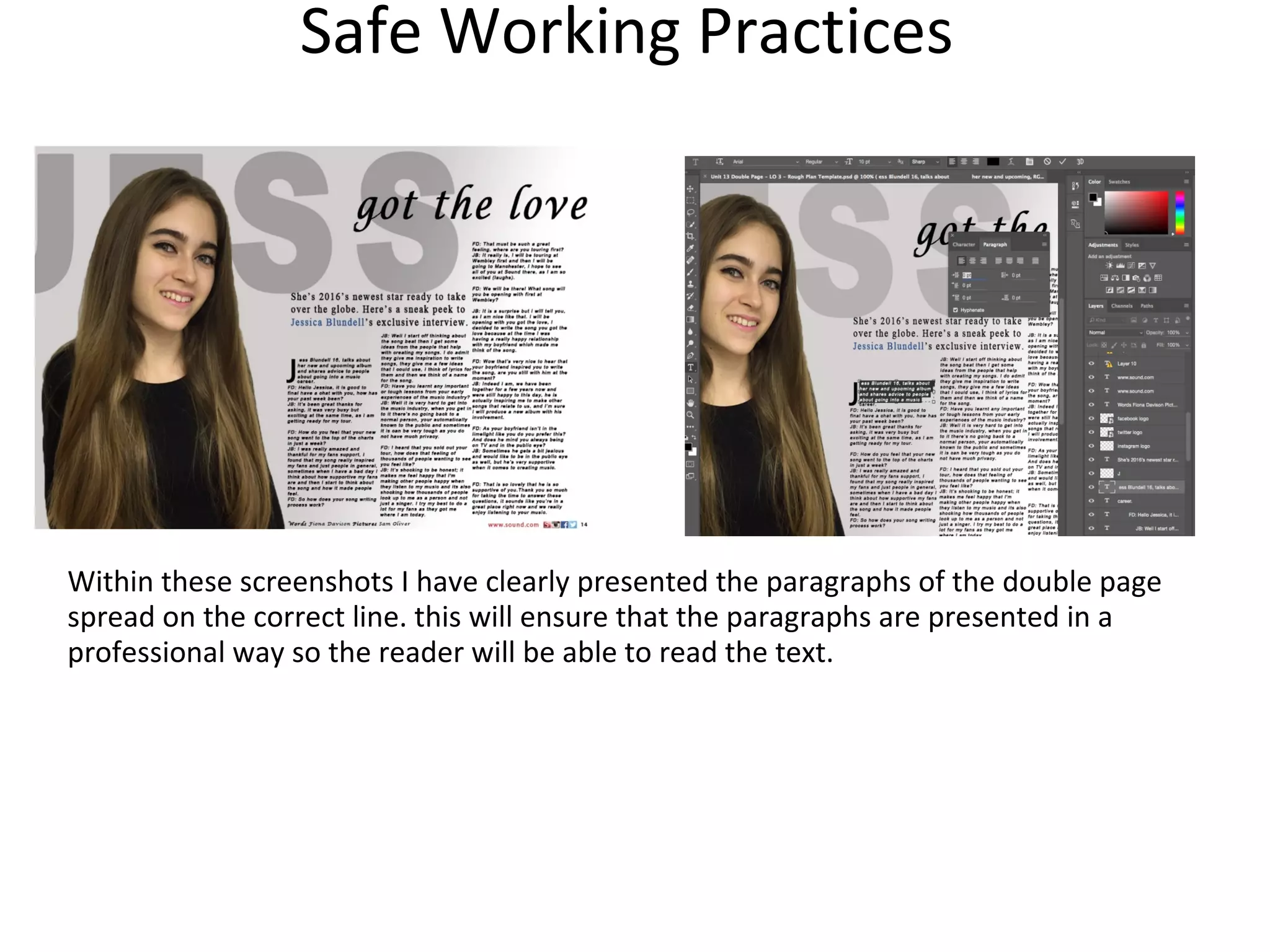
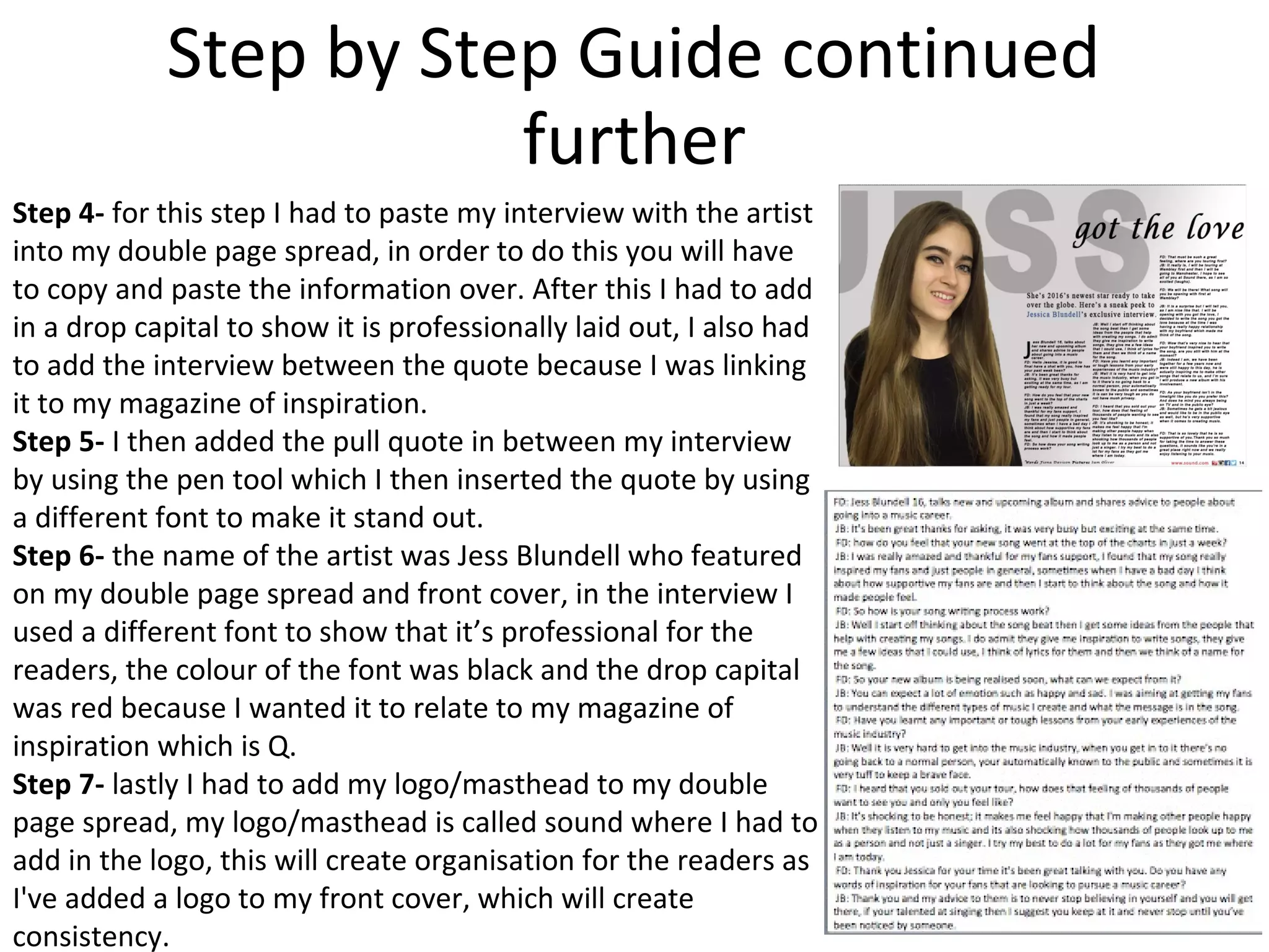
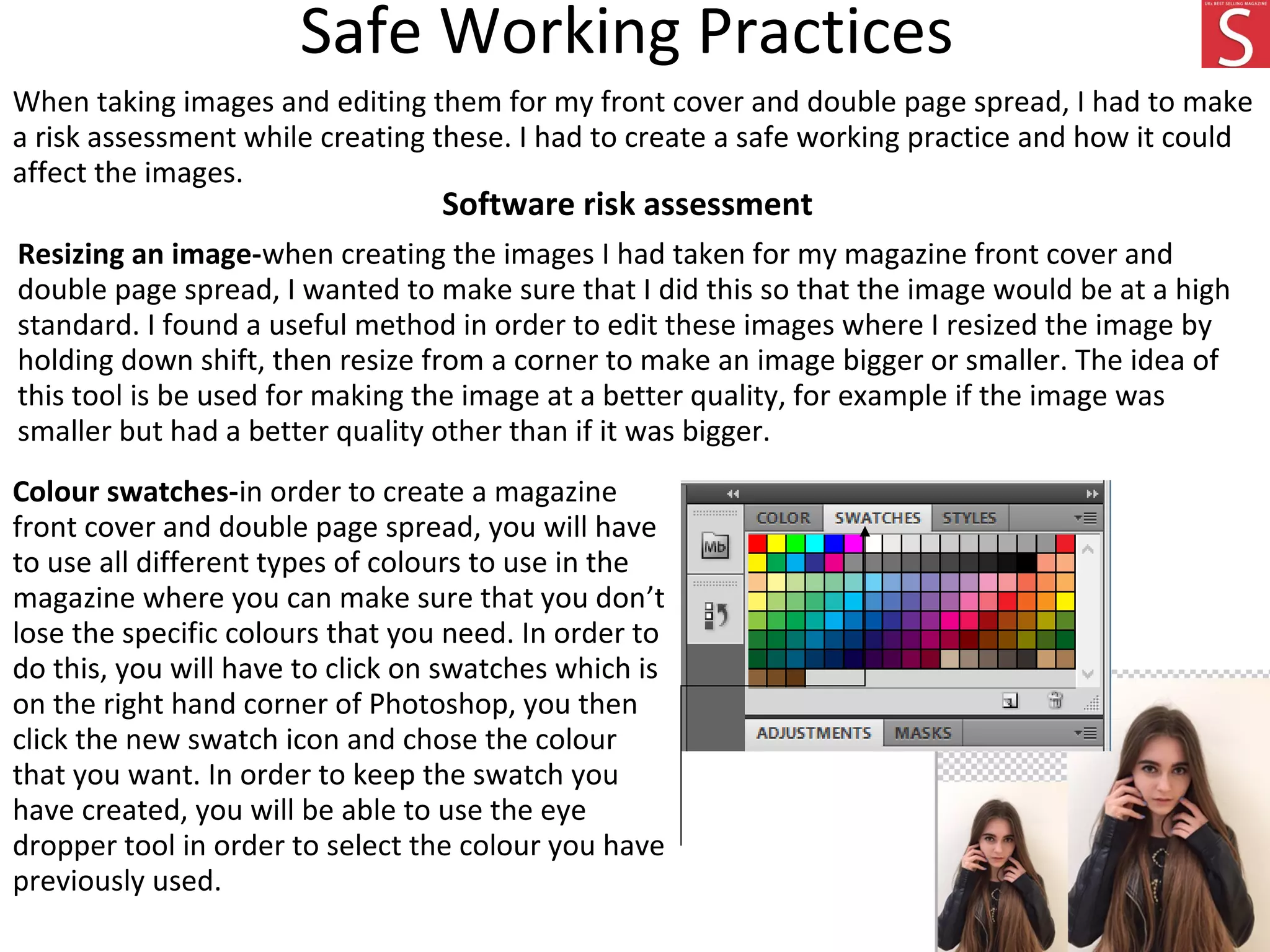
SlideShare a Scribd company logo
1 of 119
St. Andrew’s Catholic School - 64135
Fiona Davison – Candidate Number-1107
Contents
Deadlines-Production Plan for Sound magazine
I had to make sure when creating a production schedule that everyday I have specific
instructions in order to create the magazine. When creating this, I had to think about
how long it would take and the date which it is due.
Pre-Production:
When creating the pre production, there are some important deadlines that I had to make
sure that I met. This would include the interview between the artist and the
photographer. while thinking of the last date that the magazine will be released, I had to
also think about when It would be published to the public.
Pre-Production:
With the pre-production, I had to complete any
editing and final touches to my final magazine
front cover and double page spread. I included
Production:
There are multiple deadlines that I included within the production of the magazine, I have also
gathered information and the images such as famous artists that will be featured within the
magazine. The production deadline is 28th July.
Mood board Conclusion
When creating this mood, I have chosen
inspiring images from particular artists and
social media such as Instagram and Facebook to
display them in the magazine I create. My
magazine will have synergy with Facebook. This
will give the reader a brief idea of what kind of
things will be featured in the magazine and what
the articles/interviews will talk about.
Magazine Masthead/logo
When creating my masthead/logo for the magazine, I have done this in order for readers to
know what the magazine is called and what logo is used to represent it. Furthermore, I
needed to make sure that logo was similar to my magazine of inspiration which is Q to
show readers it was my inspired magazine. I have used the colours red, blue, white and
black which is similar to Q magazine as I want to base the magazine through Q magazine.
The colour black connotes mystery and darkness, this will make the readers interested
because it gives it a sense of mystery when reading my magazine. The colour red connotes
excitement as the readers won’t expect what is going to be in the magazine.
House style consistency- While looking for fonts and colour choices of the magazine, I
have decided to constantly use different features by using different types of fonts that I
have chosen. I have also decided to place the logo on each page to show that the
magazine is consistent throughout. I will be doing this so readers will find the magazine
appealing and will know the brand.
Final Masthead decision
This is my final masthead decision, I have included the slogan, Logo and included
the colours.
Magazine logos
House Style of the magazine
When creating house style for Sound I thought it was important to include the details
of the house styles and colours in which I will use on my magazine. In each of my
proposals there was an outline on what is going to be included in the magazine and
the features such as colour schemes and logos.
Colour scheme
For Sound magazine, the house style is the colour
scheme. They have chosen the colours to be bright
dark red, black and blue. The red will connote to the
readers that I am taking ideas from my magazine of
inspiration and also the how professional they have
laid out the magazine. the colour scheme will be
continued on every page of the magazine.
Masthead
When deciding on the
masthead for my magazine
sound, I thought I would have it
similar to the colour scheme
and similar to my magazine of
inspiration which is Q magazine
and I will also use similar
colours to Q such as the colour
red. I will use other colours like
black and blue to create my
masthead. I will use effects
such as make the masthead
stand out and look professional
in my magazine.
House Style of the magazine
Synergy with social media
I am going to be using synergy with other social media products within Sound
magazine for example I am going to promote the magazine on facebook and
twitter so readers can be updated when the magazine is going to be published and
who it is going to feature.
Strapline language
The strapline language for Sound magazine is “Uk’s future magazine” this will
encourage readers towards the magazine as it promotes the magazine’s title. This will
therefore attract readers as it is going to be promoted as a future magazine.
Mind Map-Final Idea
Generation of
Ideas
Colour scheme-the colour’s of Q magazine consist
of red, blue, white and black. The colour red
connotes excitement and mystery, this would
demonstrate that the magazine would encourage
explores different types of colours in order for the
reader to see the colour scheme of the magazine
overall. This would link to my created magazine
because I'm going to use bold and bright colours
such as red, blue black and white in order to
appeal to readers.
Price- the price of Q magazine costs £3.99, I
am going to repeat this by using a similar
price to the created magazine. As it is an
expensive price, I will also repeat this by
using a similar price because it would
connote to readers that the magazine is at
its best quality.
Frequency of Release- Q magazine is released on a
monthly basis, this is because the magazine is quite
expensive and produces more content for readers as
they have waited a month instead of a week to
purchase a copy of the magazine. This would also link
to the created magazine because it will also be
released on a monthly basis in order to attract
readers.
Target Audience- The target audience
of Q magazine are aimed at young
people and adults from the ages of 25.
The genre of Q magazine is electric
which is going to be the same with my
created magazine because it would be
aimed at the same target audience
meaning within the same age group.
Images- on the front cover of Q
magazine it shows the artist
Florence and the machine. The
magazine used this particular artist
because she is a popular music artist
which would attract more people to
read it. I am going to repeat this
during the making of the magazine
I'm going to be creating by using a
popular artist on the front cover to
attract more people to read it. I will
use a clos up image of the artist to
demonstrate to readers that it is an
important part of the magazine.
Brand identity-specific features that
are shown for Q magazine are self
advertisement’s that appeals through
articles and the artist. This would link
to the created magazine because it will
be known from social media that would
include personal articles about the
artist.
Masthead Names-
• M
• U
• Shuffle
• Playlist
• Volume
• More Music (MM)
Magazine Fonts
Font Name Font Preview Font Usage
Abadi MT Condensed light
Coverlines
Coverlines
Dimbo
Headline
Headline
Myraid pro
Strapline
Strapline, Article Titles
Abadi MT condensed light
Puff
Promotion
Puff Promotion
This highlights that I have included different font names which I am going to
include for each magazine convention
Magazine Colours
When deciding the magazine colours for the magazine, I had to be
very specific when using the colours because it could effect the way it
is presented to the audience. I have chosen specific colours such as
red, blue and black they are very bold and bright which would catch
the readers attention. The colour red connotes excitement and
mystery, this would catch the audiences attention because the reader
won’t expect what is going to be featured in the magazine.
House Style of the magazine - SOUND
When creating different for Q I
thought it was important to
include the details of the house
styles and colours in which I will
use on my created magazine. In
each of my proposals there was
an outline on what is going to be
included in the magazine and the
features such as colour schemes
and logos.
Masthead
When deciding on the masthead
for the magazine I thought I would
have it similar to the colour
scheme and similar to my
magazine of inspiration which is Q
magazine and I will also use
similar colours to Q such as the
colour red. I will use other colours
like black and blue to create my
masthead. I will use effects such as
make the masthead stand out and
look professional in my magazine.
Font Name Font Preview Font Usage
Abadi MT Condensed
light Coverline
s
Coverlines
Dimbo
Headline
Headline
Myraid pro
Strapline
Strapline, Article Titles
Abadi MT condensed
light Puff
Promotio
n
Puff Promotion
MASTHEAD
Sound
As shown below there is my front
for both my masthead and the
official name of my magazine
which is called Sound.
Colour scheme
For Q the house style is the colour
scheme, whereby they have chosen
the colours to be bright dark red,
black and blue. The red will connote
to the readers that I am taking ideas
from my magazine of inspiration
and also the how professional they
have laid out the magazine. the
colour scheme will be continued on
every page of the magazine.
House Style of the magazine
Synergy with social media
I am going to be using synergy with other social media products within Sound
magazine for example I am going to promote the magazine on Facebook and
twitter so readers can be updated when the magazine is going to be published
and who it is going to feature.
Strapline language
The strapline language for Sound magazine is “UK’s best selling magazine” this will
encourage readers towards the magazine as it promotes the magazine’s title. This
will therefore attract readers as it is going to be promoted as a future magazine.
Interview Draft Planning
For my double page spread within the magazine, I am going to construct an interview
with a well known artist “Florence and the Machine” I will also be featuring her in the
double spread for my magazine. she will be the main headline for my magazine and
she will also interest the audience because she is a very popular artist which would
make the audience become interested.
I have chosen to interview “Florence and the machine” because she is a well known
artist and has been in the music industry for a very long time, she has been very
successful in the music industry and has made a great impact on people today.
Florence has made three up and coming albums and nearly made the top charts in
2013. her recently released song “what kind of man” created a very emotional but
understanding impact to her fans which was a great hit when it first came out. I want
to interview her because it would create a positive impact on readers and she would
be a great inspiration to both young people and adults.
The presentation of the interview featured on the double page spread will be laid out
as a question and answer style. This is quite typical in many magazines which makes it
makes easier for the reader to understand the content that is being published in the
questionnaire.
Draft Article-Interview
Jess Blundell 16, talks new and upcoming album and shares advice to people about going into
a music career.
FD
JB: It’s been great thanks for asking, it was very busy but exciting at the same time.
FD: how do you feel that your new song went at the top of the charts in just a week?
JB: I was really amazed and thankful for my fans support, I found that my song really inspired
my fans and just people in general, sometimes when I have a bad day I think about how
supportive my fans are and then I start to think about the song and how it made people feel.
FD: So how is your song writing process work?
JB: Well I start off thinking about the song beat then I get some ideas from the people that
help with creating my songs. I do admit they give me inspiration to write songs, they give me
a few ideas that I could use, I think of lyrics for them and then we think of a name for the
song.
FD: So your new album is being realised soon, what can we expect from it?
JB: You can expect a lot of emotion such as happy and sad. I was aiming at getting my fans to
understand the different types of music I create and what the message is in the song.
FD: Have you learnt any important or tough lessons from your early experiences of the music
industry?
JB: Well it is very hard to get into the music industry, when you get in to it there’s no going
back to a normal person, your automatically known to the public and sometimes it is very tuff
to keep a brave face.
FD: I heard that you sold out your tour, how does that feeling of thousands of people want to
see you and only you feel like?
JB: It’s shocking to be honest; it makes me feel happy that I'm making other people happy
when they listen to my music and its also shocking how thousands of people look up to me as
a person and not just a singer. I try my best to do a lot for my fans as they got me where I am
today.
FD: Thank you Jessica for your time it’s been great talking with you. Do you have any words
of inspiration for your fans that are looking to pursue a music career?
JB: Thank you and my advice to them is to never stop believing in yourself and you will get
there, if your talented at singing then I suggest you keep at it and never stop until you’ve
been noticed by someone.
This is my draft
article interview
where I have
created an
interview with the
artist for it to be
featured into my
magazine. I did this
so readers will be
attracted to my
magazine as I am
using particular
artists to attract
younger viewers
and teenagers.
Location
Recce
image
plan
Time
Date:
Why?
Image 1- friends house
I took this image at my friends
house because I thought it was a
casual place as it is located in a
local area. I wanted to use a
zoom in shot of her face because
I wanted it to be featured on the
front cover of the magazine.
Image 2-friends house-bathroom
I took his image in the bathroom
of the house because I thought it
had better lighting and a clear
view of the artist.
Shot Type
Props/equipment
Lighting
Costume
Person/People
Why?
I used my friend Jess to feature in
the magazine as she looks like
particular famous people and
readers would b interested about
reading the magazine because
they would think to read about
her. I also used her because she
had a casual style to readers that
would possibly read the
magazine.
I used my friend jess as my
subject as she looks younger and
this could possibly catch the
audiences attention. I will
feature this image on my double
page spread that will be featured
in the magazine. I also used her
because she had a casual style to
readers that would possibly read
the magazine.
The lighting I used for this image
was dark because I wanted to
capture the whole face in a
different light. I didn't use any type
of lighting in particular as I wanted
it to be dark as well as light to
capture a glowing effect on the
image.
For the costume, I chose casual
clothing as I am trying to attract
young people. She is wearing a
black long sleeved top, blue jeans
and some black high heels.
I used a digital camera that I
borrowed from my school
Subject name-Jessica Blundell
The lighting I used for this image
was typically light and dark
lighting, in some parts of the image
there is lighter parts then others.
The costume I used for this image
is similar to my other image,
including causal clothing where she
is wearing a top, black jeans and
some flat shoes.
I also used a digital camera to take
this image.
Subject name-Jessica Blundell
Permission needed
Contact needed to be made
Evidence of this?
I have given the artist a
permission slip, asking for her
permission so I will be able to
take pictures of her
I have given the artist a
permission slip, asking for her
permission so I will be able to
take pictures of her
Potential Hazards/Risks
Location
Why?
Breaking the camera- this
would be dangerous because
there could be glass on the
floor which someone could
step on.
Environment where it takes
place-anyone could possibly
trip over anything that in the
way while taking pictures.
Breaking the camera- this
would be dangerous because
there could be glass on the
floor which someone could
step on.
Environment where it takes
place-anyone could possibly
trip over anything that in the
way while taking pictures.
The weather could
be bad, this could
affect the picture
because no one
would be able to
see it on the lens.
The flash of the
camera could affect
the picture overall
because it could
block out the
picture. If anything
is in the way when
taking pictures,
someone could
possibly fall over
and brake the
camera.
More Risks and Hazards
This is a form from the permission
slip that allows me to take pictures
of this person and feature them in
the magazine.
Prop list Before taking the images I needed for my front
cover and double page spread, I have made some
lists in order to make sure I have the equipment I
need. One of these lists includes the Prop List
which consists of the costume that I used, the
equipment and the props.
By making these lists, it will illustrate what I need in
order to take pictures for my Front cover and
Double Page spread. I had to then find a location
which will fit the pictures that I will eventually be
taking. I have then also made sure that the artist
that will be featured in my Front cover and Double
page will wear suitable clothing for the shoot that
links to the theme of the magazine. I made sure to
include a camera which I will be using to take
pictures with, the different lenses which will be
used in the camera and I have also used a bag to
store all the equipment I need for the shoot.
Prop List
http://www.newlook.com http://www.riverisland.com
Technical equipment
Canon DSLR
source-https://en.wikipedia.org/wiki/Camera
£6.00£15.00
Prop sourcing
Before taking images for the Front cover
and Double page spread, I needed to make
sure that I had all the equipment I needed
for the shoot. I got the equipment from my
school which I borrowed in order to take
pictures, this will make the images at a
better quality and more appealing for the
readers to see. I researched a few websites
which gave me information about the
equipment that I could use at a cheap
price. Below are some examples of the
websites I researched for my prop sourcing.
Other props that I needed to include are
costumes that the artist will be wearing. I
was able to find costumes in a local
clothing shop that could provide me with
casual clothes for the shoot. I couldn’t find
any clothes that I thought were suitable for
my shoot so I went online and found some
clothes I thought matched with the theme.
source-https://en.wikipedia.org/wiki/Camera
£6.00£15.00
Test Photography
during my test photography, I have taken 6
images of the person that is going to be featured
on my created front cover and double page
spread. I will use some of these images in the
magazine to demonstrate that I have used
different images to attract the audience
attention.
Canon DSLR
£1,375.00
Photo shoot plan
I carried out a Photoshoot
plan in order to identify who
I am going to use for the
pictures I will be taking,
what they will be wearing in
the Photoshoot and what
equipment I will need in
order to do this.
Location images
Before taking images for my magazine
front cover and double page spread, I
had to make sure that I had a location
where I will be able to take these
images. I have taken these images at a
friends house, this will also imply what
type of equipment I will need so that I
can fully take them at a suitable quality
and it will also make me aware of any
possible risks/hazards that could
happen in the process. Furthermore, I
have taken some images of the
equipment that I will be using within
the process in order to take the
images, I used a digital canon camera, I
have used this while changing the
settings each time so that I can get a
better quality image.
source-https://en.wikipedia.org/wiki/Camera
Risk Assessment-Photography consent form
Image risk assessment – Consent Form
Before taking images for the magazine, I had
to gain full permission for the person to be
photographed and the image being
published which will be both online and
printed. I thought the best way to do this is
to send an email across to the artist
describing what they have to wear and act
like during these pictures that will be taken. I
have also sent the artist a permission form
which they will have to sign and issue a date
they would have to send it back to me. By
having permission, I will be able to have a
fully signed document which means that I
will be able to take pictures and use them in
my magazine.
Production plan for Sound Magazine
Week 1 beginning on the 1st of July 2016
Monday Tuesday Wednesd
ay
Thursday Friday Saturday Sunday
Create a
production
schedule:
this will help
me to
manage the
production
of the
magazine in
time so I
won’t miss a
deadline.
Create a
production
schedule: this
will be enough
time for the
editorial board
to look over
the magazine
and add any
necessary
comments, for
example a
printing
deadline and a
distribution.
Create a
content
plan: I
will have
to create
an
editors
table of
content
for all
pages,
including
the front
and back
covers.
Create a
content
plan: by
creating an
editors
table for
the content
that is
going to be
in the
magazine,
this will
make sure I
will have all
pages of
content
including
the front
and back
covers.
Create a
content
plan: I will
have to
make sure
that the
plan is
confirmed
by all
members
of the
editorial
board.
Create a
content
plan: they
will have to
double
check that
the plan is
confirmed
by all
members of
the editorial
board so
that I can
go forward
with
creating my
magazine’s
content.
Day off
Completed
by 2nd of
July
Completed by
the 3rd of July
Complet
ed by the
4th of
July
It is important to
set up a production
plan I won’t be
able to miss a
deadline while
creating the
magazine.
The production
process is the
stages I needed to
do in order for the
production plan to
be completed
when deciding the
final interview
questions and
answers that will
be featured in the
magazine double
page spread
interview. On my
production plan, I
am going to have
the magazine ready
by 28th July 2016,
starting with the
date of the 22nd of
January. I have also
completed the
interview
questions, these
will identify what
type of content will
be featured in the
magazine and what
type of audience it
will attract.
Monday Tuesday Wednesday Thursday Friday Saturday Sunday
Create a
content
plan; I
will make
sure that
the plan
has
gotten
permissi
on by all
members
of the
editorial
board.
Create a
detailed
plan for
each story:
on this day
I will
decide
about what
type of
content
will go into
the stories.
Create a
detailed plan
for each story:
on this day I
will decide
about what
type of
content will go
into the
stories.
Create a
detailed
plan for
each story:
on this day I
will decide
about what
type of
content will
go into the
stories.
Create a
detailed
plan for
each story:
on this day I
will decide
what type
of content
will be the
best for the
story for
example
interviews,
articles
Create a
detailed
plan for
each story:
on this day I
will decide
what type
of articles
that will be
the best for
the story
Day off
Complet
ed by the
9th of
July
Week 2
Monday Tuesday Wednesday Thursday Friday Saturday Sunday
Create a
detailed
plan for
each
story:
they will
provide
me with
a visual
guide to
help me
and the
designer
envision
the
layout of
each
story.
Create a
detailed
plan for
each story:
they
provide me
with a
vision
guide in
order to
help me
and the
designer
envision
the layout
of each
story.
Create a
detailed plan
for each story:
they will
provide me
with a vision
guide in order
to help me and
the designer
envision the
layout of each
story.
Create a
detailed
plan for
each story: I
will need to
write down
detailed
instructions
for every
story.
Create a
detailed
plan for
each story: I
will discuss
planned
stories with
my authors.
Proofread
and edit
stories: I
will need to
produce a
custom
magazine
product.
Day off
Complet
ed by the
16th of
July
Week 3
This is my chosen production plan for my chosen magazine “Sound”, it includes a production
schedule in which I will create for up to 4 weeks .
Monday Tuesday Wednesday Thursday Friday Saturday Sunday
Proofrea
d and
edit
stories: I
will need
to
produce
a custom
magazine
product.
Proofread
and edit
stories: I
will have to
make an
introductio
n to the
story
which has
to be short
in order to
attract the
readers
attention.
Proofread and
edit stories: I
will have to
make an
introduction to
the story
which has to
be short in
order to
attract the
readers
attention.
Design: now
that my
magazine is
ready, I will
have to
design it.
Then I will
have to
submit it
with all the
final details
to my
graphic
designer.
Design:
now that
my
magazine is
ready, I will
have to
design it.
Then I will
have to
submit it
with all the
final details
to my
graphic
designer.
Checking:
before I can
send a new
issue of my
custom
magazine to
print, I need
to take one
more
detailed
look to see
if
everything
is in order
to create
my
magazine
Day off
Completed by
the 25th of
July
Completed
by the 27th
of July
Completed
by the 28th
of July
Week 4
Launch Date
The launch date of the magazine will be released on the 28th
July. I have specifically chosen the magazine to be released on
this date as it is in the summer time where events are held
such as festivals.
Hand Drawn Drafts-Final Idea
This is my final Front cover and Double page spread draft for my chosen magazine.
First front cover Hand Drawn Drafts
Magazine Logo- I have chosen to place
my magazine logo on the left top corner
of the front cover, I have chosen this part
in particular because it is easy for the
readers to see it and it would be the first
thing they would see. I have been
inspired to put the magazine logo in this
particular place because of Q magazine,
this is because It is my magazine of
inspiration. I have chosen these
particular colours on the magazine logo
because Q magazine has a red logo. I
have then got the idea of using the same
colour. This will show that my magazine
is similar to Q magazine.
Main story- I have decided to place
the main story on the right hand
side of the front cover because
readers will notice it straight away
as it is close to the main image, this
will encourage readers to pick it up
and read it. I thought by placing the
main story there, it will have a clear
view of the magazine logo and the
main image. I was inspired by Q
magazine to place it in this
particular area, this will
demonstrate that I am following my
magazine of inspiration.
Puff promotion- I have chosen to place
the puff promotion on the top left hand
corner, I have chosen to place it in this
particular place because it is similar to
my magazine of inspiration. I thought
about placing it there because it will
attract readers to the magazine. This will
encourage readers to buy the magazine
because the puff promotion usually
offers the readers with competitions
where they could possibly win
something.
Magazine layout- when creating the
hand drawn drafts for my magazine, I
wanted to make sure that they look
professional and eye catching for the
reader to see, this will more likely
attract the reader to read the magazine.
I wanted to carefully think about where
I wanted to place certain things such as
the masthead and the puff promotion.
In order to do this I have looked at my
magazine of inspiration and followed a
similar layout so readers will know it is
my magazine of inspiration.
Article feature- on this hand drawn
draft, I was aiming to include the
content and what readers will see
when they open the magazine. Then
I will make the title of the pages
smaller in order for the readers to
know more about the content of the
magazine and the artist it is talking
about.
First double page spread hand drawn draft
Main image- I created this double page spread by looking at my
magazine of inspiration which is Q magazine, I thought it was a
good idea for the image to be a big part of the double page spread.
This will be eye catching to the reader as it will be the first thing the
reader will see.
Information about the
artist- this includes
specific information
that readers would like
to know about the
artist, which includes
information about who
they are and how they
got famous and why
they are popular to the
public.
Article images- on the
double page spread
draft that is shown, I
will be including
smaller images to
represent the main
image and to give the
reader an idea about
what they will be
reading. Also the
smaller images can
refer back to the
article, this will
encourage the reader
to read the article and
find out what it is
about.
Interview- on the double page spread draft I have placed the interview in columns, I have
done this because it will make it more interesting for the reader. An interview in a
magazine is a personalised interview between the artist and the publisher, this will
encourage readers to find out more about the artist that they like and admire. I have also
placed it in columns because it will seem like a dramatic build up for the reader, I have
used questions and answers in the interview to imply that it is professional which will tell
readers information about the artist.
Final image plans-hand drawn drafts
Final double page spread draft- this is my final double page spread draft that I will
then include into the magazine. It will consist of the interview, the main image,
anchoraged text and pull quote. the main image will be the first thing the reader will
see, this is because the image will be presented as big and bold which will
automatically attract the readers attention. The interview is laid out in columns to
show to the reader that it is professionally laid out. It will also give them information
about artist overall. The pull quote is give readers an idea about what the overall
interview is going to be talking about.
Final image plans-hand drawn drafts
Final Front cover Draft- this is my final front cover which will be featured In the magazine. It
will include the logo which is going to be placed on the top left hand corner, this will also be
similar to Q magazine because it is my magazine of inspiration. Secondly the puff promotion
will be placed on the right top hand corner and will feature a competition where readers
could possibly win a free prize by entering. Thirdly the cover lines will consist of key events
and artists that will be featured within the magazine. The main story will feature articles
which will relate to the main image. The main headline will feature the main title of the
magazine and what the main article and interview will be about. The main image will also
have an image of the artist which will be featured in the magazine, this will more likely attract
readers to read the magazine as the artist will be popular. And lastly the bar-code will include
the issue date, when the magazine will be published, the price of the magazine overall and
some social media links which enables readers to follow so they will never miss an issue of the
magazine.
Graphic Layouts-Final Idea
Graphic Layout-Analysis
Budget summaryJobs and salaries per year
Commissioning editor-£26,500
Publishing editor- £15,000-£23,000
Magazine features editor- £25,000 to £40,000
Publishing rights manager- £22,000 to £35,000
Editorial assistant- £15,000
Press sub editor- £20,000-£23,000
Art director- £25,000-£50,000
Photo editor-£25,000- £40,000
Recruitment costs: £173,500
Marketing costs: Marketing on
Facebook
Office space
8x375=£3,000
8 Office chairs- 8x64=
£512.00
4x£300= £1,200
Computers
Added up all
together = £4,712
Conclusion to Unit 14 LO1
In this unit, I have focused on creating my final image plans for
my final images which I have taken for my front cover and
double page spread. I have also included my ideas for my front
cover and double page spread where I have drawn hand drawn
drafts that I have labelled, including different features of each
part such as barcode, masthead and cover lines. By looking at
the features I labelled, it gave me ideas where to place them on
my final magazine.
Contents
Name Slide number
Location Recce 38
Location Recce 39-41
Planned format and style 42
Risk assessment-Photography
consent form
43
Risk assessment-Form 44
Location images 45
Intellectual Property 46
Production Legal and Ethical
Issues
47-48
Legal and ethical issues 49
Press complaints commission 50-51
How to make a complaint 52-53
Complaint case study 54-55
Editors code of practice 56
Location Recce
Before taking images for my front cover and double page
spread for the magazine, I had to create a location
Reece, I have created this to demonstrate where I have
taken my final images for the magazine. I will also
mentioned about the risks and hazards that could be
caused while taking images. For example breaking the
camera, this could cause the glass to break which is a
harmful risk while taking these images for the
photographer.
Location
Recce
image
plan
Time
Date:
Why?
Image 1- friends house
I took this image at my friends
house because I thought it was a
casual place as it is located in a
local area. I wanted to use a
zoom in shot of her face because
I wanted it to be featured on the
front cover of the magazine.
Image 2-friends house-bathroom
I took his image in the bathroom
of the house because I thought it
had better lighting and a clear
view of the artist.
Shot Type
Props/equipment
Lighting
Costume
Person/People
Why?
I used my friend Jess to feature in
the magazine as she looks like
particular famous people and
readers would b interested about
reading the magazine because
they would think to read about
her. I also used her because she
had a casual style to readers that
would possibly read the
magazine.
I used my friend jess as my
subject as she looks younger and
this could possibly catch the
audiences attention. I will
feature this image on my double
page spread that will be featured
in the magazine. I also used her
because she had a casual style to
readers that would possibly read
the magazine.
The lighting I used for this image
was dark because I wanted to
capture the whole face in a
different light. I didn't use any type
of lighting in particular as I wanted
it to be dark as well as light to
capture a glowing effect on the
image.
For the costume, I chose casual
clothing as I am trying to attract
young people. She is wearing a
black long sleeved top, blue jeans
and some black high heels.
I used a digital camera that I
borrowed from my school
Subject name-Jessica Blundell
The lighting I used for this image
was typically light and dark
lighting, in some parts of the image
there is lighter parts then others.
The costume I used for this image
is similar to my other image,
including causal clothing where she
is wearing a top, black jeans and
some flat shoes.
I also used a digital camera to take
this image.
Subject name-Jessica Blundell
Permission needed
Contact needed to be made
Evidence of this?
I have given the artist a
permission slip, asking for her
permission so I will be able to
take pictures of her
I have given the artist a
permission slip, asking for her
permission so I will be able to
take pictures of her
Potential Hazards/Risks
Location
Why?
Breaking the camera- this
would be dangerous because
there could be glass on the
floor which someone could
step on.
Environment where it takes
place-anyone could possibly
trip over anything that in the
way while taking pictures.
Breaking the camera- this
would be dangerous because
there could be glass on the
floor which someone could
step on.
Environment where it takes
place-anyone could possibly
trip over anything that in the
way while taking pictures.
The weather could
be bad, this could
affect the picture
because no one
would be able to
see it on the lens.
The flash of the
camera could affect
the picture overall
because it could
block out the
picture. If anything
is in the way when
taking pictures,
someone could
possibly fall over
and brake the
camera.
The weather could
be bad, this could
affect the picture
because no one
would be able to
see it on the lens.
The flash of the
camera could affect
the picture overall
because it could
block out the
picture. If anything
is in the way when
taking pictures,
someone could
possibly fall over
and brake the
camera.
More Risks and Hazards
Friend's house Friend's house
Time- 1pm 2pm
Date- 12th of January 2015 20th of January 2015
Why- I thought it would be a casual
place to take images as the
magazine is going to aimed at
young people and adults. I also
wanted it to look like my
magazine of inspiration which
is Q magazine. The mid lighting
creates a dramatic effect which
will enable readers to
concentrate on the face of the
artist.
I thought it would be a casual
place to take images as the
magazine is going to aimed at
young people and adults. I also
wanted it to look like my
magazine of inspiration which
is Q magazine. The mid lighting
creates a dramatic effect which
will enable readers to
concentrate on the face of the
artist.
Picture needed/required Face looking straight into the
camera
Face looking straight into the
camera
Shot type= Close up Long Shot
Props Equipment- Camera Camera
Lighting- Mid Lighting Mid lighting
Costume-
Black long sleeved top, dark
blue jeans, high heels
Black long sleeved top, dark
blue jeans, high heels
Person/People Jessica Blundell Jessica Blundell
Planned format and style
Risk Assessment-Photography consent form
Image risk assessment – Consent Form
Before taking images for the magazine, I had
to gain full permission for the person to be
photographed and the image being
published which will be both online and
printed. I thought the best way to do this is
to send an email across to the artist
describing what they have to wear and act
like during these pictures that will be taken. I
have also sent the artist a permission form
which they will have to sign and issue a date
they would have to send it back to me. By
having permission, I will be able to have a
fully signed document which means that I
will be able to take pictures and use them in
my magazine.
Risk Assessment – Form
I completed an industry standard risk assessment form before taking pictures for the
magazine. I had to look into what to take, transport, camera and lighting, sound and what
the director should use. I had to do a risk assessment before hand because it will make
sure I was protecting myself and the person I was taking pictures of from any risks or
hazards, I have ensured that I have covered all aspects of risks that could happen.
https://worksmart.org.uk/health-advice/health-and-safety/hazards-and-risks/what-are-five-steps
Location images
Before taking images for my magazine
front cover and double page spread, I
had to make sure that I had a location
where I will be able to take these
images. I have taken these images at a
friends house, this will also imply what
type of equipment I will need so that I
can fully take them at a suitable quality
and it will also make me aware of any
possible risks/hazards that could
happen in the process. Furthermore, I
have taken some images of the
equipment that I will be using within
the process in order to take the
images, I used a digital canon camera, I
have used this while changing the
settings each time so that I can get a
better quality image.
source-https://en.wikipedia.org/wiki/Camera
Intellectual Property
A watermark form is considered a copyright label, it is demonstrated on both online
and written documents. This is when an image has copyright for their company or logo
they have created which is printed on it to identify who it belongs to. By having
watermark on pictures, it will prevent people from using them without permission as it
is owned by their company. below, I have made some examples of Watermark on my
front cover and double page spread to advertise that my magazine is personal and
includes Watermark on each image in order to demonstrate that it belongs to my
company. The edits I have created will be used online to ensure that no one will be
allowed access without permission and so it won’t be able to be copyrighted by other
organisations. I have created these edits in Photoshop to include into the magazine.
Front cover water mark Double page spread water mark
https://postcron.com/en/blog/watermark-on-facebook/
Production Legal and Ethical Issues
before my magazine can be published to the public, there are some legal and ethical
issues that have to be investigated before doing so. Two of these are to publish the
organization so that it is professional, this will also include privacy to label accuracy.
Copyright- the legal right to be the only one to produce, publish and sell a book,
a video or anything on social media that has been created or brought out to the
public. an example of this would be brochures, books and other things on social
media that would be considered copyrighted. for Q magazine, they use
copyright by using pictures of a particular artist or band member. By using
different images, they will have to therefore ask the company for permission in
order to use the image.
The right to privacy- publishing content about different people, it is important to regulate people’s privacy
and what they purchase on the internet. In order to make sure of this, I will have to ask the people for their
permission to feature on my magazine.
Seditious and Criminal Libel- this is when something that is released on the internet is considered
offensive to the government and the people of the public. Criminal Libel is published information that is
released about someone that is considered negative to the public and which would create a reputation
for that person or company.
Production Legal and Ethical
Issues
Discrimination-if an article is published and has signs of discrimination, this would mean they are talking about
an individuals race, colour, religion and gender. Examples of discrimination would be racism, harassment and
many others.
Children- people have to be careful about what they say about children in the media industry and content that
is released about them because they are considered innocent and vulnerable. It is important to use permission
from their parents/parent to use their information on the internet if they are under the age of 18, then the
parents or parent will then have to agree to the terms and make sure that they are using necessary content
that is appropriate for the magazine.
Accuracy-content that is published in a magazine must not be inaccurate, this means that the information
they produce such as written information or pictures they use must not be misleading. This means that it
must be accurate and not made up or extended. Furthermore, I need to be accurate in the magazine I am
creating because then I will be giving readers the correct information that they are reading about within the
magazine.
https://www.tes.com/lessons/x9hMlieIZ5BXqQ/unit-6-week-5-discrimination
http://www.eastspartachurch.com/childrens-mnistry/
Legal and Ethical Issues
Contract Challenges: when looking through the content of the magazine, it goes through a
contract to the organisation so they will only use copyright on the things that they have created.
When the person/people sign the contract, this will then mean they have to stick to it and it must
not be changed in any way possible. This would also mean that they have control of some of the
rights they have made.
Copyright:Intellectual Property-before making the magazine, I had to research legal areas that I
can then be able to use a type of content in my magazine that I will be producing. Using this, they
will have to ask for permission to use particular content so it can be featured in the magazine and
so it will be safe from paying fines.
Privacy-when publishing content into my magazine, I will have to make sure that I limit people's
privacy that will be featured in the magazine. I will have to make sure that I ask for permission for
any personal details that will be featured before I publish the magazine and with the permission of
the person I would like to feature in the magazine. I have to also made sure not to include
anything negative information about that person so the magazine won't have a negative impact on
the readers and public.
https://www.copyrightservice.co.uk/
When making the magazine, I have to make sure
that I include legal and ethical issues when
dealing with the content that is going to be
featured in the magazine. For example I could
talk about private information from an artist and
I will have to deal with what I say and the limits. I
will then create protection copyright so that I
only use it for my organisation and other
companies will not be able to access it.
Press Complaints Commission
When producing and publishing the magazine, I will have to include the editors code
which can be found on the press complaints commission website. The first thing about
the editors code is to make sure that the magazine is of high standards when it comes
to the making of the magazine and making sure that every page is professorially laid
out. This will include the content and how the company will be able to handle readers
information that is provided so that the magazine will be able to handle the situation
in a reasonable manner.
Overall the information in the editors code must be applied into the magazine that is
created from the magazine development. This will include both printed and online
punishments so readers won't miss an issue of the magazine. This would mean that
the editors can check through the information that is created by the publishers so that
they can make sure that the content is published professionally within the editors
codes instructions.
http://www.pcc.org.uk/assets/111/Teachers__Resource_Pack.pdf
http://www.pcc.org.uk/assets/80/PCC_Complaints_Statistics_for_2011.pdf
Press Complaints Commission
Accuracy
The editors code is responsible to ensure that all content that is going to be published
within the magazine is suitable and is going to be featured on the front cover and double
page spread that I have created. These will be featured in the magazine in order to
attract readers to read it. The editors code have to make sure that everything that is
published is “accurate” meaning that there is no spelling mistakes or inaccurate
information such as information about certain artists that are going to be featured in it.
By following the editors code, this will grant them high quality of information that will be
published in the magazine and will also maintain the layout. This will repeat certain
things such as the logo and strapline. Overall accuracy will be used throughout the
magazine and will follow the editors code which will ensure that the content that will be
released is accurate
Privacy
For the magazine front cover and double page spread, I will have to gain permission from
the person that will be featured in the magazine so that it can be published. To make sure
that the editors of the magazine will gain permission, they will have to directly contact the
person that they would like to feature in it, they could possibly do this by email in order for
them to gain permission to take their photograph.
How to make a complaint
Initial Assessment- firstly the editors will receive and choose whether the complaint
they have received allows it to be a complaint and what type of complaint it is. If it
isn’t a complaint for some reason IPSO will email the person or people back explaining
why it isn’t a complaint and that it doesn’t fit into any type of complaint services they
have.
Referral to the publication- if the complaint doesn’t have any particular code, it will
then be sent to the head of the editors publication. They will then receive the
complaint and they will then organise any type of issue that has been made if it
hasn’t already been resolved within 28 working days.
The investigation-if a complaint has not been resolved by the publishers, the
complaints group that are involved with the complaint will contact the editor for a
response to the complaint.
Adjudication by the complaints committee-if the complaint is still not resolved, the
complaints committee will discuss whether they should leave it unresolved from the
editors code.
https://www.ipso.co.uk/make-a-complaint/
How to make a complaint
Remedies-if the complaints committee decides that the code has not been broken down
with the complaints they have received, it will automatically receive the correction from
the publication.
Review of the process-if your compliant goes through the process but a person is unhappy
with exactly how they complained, you can ask for a review from the complaints reviewer
so they can tell you what is positive and negative about your complaint.
As you can see, I have a
screenshot of the IPSO website
page on how to make a
complaint. On the screenshot
you can choose what type of
complaint you would like to
make and whether you have
contacted the publication
already about the complaint.
When you have fully filled in all
the information you want to, it
will then be sent off to the
publication and you will receive
an email about the complaint
you have made.
Complaint Case study
The sun newspaper published information on the 8th of September about a
woman called Camilla Vaid, she complained to the press complaints commission
about the newspaper publishing information about private pictures in clause 3 of
the editors code of practice. Camilla was shocked about the situation and then
went further and made a complaint about what she has witnessed. The press
complaints commission replied to her and the complaint was soon resolved after
the PCC removed the article from the newspaper and sent a private apology to her
by letter about what happened. The private pictures were soon taken down as the
complaint was resolved.
http://www.pcc.org.uk
Complaint Case study
A woman complained to the Daily Telegraph about an article that had been published
called “Mother drowned after row with lesbian partner” the article had featured
discriminations to her sexuality and also with her partner in breach clause 2. they also
interfered in her life and questioned her sexuality. This complaint started on the 8th of
September 2014 when the PCC had been closed for a short amount of time. The
complaint was soon resolved when the complaints committee had to look into further
detail, this is so they can resolve the issue and soon the article will be removed from the
magazine. The woman’s main concern was the main headline which she found
“irrelevant” that her and her partner are lesbians and use different words such as “lovers”
instead of referring to them as just “partners” and she was confused that they would
mention her sexuality in the article and how it wasn’t any of their concern. The Daily
Telegraph soon responded to this complaint and said that the couples sexuality was noted
at the inquest and there was evidence that the woman’s family had been experiencing
difficulties after the death of her partner. The complaint was about the same sex
relationship and was therefore reported. The Daily Telegraph soon reported their
apologies to the woman and showed sympathy for her and her partner being dead and
how it affected her and her family, they soon took down the article and it was never
mentioned again.
Complaint Case study Continued
http://www.pcc.org.uk/cases/adjudicated.html?article=NDU4MQ==&type=
Ms. Sabrina Guinness from London complained about an article in Hello magazine
that was incorrect and misleading information. The article accused her of being in an
relationship with Sir Paul McCartney, which broke clause 1 of the editor code
(incorrect and misleading content). The issue was soon resolved when in the next
issue of Hello magazine printed a statement that they were not in a relationship and
issued an apology to both Paul McCartney and Ms. Guinness .
Health and safety at work 1974
The health and safety risks at the work place consists of many different things
such as being aware of the people around you, protecting others around them
against risks and health issues in the environment of the work place. Some risks
and safety issues may be spilling a drink, this could have an effect to other
people in the work place because they could possibly fall over the liquid.
Another risk is making sure that other workers that are around you are not in a
health and safety issue for example if they are using dangerous equipment that
could be harmful to themselves or other people. All the following are some
health and safety issues that workers may face in the work place. It is vital that
workers have to be in a safe environment when they are working.
http://www.hse.gov.uk/legislation/hswa.htm
Editors code of practice
https://www.ipso.co.uk/editors-code-of-practice/
There are codes of practice that
editors have to follow to obey
legal and ethical issues such as:
Clause 1-accuracy
I must make sure my work is
accurate so I'm not publishing
incorrect information about
anyone, specially the artist, I am
going to make sure I do this
especially on the first issue so
readers will be able to gain a good
first impression.
Clause 12-Discrimiation
I must make sure my work doesn’t
discriminate against anyone for
example race, colour, religion and
gender identity.
Editors code of practice
https://www.ipso.co.uk/editors-code-of-practice/
I am going to use these codes in order to improve the quality of the magazine, for
example in clause 1 I am going to improve the accuracy of the magazine content
where I will publish the information I have received and endeavour to not
misrepresent the person being interviewed for example.
I will also use clause 12 where I will make sure that I haven't use any type of
discrimination that may seem offensive to the public eye.
Trademarking the name of the magazine
In Sound, the designer team will ensure that the name we have chosen, slogan and logo
is trademarked under the ‘intellectual property’’ law. The cost of the trade marketing
will cost £170.
Mention considerations (copyrighting the name and logo)
How you did this
1-the first step you will need to do if you want to trademark the name of the magazine
is to firstly register your trade mark online to protect the brand. When you have
registered, you will be able to confront anyone that is going to use it without
permission.
2-after you have applied, you will be able to be given feedback within 20 days. when
they have received your application, it will be published into the trade marks journal.
Then the trade mark will be resolved and you will be able to receive a certificate to
confirm the registration.
3-you will then need to identify how much it will cost within the application, for
example you will need to pay £100 plus £25 for each class.
https://www.gov.uk/how-to-register-a-trade-mark/apply
Conclusion
Overall in this LO I have spoken about the risks when creating
the magazine, I have looked into legal and ethical issues that
will be included when publishing a magazine.
I looked at the risk assessments when taking pictures for my
created magazine. I thought of the many risks that can happen
while taking pictures such as braking the camera.
I have also made two image plans in this LO which consists of
such asking for permission from the person that I will be using
for the pictures within the magazine. I have also included the
equipment and the location where I will be taking these
images.
Overall I have explored many things within this LO such as risk
assessments and a permission report to demonstrate that I
have got permission from the person that I am going to be
taking pictures of.
Contents page
Title Slide
Mood board 60
Equipment 62
Test photography 63
Pre-Production material 64
Production process for sound
magazine
65-67
Final double page spread 68
Post-Production Publishing
Tools
69
Step by step guide-Front cover
and double page spread
70-73
Conclusion 74
Equipment
Before taking the images I needed for my front cover and double page spread
within the magazine, I had to think about what equipment I would need in order
to take the images. In the first image I have included a picture of a camera, I will
use this in order to take images in a good quality standard. This will also help me
to take very clear images so that it is at a professional standard for the audience.
Furthermore, I have also included different lighting effects on the camera in order
to capture the best lighting for the quality of the image.
source-https://en.wikipedia.org/wiki/Camera
http://www.digital-photo-secrets.com/tip/482/the-idiots-guide-to-camera-settings/
Test Photography
within my test photography, I have taken 6 images of the person that is
going to be featured on the front cover and double page spread. I will use
these images in my magazine to demonstrate that I have used different
angle shots.
Within the creation of the magazine, I
have used a canon camera to take these
images for my Front cover and double
page spread in order for them to be
featured within the magazine.
Pre-Production Material
Within the making of the magazine, I have included pre-production materials to make sure that
I am sticking to the deadlines I have made. I had some problems trying to take the right image
at the time because the lighting was changing each time, I had to then wait for the right time
to take the image in order for the lighting to be noticeable.
Potential Hazards/risks:
The potential hazards/risks
while taking images for the
magazine front cover and
double page spread consists of
breaking the camera, this could
be a risk because there could be
glass from the camera lens on
the floor where anyone could be
at risk from falling over. Another
risk that could happen would be
losing the camera or misplacing
it when at the location taking
images, this would affect the
images because they would no
longer be found which means
they would have to be taken
again.
Safe Working Practices-
Downloading font styles
In order to ensure that I had all the necessary
fonts I wanted to use, I used a website called
dafont.com which is an online website where it
provides you with different types of fonts you
can then download and use.
The fonts that are displayed are copyrighted
when you will need to have a license when
downloading fonts in order to install them.
This is a helpful resource because it enabled
me to possible the appropriate fonts I have
then used in my font cover and double page
spread.
Production plan for Sound Magazine
Week 1 beginning on the 1st of July 2016
Monday Tuesday Wednesd
ay
Thursday Friday Saturday Sunday
Create a
production
schedule:
this will help
me to
manage the
production
of the
magazine in
time so I
won’t miss a
deadline.
Create a
production
schedule: this
will be enough
time for the
editorial board
to look over
the magazine
and add any
necessary
comments, for
example a
printing
deadline and a
distribution.
Create a
content
plan: I
will have
to create
an
editors
table of
content
for all
pages,
including
the front
and back
covers.
Create a
content
plan: by
creating an
editors
table for
the content
that is
going to be
in the
magazine,
this will
make sure I
will have all
pages of
content
including
the front
and back
covers.
Create a
content
plan: I will
have to
make sure
that the
plan is
confirmed
by all
members
of the
editorial
board.
Create a
content
plan: they
will have to
double
check that
the plan is
confirmed
by all
members of
the editorial
board so
that I can
go forward
with
creating my
magazine’s
content.
Day off
Completed
by 2nd of
July
Completed by
the 3rd of July
Complet
ed by the
4th of
July
It is important to
set up a production
plan I won’t be
able to miss a
deadline while
creating the
magazine.
The production
process is the
stages I needed to
do in order for the
production plan to
be completed
when deciding the
final interview
questions and
answers that will
be featured in the
magazine double
page spread
interview. On my
production plan, I
am going to have
the magazine ready
by 28th July 2016,
starting with the
date of the 22nd of
January. I have also
completed the
interview
questions, these
will identify what
type of content will
be featured in the
magazine and what
type of audience it
will attract.
Monday Tuesday Wednesday Thursday Friday Saturday Sunday
Create a
content
plan; I
will make
sure that
the plan
has
gotten
permissi
on by all
members
of the
editorial
board.
Create a
detailed
plan for
each story:
on this day
I will
decide
about what
type of
content
will go into
the stories.
Create a
detailed plan
for each story:
on this day I
will decide
about what
type of
content will go
into the
stories.
Create a
detailed
plan for
each story:
on this day I
will decide
about what
type of
content will
go into the
stories.
Create a
detailed
plan for
each story:
on this day I
will decide
what type
of content
will be the
best for the
story for
example
interviews,
articles
Create a
detailed
plan for
each story:
on this day I
will decide
what type
of articles
that will be
the best for
the story
Day off
Complet
ed by the
9th of
July
Week 2
Monday Tuesday Wednesday Thursday Friday Saturday Sunday
Create a
detailed
plan for
each
story:
they will
provide
me with
a visual
guide to
help me
and the
designer
envision
the
layout of
each
story.
Create a
detailed
plan for
each story:
they
provide me
with a
vision
guide in
order to
help me
and the
designer
envision
the layout
of each
story.
Create a
detailed plan
for each story:
they will
provide me
with a vision
guide in order
to help me and
the designer
envision the
layout of each
story.
Create a
detailed
plan for
each story: I
will need to
write down
detailed
instructions
for every
story.
Create a
detailed
plan for
each story: I
will discuss
planned
stories with
my authors.
Proofread
and edit
stories: I
will need to
produce a
custom
magazine
product.
Day off
Complet
ed by the
16th of
July
Week 3
This is my chosen production plan for my chosen magazine “Sound”, it includes a production
schedule in which I will create for up to 4 weeks .
Monday Tuesday Wednesday Thursday Friday Saturday Sunday
Proofrea
d and
edit
stories: I
will need
to
produce
a custom
magazine
product.
Proofread
and edit
stories: I
will have to
make an
introductio
n to the
story
which has
to be short
in order to
attract the
readers
attention.
Proofread and
edit stories: I
will have to
make an
introduction to
the story
which has to
be short in
order to
attract the
readers
attention.
Design: now
that my
magazine is
ready, I will
have to
design it.
Then I will
have to
submit it
with all the
final details
to my
graphic
designer.
Design:
now that
my
magazine is
ready, I will
have to
design it.
Then I will
have to
submit it
with all the
final details
to my
graphic
designer.
Checking:
before I can
send a new
issue of my
custom
magazine to
print, I need
to take one
more
detailed
look to see
if
everything
is in order
to create
my
magazine
Day off
Completed by
the 25th of
July
Completed
by the 27th
of July
Completed
by the 28th
of July
Week 4
Front coverMasthead/logo-the logo of this
magazine is placed in the top left
hand corner, this will be featured all
throughout the magazine. the logo
is the colour red which links back to
my magazine of inspiration. I have
then chosen the colour red to also
be on my magazine front cover. The
colour red can connote excitement
and adventure which the readers
will experience while reading the
magazine.
Puff promotion-I have
changed the puff promotion
throughout making this front
cover, I have moved it to the
top left hand corner and I
have also made the colour
lighter in order to attract a
younger audience. Readers
will find the puff promotion
eye catching because of the
colours, I have then decided
to use and it will give the
reader more information
about what is going to be
featured in the magazine.
Main headline-the main headline is placed on the bottom right
hand corner, it is very eye catching as I have used multiple
colours such as red and black, these colours connote excitement
and adventure, this will enable readers to then be automatically
attracted to read the magazine.
Main image-the main image style of
the pose is originally from my
magazine of inspiration which is Q
magazine, I got inspired and thought
to use the same pose that they have
used on the front cover.
Cover lines-In the cover lines, I have
included advertisements to feature in the
magazine, this will help readers to know
what the magazine is going to be about.
Barcode-the barcode is inspired by Q magazine, it includes
how much the magazine costs, social media sites such as
Facebook and twitter and the date when it has been
published.
Main headline-I have placed the main headline on the top of the page where it is spread out just
behind of the main image, I have chosen the colour grey as it would link to my double page spread
of inspiration which features Florence and the machine.
Main image-I
have placed the
main image on the
left hand side of
the page, I have
chosen this
particular image
as it is similar to
my magazine of
inspiration.
Interview-the interview with the artist is separated into three columns, I have also included
a drop capital in order for it to look more professional.
Quote-I have
based the main
quote in the
middle of the
page which is just
above the first
two columns of
the interview.
This is my final Front Cover for my magazine, I have followed with the colour scheme of my magazine of
inspiration, I have also used colours similar to Q such as red and black. I have chosen these colours because
it makes it easier to see and it also makes the image stand out. I have been influenced by Q magazine to
choose the artist Florence and the machine, I have chosen her because she is very popular and known to
the public.
This is my final double page spread for my magazine, I have followed with the colour
scheme of my magazine of inspiration, I have also used colours similar to Q such as red
and black. I have chosen these colours because it makes it easier to see and it also makes
the image stand out. I have been influenced by Q magazine to choose the artist Florence
and the machine, I have chosen her because she is very popular and known to the
public.
Post-Production Publishing Tools
The first thing I had to do when creating a magazine front cover is to first create a
canvas, you can do this by firstly opening up Photoshop and typing in the width
that you would like to have and the height of you choice. This will be the first step
in order to edit images or create pages, you will have to go to file then new in
order to do this, I chose the size of the canvas based on my magazine of
inspiration which is Q magazine.
Placing an image-in
order to place an
image, you will have to
go to file and place, this
will enable you to go
onto your own files and
pick a certain picture
that you would like to
use.
Post-Production Skills-Software
When creating the magazines front cover and double page spread, I only
used one piece of software and that is Photoshop.
I used Photoshop in order to create my front cover and double page spread,
I did this so I am making them at a better quality to be featured in the
magazine. Photoshop allows you to edit images to make them more
realistic, less realistic or at a good quality, you can use tools such as the text
tool which can enable you to insert any type of text into the front cover
when needed. I have chosen Photoshop to be my main editor because I
thought it was the best software to use in order to edit images.
Post-Production Skills-Tools Front
cover
When creating the front cover of the magazine, I had to use some tools in order to
complete it successfully. This would help it to adjust small things which would improve the
magazine overall.
Front cover:
Firstly I used the ruler tool in order to help
layout my front cover and so I can measure
where to place each feature. The ruler tool will
appear on the left hand side of the screen
where you would layout using the lines that
are shown, this will then help creating the
front cover.
Post-Production Skills-Tools
Double page spreadPen tool:
Pen tool-I used the pen tool on the double page spread when dealing with the columns for the
interview. This will make sure that the text won’t go out of the column and it will look more
professional for the readers. In order to use the pen tool, you will have to create a column or a
box by clicking on each of the corners that you want the box/column to be. It will then create
the shape you want and then you can then insert the text onto the double page spread.
Ruler Tool:
In order to create my double page spread for my chosen magazine, I
had to look into further detail how I could lay it out to make sure
that everything was in the right place. In order to use the ruler tool, I
had to use a short cut for this which is CTRL H or R on the keyboard
and it should come up with the ruler tool, this will help in order to
measure things in the right places.
Post production skills
Quick selection tool-I was able to use the quick
selection tool in Photoshop to crop out the background
that I didn’t need so the picture will be able to look
more professional.
Quick mask tool-I was able to use this tool within the
image where I had to refined the edges of the picture
to make it look more presentable
Eye dropper tool-I used this tool to gain any colours
that I will be using while creating my magazine front
cover and double page spread. I will be able to save
the colours that I want to use by using the colour
swatches where it enables me to save the colour I
want to use.
Proof-reading and sub-editing
I have proof read all my work that I have created within my 4 LOs, which will
show that all my work is in a professional format in all of my work that I have
produced.
in the screenshots above has an example that I have proof read my work. The
first screenshot is the mistake I have made and the second one demonstrates I
have corrected the mistake.
Proof-reading and sub-editing
Removing hyphens- in order to make
sure that the interview is presented in a
professional way, I had to remove the
hyphens between the lines of the text so
there is no gaps in-between. Firstly I had
to select the text and go to window in the
top bar and click on paragraph. A small
square window should appear on the
screen then click on the very left side
hyphens and it will automatically shape
the text in a straight line.
Safe Working Practices
When taking images and editing them for my front cover and double page spread, I had to make
a risk assessment while creating these. I had to create a safe working practice and how it could
affect the images.
Software risk assessment
Resizing an image-when creating the images I had taken for my magazine front cover and
double page spread, I wanted to make sure that I did this so that the image would be at a high
standard. I found a useful method in order to edit these images where I resized the image by
holding down shift, then resize from a corner to make an image bigger or smaller. The idea of
this tool is be used for making the image at a better quality, for example if the image was
smaller but had a better quality other than if it was bigger.
Colour swatches-in order to create a magazine
front cover and double page spread, you will have
to use all different types of colours to use in the
magazine where you can make sure that you don’t
lose the specific colours that you need. In order to
do this, you will have to click on swatches which is
on the right hand corner of Photoshop, you then
click the new swatch icon and chose the colour
that you want. In order to keep the swatch you
have created, you will be able to use the eye
dropper tool in order to select the colour you have
previously used.
Post production skills
Quick selection tool-I was able to use the quick selection tool
in Photoshop to crop out the background that I didn’t need so
the picture will be able to look more professional.
Eye dropper tool-I used this tool to gain any colours that I will
be using while creating my magazine front cover and double
page spread. I will be able to save the colours that I want to
use by using the colour swatches where it enables me to save
the colour I want to use. I saved the colours into swatches to
preserve the brand identity of the magazine.
Quick mask tool (Q) -
I was able to use this tool within the image where I had to refine the edges of the
picture to make it look more presentable.
By using the brush presets, I was able to “reveal” (White) and “conceal” (Black)
areas of the image that needed to remain and be cropped out.
Safe Working Practices
Within these screenshots I have clearly presented the paragraphs of the double page
spread on the correct line. this will ensure that the paragraphs are presented in a
professional way so the reader will be able to read the text.
Main headline-the main headline is placed behind the main image, I have chosen this
particular place as it would stand out to the audience. I have used the colour grey as it is
similar to my double page spread of inspiration which features Florence and the machine.
Step by Step Guide
Command shift 4
Front cover
Step 1- while making a front cover you will need to open up Photoshop and create an
A4 page spread. Go to File – New – International paper which makes it an A4 sized
canvas
Step 2- I then started to create my barcode where there was a template in the public
drive where you go to CTEC media where you will find a barcode template, go to file and
place, then you will have your barcode.
Step 3- for the background of my front cover, I decided to keep it white so it links to my
magazine of inspiration, if you would like to change the colour at any point then go to
the paint bucket tool, click on a colour that you would want then click on the
background.
Step 4- to create the masthead you would have to click on the pen tool then you would
have to make a shape of a square by clicking each of the points, this will enable you to
have your masthead,to change the colour go to the paint bucket tool.
Step 5-to insert a font you would need to go online and make a font on a website such
as dafont.com where you download the font and it will appear on all the other fonts on
Photoshop then you copy and paste it through and you drag it to where your masthead
is, to resize it press command T and hold down shift so the font doesn't look pixelated,
you will have to do the same for the strapline.
Step by Step Guide
Step 6- to create the puff promotion you will need to go to the shape tool on
Photoshop where you would have to resize it so it can be enlarged as you
want it to be, to add colour you will again have to use the paint bucket tool
where you can choose a colour of your choice on the outside of the circle
where you would have to use a stroke affect where it gives you options if you
want the colour to be faded or bold.
Step 7- to add cover lines into your front cover you will need to add text
where you can write promotions to promote your magazine, you will then
need to resize and drag them both so they are on both sides of the magazine
cover.
Step 8- to add the title of your magazine you will need to again add text by
clicking on the text box tool then you will need to type in your magazine title
and you will then need to again resize it and make it stand out by using colour
to make it stand out.
Step by step guide continued
Step 1- the first step to creating a double page spread on a magazine would
be to choose a theme that would fit best for your magazine for example
your colour scheme, I have chosen a white colour that is faded into a
brown/ dark pink colour for the canvas.
Step 2- the next thing you will need to do is to add a page number to your
double page spread so that readers can see what page it is on
Step 3- for this step you will need to take pictures of your chosen subject,
after taking the images you will need to save them in your file place. After
that you will need to go to file then place in Photoshop and your chosen
image will appear, you will need to quick select the image and move it
where you would like it to go on your double page spread.
Step by Step Guide continued
further
Step 4- for this step I had to paste my interview with the artist
into my double page spread, in order to do this you will have
to copy and paste the information over. After this I had to add
in a drop capital to show it is professionally laid out, I also had
to add the interview between the quote because I was linking
it to my magazine of inspiration.
Step 5- I then added the pull quote in between my interview
by using the pen tool which I then inserted the quote by using
a different font to make it stand out.
Step 6- the name of the artist was Jess Blundell who featured
on my double page spread and front cover, in the interview I
used a different font to show that it’s professional for the
readers, the colour of the font was black and the drop capital
was red because I wanted it to relate to my magazine of
inspiration which is Q.
Step 7- lastly I had to add my logo/masthead to my double
page spread, my logo/masthead is called sound where I had to
add in the logo, this will create organisation for the readers as
I've added a logo to my front cover, which will create
consistency.
Conclusion
In this LO I have looked into the main process of production, meaning I have
made a production plan in order to help me create the magazine. I firstly created
a mood board which will demonstrate to the readers what will be featured in the
magazine, for example what artists and content will be included. I have created
this to imply the main features of the magazine, such as what target audience it
is aimed at and the music genre.
For the main production process, I had to edit photos I have taken for the
magazine front cover and double page spread. I edited these in Photoshop in
order to create the magazine all together. I had to make sure that I used the
right location to take these images so they are professional to the readers. I had
to therefore create an image plan so I know where to take the images.
I have also looked at the production plan, this is where I had to make a schedule
in order to make a music magazine, I had to include similar content to my
magazine of inspiration. This will also help me to stick to my deadlines that are
set.
Contentspage
Title Slide
Deadlines-Production plan for sound
magazine
77
Post-Production skills-Software 78
Post-Production Skills-Tools Front cover 79
Post-Production Skills-Tools Double page
spread
80
Safe working practices 81
Magazine fonts 82
Colour swatches for my Front cover and
Double page spread
83
Production changes-front cover 84
front cover 85
Production changes-double page spread 86
Final front cover 87
Final double page spread 88
Witness statement 89
Proof-reading and sub-editing 90
Post-Production Skills-Software
When creating the magazines front cover and double page spread, I only
used one piece of software and that is Photoshop.
I used Photoshop in order to create my front cover and double page spread,
I did this so I am making them at a better quality to be featured in the
magazine. Photoshop allows you to edit images to make them more
realistic, less realistic or at a good quality, you can use tools such as the text
tool which can enable you to insert any type of text into the front cover
when needed. I have chosen Photoshop to be my main editor because I
thought it was the best software to use in order to edit images.
Post-Production Skills-Tools Front
cover
When creating the front cover of the magazine, I had to use some tools in order to
complete it successfully. This would help it to adjust small things which would improve the
magazine overall.
Front cover:
Firstly I used the ruler tool in order to help
layout my front cover and so I can measure
where to place each feature. The ruler tool will
appear on the left hand side of the screen
where you would layout using the lines that
are shown, this will then help creating the
front cover.
Post-Production Skills-Tools
Double page spreadPen tool:
Pen tool-I used the pen tool on the double page spread when dealing with the columns for the
interview. This will make sure that the text won’t go out of the column and it will look more
professional for the readers. In order to use the pen tool, you will have to create a column or a
box by clicking on each of the corners that you want the box/column to be. It will then create
the shape you want and then you can then insert the text onto the double page spread.
Ruler Tool:
In order to create my double page spread for my chosen magazine, I
had to look into further detail how I could lay it out to make sure
that everything was in the right place. In order to use the ruler tool, I
had to use a short cut for this which is CTRL H or R on the keyboard
and it should come up with the ruler tool, this will help in order to
measure things in the right places.
Post production skills
Quick selection tool-I was able to use the quick selection tool
in Photoshop to crop out the background that I didn’t need so
the picture will be able to look more professional.
Quick mask tool-I was able to use this tool within the image
where I had to refine the edges of the picture to make it look
more presentable.
Screen shot of you doing this
Eye dropper tool-I used this tool to gain any colours that I will
be using while creating my magazine front cover and double
page spread. I will be able to save the colours that I want to
use by using the colour swatches where it enables me to save
the colour I want to use. I saved the colours into swatches to
preserve the brand identity of the magazine.
Safe Working Practices
When taking images and editing them for my front cover and double page spread, I had to make
a risk assessment while creating these. I had to create a safe working practice and how it could
affect the images.
Software risk assessment
Resizing an image-when creating the images I had taken for my magazine front cover and
double page spread, I wanted to make sure that I did this so that the image would be at a high
standard. I found a useful method in order to edit these images where I resized the image by
holding down shift, then resize from a corner to make an image bigger or smaller. The idea of
this tool is be used for making the image at a better quality, for example if the image was
smaller but had a better quality other than if it was bigger.
Colour swatches-in order to create a magazine
front cover and double page spread, you will have
to use all different types of colours to use in the
magazine where you can make sure that you don’t
lose the specific colours that you need. In order to
do this, you will have to click on swatches which is
on the right hand corner of Photoshop, you then
click the new swatch icon and chose the colour
that you want. In order to keep the swatch you
have created, you will be able to use the eye
dropper tool in order to select the colour you have
previously used.
Safe Working Practices
Within these screenshots I have clearly presented the paragraphs of the double page
spread on the correct line. this will ensure that the paragraphs are presented in a
professional way so the reader will be able to read the text.
Magazine Fonts
Font Name Font Preview Font Usage
Abadi MT Condensed light
Coverlines
Coverlines
Dimbo
Headline
Headline
Myraid pro
Strapline
Strapline, Article Titles
Abadi MT condensed light
Puff
Promotion
Puff Promotion
This highlights the different font names I am going to use for each magazine
convention
Colour swatches- I used all different types of
colours in the magazine to make sure that i don’t
lose the specific colour that i need in order to
keep the same colours on my front cover and
double page spread. I had to click on swatches
which is on the right hand corner of Photoshop,
you will then have to click on the new swatch icon
and chose the colour that you want. I used this in
order to keep the colours that I am using while
creating these pages.
In order to capture this colour to save
in the swatches, I used the tool below:
Colour swatches for my Front cover
and Double page spread
Eye dropper tool (I)
Front coverMasthead/logo-the logo of this
magazine is placed in the top left
hand corner, this will be featured all
throughout the magazine. the logo
is the colour red which links back to
my magazine of inspiration. I have
then chosen the colour red to also
be on my magazine front cover. The
colour red can connote excitement
and adventure which the readers
will experience while reading the
magazine.
Puff promotion-I have
changed the puff promotion
throughout making this front
cover, I have moved it to the
top left hand corner and I
have also made the colour
lighter in order to attract a
younger audience. Readers
will find the puff promotion
eye catching because of the
colours, I have then decided
to use and it will give the
reader more information
about what is going to be
featured in the magazine.
Main headline-the main headline is placed on the bottom right
hand corner, it is very eye catching as I have used multiple
colours such as red and black, these colours connote excitement
and adventure, this will enable readers to then be automatically
attracted to read the magazine.
Main image-the main image style of
the pose is originally from my
magazine of inspiration which is Q
magazine, I got inspired and thought
to use the same pose that they have
used on the front cover.
Cover lines-In the cover lines, I have
included advertisements to feature in the
magazine, this will help readers to know
what the magazine is going to be about.
Barcode-the barcode is inspired by Q magazine, it includes
how much the magazine costs, social media sites such as
Facebook and twitter and the date when it has been
published.
Main headline-I have placed the main headline on the top of the page where it is spread
out just behind of the main image, I have chosen the colour grey as it would link to my
double page spread of inspiration which features Florence and the machine.
Main image-I
have placed the
main image on
the left hand
side of the page,
I have chosen
this particular
image as it is
similar to my
magazine of
inspiration.
Interview-the interview with the artist is separated into three columns, I have also
included a drop capital in order for it to look more professional.
Quote-I have
based the main
quote in the
middle of the
page which is
just above the
first two
columns of the
interview.
Photoshop improvements-front cover
On the spreadsheet improvements, it stated that my headline on
the magazine was too small. I have then improved this by making
the font bigger in order for the readers to see it.
Changing the main image-while making corrections to my final
magazine front cover, I had to completely change the main image, I
did this by taking a completely different picture of a new pose that
was inspired of my magazine of inspiration. When I successfully
happy with the picture I had taken, I uploaded it onto my front
cover and enlarged the image where I wanted it to go.
Changing the colours-in order to make my magazine similar to Q
magazine which is my inspirational magazine, I had to change the
colours in order for it to look like Q magazine. I did this by changing
the colours of the main headlines and I also used colours of my own
choice such as black.
Photoshop improvements-double page spread
this is my before and after double page spread, the
one on the top is my first double page spread that I
created, the other one is my final double page spread
that will be used in my magazine. I had to completely
change the layout of the double page spread, in order
to do this I had to refer back to my magazine of
inspiration which is Q magazine.
Changing the image-the first correction I had to make
was to completely change the image that was
originally on the double page spread, I done this by
taking a completely new image and then inserted it
into the double page spread where I wanted it to go.
changing the main title-in order to link my created
double page spread to my magazine of inspiration, I
had to change the main title which is the name of the
artist. I done this by inserting the text where I would
type the name of the artist, I then changed the font of
the text I want to use, enlarged the text and placed it
where I wanted it to go.
Final Front cover
This is my final front cover for my magazine Sound which will be featured in the magazine.
Final Double page spread
This is my final double page spread which will be featured in the magazine.
Witness statement
This is my witness statement that show
corrections and improvements that I have
made.
Conclusion
This is my final learning outcome where I have explored many things such as
editing and making changes to my magazine Front covers and double page
spreads. I have then made these changes using Photoshop in order to create my
final Front cover and double page spread.
I have also explored the fonts that will be created in my final products,
furthermore, I have also included my production plan and the deadlines I had to
make in order to publish the magazine.
During my post-production skills-front cover, I have explored ways where I have
used in order to create it such as the ruler tool, this tool is used in order to
layout the magazine and to demonstrate where everything would go.

More Related Content

What's hot

Media evaluation
Media evaluationMedia evaluation
Media evaluationYelim Chung
 
LO4 Presentation
LO4 PresentationLO4 Presentation
LO4 PresentationKdavison17
 
LO4 Presentation
LO4 PresentationLO4 Presentation
LO4 PresentationKdavison17
 
As media studies-salimjeylanisaeed1
As media studies-salimjeylanisaeed1As media studies-salimjeylanisaeed1
As media studies-salimjeylanisaeed1swaleh1234
 
Evaluation question 1
Evaluation question 1Evaluation question 1
Evaluation question 1Rachell_94
 
As Media Evaluation Salim Jeylani Saeed
As Media Evaluation Salim Jeylani SaeedAs Media Evaluation Salim Jeylani Saeed
As Media Evaluation Salim Jeylani Saeedswaleh1234
 
Music magazine evaluation
Music magazine evaluationMusic magazine evaluation
Music magazine evaluationguest88f4b0
 
Media evaluation
Media evaluationMedia evaluation
Media evaluationOllySnowxx
 
AS Media Studies: Evaluation Question 5
AS Media Studies: Evaluation Question 5AS Media Studies: Evaluation Question 5
AS Media Studies: Evaluation Question 5_arlindm1
 
Mag evaluation final
Mag evaluation finalMag evaluation final
Mag evaluation finalPatrycjaLaska
 

What's hot (19)

Media evaluation
Media evaluationMedia evaluation
Media evaluation
 
Media c.w
Media c.wMedia c.w
Media c.w
 
LO4 Presentation
LO4 PresentationLO4 Presentation
LO4 Presentation
 
LO4 Presentation
LO4 PresentationLO4 Presentation
LO4 Presentation
 
As media studies-salimjeylanisaeed1
As media studies-salimjeylanisaeed1As media studies-salimjeylanisaeed1
As media studies-salimjeylanisaeed1
 
Evaluation question 1
Evaluation question 1Evaluation question 1
Evaluation question 1
 
Media Studies Magazine Evaluation
Media Studies Magazine EvaluationMedia Studies Magazine Evaluation
Media Studies Magazine Evaluation
 
As Media Evaluation Salim Jeylani Saeed
As Media Evaluation Salim Jeylani SaeedAs Media Evaluation Salim Jeylani Saeed
As Media Evaluation Salim Jeylani Saeed
 
Music magazine evaluation
Music magazine evaluationMusic magazine evaluation
Music magazine evaluation
 
Evaluation
EvaluationEvaluation
Evaluation
 
Front Cover Evaluation
Front Cover EvaluationFront Cover Evaluation
Front Cover Evaluation
 
Evaluation
EvaluationEvaluation
Evaluation
 
Evaluation
EvaluationEvaluation
Evaluation
 
D:\Sarai\Evaluation
D:\Sarai\EvaluationD:\Sarai\Evaluation
D:\Sarai\Evaluation
 
Media evaluation
Media evaluationMedia evaluation
Media evaluation
 
AS Media Studies: Evaluation Question 5
AS Media Studies: Evaluation Question 5AS Media Studies: Evaluation Question 5
AS Media Studies: Evaluation Question 5
 
Log book
Log book Log book
Log book
 
Mag evaluation final
Mag evaluation finalMag evaluation final
Mag evaluation final
 
Log book
Log book Log book
Log book
 

Similar to Unit 14 final

Becci pearson
Becci pearsonBecci pearson
Becci pearsonbev
 
Proposal M magazine
Proposal M magazineProposal M magazine
Proposal M magazineCarmel_S
 
Orselina evaluation
Orselina evaluationOrselina evaluation
Orselina evaluationboogedy
 
Evaulation presentation media
Evaulation presentation  mediaEvaulation presentation  media
Evaulation presentation mediaL4DYD3
 
Proposal 1 shutters
Proposal 1 shuttersProposal 1 shutters
Proposal 1 shutterstmcenaney
 
Unit 13 LO2
Unit 13 LO2Unit 13 LO2
Unit 13 LO2Carmel_S
 
Powerpoint evaluation writting
Powerpoint evaluation writtingPowerpoint evaluation writting
Powerpoint evaluation writtingSteve_Royle
 
Unit 13 LO3
Unit 13 LO3Unit 13 LO3
Unit 13 LO3Carmel_S
 
AS Media studies magazine evaluation
AS Media studies magazine evaluationAS Media studies magazine evaluation
AS Media studies magazine evaluationmark shaw
 
Proposal E magazine
Proposal E magazineProposal E magazine
Proposal E magazineCarmel_S
 
Final power point
Final power pointFinal power point
Final power pointomakinde
 
Media evaluation
Media evaluationMedia evaluation
Media evaluationashhillfilm
 
Media evaluation
Media evaluationMedia evaluation
Media evaluationashhillfilm
 
Evaluation
EvaluationEvaluation
Evaluationhafsahj
 

Similar to Unit 14 final (20)

Becci pearson
Becci pearsonBecci pearson
Becci pearson
 
Proposal M magazine
Proposal M magazineProposal M magazine
Proposal M magazine
 
Orselina evaluation
Orselina evaluationOrselina evaluation
Orselina evaluation
 
Evaulation presentation media
Evaulation presentation  mediaEvaulation presentation  media
Evaulation presentation media
 
Proposal 1 shutters
Proposal 1 shuttersProposal 1 shutters
Proposal 1 shutters
 
Unit 13 LO2
Unit 13 LO2Unit 13 LO2
Unit 13 LO2
 
Magazine evaluation
Magazine evaluationMagazine evaluation
Magazine evaluation
 
Powerpoint evaluation writting
Powerpoint evaluation writtingPowerpoint evaluation writting
Powerpoint evaluation writting
 
Unit 13 LO3
Unit 13 LO3Unit 13 LO3
Unit 13 LO3
 
Exam
ExamExam
Exam
 
AS Media studies magazine evaluation
AS Media studies magazine evaluationAS Media studies magazine evaluation
AS Media studies magazine evaluation
 
Proposal E magazine
Proposal E magazineProposal E magazine
Proposal E magazine
 
Evaluation
EvaluationEvaluation
Evaluation
 
Final power point
Final power pointFinal power point
Final power point
 
Evaluation.
Evaluation.Evaluation.
Evaluation.
 
Evaluation
EvaluationEvaluation
Evaluation
 
Media evaluation
Media evaluationMedia evaluation
Media evaluation
 
Media evaluation
Media evaluationMedia evaluation
Media evaluation
 
Evaluation 1
Evaluation 1Evaluation 1
Evaluation 1
 
Evaluation
EvaluationEvaluation
Evaluation
 

More from fdavison

Fiona davison unit 15 marked
Fiona davison   unit 15 marked Fiona davison   unit 15 marked
Fiona davison unit 15 marked fdavison
 
Unit 15 pitch
Unit 15 pitch Unit 15 pitch
Unit 15 pitch fdavison
 
Fd witness statement unit 15
Fd witness statement unit 15Fd witness statement unit 15
Fd witness statement unit 15fdavison
 
Unit 35 final_19
Unit 35 final_19Unit 35 final_19
Unit 35 final_19fdavison
 
Unit 15 pitch
Unit 15 pitch Unit 15 pitch
Unit 15 pitch fdavison
 
Unit 15 lo2 proposal audio visual
Unit 15 lo2 proposal audio visualUnit 15 lo2 proposal audio visual
Unit 15 lo2 proposal audio visualfdavison
 
Unit 15 lo2 proposal final
Unit 15 lo2 proposal finalUnit 15 lo2 proposal final
Unit 15 lo2 proposal finalfdavison
 
Unit 15 production plan
Unit 15 production planUnit 15 production plan
Unit 15 production planfdavison
 
Unit 15-photo shoot plan
Unit 15-photo shoot planUnit 15-photo shoot plan
Unit 15-photo shoot planfdavison
 
Fiona davison-unit 15
Fiona davison-unit 15Fiona davison-unit 15
Fiona davison-unit 15fdavison
 
Unit 13 witness statement
Unit 13 witness statement Unit 13 witness statement
Unit 13 witness statement fdavison
 
Unit 13 witness statement
Unit 13 witness statement Unit 13 witness statement
Unit 13 witness statement fdavison
 
Lo 3 photo shoot plan
Lo 3   photo shoot planLo 3   photo shoot plan
Lo 3 photo shoot planfdavison
 
Unit 13 lo 4 production plan template (2)
Unit 13   lo 4 production plan template (2)Unit 13   lo 4 production plan template (2)
Unit 13 lo 4 production plan template (2)fdavison
 
Fiona davison unit 30 final
Fiona davison   unit 30 finalFiona davison   unit 30 final
Fiona davison unit 30 finalfdavison
 
Lo 3 photo shoot plan
Lo 3   photo shoot planLo 3   photo shoot plan
Lo 3 photo shoot planfdavison
 
Unit 13 lo 4 production plan template (2)
Unit 13   lo 4 production plan template (2)Unit 13   lo 4 production plan template (2)
Unit 13 lo 4 production plan template (2)fdavison
 
Unit 13 fiona davison 1 2 3comments
Unit 13   fiona davison 1 2 3commentsUnit 13   fiona davison 1 2 3comments
Unit 13 fiona davison 1 2 3commentsfdavison
 
Unit 01 final
Unit 01 finalUnit 01 final
Unit 01 finalfdavison
 
Lo 3 photo shoot plan
Lo 3   photo shoot planLo 3   photo shoot plan
Lo 3 photo shoot planfdavison
 

More from fdavison (20)

Fiona davison unit 15 marked
Fiona davison   unit 15 marked Fiona davison   unit 15 marked
Fiona davison unit 15 marked
 
Unit 15 pitch
Unit 15 pitch Unit 15 pitch
Unit 15 pitch
 
Fd witness statement unit 15
Fd witness statement unit 15Fd witness statement unit 15
Fd witness statement unit 15
 
Unit 35 final_19
Unit 35 final_19Unit 35 final_19
Unit 35 final_19
 
Unit 15 pitch
Unit 15 pitch Unit 15 pitch
Unit 15 pitch
 
Unit 15 lo2 proposal audio visual
Unit 15 lo2 proposal audio visualUnit 15 lo2 proposal audio visual
Unit 15 lo2 proposal audio visual
 
Unit 15 lo2 proposal final
Unit 15 lo2 proposal finalUnit 15 lo2 proposal final
Unit 15 lo2 proposal final
 
Unit 15 production plan
Unit 15 production planUnit 15 production plan
Unit 15 production plan
 
Unit 15-photo shoot plan
Unit 15-photo shoot planUnit 15-photo shoot plan
Unit 15-photo shoot plan
 
Fiona davison-unit 15
Fiona davison-unit 15Fiona davison-unit 15
Fiona davison-unit 15
 
Unit 13 witness statement
Unit 13 witness statement Unit 13 witness statement
Unit 13 witness statement
 
Unit 13 witness statement
Unit 13 witness statement Unit 13 witness statement
Unit 13 witness statement
 
Lo 3 photo shoot plan
Lo 3   photo shoot planLo 3   photo shoot plan
Lo 3 photo shoot plan
 
Unit 13 lo 4 production plan template (2)
Unit 13   lo 4 production plan template (2)Unit 13   lo 4 production plan template (2)
Unit 13 lo 4 production plan template (2)
 
Fiona davison unit 30 final
Fiona davison   unit 30 finalFiona davison   unit 30 final
Fiona davison unit 30 final
 
Lo 3 photo shoot plan
Lo 3   photo shoot planLo 3   photo shoot plan
Lo 3 photo shoot plan
 
Unit 13 lo 4 production plan template (2)
Unit 13   lo 4 production plan template (2)Unit 13   lo 4 production plan template (2)
Unit 13 lo 4 production plan template (2)
 
Unit 13 fiona davison 1 2 3comments
Unit 13   fiona davison 1 2 3commentsUnit 13   fiona davison 1 2 3comments
Unit 13 fiona davison 1 2 3comments
 
Unit 01 final
Unit 01 finalUnit 01 final
Unit 01 final
 
Lo 3 photo shoot plan
Lo 3   photo shoot planLo 3   photo shoot plan
Lo 3 photo shoot plan
 

Recently uploaded

Presiding Officer Training module 2024 lok sabha elections
Presiding Officer Training module 2024 lok sabha electionsPresiding Officer Training module 2024 lok sabha elections
Presiding Officer Training module 2024 lok sabha electionsanshu789521
 
Painted Grey Ware.pptx, PGW Culture of India
Painted Grey Ware.pptx, PGW Culture of IndiaPainted Grey Ware.pptx, PGW Culture of India
Painted Grey Ware.pptx, PGW Culture of IndiaVirag Sontakke
 
Roles & Responsibilities in Pharmacovigilance
Roles & Responsibilities in PharmacovigilanceRoles & Responsibilities in Pharmacovigilance
Roles & Responsibilities in PharmacovigilanceSamikshaHamane
 
POINT- BIOCHEMISTRY SEM 2 ENZYMES UNIT 5.pptx
POINT- BIOCHEMISTRY SEM 2 ENZYMES UNIT 5.pptxPOINT- BIOCHEMISTRY SEM 2 ENZYMES UNIT 5.pptx
POINT- BIOCHEMISTRY SEM 2 ENZYMES UNIT 5.pptxSayali Powar
 
18-04-UA_REPORT_MEDIALITERAСY_INDEX-DM_23-1-final-eng.pdf
18-04-UA_REPORT_MEDIALITERAСY_INDEX-DM_23-1-final-eng.pdf18-04-UA_REPORT_MEDIALITERAСY_INDEX-DM_23-1-final-eng.pdf
18-04-UA_REPORT_MEDIALITERAСY_INDEX-DM_23-1-final-eng.pdfssuser54595a
 
Introduction to ArtificiaI Intelligence in Higher Education
Introduction to ArtificiaI Intelligence in Higher EducationIntroduction to ArtificiaI Intelligence in Higher Education
Introduction to ArtificiaI Intelligence in Higher Educationpboyjonauth
 
Hierarchy of management that covers different levels of management
Hierarchy of management that covers different levels of managementHierarchy of management that covers different levels of management
Hierarchy of management that covers different levels of managementmkooblal
 
ECONOMIC CONTEXT - PAPER 1 Q3: NEWSPAPERS.pptx
ECONOMIC CONTEXT - PAPER 1 Q3: NEWSPAPERS.pptxECONOMIC CONTEXT - PAPER 1 Q3: NEWSPAPERS.pptx
ECONOMIC CONTEXT - PAPER 1 Q3: NEWSPAPERS.pptxiammrhaywood
 
Historical philosophical, theoretical, and legal foundations of special and i...
Historical philosophical, theoretical, and legal foundations of special and i...Historical philosophical, theoretical, and legal foundations of special and i...
Historical philosophical, theoretical, and legal foundations of special and i...jaredbarbolino94
 
ECONOMIC CONTEXT - LONG FORM TV DRAMA - PPT
ECONOMIC CONTEXT - LONG FORM TV DRAMA - PPTECONOMIC CONTEXT - LONG FORM TV DRAMA - PPT
ECONOMIC CONTEXT - LONG FORM TV DRAMA - PPTiammrhaywood
 
Software Engineering Methodologies (overview)
Software Engineering Methodologies (overview)Software Engineering Methodologies (overview)
Software Engineering Methodologies (overview)eniolaolutunde
 
भारत-रोम व्यापार.pptx, Indo-Roman Trade,
भारत-रोम व्यापार.pptx, Indo-Roman Trade,भारत-रोम व्यापार.pptx, Indo-Roman Trade,
भारत-रोम व्यापार.pptx, Indo-Roman Trade,Virag Sontakke
 
Types of Journalistic Writing Grade 8.pptx
Types of Journalistic Writing Grade 8.pptxTypes of Journalistic Writing Grade 8.pptx
Types of Journalistic Writing Grade 8.pptxEyham Joco
 
Employee wellbeing at the workplace.pptx
Employee wellbeing at the workplace.pptxEmployee wellbeing at the workplace.pptx
Employee wellbeing at the workplace.pptxNirmalaLoungPoorunde1
 
Incoming and Outgoing Shipments in 1 STEP Using Odoo 17
Incoming and Outgoing Shipments in 1 STEP Using Odoo 17Incoming and Outgoing Shipments in 1 STEP Using Odoo 17
Incoming and Outgoing Shipments in 1 STEP Using Odoo 17Celine George
 
Earth Day Presentation wow hello nice great
Earth Day Presentation wow hello nice greatEarth Day Presentation wow hello nice great
Earth Day Presentation wow hello nice greatYousafMalik24
 
Crayon Activity Handout For the Crayon A
Crayon Activity Handout For the Crayon ACrayon Activity Handout For the Crayon A
Crayon Activity Handout For the Crayon AUnboundStockton
 

Recently uploaded (20)

Presiding Officer Training module 2024 lok sabha elections
Presiding Officer Training module 2024 lok sabha electionsPresiding Officer Training module 2024 lok sabha elections
Presiding Officer Training module 2024 lok sabha elections
 
Painted Grey Ware.pptx, PGW Culture of India
Painted Grey Ware.pptx, PGW Culture of IndiaPainted Grey Ware.pptx, PGW Culture of India
Painted Grey Ware.pptx, PGW Culture of India
 
9953330565 Low Rate Call Girls In Rohini Delhi NCR
9953330565 Low Rate Call Girls In Rohini  Delhi NCR9953330565 Low Rate Call Girls In Rohini  Delhi NCR
9953330565 Low Rate Call Girls In Rohini Delhi NCR
 
OS-operating systems- ch04 (Threads) ...
OS-operating systems- ch04 (Threads) ...OS-operating systems- ch04 (Threads) ...
OS-operating systems- ch04 (Threads) ...
 
Roles & Responsibilities in Pharmacovigilance
Roles & Responsibilities in PharmacovigilanceRoles & Responsibilities in Pharmacovigilance
Roles & Responsibilities in Pharmacovigilance
 
POINT- BIOCHEMISTRY SEM 2 ENZYMES UNIT 5.pptx
POINT- BIOCHEMISTRY SEM 2 ENZYMES UNIT 5.pptxPOINT- BIOCHEMISTRY SEM 2 ENZYMES UNIT 5.pptx
POINT- BIOCHEMISTRY SEM 2 ENZYMES UNIT 5.pptx
 
18-04-UA_REPORT_MEDIALITERAСY_INDEX-DM_23-1-final-eng.pdf
18-04-UA_REPORT_MEDIALITERAСY_INDEX-DM_23-1-final-eng.pdf18-04-UA_REPORT_MEDIALITERAСY_INDEX-DM_23-1-final-eng.pdf
18-04-UA_REPORT_MEDIALITERAСY_INDEX-DM_23-1-final-eng.pdf
 
Introduction to ArtificiaI Intelligence in Higher Education
Introduction to ArtificiaI Intelligence in Higher EducationIntroduction to ArtificiaI Intelligence in Higher Education
Introduction to ArtificiaI Intelligence in Higher Education
 
Hierarchy of management that covers different levels of management
Hierarchy of management that covers different levels of managementHierarchy of management that covers different levels of management
Hierarchy of management that covers different levels of management
 
ESSENTIAL of (CS/IT/IS) class 06 (database)
ESSENTIAL of (CS/IT/IS) class 06 (database)ESSENTIAL of (CS/IT/IS) class 06 (database)
ESSENTIAL of (CS/IT/IS) class 06 (database)
 
ECONOMIC CONTEXT - PAPER 1 Q3: NEWSPAPERS.pptx
ECONOMIC CONTEXT - PAPER 1 Q3: NEWSPAPERS.pptxECONOMIC CONTEXT - PAPER 1 Q3: NEWSPAPERS.pptx
ECONOMIC CONTEXT - PAPER 1 Q3: NEWSPAPERS.pptx
 
Historical philosophical, theoretical, and legal foundations of special and i...
Historical philosophical, theoretical, and legal foundations of special and i...Historical philosophical, theoretical, and legal foundations of special and i...
Historical philosophical, theoretical, and legal foundations of special and i...
 
ECONOMIC CONTEXT - LONG FORM TV DRAMA - PPT
ECONOMIC CONTEXT - LONG FORM TV DRAMA - PPTECONOMIC CONTEXT - LONG FORM TV DRAMA - PPT
ECONOMIC CONTEXT - LONG FORM TV DRAMA - PPT
 
Software Engineering Methodologies (overview)
Software Engineering Methodologies (overview)Software Engineering Methodologies (overview)
Software Engineering Methodologies (overview)
 
भारत-रोम व्यापार.pptx, Indo-Roman Trade,
भारत-रोम व्यापार.pptx, Indo-Roman Trade,भारत-रोम व्यापार.pptx, Indo-Roman Trade,
भारत-रोम व्यापार.pptx, Indo-Roman Trade,
 
Types of Journalistic Writing Grade 8.pptx
Types of Journalistic Writing Grade 8.pptxTypes of Journalistic Writing Grade 8.pptx
Types of Journalistic Writing Grade 8.pptx
 
Employee wellbeing at the workplace.pptx
Employee wellbeing at the workplace.pptxEmployee wellbeing at the workplace.pptx
Employee wellbeing at the workplace.pptx
 
Incoming and Outgoing Shipments in 1 STEP Using Odoo 17
Incoming and Outgoing Shipments in 1 STEP Using Odoo 17Incoming and Outgoing Shipments in 1 STEP Using Odoo 17
Incoming and Outgoing Shipments in 1 STEP Using Odoo 17
 
Earth Day Presentation wow hello nice great
Earth Day Presentation wow hello nice greatEarth Day Presentation wow hello nice great
Earth Day Presentation wow hello nice great
 
Crayon Activity Handout For the Crayon A
Crayon Activity Handout For the Crayon ACrayon Activity Handout For the Crayon A
Crayon Activity Handout For the Crayon A
 

Unit 14 final

  • 1. St. Andrew’s Catholic School - 64135 Fiona Davison – Candidate Number-1107
  • 3.
  • 4. Deadlines-Production Plan for Sound magazine I had to make sure when creating a production schedule that everyday I have specific instructions in order to create the magazine. When creating this, I had to think about how long it would take and the date which it is due. Pre-Production: When creating the pre production, there are some important deadlines that I had to make sure that I met. This would include the interview between the artist and the photographer. while thinking of the last date that the magazine will be released, I had to also think about when It would be published to the public. Pre-Production: With the pre-production, I had to complete any editing and final touches to my final magazine front cover and double page spread. I included Production: There are multiple deadlines that I included within the production of the magazine, I have also gathered information and the images such as famous artists that will be featured within the magazine. The production deadline is 28th July.
  • 5.
  • 6. Mood board Conclusion When creating this mood, I have chosen inspiring images from particular artists and social media such as Instagram and Facebook to display them in the magazine I create. My magazine will have synergy with Facebook. This will give the reader a brief idea of what kind of things will be featured in the magazine and what the articles/interviews will talk about.
  • 7. Magazine Masthead/logo When creating my masthead/logo for the magazine, I have done this in order for readers to know what the magazine is called and what logo is used to represent it. Furthermore, I needed to make sure that logo was similar to my magazine of inspiration which is Q to show readers it was my inspired magazine. I have used the colours red, blue, white and black which is similar to Q magazine as I want to base the magazine through Q magazine. The colour black connotes mystery and darkness, this will make the readers interested because it gives it a sense of mystery when reading my magazine. The colour red connotes excitement as the readers won’t expect what is going to be in the magazine. House style consistency- While looking for fonts and colour choices of the magazine, I have decided to constantly use different features by using different types of fonts that I have chosen. I have also decided to place the logo on each page to show that the magazine is consistent throughout. I will be doing this so readers will find the magazine appealing and will know the brand.
  • 8. Final Masthead decision This is my final masthead decision, I have included the slogan, Logo and included the colours.
  • 10. House Style of the magazine When creating house style for Sound I thought it was important to include the details of the house styles and colours in which I will use on my magazine. In each of my proposals there was an outline on what is going to be included in the magazine and the features such as colour schemes and logos. Colour scheme For Sound magazine, the house style is the colour scheme. They have chosen the colours to be bright dark red, black and blue. The red will connote to the readers that I am taking ideas from my magazine of inspiration and also the how professional they have laid out the magazine. the colour scheme will be continued on every page of the magazine. Masthead When deciding on the masthead for my magazine sound, I thought I would have it similar to the colour scheme and similar to my magazine of inspiration which is Q magazine and I will also use similar colours to Q such as the colour red. I will use other colours like black and blue to create my masthead. I will use effects such as make the masthead stand out and look professional in my magazine.
  • 11. House Style of the magazine Synergy with social media I am going to be using synergy with other social media products within Sound magazine for example I am going to promote the magazine on facebook and twitter so readers can be updated when the magazine is going to be published and who it is going to feature. Strapline language The strapline language for Sound magazine is “Uk’s future magazine” this will encourage readers towards the magazine as it promotes the magazine’s title. This will therefore attract readers as it is going to be promoted as a future magazine.
  • 12. Mind Map-Final Idea Generation of Ideas Colour scheme-the colour’s of Q magazine consist of red, blue, white and black. The colour red connotes excitement and mystery, this would demonstrate that the magazine would encourage explores different types of colours in order for the reader to see the colour scheme of the magazine overall. This would link to my created magazine because I'm going to use bold and bright colours such as red, blue black and white in order to appeal to readers. Price- the price of Q magazine costs £3.99, I am going to repeat this by using a similar price to the created magazine. As it is an expensive price, I will also repeat this by using a similar price because it would connote to readers that the magazine is at its best quality. Frequency of Release- Q magazine is released on a monthly basis, this is because the magazine is quite expensive and produces more content for readers as they have waited a month instead of a week to purchase a copy of the magazine. This would also link to the created magazine because it will also be released on a monthly basis in order to attract readers. Target Audience- The target audience of Q magazine are aimed at young people and adults from the ages of 25. The genre of Q magazine is electric which is going to be the same with my created magazine because it would be aimed at the same target audience meaning within the same age group. Images- on the front cover of Q magazine it shows the artist Florence and the machine. The magazine used this particular artist because she is a popular music artist which would attract more people to read it. I am going to repeat this during the making of the magazine I'm going to be creating by using a popular artist on the front cover to attract more people to read it. I will use a clos up image of the artist to demonstrate to readers that it is an important part of the magazine. Brand identity-specific features that are shown for Q magazine are self advertisement’s that appeals through articles and the artist. This would link to the created magazine because it will be known from social media that would include personal articles about the artist. Masthead Names- • M • U • Shuffle • Playlist • Volume • More Music (MM)
  • 13. Magazine Fonts Font Name Font Preview Font Usage Abadi MT Condensed light Coverlines Coverlines Dimbo Headline Headline Myraid pro Strapline Strapline, Article Titles Abadi MT condensed light Puff Promotion Puff Promotion This highlights that I have included different font names which I am going to include for each magazine convention
  • 14. Magazine Colours When deciding the magazine colours for the magazine, I had to be very specific when using the colours because it could effect the way it is presented to the audience. I have chosen specific colours such as red, blue and black they are very bold and bright which would catch the readers attention. The colour red connotes excitement and mystery, this would catch the audiences attention because the reader won’t expect what is going to be featured in the magazine.
  • 15. House Style of the magazine - SOUND When creating different for Q I thought it was important to include the details of the house styles and colours in which I will use on my created magazine. In each of my proposals there was an outline on what is going to be included in the magazine and the features such as colour schemes and logos. Masthead When deciding on the masthead for the magazine I thought I would have it similar to the colour scheme and similar to my magazine of inspiration which is Q magazine and I will also use similar colours to Q such as the colour red. I will use other colours like black and blue to create my masthead. I will use effects such as make the masthead stand out and look professional in my magazine. Font Name Font Preview Font Usage Abadi MT Condensed light Coverline s Coverlines Dimbo Headline Headline Myraid pro Strapline Strapline, Article Titles Abadi MT condensed light Puff Promotio n Puff Promotion MASTHEAD Sound As shown below there is my front for both my masthead and the official name of my magazine which is called Sound. Colour scheme For Q the house style is the colour scheme, whereby they have chosen the colours to be bright dark red, black and blue. The red will connote to the readers that I am taking ideas from my magazine of inspiration and also the how professional they have laid out the magazine. the colour scheme will be continued on every page of the magazine.
  • 16. House Style of the magazine Synergy with social media I am going to be using synergy with other social media products within Sound magazine for example I am going to promote the magazine on Facebook and twitter so readers can be updated when the magazine is going to be published and who it is going to feature. Strapline language The strapline language for Sound magazine is “UK’s best selling magazine” this will encourage readers towards the magazine as it promotes the magazine’s title. This will therefore attract readers as it is going to be promoted as a future magazine.
  • 17. Interview Draft Planning For my double page spread within the magazine, I am going to construct an interview with a well known artist “Florence and the Machine” I will also be featuring her in the double spread for my magazine. she will be the main headline for my magazine and she will also interest the audience because she is a very popular artist which would make the audience become interested. I have chosen to interview “Florence and the machine” because she is a well known artist and has been in the music industry for a very long time, she has been very successful in the music industry and has made a great impact on people today. Florence has made three up and coming albums and nearly made the top charts in 2013. her recently released song “what kind of man” created a very emotional but understanding impact to her fans which was a great hit when it first came out. I want to interview her because it would create a positive impact on readers and she would be a great inspiration to both young people and adults. The presentation of the interview featured on the double page spread will be laid out as a question and answer style. This is quite typical in many magazines which makes it makes easier for the reader to understand the content that is being published in the questionnaire.
  • 18. Draft Article-Interview Jess Blundell 16, talks new and upcoming album and shares advice to people about going into a music career. FD JB: It’s been great thanks for asking, it was very busy but exciting at the same time. FD: how do you feel that your new song went at the top of the charts in just a week? JB: I was really amazed and thankful for my fans support, I found that my song really inspired my fans and just people in general, sometimes when I have a bad day I think about how supportive my fans are and then I start to think about the song and how it made people feel. FD: So how is your song writing process work? JB: Well I start off thinking about the song beat then I get some ideas from the people that help with creating my songs. I do admit they give me inspiration to write songs, they give me a few ideas that I could use, I think of lyrics for them and then we think of a name for the song. FD: So your new album is being realised soon, what can we expect from it? JB: You can expect a lot of emotion such as happy and sad. I was aiming at getting my fans to understand the different types of music I create and what the message is in the song. FD: Have you learnt any important or tough lessons from your early experiences of the music industry? JB: Well it is very hard to get into the music industry, when you get in to it there’s no going back to a normal person, your automatically known to the public and sometimes it is very tuff to keep a brave face. FD: I heard that you sold out your tour, how does that feeling of thousands of people want to see you and only you feel like? JB: It’s shocking to be honest; it makes me feel happy that I'm making other people happy when they listen to my music and its also shocking how thousands of people look up to me as a person and not just a singer. I try my best to do a lot for my fans as they got me where I am today. FD: Thank you Jessica for your time it’s been great talking with you. Do you have any words of inspiration for your fans that are looking to pursue a music career? JB: Thank you and my advice to them is to never stop believing in yourself and you will get there, if your talented at singing then I suggest you keep at it and never stop until you’ve been noticed by someone. This is my draft article interview where I have created an interview with the artist for it to be featured into my magazine. I did this so readers will be attracted to my magazine as I am using particular artists to attract younger viewers and teenagers.
  • 19. Location Recce image plan Time Date: Why? Image 1- friends house I took this image at my friends house because I thought it was a casual place as it is located in a local area. I wanted to use a zoom in shot of her face because I wanted it to be featured on the front cover of the magazine. Image 2-friends house-bathroom I took his image in the bathroom of the house because I thought it had better lighting and a clear view of the artist. Shot Type Props/equipment Lighting Costume Person/People Why? I used my friend Jess to feature in the magazine as she looks like particular famous people and readers would b interested about reading the magazine because they would think to read about her. I also used her because she had a casual style to readers that would possibly read the magazine. I used my friend jess as my subject as she looks younger and this could possibly catch the audiences attention. I will feature this image on my double page spread that will be featured in the magazine. I also used her because she had a casual style to readers that would possibly read the magazine.
  • 20. The lighting I used for this image was dark because I wanted to capture the whole face in a different light. I didn't use any type of lighting in particular as I wanted it to be dark as well as light to capture a glowing effect on the image. For the costume, I chose casual clothing as I am trying to attract young people. She is wearing a black long sleeved top, blue jeans and some black high heels. I used a digital camera that I borrowed from my school Subject name-Jessica Blundell The lighting I used for this image was typically light and dark lighting, in some parts of the image there is lighter parts then others. The costume I used for this image is similar to my other image, including causal clothing where she is wearing a top, black jeans and some flat shoes. I also used a digital camera to take this image. Subject name-Jessica Blundell Permission needed Contact needed to be made Evidence of this? I have given the artist a permission slip, asking for her permission so I will be able to take pictures of her I have given the artist a permission slip, asking for her permission so I will be able to take pictures of her Potential Hazards/Risks Location Why? Breaking the camera- this would be dangerous because there could be glass on the floor which someone could step on. Environment where it takes place-anyone could possibly trip over anything that in the way while taking pictures. Breaking the camera- this would be dangerous because there could be glass on the floor which someone could step on. Environment where it takes place-anyone could possibly trip over anything that in the way while taking pictures.
  • 21. The weather could be bad, this could affect the picture because no one would be able to see it on the lens. The flash of the camera could affect the picture overall because it could block out the picture. If anything is in the way when taking pictures, someone could possibly fall over and brake the camera. The weather could be bad, this could affect the picture because no one would be able to see it on the lens. The flash of the camera could affect the picture overall because it could block out the picture. If anything is in the way when taking pictures, someone could possibly fall over and brake the camera. More Risks and Hazards
  • 22. This is a form from the permission slip that allows me to take pictures of this person and feature them in the magazine.
  • 23. Prop list Before taking the images I needed for my front cover and double page spread, I have made some lists in order to make sure I have the equipment I need. One of these lists includes the Prop List which consists of the costume that I used, the equipment and the props. By making these lists, it will illustrate what I need in order to take pictures for my Front cover and Double Page spread. I had to then find a location which will fit the pictures that I will eventually be taking. I have then also made sure that the artist that will be featured in my Front cover and Double page will wear suitable clothing for the shoot that links to the theme of the magazine. I made sure to include a camera which I will be using to take pictures with, the different lenses which will be used in the camera and I have also used a bag to store all the equipment I need for the shoot. Prop List http://www.newlook.com http://www.riverisland.com Technical equipment Canon DSLR source-https://en.wikipedia.org/wiki/Camera £6.00£15.00
  • 24. Prop sourcing Before taking images for the Front cover and Double page spread, I needed to make sure that I had all the equipment I needed for the shoot. I got the equipment from my school which I borrowed in order to take pictures, this will make the images at a better quality and more appealing for the readers to see. I researched a few websites which gave me information about the equipment that I could use at a cheap price. Below are some examples of the websites I researched for my prop sourcing. Other props that I needed to include are costumes that the artist will be wearing. I was able to find costumes in a local clothing shop that could provide me with casual clothes for the shoot. I couldn’t find any clothes that I thought were suitable for my shoot so I went online and found some clothes I thought matched with the theme. source-https://en.wikipedia.org/wiki/Camera £6.00£15.00
  • 25. Test Photography during my test photography, I have taken 6 images of the person that is going to be featured on my created front cover and double page spread. I will use some of these images in the magazine to demonstrate that I have used different images to attract the audience attention. Canon DSLR £1,375.00
  • 27. I carried out a Photoshoot plan in order to identify who I am going to use for the pictures I will be taking, what they will be wearing in the Photoshoot and what equipment I will need in order to do this.
  • 28. Location images Before taking images for my magazine front cover and double page spread, I had to make sure that I had a location where I will be able to take these images. I have taken these images at a friends house, this will also imply what type of equipment I will need so that I can fully take them at a suitable quality and it will also make me aware of any possible risks/hazards that could happen in the process. Furthermore, I have taken some images of the equipment that I will be using within the process in order to take the images, I used a digital canon camera, I have used this while changing the settings each time so that I can get a better quality image. source-https://en.wikipedia.org/wiki/Camera
  • 29. Risk Assessment-Photography consent form Image risk assessment – Consent Form Before taking images for the magazine, I had to gain full permission for the person to be photographed and the image being published which will be both online and printed. I thought the best way to do this is to send an email across to the artist describing what they have to wear and act like during these pictures that will be taken. I have also sent the artist a permission form which they will have to sign and issue a date they would have to send it back to me. By having permission, I will be able to have a fully signed document which means that I will be able to take pictures and use them in my magazine.
  • 30. Production plan for Sound Magazine Week 1 beginning on the 1st of July 2016 Monday Tuesday Wednesd ay Thursday Friday Saturday Sunday Create a production schedule: this will help me to manage the production of the magazine in time so I won’t miss a deadline. Create a production schedule: this will be enough time for the editorial board to look over the magazine and add any necessary comments, for example a printing deadline and a distribution. Create a content plan: I will have to create an editors table of content for all pages, including the front and back covers. Create a content plan: by creating an editors table for the content that is going to be in the magazine, this will make sure I will have all pages of content including the front and back covers. Create a content plan: I will have to make sure that the plan is confirmed by all members of the editorial board. Create a content plan: they will have to double check that the plan is confirmed by all members of the editorial board so that I can go forward with creating my magazine’s content. Day off Completed by 2nd of July Completed by the 3rd of July Complet ed by the 4th of July It is important to set up a production plan I won’t be able to miss a deadline while creating the magazine. The production process is the stages I needed to do in order for the production plan to be completed when deciding the final interview questions and answers that will be featured in the magazine double page spread interview. On my production plan, I am going to have the magazine ready by 28th July 2016, starting with the date of the 22nd of January. I have also completed the interview questions, these will identify what type of content will be featured in the magazine and what type of audience it will attract.
  • 31. Monday Tuesday Wednesday Thursday Friday Saturday Sunday Create a content plan; I will make sure that the plan has gotten permissi on by all members of the editorial board. Create a detailed plan for each story: on this day I will decide about what type of content will go into the stories. Create a detailed plan for each story: on this day I will decide about what type of content will go into the stories. Create a detailed plan for each story: on this day I will decide about what type of content will go into the stories. Create a detailed plan for each story: on this day I will decide what type of content will be the best for the story for example interviews, articles Create a detailed plan for each story: on this day I will decide what type of articles that will be the best for the story Day off Complet ed by the 9th of July Week 2
  • 32. Monday Tuesday Wednesday Thursday Friday Saturday Sunday Create a detailed plan for each story: they will provide me with a visual guide to help me and the designer envision the layout of each story. Create a detailed plan for each story: they provide me with a vision guide in order to help me and the designer envision the layout of each story. Create a detailed plan for each story: they will provide me with a vision guide in order to help me and the designer envision the layout of each story. Create a detailed plan for each story: I will need to write down detailed instructions for every story. Create a detailed plan for each story: I will discuss planned stories with my authors. Proofread and edit stories: I will need to produce a custom magazine product. Day off Complet ed by the 16th of July Week 3
  • 33. This is my chosen production plan for my chosen magazine “Sound”, it includes a production schedule in which I will create for up to 4 weeks . Monday Tuesday Wednesday Thursday Friday Saturday Sunday Proofrea d and edit stories: I will need to produce a custom magazine product. Proofread and edit stories: I will have to make an introductio n to the story which has to be short in order to attract the readers attention. Proofread and edit stories: I will have to make an introduction to the story which has to be short in order to attract the readers attention. Design: now that my magazine is ready, I will have to design it. Then I will have to submit it with all the final details to my graphic designer. Design: now that my magazine is ready, I will have to design it. Then I will have to submit it with all the final details to my graphic designer. Checking: before I can send a new issue of my custom magazine to print, I need to take one more detailed look to see if everything is in order to create my magazine Day off Completed by the 25th of July Completed by the 27th of July Completed by the 28th of July Week 4
  • 34. Launch Date The launch date of the magazine will be released on the 28th July. I have specifically chosen the magazine to be released on this date as it is in the summer time where events are held such as festivals.
  • 35. Hand Drawn Drafts-Final Idea This is my final Front cover and Double page spread draft for my chosen magazine.
  • 36. First front cover Hand Drawn Drafts Magazine Logo- I have chosen to place my magazine logo on the left top corner of the front cover, I have chosen this part in particular because it is easy for the readers to see it and it would be the first thing they would see. I have been inspired to put the magazine logo in this particular place because of Q magazine, this is because It is my magazine of inspiration. I have chosen these particular colours on the magazine logo because Q magazine has a red logo. I have then got the idea of using the same colour. This will show that my magazine is similar to Q magazine. Main story- I have decided to place the main story on the right hand side of the front cover because readers will notice it straight away as it is close to the main image, this will encourage readers to pick it up and read it. I thought by placing the main story there, it will have a clear view of the magazine logo and the main image. I was inspired by Q magazine to place it in this particular area, this will demonstrate that I am following my magazine of inspiration. Puff promotion- I have chosen to place the puff promotion on the top left hand corner, I have chosen to place it in this particular place because it is similar to my magazine of inspiration. I thought about placing it there because it will attract readers to the magazine. This will encourage readers to buy the magazine because the puff promotion usually offers the readers with competitions where they could possibly win something. Magazine layout- when creating the hand drawn drafts for my magazine, I wanted to make sure that they look professional and eye catching for the reader to see, this will more likely attract the reader to read the magazine. I wanted to carefully think about where I wanted to place certain things such as the masthead and the puff promotion. In order to do this I have looked at my magazine of inspiration and followed a similar layout so readers will know it is my magazine of inspiration. Article feature- on this hand drawn draft, I was aiming to include the content and what readers will see when they open the magazine. Then I will make the title of the pages smaller in order for the readers to know more about the content of the magazine and the artist it is talking about.
  • 37. First double page spread hand drawn draft Main image- I created this double page spread by looking at my magazine of inspiration which is Q magazine, I thought it was a good idea for the image to be a big part of the double page spread. This will be eye catching to the reader as it will be the first thing the reader will see. Information about the artist- this includes specific information that readers would like to know about the artist, which includes information about who they are and how they got famous and why they are popular to the public. Article images- on the double page spread draft that is shown, I will be including smaller images to represent the main image and to give the reader an idea about what they will be reading. Also the smaller images can refer back to the article, this will encourage the reader to read the article and find out what it is about. Interview- on the double page spread draft I have placed the interview in columns, I have done this because it will make it more interesting for the reader. An interview in a magazine is a personalised interview between the artist and the publisher, this will encourage readers to find out more about the artist that they like and admire. I have also placed it in columns because it will seem like a dramatic build up for the reader, I have used questions and answers in the interview to imply that it is professional which will tell readers information about the artist.
  • 38. Final image plans-hand drawn drafts Final double page spread draft- this is my final double page spread draft that I will then include into the magazine. It will consist of the interview, the main image, anchoraged text and pull quote. the main image will be the first thing the reader will see, this is because the image will be presented as big and bold which will automatically attract the readers attention. The interview is laid out in columns to show to the reader that it is professionally laid out. It will also give them information about artist overall. The pull quote is give readers an idea about what the overall interview is going to be talking about.
  • 39. Final image plans-hand drawn drafts Final Front cover Draft- this is my final front cover which will be featured In the magazine. It will include the logo which is going to be placed on the top left hand corner, this will also be similar to Q magazine because it is my magazine of inspiration. Secondly the puff promotion will be placed on the right top hand corner and will feature a competition where readers could possibly win a free prize by entering. Thirdly the cover lines will consist of key events and artists that will be featured within the magazine. The main story will feature articles which will relate to the main image. The main headline will feature the main title of the magazine and what the main article and interview will be about. The main image will also have an image of the artist which will be featured in the magazine, this will more likely attract readers to read the magazine as the artist will be popular. And lastly the bar-code will include the issue date, when the magazine will be published, the price of the magazine overall and some social media links which enables readers to follow so they will never miss an issue of the magazine.
  • 42. Budget summaryJobs and salaries per year Commissioning editor-£26,500 Publishing editor- £15,000-£23,000 Magazine features editor- £25,000 to £40,000 Publishing rights manager- £22,000 to £35,000 Editorial assistant- £15,000 Press sub editor- £20,000-£23,000 Art director- £25,000-£50,000 Photo editor-£25,000- £40,000 Recruitment costs: £173,500 Marketing costs: Marketing on Facebook Office space 8x375=£3,000 8 Office chairs- 8x64= £512.00 4x£300= £1,200 Computers Added up all together = £4,712
  • 43. Conclusion to Unit 14 LO1 In this unit, I have focused on creating my final image plans for my final images which I have taken for my front cover and double page spread. I have also included my ideas for my front cover and double page spread where I have drawn hand drawn drafts that I have labelled, including different features of each part such as barcode, masthead and cover lines. By looking at the features I labelled, it gave me ideas where to place them on my final magazine.
  • 44.
  • 45. Contents Name Slide number Location Recce 38 Location Recce 39-41 Planned format and style 42 Risk assessment-Photography consent form 43 Risk assessment-Form 44 Location images 45 Intellectual Property 46 Production Legal and Ethical Issues 47-48 Legal and ethical issues 49 Press complaints commission 50-51 How to make a complaint 52-53 Complaint case study 54-55 Editors code of practice 56
  • 46. Location Recce Before taking images for my front cover and double page spread for the magazine, I had to create a location Reece, I have created this to demonstrate where I have taken my final images for the magazine. I will also mentioned about the risks and hazards that could be caused while taking images. For example breaking the camera, this could cause the glass to break which is a harmful risk while taking these images for the photographer.
  • 47. Location Recce image plan Time Date: Why? Image 1- friends house I took this image at my friends house because I thought it was a casual place as it is located in a local area. I wanted to use a zoom in shot of her face because I wanted it to be featured on the front cover of the magazine. Image 2-friends house-bathroom I took his image in the bathroom of the house because I thought it had better lighting and a clear view of the artist. Shot Type Props/equipment Lighting Costume Person/People Why? I used my friend Jess to feature in the magazine as she looks like particular famous people and readers would b interested about reading the magazine because they would think to read about her. I also used her because she had a casual style to readers that would possibly read the magazine. I used my friend jess as my subject as she looks younger and this could possibly catch the audiences attention. I will feature this image on my double page spread that will be featured in the magazine. I also used her because she had a casual style to readers that would possibly read the magazine.
  • 48. The lighting I used for this image was dark because I wanted to capture the whole face in a different light. I didn't use any type of lighting in particular as I wanted it to be dark as well as light to capture a glowing effect on the image. For the costume, I chose casual clothing as I am trying to attract young people. She is wearing a black long sleeved top, blue jeans and some black high heels. I used a digital camera that I borrowed from my school Subject name-Jessica Blundell The lighting I used for this image was typically light and dark lighting, in some parts of the image there is lighter parts then others. The costume I used for this image is similar to my other image, including causal clothing where she is wearing a top, black jeans and some flat shoes. I also used a digital camera to take this image. Subject name-Jessica Blundell Permission needed Contact needed to be made Evidence of this? I have given the artist a permission slip, asking for her permission so I will be able to take pictures of her I have given the artist a permission slip, asking for her permission so I will be able to take pictures of her Potential Hazards/Risks Location Why? Breaking the camera- this would be dangerous because there could be glass on the floor which someone could step on. Environment where it takes place-anyone could possibly trip over anything that in the way while taking pictures. Breaking the camera- this would be dangerous because there could be glass on the floor which someone could step on. Environment where it takes place-anyone could possibly trip over anything that in the way while taking pictures.
  • 49. The weather could be bad, this could affect the picture because no one would be able to see it on the lens. The flash of the camera could affect the picture overall because it could block out the picture. If anything is in the way when taking pictures, someone could possibly fall over and brake the camera. The weather could be bad, this could affect the picture because no one would be able to see it on the lens. The flash of the camera could affect the picture overall because it could block out the picture. If anything is in the way when taking pictures, someone could possibly fall over and brake the camera. More Risks and Hazards
  • 50. Friend's house Friend's house Time- 1pm 2pm Date- 12th of January 2015 20th of January 2015 Why- I thought it would be a casual place to take images as the magazine is going to aimed at young people and adults. I also wanted it to look like my magazine of inspiration which is Q magazine. The mid lighting creates a dramatic effect which will enable readers to concentrate on the face of the artist. I thought it would be a casual place to take images as the magazine is going to aimed at young people and adults. I also wanted it to look like my magazine of inspiration which is Q magazine. The mid lighting creates a dramatic effect which will enable readers to concentrate on the face of the artist. Picture needed/required Face looking straight into the camera Face looking straight into the camera Shot type= Close up Long Shot Props Equipment- Camera Camera Lighting- Mid Lighting Mid lighting Costume- Black long sleeved top, dark blue jeans, high heels Black long sleeved top, dark blue jeans, high heels Person/People Jessica Blundell Jessica Blundell Planned format and style
  • 51. Risk Assessment-Photography consent form Image risk assessment – Consent Form Before taking images for the magazine, I had to gain full permission for the person to be photographed and the image being published which will be both online and printed. I thought the best way to do this is to send an email across to the artist describing what they have to wear and act like during these pictures that will be taken. I have also sent the artist a permission form which they will have to sign and issue a date they would have to send it back to me. By having permission, I will be able to have a fully signed document which means that I will be able to take pictures and use them in my magazine.
  • 52. Risk Assessment – Form I completed an industry standard risk assessment form before taking pictures for the magazine. I had to look into what to take, transport, camera and lighting, sound and what the director should use. I had to do a risk assessment before hand because it will make sure I was protecting myself and the person I was taking pictures of from any risks or hazards, I have ensured that I have covered all aspects of risks that could happen. https://worksmart.org.uk/health-advice/health-and-safety/hazards-and-risks/what-are-five-steps
  • 53. Location images Before taking images for my magazine front cover and double page spread, I had to make sure that I had a location where I will be able to take these images. I have taken these images at a friends house, this will also imply what type of equipment I will need so that I can fully take them at a suitable quality and it will also make me aware of any possible risks/hazards that could happen in the process. Furthermore, I have taken some images of the equipment that I will be using within the process in order to take the images, I used a digital canon camera, I have used this while changing the settings each time so that I can get a better quality image. source-https://en.wikipedia.org/wiki/Camera
  • 54. Intellectual Property A watermark form is considered a copyright label, it is demonstrated on both online and written documents. This is when an image has copyright for their company or logo they have created which is printed on it to identify who it belongs to. By having watermark on pictures, it will prevent people from using them without permission as it is owned by their company. below, I have made some examples of Watermark on my front cover and double page spread to advertise that my magazine is personal and includes Watermark on each image in order to demonstrate that it belongs to my company. The edits I have created will be used online to ensure that no one will be allowed access without permission and so it won’t be able to be copyrighted by other organisations. I have created these edits in Photoshop to include into the magazine. Front cover water mark Double page spread water mark https://postcron.com/en/blog/watermark-on-facebook/
  • 55. Production Legal and Ethical Issues before my magazine can be published to the public, there are some legal and ethical issues that have to be investigated before doing so. Two of these are to publish the organization so that it is professional, this will also include privacy to label accuracy. Copyright- the legal right to be the only one to produce, publish and sell a book, a video or anything on social media that has been created or brought out to the public. an example of this would be brochures, books and other things on social media that would be considered copyrighted. for Q magazine, they use copyright by using pictures of a particular artist or band member. By using different images, they will have to therefore ask the company for permission in order to use the image. The right to privacy- publishing content about different people, it is important to regulate people’s privacy and what they purchase on the internet. In order to make sure of this, I will have to ask the people for their permission to feature on my magazine. Seditious and Criminal Libel- this is when something that is released on the internet is considered offensive to the government and the people of the public. Criminal Libel is published information that is released about someone that is considered negative to the public and which would create a reputation for that person or company.
  • 56. Production Legal and Ethical Issues Discrimination-if an article is published and has signs of discrimination, this would mean they are talking about an individuals race, colour, religion and gender. Examples of discrimination would be racism, harassment and many others. Children- people have to be careful about what they say about children in the media industry and content that is released about them because they are considered innocent and vulnerable. It is important to use permission from their parents/parent to use their information on the internet if they are under the age of 18, then the parents or parent will then have to agree to the terms and make sure that they are using necessary content that is appropriate for the magazine. Accuracy-content that is published in a magazine must not be inaccurate, this means that the information they produce such as written information or pictures they use must not be misleading. This means that it must be accurate and not made up or extended. Furthermore, I need to be accurate in the magazine I am creating because then I will be giving readers the correct information that they are reading about within the magazine. https://www.tes.com/lessons/x9hMlieIZ5BXqQ/unit-6-week-5-discrimination http://www.eastspartachurch.com/childrens-mnistry/
  • 57. Legal and Ethical Issues Contract Challenges: when looking through the content of the magazine, it goes through a contract to the organisation so they will only use copyright on the things that they have created. When the person/people sign the contract, this will then mean they have to stick to it and it must not be changed in any way possible. This would also mean that they have control of some of the rights they have made. Copyright:Intellectual Property-before making the magazine, I had to research legal areas that I can then be able to use a type of content in my magazine that I will be producing. Using this, they will have to ask for permission to use particular content so it can be featured in the magazine and so it will be safe from paying fines. Privacy-when publishing content into my magazine, I will have to make sure that I limit people's privacy that will be featured in the magazine. I will have to make sure that I ask for permission for any personal details that will be featured before I publish the magazine and with the permission of the person I would like to feature in the magazine. I have to also made sure not to include anything negative information about that person so the magazine won't have a negative impact on the readers and public. https://www.copyrightservice.co.uk/ When making the magazine, I have to make sure that I include legal and ethical issues when dealing with the content that is going to be featured in the magazine. For example I could talk about private information from an artist and I will have to deal with what I say and the limits. I will then create protection copyright so that I only use it for my organisation and other companies will not be able to access it.
  • 58. Press Complaints Commission When producing and publishing the magazine, I will have to include the editors code which can be found on the press complaints commission website. The first thing about the editors code is to make sure that the magazine is of high standards when it comes to the making of the magazine and making sure that every page is professorially laid out. This will include the content and how the company will be able to handle readers information that is provided so that the magazine will be able to handle the situation in a reasonable manner. Overall the information in the editors code must be applied into the magazine that is created from the magazine development. This will include both printed and online punishments so readers won't miss an issue of the magazine. This would mean that the editors can check through the information that is created by the publishers so that they can make sure that the content is published professionally within the editors codes instructions. http://www.pcc.org.uk/assets/111/Teachers__Resource_Pack.pdf http://www.pcc.org.uk/assets/80/PCC_Complaints_Statistics_for_2011.pdf
  • 59. Press Complaints Commission Accuracy The editors code is responsible to ensure that all content that is going to be published within the magazine is suitable and is going to be featured on the front cover and double page spread that I have created. These will be featured in the magazine in order to attract readers to read it. The editors code have to make sure that everything that is published is “accurate” meaning that there is no spelling mistakes or inaccurate information such as information about certain artists that are going to be featured in it. By following the editors code, this will grant them high quality of information that will be published in the magazine and will also maintain the layout. This will repeat certain things such as the logo and strapline. Overall accuracy will be used throughout the magazine and will follow the editors code which will ensure that the content that will be released is accurate Privacy For the magazine front cover and double page spread, I will have to gain permission from the person that will be featured in the magazine so that it can be published. To make sure that the editors of the magazine will gain permission, they will have to directly contact the person that they would like to feature in it, they could possibly do this by email in order for them to gain permission to take their photograph.
  • 60. How to make a complaint Initial Assessment- firstly the editors will receive and choose whether the complaint they have received allows it to be a complaint and what type of complaint it is. If it isn’t a complaint for some reason IPSO will email the person or people back explaining why it isn’t a complaint and that it doesn’t fit into any type of complaint services they have. Referral to the publication- if the complaint doesn’t have any particular code, it will then be sent to the head of the editors publication. They will then receive the complaint and they will then organise any type of issue that has been made if it hasn’t already been resolved within 28 working days. The investigation-if a complaint has not been resolved by the publishers, the complaints group that are involved with the complaint will contact the editor for a response to the complaint. Adjudication by the complaints committee-if the complaint is still not resolved, the complaints committee will discuss whether they should leave it unresolved from the editors code. https://www.ipso.co.uk/make-a-complaint/
  • 61. How to make a complaint Remedies-if the complaints committee decides that the code has not been broken down with the complaints they have received, it will automatically receive the correction from the publication. Review of the process-if your compliant goes through the process but a person is unhappy with exactly how they complained, you can ask for a review from the complaints reviewer so they can tell you what is positive and negative about your complaint. As you can see, I have a screenshot of the IPSO website page on how to make a complaint. On the screenshot you can choose what type of complaint you would like to make and whether you have contacted the publication already about the complaint. When you have fully filled in all the information you want to, it will then be sent off to the publication and you will receive an email about the complaint you have made.
  • 62. Complaint Case study The sun newspaper published information on the 8th of September about a woman called Camilla Vaid, she complained to the press complaints commission about the newspaper publishing information about private pictures in clause 3 of the editors code of practice. Camilla was shocked about the situation and then went further and made a complaint about what she has witnessed. The press complaints commission replied to her and the complaint was soon resolved after the PCC removed the article from the newspaper and sent a private apology to her by letter about what happened. The private pictures were soon taken down as the complaint was resolved. http://www.pcc.org.uk
  • 63. Complaint Case study A woman complained to the Daily Telegraph about an article that had been published called “Mother drowned after row with lesbian partner” the article had featured discriminations to her sexuality and also with her partner in breach clause 2. they also interfered in her life and questioned her sexuality. This complaint started on the 8th of September 2014 when the PCC had been closed for a short amount of time. The complaint was soon resolved when the complaints committee had to look into further detail, this is so they can resolve the issue and soon the article will be removed from the magazine. The woman’s main concern was the main headline which she found “irrelevant” that her and her partner are lesbians and use different words such as “lovers” instead of referring to them as just “partners” and she was confused that they would mention her sexuality in the article and how it wasn’t any of their concern. The Daily Telegraph soon responded to this complaint and said that the couples sexuality was noted at the inquest and there was evidence that the woman’s family had been experiencing difficulties after the death of her partner. The complaint was about the same sex relationship and was therefore reported. The Daily Telegraph soon reported their apologies to the woman and showed sympathy for her and her partner being dead and how it affected her and her family, they soon took down the article and it was never mentioned again.
  • 64. Complaint Case study Continued http://www.pcc.org.uk/cases/adjudicated.html?article=NDU4MQ==&type= Ms. Sabrina Guinness from London complained about an article in Hello magazine that was incorrect and misleading information. The article accused her of being in an relationship with Sir Paul McCartney, which broke clause 1 of the editor code (incorrect and misleading content). The issue was soon resolved when in the next issue of Hello magazine printed a statement that they were not in a relationship and issued an apology to both Paul McCartney and Ms. Guinness .
  • 65. Health and safety at work 1974 The health and safety risks at the work place consists of many different things such as being aware of the people around you, protecting others around them against risks and health issues in the environment of the work place. Some risks and safety issues may be spilling a drink, this could have an effect to other people in the work place because they could possibly fall over the liquid. Another risk is making sure that other workers that are around you are not in a health and safety issue for example if they are using dangerous equipment that could be harmful to themselves or other people. All the following are some health and safety issues that workers may face in the work place. It is vital that workers have to be in a safe environment when they are working. http://www.hse.gov.uk/legislation/hswa.htm
  • 66. Editors code of practice https://www.ipso.co.uk/editors-code-of-practice/ There are codes of practice that editors have to follow to obey legal and ethical issues such as: Clause 1-accuracy I must make sure my work is accurate so I'm not publishing incorrect information about anyone, specially the artist, I am going to make sure I do this especially on the first issue so readers will be able to gain a good first impression. Clause 12-Discrimiation I must make sure my work doesn’t discriminate against anyone for example race, colour, religion and gender identity.
  • 67. Editors code of practice https://www.ipso.co.uk/editors-code-of-practice/ I am going to use these codes in order to improve the quality of the magazine, for example in clause 1 I am going to improve the accuracy of the magazine content where I will publish the information I have received and endeavour to not misrepresent the person being interviewed for example. I will also use clause 12 where I will make sure that I haven't use any type of discrimination that may seem offensive to the public eye.
  • 68. Trademarking the name of the magazine In Sound, the designer team will ensure that the name we have chosen, slogan and logo is trademarked under the ‘intellectual property’’ law. The cost of the trade marketing will cost £170. Mention considerations (copyrighting the name and logo) How you did this 1-the first step you will need to do if you want to trademark the name of the magazine is to firstly register your trade mark online to protect the brand. When you have registered, you will be able to confront anyone that is going to use it without permission. 2-after you have applied, you will be able to be given feedback within 20 days. when they have received your application, it will be published into the trade marks journal. Then the trade mark will be resolved and you will be able to receive a certificate to confirm the registration. 3-you will then need to identify how much it will cost within the application, for example you will need to pay £100 plus £25 for each class. https://www.gov.uk/how-to-register-a-trade-mark/apply
  • 69. Conclusion Overall in this LO I have spoken about the risks when creating the magazine, I have looked into legal and ethical issues that will be included when publishing a magazine. I looked at the risk assessments when taking pictures for my created magazine. I thought of the many risks that can happen while taking pictures such as braking the camera. I have also made two image plans in this LO which consists of such asking for permission from the person that I will be using for the pictures within the magazine. I have also included the equipment and the location where I will be taking these images. Overall I have explored many things within this LO such as risk assessments and a permission report to demonstrate that I have got permission from the person that I am going to be taking pictures of.
  • 70.
  • 71. Contents page Title Slide Mood board 60 Equipment 62 Test photography 63 Pre-Production material 64 Production process for sound magazine 65-67 Final double page spread 68 Post-Production Publishing Tools 69 Step by step guide-Front cover and double page spread 70-73 Conclusion 74
  • 72.
  • 73. Equipment Before taking the images I needed for my front cover and double page spread within the magazine, I had to think about what equipment I would need in order to take the images. In the first image I have included a picture of a camera, I will use this in order to take images in a good quality standard. This will also help me to take very clear images so that it is at a professional standard for the audience. Furthermore, I have also included different lighting effects on the camera in order to capture the best lighting for the quality of the image. source-https://en.wikipedia.org/wiki/Camera http://www.digital-photo-secrets.com/tip/482/the-idiots-guide-to-camera-settings/
  • 74. Test Photography within my test photography, I have taken 6 images of the person that is going to be featured on the front cover and double page spread. I will use these images in my magazine to demonstrate that I have used different angle shots. Within the creation of the magazine, I have used a canon camera to take these images for my Front cover and double page spread in order for them to be featured within the magazine.
  • 75. Pre-Production Material Within the making of the magazine, I have included pre-production materials to make sure that I am sticking to the deadlines I have made. I had some problems trying to take the right image at the time because the lighting was changing each time, I had to then wait for the right time to take the image in order for the lighting to be noticeable. Potential Hazards/risks: The potential hazards/risks while taking images for the magazine front cover and double page spread consists of breaking the camera, this could be a risk because there could be glass from the camera lens on the floor where anyone could be at risk from falling over. Another risk that could happen would be losing the camera or misplacing it when at the location taking images, this would affect the images because they would no longer be found which means they would have to be taken again.
  • 76. Safe Working Practices- Downloading font styles In order to ensure that I had all the necessary fonts I wanted to use, I used a website called dafont.com which is an online website where it provides you with different types of fonts you can then download and use. The fonts that are displayed are copyrighted when you will need to have a license when downloading fonts in order to install them. This is a helpful resource because it enabled me to possible the appropriate fonts I have then used in my font cover and double page spread.
  • 77. Production plan for Sound Magazine Week 1 beginning on the 1st of July 2016 Monday Tuesday Wednesd ay Thursday Friday Saturday Sunday Create a production schedule: this will help me to manage the production of the magazine in time so I won’t miss a deadline. Create a production schedule: this will be enough time for the editorial board to look over the magazine and add any necessary comments, for example a printing deadline and a distribution. Create a content plan: I will have to create an editors table of content for all pages, including the front and back covers. Create a content plan: by creating an editors table for the content that is going to be in the magazine, this will make sure I will have all pages of content including the front and back covers. Create a content plan: I will have to make sure that the plan is confirmed by all members of the editorial board. Create a content plan: they will have to double check that the plan is confirmed by all members of the editorial board so that I can go forward with creating my magazine’s content. Day off Completed by 2nd of July Completed by the 3rd of July Complet ed by the 4th of July It is important to set up a production plan I won’t be able to miss a deadline while creating the magazine. The production process is the stages I needed to do in order for the production plan to be completed when deciding the final interview questions and answers that will be featured in the magazine double page spread interview. On my production plan, I am going to have the magazine ready by 28th July 2016, starting with the date of the 22nd of January. I have also completed the interview questions, these will identify what type of content will be featured in the magazine and what type of audience it will attract.
  • 78. Monday Tuesday Wednesday Thursday Friday Saturday Sunday Create a content plan; I will make sure that the plan has gotten permissi on by all members of the editorial board. Create a detailed plan for each story: on this day I will decide about what type of content will go into the stories. Create a detailed plan for each story: on this day I will decide about what type of content will go into the stories. Create a detailed plan for each story: on this day I will decide about what type of content will go into the stories. Create a detailed plan for each story: on this day I will decide what type of content will be the best for the story for example interviews, articles Create a detailed plan for each story: on this day I will decide what type of articles that will be the best for the story Day off Complet ed by the 9th of July Week 2
  • 79. Monday Tuesday Wednesday Thursday Friday Saturday Sunday Create a detailed plan for each story: they will provide me with a visual guide to help me and the designer envision the layout of each story. Create a detailed plan for each story: they provide me with a vision guide in order to help me and the designer envision the layout of each story. Create a detailed plan for each story: they will provide me with a vision guide in order to help me and the designer envision the layout of each story. Create a detailed plan for each story: I will need to write down detailed instructions for every story. Create a detailed plan for each story: I will discuss planned stories with my authors. Proofread and edit stories: I will need to produce a custom magazine product. Day off Complet ed by the 16th of July Week 3
  • 80. This is my chosen production plan for my chosen magazine “Sound”, it includes a production schedule in which I will create for up to 4 weeks . Monday Tuesday Wednesday Thursday Friday Saturday Sunday Proofrea d and edit stories: I will need to produce a custom magazine product. Proofread and edit stories: I will have to make an introductio n to the story which has to be short in order to attract the readers attention. Proofread and edit stories: I will have to make an introduction to the story which has to be short in order to attract the readers attention. Design: now that my magazine is ready, I will have to design it. Then I will have to submit it with all the final details to my graphic designer. Design: now that my magazine is ready, I will have to design it. Then I will have to submit it with all the final details to my graphic designer. Checking: before I can send a new issue of my custom magazine to print, I need to take one more detailed look to see if everything is in order to create my magazine Day off Completed by the 25th of July Completed by the 27th of July Completed by the 28th of July Week 4
  • 81. Front coverMasthead/logo-the logo of this magazine is placed in the top left hand corner, this will be featured all throughout the magazine. the logo is the colour red which links back to my magazine of inspiration. I have then chosen the colour red to also be on my magazine front cover. The colour red can connote excitement and adventure which the readers will experience while reading the magazine. Puff promotion-I have changed the puff promotion throughout making this front cover, I have moved it to the top left hand corner and I have also made the colour lighter in order to attract a younger audience. Readers will find the puff promotion eye catching because of the colours, I have then decided to use and it will give the reader more information about what is going to be featured in the magazine. Main headline-the main headline is placed on the bottom right hand corner, it is very eye catching as I have used multiple colours such as red and black, these colours connote excitement and adventure, this will enable readers to then be automatically attracted to read the magazine. Main image-the main image style of the pose is originally from my magazine of inspiration which is Q magazine, I got inspired and thought to use the same pose that they have used on the front cover. Cover lines-In the cover lines, I have included advertisements to feature in the magazine, this will help readers to know what the magazine is going to be about. Barcode-the barcode is inspired by Q magazine, it includes how much the magazine costs, social media sites such as Facebook and twitter and the date when it has been published.
  • 82. Main headline-I have placed the main headline on the top of the page where it is spread out just behind of the main image, I have chosen the colour grey as it would link to my double page spread of inspiration which features Florence and the machine. Main image-I have placed the main image on the left hand side of the page, I have chosen this particular image as it is similar to my magazine of inspiration. Interview-the interview with the artist is separated into three columns, I have also included a drop capital in order for it to look more professional. Quote-I have based the main quote in the middle of the page which is just above the first two columns of the interview.
  • 83. This is my final Front Cover for my magazine, I have followed with the colour scheme of my magazine of inspiration, I have also used colours similar to Q such as red and black. I have chosen these colours because it makes it easier to see and it also makes the image stand out. I have been influenced by Q magazine to choose the artist Florence and the machine, I have chosen her because she is very popular and known to the public.
  • 84. This is my final double page spread for my magazine, I have followed with the colour scheme of my magazine of inspiration, I have also used colours similar to Q such as red and black. I have chosen these colours because it makes it easier to see and it also makes the image stand out. I have been influenced by Q magazine to choose the artist Florence and the machine, I have chosen her because she is very popular and known to the public.
  • 85. Post-Production Publishing Tools The first thing I had to do when creating a magazine front cover is to first create a canvas, you can do this by firstly opening up Photoshop and typing in the width that you would like to have and the height of you choice. This will be the first step in order to edit images or create pages, you will have to go to file then new in order to do this, I chose the size of the canvas based on my magazine of inspiration which is Q magazine. Placing an image-in order to place an image, you will have to go to file and place, this will enable you to go onto your own files and pick a certain picture that you would like to use.
  • 86. Post-Production Skills-Software When creating the magazines front cover and double page spread, I only used one piece of software and that is Photoshop. I used Photoshop in order to create my front cover and double page spread, I did this so I am making them at a better quality to be featured in the magazine. Photoshop allows you to edit images to make them more realistic, less realistic or at a good quality, you can use tools such as the text tool which can enable you to insert any type of text into the front cover when needed. I have chosen Photoshop to be my main editor because I thought it was the best software to use in order to edit images.
  • 87. Post-Production Skills-Tools Front cover When creating the front cover of the magazine, I had to use some tools in order to complete it successfully. This would help it to adjust small things which would improve the magazine overall. Front cover: Firstly I used the ruler tool in order to help layout my front cover and so I can measure where to place each feature. The ruler tool will appear on the left hand side of the screen where you would layout using the lines that are shown, this will then help creating the front cover.
  • 88. Post-Production Skills-Tools Double page spreadPen tool: Pen tool-I used the pen tool on the double page spread when dealing with the columns for the interview. This will make sure that the text won’t go out of the column and it will look more professional for the readers. In order to use the pen tool, you will have to create a column or a box by clicking on each of the corners that you want the box/column to be. It will then create the shape you want and then you can then insert the text onto the double page spread. Ruler Tool: In order to create my double page spread for my chosen magazine, I had to look into further detail how I could lay it out to make sure that everything was in the right place. In order to use the ruler tool, I had to use a short cut for this which is CTRL H or R on the keyboard and it should come up with the ruler tool, this will help in order to measure things in the right places.
  • 89. Post production skills Quick selection tool-I was able to use the quick selection tool in Photoshop to crop out the background that I didn’t need so the picture will be able to look more professional. Quick mask tool-I was able to use this tool within the image where I had to refined the edges of the picture to make it look more presentable Eye dropper tool-I used this tool to gain any colours that I will be using while creating my magazine front cover and double page spread. I will be able to save the colours that I want to use by using the colour swatches where it enables me to save the colour I want to use.
  • 90. Proof-reading and sub-editing I have proof read all my work that I have created within my 4 LOs, which will show that all my work is in a professional format in all of my work that I have produced. in the screenshots above has an example that I have proof read my work. The first screenshot is the mistake I have made and the second one demonstrates I have corrected the mistake.
  • 91. Proof-reading and sub-editing Removing hyphens- in order to make sure that the interview is presented in a professional way, I had to remove the hyphens between the lines of the text so there is no gaps in-between. Firstly I had to select the text and go to window in the top bar and click on paragraph. A small square window should appear on the screen then click on the very left side hyphens and it will automatically shape the text in a straight line.
  • 92. Safe Working Practices When taking images and editing them for my front cover and double page spread, I had to make a risk assessment while creating these. I had to create a safe working practice and how it could affect the images. Software risk assessment Resizing an image-when creating the images I had taken for my magazine front cover and double page spread, I wanted to make sure that I did this so that the image would be at a high standard. I found a useful method in order to edit these images where I resized the image by holding down shift, then resize from a corner to make an image bigger or smaller. The idea of this tool is be used for making the image at a better quality, for example if the image was smaller but had a better quality other than if it was bigger. Colour swatches-in order to create a magazine front cover and double page spread, you will have to use all different types of colours to use in the magazine where you can make sure that you don’t lose the specific colours that you need. In order to do this, you will have to click on swatches which is on the right hand corner of Photoshop, you then click the new swatch icon and chose the colour that you want. In order to keep the swatch you have created, you will be able to use the eye dropper tool in order to select the colour you have previously used.
  • 93. Post production skills Quick selection tool-I was able to use the quick selection tool in Photoshop to crop out the background that I didn’t need so the picture will be able to look more professional. Eye dropper tool-I used this tool to gain any colours that I will be using while creating my magazine front cover and double page spread. I will be able to save the colours that I want to use by using the colour swatches where it enables me to save the colour I want to use. I saved the colours into swatches to preserve the brand identity of the magazine.
  • 94. Quick mask tool (Q) - I was able to use this tool within the image where I had to refine the edges of the picture to make it look more presentable. By using the brush presets, I was able to “reveal” (White) and “conceal” (Black) areas of the image that needed to remain and be cropped out.
  • 95. Safe Working Practices Within these screenshots I have clearly presented the paragraphs of the double page spread on the correct line. this will ensure that the paragraphs are presented in a professional way so the reader will be able to read the text.
  • 96. Main headline-the main headline is placed behind the main image, I have chosen this particular place as it would stand out to the audience. I have used the colour grey as it is similar to my double page spread of inspiration which features Florence and the machine.
  • 97. Step by Step Guide Command shift 4 Front cover Step 1- while making a front cover you will need to open up Photoshop and create an A4 page spread. Go to File – New – International paper which makes it an A4 sized canvas Step 2- I then started to create my barcode where there was a template in the public drive where you go to CTEC media where you will find a barcode template, go to file and place, then you will have your barcode. Step 3- for the background of my front cover, I decided to keep it white so it links to my magazine of inspiration, if you would like to change the colour at any point then go to the paint bucket tool, click on a colour that you would want then click on the background. Step 4- to create the masthead you would have to click on the pen tool then you would have to make a shape of a square by clicking each of the points, this will enable you to have your masthead,to change the colour go to the paint bucket tool. Step 5-to insert a font you would need to go online and make a font on a website such as dafont.com where you download the font and it will appear on all the other fonts on Photoshop then you copy and paste it through and you drag it to where your masthead is, to resize it press command T and hold down shift so the font doesn't look pixelated, you will have to do the same for the strapline.
  • 98. Step by Step Guide Step 6- to create the puff promotion you will need to go to the shape tool on Photoshop where you would have to resize it so it can be enlarged as you want it to be, to add colour you will again have to use the paint bucket tool where you can choose a colour of your choice on the outside of the circle where you would have to use a stroke affect where it gives you options if you want the colour to be faded or bold. Step 7- to add cover lines into your front cover you will need to add text where you can write promotions to promote your magazine, you will then need to resize and drag them both so they are on both sides of the magazine cover. Step 8- to add the title of your magazine you will need to again add text by clicking on the text box tool then you will need to type in your magazine title and you will then need to again resize it and make it stand out by using colour to make it stand out.
  • 99. Step by step guide continued Step 1- the first step to creating a double page spread on a magazine would be to choose a theme that would fit best for your magazine for example your colour scheme, I have chosen a white colour that is faded into a brown/ dark pink colour for the canvas. Step 2- the next thing you will need to do is to add a page number to your double page spread so that readers can see what page it is on Step 3- for this step you will need to take pictures of your chosen subject, after taking the images you will need to save them in your file place. After that you will need to go to file then place in Photoshop and your chosen image will appear, you will need to quick select the image and move it where you would like it to go on your double page spread.
  • 100. Step by Step Guide continued further Step 4- for this step I had to paste my interview with the artist into my double page spread, in order to do this you will have to copy and paste the information over. After this I had to add in a drop capital to show it is professionally laid out, I also had to add the interview between the quote because I was linking it to my magazine of inspiration. Step 5- I then added the pull quote in between my interview by using the pen tool which I then inserted the quote by using a different font to make it stand out. Step 6- the name of the artist was Jess Blundell who featured on my double page spread and front cover, in the interview I used a different font to show that it’s professional for the readers, the colour of the font was black and the drop capital was red because I wanted it to relate to my magazine of inspiration which is Q. Step 7- lastly I had to add my logo/masthead to my double page spread, my logo/masthead is called sound where I had to add in the logo, this will create organisation for the readers as I've added a logo to my front cover, which will create consistency.
  • 101. Conclusion In this LO I have looked into the main process of production, meaning I have made a production plan in order to help me create the magazine. I firstly created a mood board which will demonstrate to the readers what will be featured in the magazine, for example what artists and content will be included. I have created this to imply the main features of the magazine, such as what target audience it is aimed at and the music genre. For the main production process, I had to edit photos I have taken for the magazine front cover and double page spread. I edited these in Photoshop in order to create the magazine all together. I had to make sure that I used the right location to take these images so they are professional to the readers. I had to therefore create an image plan so I know where to take the images. I have also looked at the production plan, this is where I had to make a schedule in order to make a music magazine, I had to include similar content to my magazine of inspiration. This will also help me to stick to my deadlines that are set.
  • 102.
  • 103. Contentspage Title Slide Deadlines-Production plan for sound magazine 77 Post-Production skills-Software 78 Post-Production Skills-Tools Front cover 79 Post-Production Skills-Tools Double page spread 80 Safe working practices 81 Magazine fonts 82 Colour swatches for my Front cover and Double page spread 83 Production changes-front cover 84 front cover 85 Production changes-double page spread 86 Final front cover 87 Final double page spread 88 Witness statement 89 Proof-reading and sub-editing 90
  • 104. Post-Production Skills-Software When creating the magazines front cover and double page spread, I only used one piece of software and that is Photoshop. I used Photoshop in order to create my front cover and double page spread, I did this so I am making them at a better quality to be featured in the magazine. Photoshop allows you to edit images to make them more realistic, less realistic or at a good quality, you can use tools such as the text tool which can enable you to insert any type of text into the front cover when needed. I have chosen Photoshop to be my main editor because I thought it was the best software to use in order to edit images.
  • 105. Post-Production Skills-Tools Front cover When creating the front cover of the magazine, I had to use some tools in order to complete it successfully. This would help it to adjust small things which would improve the magazine overall. Front cover: Firstly I used the ruler tool in order to help layout my front cover and so I can measure where to place each feature. The ruler tool will appear on the left hand side of the screen where you would layout using the lines that are shown, this will then help creating the front cover.
  • 106. Post-Production Skills-Tools Double page spreadPen tool: Pen tool-I used the pen tool on the double page spread when dealing with the columns for the interview. This will make sure that the text won’t go out of the column and it will look more professional for the readers. In order to use the pen tool, you will have to create a column or a box by clicking on each of the corners that you want the box/column to be. It will then create the shape you want and then you can then insert the text onto the double page spread. Ruler Tool: In order to create my double page spread for my chosen magazine, I had to look into further detail how I could lay it out to make sure that everything was in the right place. In order to use the ruler tool, I had to use a short cut for this which is CTRL H or R on the keyboard and it should come up with the ruler tool, this will help in order to measure things in the right places.
  • 107. Post production skills Quick selection tool-I was able to use the quick selection tool in Photoshop to crop out the background that I didn’t need so the picture will be able to look more professional. Quick mask tool-I was able to use this tool within the image where I had to refine the edges of the picture to make it look more presentable. Screen shot of you doing this Eye dropper tool-I used this tool to gain any colours that I will be using while creating my magazine front cover and double page spread. I will be able to save the colours that I want to use by using the colour swatches where it enables me to save the colour I want to use. I saved the colours into swatches to preserve the brand identity of the magazine.
  • 108. Safe Working Practices When taking images and editing them for my front cover and double page spread, I had to make a risk assessment while creating these. I had to create a safe working practice and how it could affect the images. Software risk assessment Resizing an image-when creating the images I had taken for my magazine front cover and double page spread, I wanted to make sure that I did this so that the image would be at a high standard. I found a useful method in order to edit these images where I resized the image by holding down shift, then resize from a corner to make an image bigger or smaller. The idea of this tool is be used for making the image at a better quality, for example if the image was smaller but had a better quality other than if it was bigger. Colour swatches-in order to create a magazine front cover and double page spread, you will have to use all different types of colours to use in the magazine where you can make sure that you don’t lose the specific colours that you need. In order to do this, you will have to click on swatches which is on the right hand corner of Photoshop, you then click the new swatch icon and chose the colour that you want. In order to keep the swatch you have created, you will be able to use the eye dropper tool in order to select the colour you have previously used.
  • 109. Safe Working Practices Within these screenshots I have clearly presented the paragraphs of the double page spread on the correct line. this will ensure that the paragraphs are presented in a professional way so the reader will be able to read the text.
  • 110. Magazine Fonts Font Name Font Preview Font Usage Abadi MT Condensed light Coverlines Coverlines Dimbo Headline Headline Myraid pro Strapline Strapline, Article Titles Abadi MT condensed light Puff Promotion Puff Promotion This highlights the different font names I am going to use for each magazine convention
  • 111. Colour swatches- I used all different types of colours in the magazine to make sure that i don’t lose the specific colour that i need in order to keep the same colours on my front cover and double page spread. I had to click on swatches which is on the right hand corner of Photoshop, you will then have to click on the new swatch icon and chose the colour that you want. I used this in order to keep the colours that I am using while creating these pages. In order to capture this colour to save in the swatches, I used the tool below: Colour swatches for my Front cover and Double page spread Eye dropper tool (I)
  • 112. Front coverMasthead/logo-the logo of this magazine is placed in the top left hand corner, this will be featured all throughout the magazine. the logo is the colour red which links back to my magazine of inspiration. I have then chosen the colour red to also be on my magazine front cover. The colour red can connote excitement and adventure which the readers will experience while reading the magazine. Puff promotion-I have changed the puff promotion throughout making this front cover, I have moved it to the top left hand corner and I have also made the colour lighter in order to attract a younger audience. Readers will find the puff promotion eye catching because of the colours, I have then decided to use and it will give the reader more information about what is going to be featured in the magazine. Main headline-the main headline is placed on the bottom right hand corner, it is very eye catching as I have used multiple colours such as red and black, these colours connote excitement and adventure, this will enable readers to then be automatically attracted to read the magazine. Main image-the main image style of the pose is originally from my magazine of inspiration which is Q magazine, I got inspired and thought to use the same pose that they have used on the front cover. Cover lines-In the cover lines, I have included advertisements to feature in the magazine, this will help readers to know what the magazine is going to be about. Barcode-the barcode is inspired by Q magazine, it includes how much the magazine costs, social media sites such as Facebook and twitter and the date when it has been published.
  • 113. Main headline-I have placed the main headline on the top of the page where it is spread out just behind of the main image, I have chosen the colour grey as it would link to my double page spread of inspiration which features Florence and the machine. Main image-I have placed the main image on the left hand side of the page, I have chosen this particular image as it is similar to my magazine of inspiration. Interview-the interview with the artist is separated into three columns, I have also included a drop capital in order for it to look more professional. Quote-I have based the main quote in the middle of the page which is just above the first two columns of the interview.
  • 114. Photoshop improvements-front cover On the spreadsheet improvements, it stated that my headline on the magazine was too small. I have then improved this by making the font bigger in order for the readers to see it. Changing the main image-while making corrections to my final magazine front cover, I had to completely change the main image, I did this by taking a completely different picture of a new pose that was inspired of my magazine of inspiration. When I successfully happy with the picture I had taken, I uploaded it onto my front cover and enlarged the image where I wanted it to go. Changing the colours-in order to make my magazine similar to Q magazine which is my inspirational magazine, I had to change the colours in order for it to look like Q magazine. I did this by changing the colours of the main headlines and I also used colours of my own choice such as black.
  • 115. Photoshop improvements-double page spread this is my before and after double page spread, the one on the top is my first double page spread that I created, the other one is my final double page spread that will be used in my magazine. I had to completely change the layout of the double page spread, in order to do this I had to refer back to my magazine of inspiration which is Q magazine. Changing the image-the first correction I had to make was to completely change the image that was originally on the double page spread, I done this by taking a completely new image and then inserted it into the double page spread where I wanted it to go. changing the main title-in order to link my created double page spread to my magazine of inspiration, I had to change the main title which is the name of the artist. I done this by inserting the text where I would type the name of the artist, I then changed the font of the text I want to use, enlarged the text and placed it where I wanted it to go.
  • 116. Final Front cover This is my final front cover for my magazine Sound which will be featured in the magazine.
  • 117. Final Double page spread This is my final double page spread which will be featured in the magazine.
  • 118. Witness statement This is my witness statement that show corrections and improvements that I have made.
  • 119. Conclusion This is my final learning outcome where I have explored many things such as editing and making changes to my magazine Front covers and double page spreads. I have then made these changes using Photoshop in order to create my final Front cover and double page spread. I have also explored the fonts that will be created in my final products, furthermore, I have also included my production plan and the deadlines I had to make in order to publish the magazine. During my post-production skills-front cover, I have explored ways where I have used in order to create it such as the ruler tool, this tool is used in order to layout the magazine and to demonstrate where everything would go.

Editor's Notes

  1. Missing you need a slide on this.
  2. Missing you need a slide on this.
  3. .