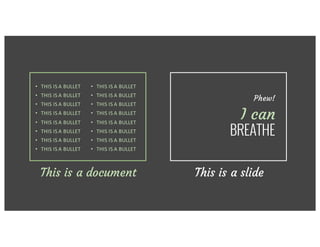
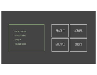
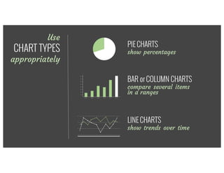
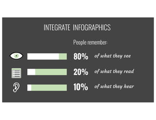
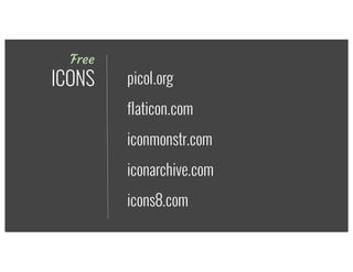
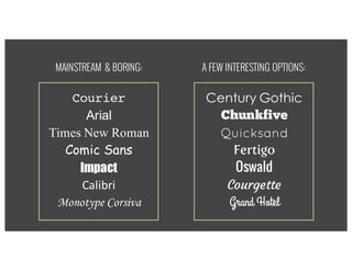
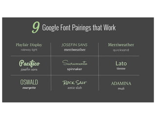
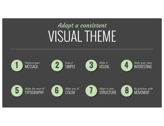
How to design a
KILLER DECK
Essential tips in presentation design8
by
95%
OF PRESENTATIONS
make you
feel like
this
… OR this
Set yourself
APART
from the
rest!
Express	yourself*Take your corporate
templates with
A GRAIN OF SALT
Wow themWOWYour audience!
but
HOW?
Sharpen your
MESSAGE1
What	do	you	want	your	audience	to	take	
home?
What do you want them to take home?
messages
Focus on
THREE
messages
Focus on
THREE
(That’s all most of us will retain.)
Keep it
SIMPLE2
Less is
MORE
Your audience will either
READ YOUR SLIDES
or
LISTEN TO YOU
Which would you prefer?
Your audience will either
READ YOUR SLIDES
or
LISTEN TO YOU
Each slide is like a
BILLBOARD
Each slide is like a
BILLBOARD
3
It should take
SECONDS
to digest
MESSAGE
1per slide
• THIS	IS	A	BULLET
• THIS	IS	A	BULLET
• THIS	IS	A	BULLET
• THIS	IS	A	BULLET
• THIS	IS	A	BULLET
• THIS	IS	A	BULLET
• THIS	IS	A	BULLET
• THIS	IS	A	BULLET
This is a document
• THIS	IS	A	BULLET
• THIS	IS	A	BULLET
• THIS	IS	A	BULLET
• THIS	IS	A	BULLET
• THIS	IS	A	BULLET
• THIS	IS	A	BULLET
• THIS	IS	A	BULLET
• THIS	IS	A	BULLET
• THIS	IS	A	BULLET
• THIS	IS	A	BULLET
• THIS	IS	A	BULLET
• THIS	IS	A	BULLET
• THIS	IS	A	BULLET
• THIS	IS	A	BULLET
• THIS	IS	A	BULLET
• THIS	IS	A	BULLET
This is a document This is a slide
Phew!
I can
BREATHE
• THIS	IS	A	BULLET
• THIS	IS	A	BULLET
• THIS	IS	A	BULLET
• THIS	IS	A	BULLET
• THIS	IS	A	BULLET
• THIS	IS	A	BULLET
• THIS	IS	A	BULLET
• THIS	IS	A	BULLET
• DON’T	CRAM
• EVERYTHING
• INTO	A
• SINGLE	SLIDE
• DON’T	CRAM
• EVERYTHING
• INTO	A
• SINGLE	SLIDE
SPACE IT ACROSS
MULTIPLE SLIDES
Make it
VISUAL3
Use stunning
IMAGES
Take your audience on a journey
Images	are	powerful
Create a mood with photos
BIGGER
is better
BANClipart!
It’s child’s play with FREE photo sites
unsplash.com
isorepublic.com
freeimages.com
& more!
Take	your	own
Or take your
OWN PICS!
Make your data
INTERESTING4
Sleeping	manTables of data are
BORING
Use
CHART TYPES
appropriately
PIE CHARTS
show percentages
BAR or COLUMN CHARTS
compare several
items in a range
LINE CHARTS
show trends over time
80% of what they see
20% of what they read
10% of what they hear
INTEGRATE INFOGRAPHICS
People remember:
Free
ICONS
iconmonstr.com
iconarchive.com
icons8.com
flaticon.com
picol.org
Make the most of
TYPOGRAPHY5
MAINSTREAM & BORING:
Century Gothic
Chunkfive
Quicksand
Fertigo
Oswald
Courgette
Grand Hotel
Courier
Arial
Times New Roman
Comic Sans
Impact
Calibri
Monotype Corsiva
A FEW INTERESTING OPTIONS:
EXPERIMENT
with font combinations
Not every match is made in heaven
EXPERIMENT
with font combinations
thick & slanted
thin & straight
CONTRAST
is key!
EXPERIMENT
with font combinations
MAXIMUM
Style3
Google Font Pairings that Work
Playfair Display
raleway light
Pacifico
josefin sans
JOSEFIN SANS
merriweather
Sacramento
spinnaker
ADAMINA
muli
Rock Salt
antic slab
Merriweather
quicksand
Lato
tienne
OSWALD
courgette
9
Make good use of
COLOR6
COLORS CREATE
emotion
CHOOSE
COLORS
that fit
together
well
Find INSPIRATION in
PHOTOS you love
Get	inspired	by	an	image
Adobe Kuler: http://color.adobe.com
Adopt a clear
STRUCTURE7
Use	a	consistent	visual	theme	throughout
Take them
through your
STORY
Without
LOSING
them
Adopt a consistent
VISUAL THEME
21 3 4
65 7 8
Sharpen your
MESSAGE
Keep it
SIMPLE
Make it
VISUAL
Make your data
INTERESTING
Be judicious with
MOVEMENT
Adopt a clear
STRUCTURE
Make use of
COLOR
Make the most of
TYPOGRAPHY
Be judicious with
MOVEMENT8
Use	animations	&	transitions	for	good	&	not	
evil
Use animation
for GOOD
not EVIL
There’s	no	excuse	for	using	the	boomerang	
effecBOUNCING
is for balls
There’s	no	excuse	for	using	the	boomerang	
effecBOUNCING
is for balls
not for
animations
Stick to SUBTLE
animations that SUPPORT,
rather than DISTRACT
CALL	TO	ACTION
Do you need
a pitch that
ROCKS?
CALL	TO	ACTION
Do you need
a pitch that
ROCKS?
E-mail us!
info2@exaltus.ca

How to Design a Killer Deck - 8 Essential Tips in Presentation Design