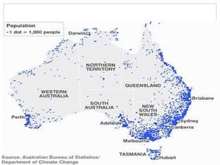
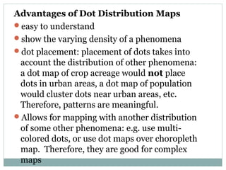
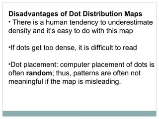
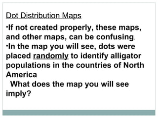
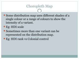
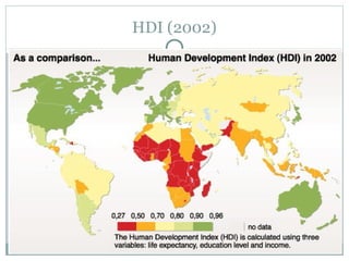
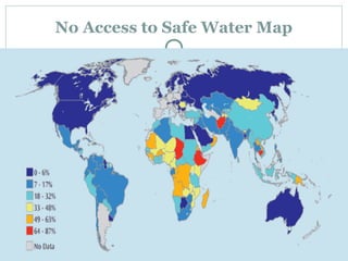
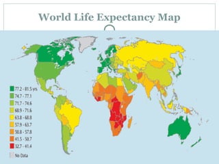
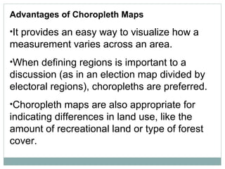
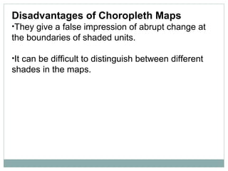
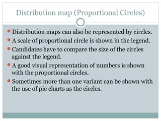
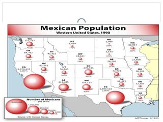
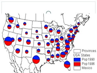
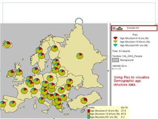
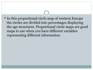
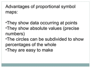
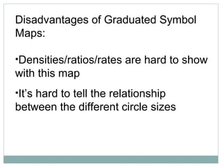
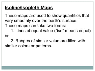
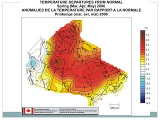
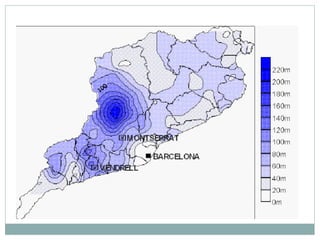
This document discusses different types of distribution maps, including dot maps, choropleth maps, proportional circle maps, and isoline maps. Dot maps represent values using dots, with dot density corresponding to measurement levels. Choropleth maps use color shades to show measurement variations across areas. Proportional circle maps represent data at points using circle areas scaled to values. Isoline maps show quantities that vary smoothly using lines or colors of equal value. Each map type has advantages like ease of use but also disadvantages like difficulty showing some relationships.