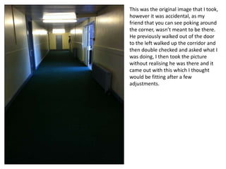
This was the original image that I took,
however it was accidental, as my
friend that you can see poking around
the corner, wasn’t meant to be there.
He previously walked out of the door
to the left walked up the corridor and
then double checked and asked what I
was doing, I then took the picture
without realising he was there and it
came out with this which I thought
would be fitting after a few
adjustments.
the image that is being used as the
poster’s main (previous slide) I
PhotoShopped and gave it effects so
that it would look dark and fitting for
the horror genre.
the white writing on the wall I thought
to begin with stood out and thus
attracted the viewers eyes to the
writing, but after evaluating, I changed
it to black for the reasons on the next
slide.
This was my original poster that I made
minor tweeks to such as the white
writing on the wall to the black that is
there now. the reason why I changed
such a simple thing as the colour of the
writing on the wall was because I
evaluated it and tried the writing in
different colours and thought that the
black colour compared to the white
was more shadow-like making it look
suspicious as well.
What I thought would be the final
draft was this. I changed the writing of
the title of the film to red, and seeing
as I changed the writing on the wall to
a darker colour, I thought that I have to
have a focal point for the audience and
so the film title’s name had to be
changed to red. Red also is a colour
that denotes suspicion and evil, which
is why I chose it, not only that but in
my research, Insidious, one of the
posters that I researched has red
writing for the title of the film with a
fairly dark background.
However, I then started again and on
the next slide is the second attempt.
So I started off with the same original
image and then I cropped it slightly to
put more emphasis on the door and
person at the end.
For the next stage I then added a
black and white effect for the
picture to be darker.


That is where the door used to be as
I edited it out. the reason why I
edited it out is because I felt it
would create a more concentrated
effect on the main door at the end
of the corridor.
the difference between this slide and
the last is that the photo has had a
darkening overlay added to the top of
it.
the reason why I made this decision is
because it has made the image a lot
more suspicious. the way now how the
lights lay add to it because there is
more contrast between the dark and
the light of the image which for the
genre is perfect, because of the nature
of horrors, it encourages darkness and
suspense.
the door on then left I decided to edit
out just like the door on the right
because I wanted more emphasis to
be on the door at the end so if there
were no doors left then the desired
door would be the only one that
would be left.
the next step that I took was to add text
to the wall, as like in many horror
posters that I’ve researched, they have a
tag line, which draws the viewer in and
makes the audience more aware of the
film, but with the tag line, if it’s a
memorable, they’ll remember it and be
more inclined to want to see the film,
but will also add suspicion about the
film.
Finally I added the finishing touches
to the poster, as all was left to add
was the title of the film and the
credits of who is the film, who made
it, screenplay ect.
I also added, for the reason of
authenticity, the Paramount and
DreamWorks Pictures were put onto
the poster.
Evaluation

Overall I would say the progress that I have made is progress that I am happy with. I have
taken an image with the concepts that I wanted and planned out, with the door being at
the centre point of the poster, but with a mysterious twist, as there is a figure at the end
just before the door.
After all of the Photoshopping that I have done to the image I am incredibly happy with the
result as it meets and exceeds what I wanted to achieve with the poster and its look, layout
and effect that it has on people.
If I was to do the poster again I would only change how much shorter time it would take me
to do it, for the simple reason that I don’t think I could or would want to improve it.
In conclusion, I have enjoyed making the poster and going through similar motions as to
what professional posters of movies go through.

Transition

  • 1.
    This was theoriginal image that I took, however it was accidental, as my friend that you can see poking around the corner, wasn’t meant to be there. He previously walked out of the door to the left walked up the corridor and then double checked and asked what I was doing, I then took the picture without realising he was there and it came out with this which I thought would be fitting after a few adjustments.
  • 2.
    the image thatis being used as the poster’s main (previous slide) I PhotoShopped and gave it effects so that it would look dark and fitting for the horror genre. the white writing on the wall I thought to begin with stood out and thus attracted the viewers eyes to the writing, but after evaluating, I changed it to black for the reasons on the next slide.
  • 3.
    This was myoriginal poster that I made minor tweeks to such as the white writing on the wall to the black that is there now. the reason why I changed such a simple thing as the colour of the writing on the wall was because I evaluated it and tried the writing in different colours and thought that the black colour compared to the white was more shadow-like making it look suspicious as well.
  • 4.
    What I thoughtwould be the final draft was this. I changed the writing of the title of the film to red, and seeing as I changed the writing on the wall to a darker colour, I thought that I have to have a focal point for the audience and so the film title’s name had to be changed to red. Red also is a colour that denotes suspicion and evil, which is why I chose it, not only that but in my research, Insidious, one of the posters that I researched has red writing for the title of the film with a fairly dark background. However, I then started again and on the next slide is the second attempt.
  • 5.
    So I startedoff with the same original image and then I cropped it slightly to put more emphasis on the door and person at the end.
  • 6.
    For the nextstage I then added a black and white effect for the picture to be darker. That is where the door used to be as I edited it out. the reason why I edited it out is because I felt it would create a more concentrated effect on the main door at the end of the corridor.
  • 7.
    the difference betweenthis slide and the last is that the photo has had a darkening overlay added to the top of it. the reason why I made this decision is because it has made the image a lot more suspicious. the way now how the lights lay add to it because there is more contrast between the dark and the light of the image which for the genre is perfect, because of the nature of horrors, it encourages darkness and suspense.
  • 8.
    the door onthen left I decided to edit out just like the door on the right because I wanted more emphasis to be on the door at the end so if there were no doors left then the desired door would be the only one that would be left.
  • 9.
    the next stepthat I took was to add text to the wall, as like in many horror posters that I’ve researched, they have a tag line, which draws the viewer in and makes the audience more aware of the film, but with the tag line, if it’s a memorable, they’ll remember it and be more inclined to want to see the film, but will also add suspicion about the film.
  • 10.
    Finally I addedthe finishing touches to the poster, as all was left to add was the title of the film and the credits of who is the film, who made it, screenplay ect. I also added, for the reason of authenticity, the Paramount and DreamWorks Pictures were put onto the poster.
  • 11.
    Evaluation Overall I wouldsay the progress that I have made is progress that I am happy with. I have taken an image with the concepts that I wanted and planned out, with the door being at the centre point of the poster, but with a mysterious twist, as there is a figure at the end just before the door. After all of the Photoshopping that I have done to the image I am incredibly happy with the result as it meets and exceeds what I wanted to achieve with the poster and its look, layout and effect that it has on people. If I was to do the poster again I would only change how much shorter time it would take me to do it, for the simple reason that I don’t think I could or would want to improve it. In conclusion, I have enjoyed making the poster and going through similar motions as to what professional posters of movies go through.