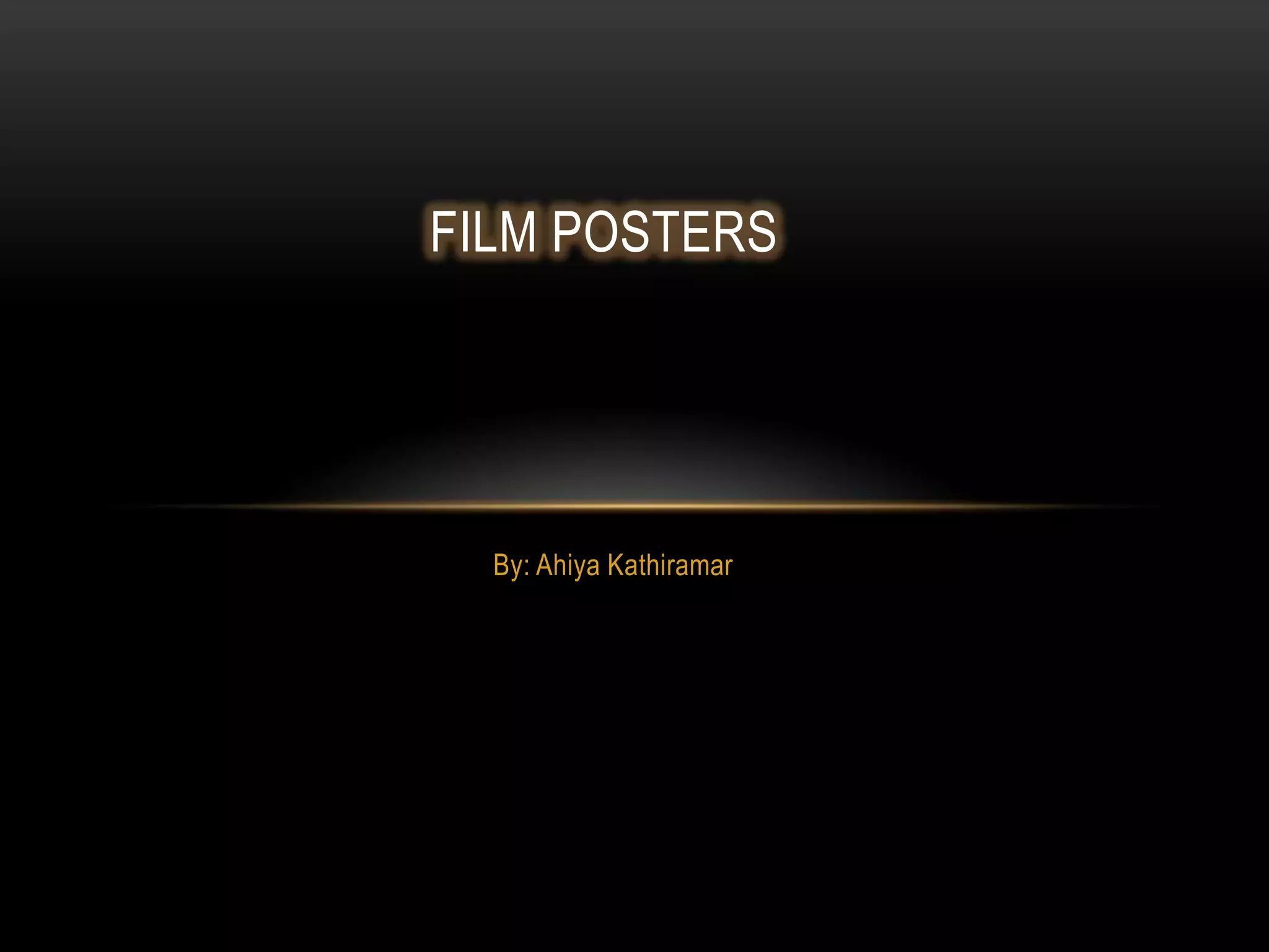
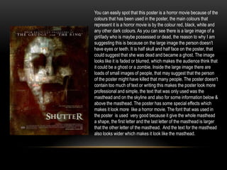
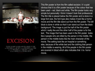
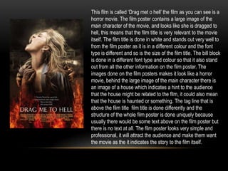
By: Ahiya Kathiramar
FILM POSTERS
You can easily spot that this poster is a horror movie because of the
colours that has been used in the poster, the main colours that
represent it is a horror movie is by the colour red, black, white and
any other dark colours. As you can see there is a large image of a
girl/lady who is maybe possessed or dead, the reason to why I am
suggesting this is because on the large image the person doesn't
have eyes or teeth. It is half skull and half face on the poster, that
could suggest that she was dead and became a ghost. The image
looks like it is faded or blurred, which makes the audience think that
it could be a ghost or a zombie. Inside the large image there are
loads of small images of people, that may suggest that the person
of the poster might have killed that many people. The poster doesn't
contain too much of text or writing this makes the poster look more
professional and simple, the text that was only used was the
masthead and on the skyline and also for some information below &
above the masthead. The poster has some special effects which
makes it look more like a horror movie. The font that was used in
the poster is used very good because it give the whole masthead
a shape, the first letter and the last letter of the masthead is larger
that the other letter of the masthead. And the text for the masthead
also looks wider which makes it look like the masthead.
This film poster is called insidious. The film poster
represents with a little boy who is the main character of
the movie , the little boy looks like he is possessed on
the film poster. The way the image was taken was by
a mid shot because it doesn’t show the full form of the
little boy but rather shows it half way. Behind the boy
there is his house which makes it look like it is haunted
or something. The atmosphere of the film poster
makes it look more like a horror movie because it is
dark. The film poster looks very simple and has few
text which makes it look professional, the colour of the
text are all in white except from 2 letter in the masthead
‘SI’ gives a hint to the audience that these letter are
relevant to what is going to happen in the movie.
The film is called ‘Sinister’ the film poster is done
very creatively and it look very unique because of the
way it is represented that it is a horror movie. The
poster contains few text which includes the film title.
The film title is in the colour red so that it stands out
from all the other colours. The masthead makes it
looks like it was painted with blood as it dripping
down, and just below the film title there are small
images made by the blood that was dripping; it looks
like people who are hung. The background that was
done on the film poster looks like a wallpaper of a old
house, this may suggest that the film could be about
a haunted house. There is a second image placed
behind the film title, that second image almost looks
like a face. There are also few text used above the
film poster about the producer and the director of the
film, this text is in white and so is the little icons and
text below the film poster. There are also red text
below the film poster which is the tag line of the
movie.
This film poster is from the film called excision. It ‘s quiet
obvious that it is a film poster because of the colour that has
been used – red, black and white. The film poster looks very
simple but personally I think it doesn’t look that professional.
The film title is placed below the film poster and is done in a
large font size, the font type also makes it look like a horror
movie and the film title stand out from the film poster. The bill
block is done in white so that It can stand out from the black
background. The image is just the half of the film poster
which I really like and the other half of the poster is for the
text. The image that has been used in the film poster looks
like 2 people who are killed by the person in the middle, the
person in the middle looks like the main character of the
movie. The setting look like an hospital or something
else, because of the white bed and the clothing that person
in the middle is wearing. All of the people in the film poster
are covered in blood which also indicates that it is horror
movie.
This film is called ‘Drag met o hell’ the film as you can see is a
horror movie. The film poster contains a large image of the
main character of the movie, and looks like she is dragged to
hell, this means that the film title is very relevant to the movie
itself. The film title is done in white and stands out very well to
from the film poster as it is in a different colour and the font
type is different and so is the size of the film title. The bill block
is done in a different font type and colour so that it also stand
out from all the other information on the film poster. The
images done on the film posters makes it look like a horror
movie, behind the large image of the main character there is
an image of a house which indicates a hint to the audience
that the house might be related to the film, it could also mean
that the house is haunted or something. The tag line that is
above the film title film title is done differently and the
structure of the whole film poster is done uniquely because
usually there would be some text above on the film poster but
there is no text at all. The film poster looks very simple and
professional, it will attract the audience and make them want
the movie as the it indicates the story to the film itself.

Film posters

  • 1.
  • 2.
    You can easilyspot that this poster is a horror movie because of the colours that has been used in the poster, the main colours that represent it is a horror movie is by the colour red, black, white and any other dark colours. As you can see there is a large image of a girl/lady who is maybe possessed or dead, the reason to why I am suggesting this is because on the large image the person doesn't have eyes or teeth. It is half skull and half face on the poster, that could suggest that she was dead and became a ghost. The image looks like it is faded or blurred, which makes the audience think that it could be a ghost or a zombie. Inside the large image there are loads of small images of people, that may suggest that the person of the poster might have killed that many people. The poster doesn't contain too much of text or writing this makes the poster look more professional and simple, the text that was only used was the masthead and on the skyline and also for some information below & above the masthead. The poster has some special effects which makes it look more like a horror movie. The font that was used in the poster is used very good because it give the whole masthead a shape, the first letter and the last letter of the masthead is larger that the other letter of the masthead. And the text for the masthead also looks wider which makes it look like the masthead.
  • 3.
    This film posteris called insidious. The film poster represents with a little boy who is the main character of the movie , the little boy looks like he is possessed on the film poster. The way the image was taken was by a mid shot because it doesn’t show the full form of the little boy but rather shows it half way. Behind the boy there is his house which makes it look like it is haunted or something. The atmosphere of the film poster makes it look more like a horror movie because it is dark. The film poster looks very simple and has few text which makes it look professional, the colour of the text are all in white except from 2 letter in the masthead ‘SI’ gives a hint to the audience that these letter are relevant to what is going to happen in the movie.
  • 4.
    The film iscalled ‘Sinister’ the film poster is done very creatively and it look very unique because of the way it is represented that it is a horror movie. The poster contains few text which includes the film title. The film title is in the colour red so that it stands out from all the other colours. The masthead makes it looks like it was painted with blood as it dripping down, and just below the film title there are small images made by the blood that was dripping; it looks like people who are hung. The background that was done on the film poster looks like a wallpaper of a old house, this may suggest that the film could be about a haunted house. There is a second image placed behind the film title, that second image almost looks like a face. There are also few text used above the film poster about the producer and the director of the film, this text is in white and so is the little icons and text below the film poster. There are also red text below the film poster which is the tag line of the movie.
  • 5.
    This film posteris from the film called excision. It ‘s quiet obvious that it is a film poster because of the colour that has been used – red, black and white. The film poster looks very simple but personally I think it doesn’t look that professional. The film title is placed below the film poster and is done in a large font size, the font type also makes it look like a horror movie and the film title stand out from the film poster. The bill block is done in white so that It can stand out from the black background. The image is just the half of the film poster which I really like and the other half of the poster is for the text. The image that has been used in the film poster looks like 2 people who are killed by the person in the middle, the person in the middle looks like the main character of the movie. The setting look like an hospital or something else, because of the white bed and the clothing that person in the middle is wearing. All of the people in the film poster are covered in blood which also indicates that it is horror movie.
  • 6.
    This film iscalled ‘Drag met o hell’ the film as you can see is a horror movie. The film poster contains a large image of the main character of the movie, and looks like she is dragged to hell, this means that the film title is very relevant to the movie itself. The film title is done in white and stands out very well to from the film poster as it is in a different colour and the font type is different and so is the size of the film title. The bill block is done in a different font type and colour so that it also stand out from all the other information on the film poster. The images done on the film posters makes it look like a horror movie, behind the large image of the main character there is an image of a house which indicates a hint to the audience that the house might be related to the film, it could also mean that the house is haunted or something. The tag line that is above the film title film title is done differently and the structure of the whole film poster is done uniquely because usually there would be some text above on the film poster but there is no text at all. The film poster looks very simple and professional, it will attract the audience and make them want the movie as the it indicates the story to the film itself.