Shyanne Sanders
EASY A- Title sequence
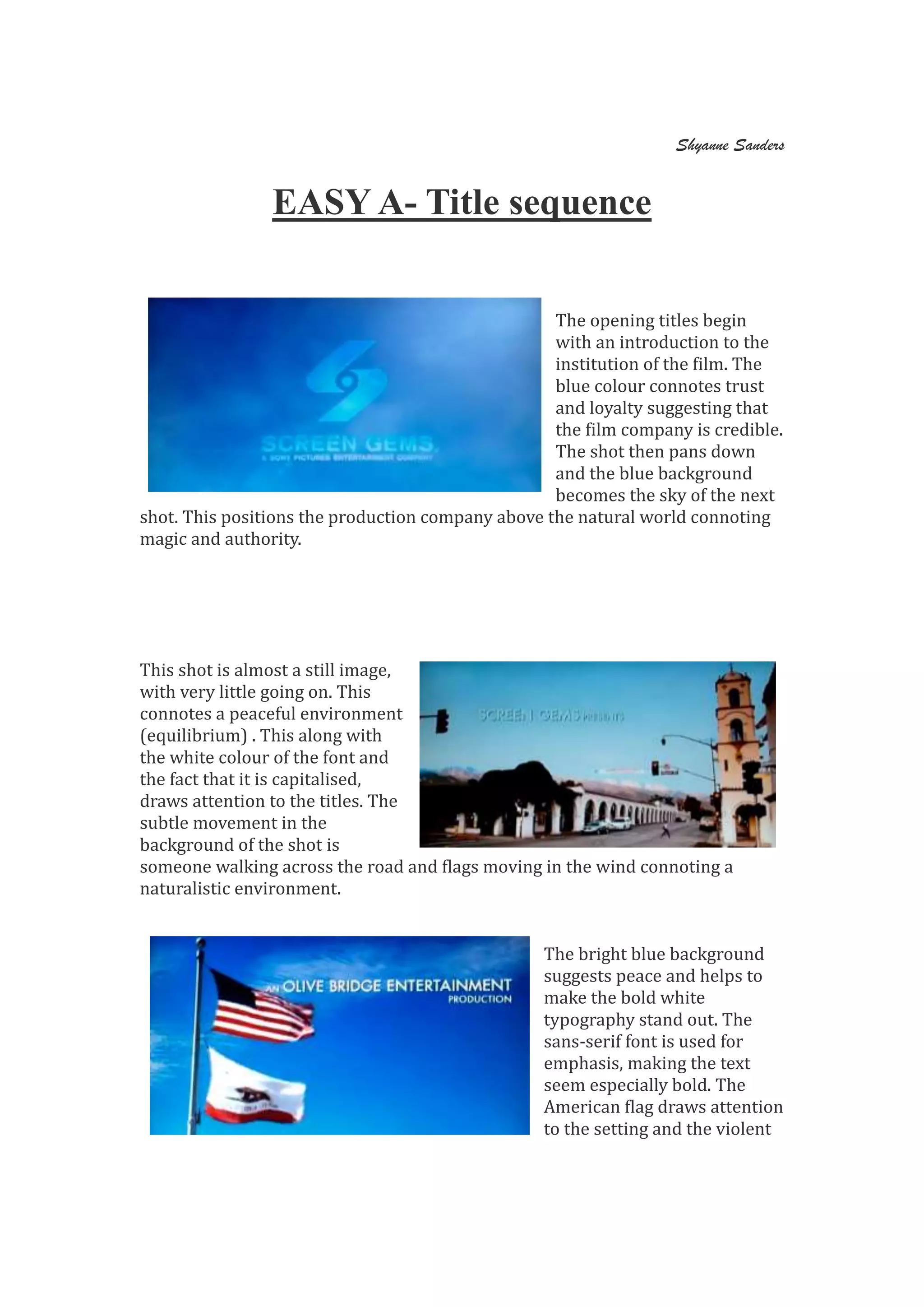
The opening titles begin
with an introduction to the
institution of the film. The
blue colour connotes trust
and loyalty suggesting that
the film company is credible.
The shot then pans down
and the blue background
becomes the sky of the next
shot. This positions the production company above the natural world connoting
magic and authority.
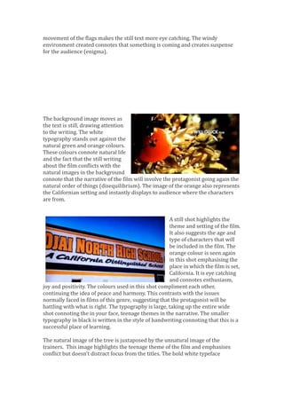
This shot is almost a still image,
with very little going on. This
connotes a peaceful environment
(equilibrium) . This along with
the white colour of the font and
the fact that it is capitalised,
draws attention to the titles. The
subtle movement in the
background of the shot is
someone walking across the road and flags moving in the wind connoting a
naturalistic environment.
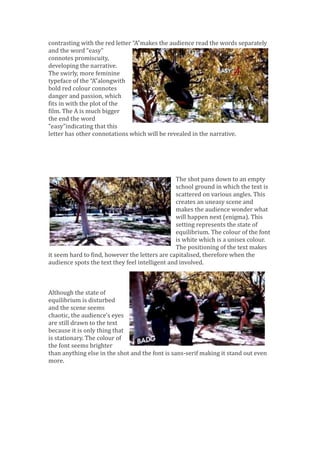
The bright blue background
suggests peace and helps to
make the bold white
typography stand out. The
sans-serif font is used for
emphasis, making the text
seem especially bold. The
American flag draws attention
to the setting and the violent
movement of the flags makes the still text more eye catching. The windy
environment created connotes that something is coming and creates suspense
for the audience (enigma).
The background image moves as
the text is still, drawing attention
to the writing. The white
typography stands out against the
natural green and orange colours.
These colours connote natural life
and the fact that the still writing
about the film conflicts with the
natural images in the background
connote that the narrative of the film will involve the protagonist going again the
natural order of things (disequilibrium). The image of the orange also represents
the Californian setting and instantly displays to audience where the characters
are from.
A still shot highlights the
theme and setting of the film.
It also suggests the age and
type of characters that will
be included in the film. The
orange colour is seen again
in this shot emphasising the
place in which the film is set,
California. It is eye catching
and connotes enthusiasm,
joy and positivity. The colours used in this shot compliment each other,
continuing the idea of peace and harmony. This contrasts with the issues
normally faced in films of this genre, suggesting that the protagonist will be
battling with what is right. The typography is large, taking up the entire wide
shot connoting the in your face, teenage themes in the narrative. The smaller
typography in black is written in the style of handwriting connoting that this is a
successful place of learning.
The natural image of the tree is juxtaposed by the unnatural image of the
trainers. This image highlights the teenage theme of the film and emphasises
conflict but doesn’t distract focus from the titles. The bold white typeface
contrasting with the red letter “A”makes the audience read the words separately
and the word “easy”
connotes promiscuity,
developing the narrative.
The swirly, more feminine
typeface of the “A”alongwith
bold red colour connotes
danger and passion, which
fits in with the plot of the
film. The A is much bigger
the end the word
“easy”indicating that this
letter has other connotations which will be revealed in the narrative.
The shot pans down to an empty
school ground in which the text is
scattered on various angles. This
creates an uneasy scene and
makes the audience wonder what
will happen next (enigma). This
setting represents the state of
equilibrium. The colour of the font
is white which is a unisex colour.
The positioning of the text makes
it seem hard to find, however the letters are capitalised, therefore when the
audience spots the text they feel intelligent and involved.
Although the state of
equilibrium is disturbed
and the scene seems
chaotic, the audience's eyes
are still drawn to the text
because it is only thing that
is stationary. The colour of
the font seems brighter
than anything else in the shot and the font is sans-serif making it stand out even
more.
The text almost acts as a label as the shot reveals different groups of teenagers,
foreshadowing the stereotypical characters who are featured in the film. The
teenage target audience will be able to identify with the feeling of being labeled
(uses and gratification).
The text then becomes subtle
and hider to find to highlight the
feelings of the main character;
invisible and unwanted. This is
a common issue amongst
teenagers at school and is
therefore a convention of films
within this genre. The
positioning, although harder to
find is at the top of the shot, when previously was at the bottom, connoting that
the protagonist will gain confidence in herself and become higher up in social
status by the end of the narrative.
Previously the characters walked in
front of the text, blocking it from
view, but here the character and the
text are side by side and at equal
levels. This connotes that this
character is an important part in the
story-line of the film. This is the last
title in the opening sequence and
therefore makes the audience pay attention to and remember this name.
Positioning the titles and the character on the group with a high angle shot
allows the audience to identify with her vulnerability (uses and gratification).

Title sequence1 easy a

  • 1.
    Shyanne Sanders EASY A-Title sequence The opening titles begin with an introduction to the institution of the film. The blue colour connotes trust and loyalty suggesting that the film company is credible. The shot then pans down and the blue background becomes the sky of the next shot. This positions the production company above the natural world connoting magic and authority. This shot is almost a still image, with very little going on. This connotes a peaceful environment (equilibrium) . This along with the white colour of the font and the fact that it is capitalised, draws attention to the titles. The subtle movement in the background of the shot is someone walking across the road and flags moving in the wind connoting a naturalistic environment. The bright blue background suggests peace and helps to make the bold white typography stand out. The sans-serif font is used for emphasis, making the text seem especially bold. The American flag draws attention to the setting and the violent
  • 2.
    movement of theflags makes the still text more eye catching. The windy environment created connotes that something is coming and creates suspense for the audience (enigma). The background image moves as the text is still, drawing attention to the writing. The white typography stands out against the natural green and orange colours. These colours connote natural life and the fact that the still writing about the film conflicts with the natural images in the background connote that the narrative of the film will involve the protagonist going again the natural order of things (disequilibrium). The image of the orange also represents the Californian setting and instantly displays to audience where the characters are from. A still shot highlights the theme and setting of the film. It also suggests the age and type of characters that will be included in the film. The orange colour is seen again in this shot emphasising the place in which the film is set, California. It is eye catching and connotes enthusiasm, joy and positivity. The colours used in this shot compliment each other, continuing the idea of peace and harmony. This contrasts with the issues normally faced in films of this genre, suggesting that the protagonist will be battling with what is right. The typography is large, taking up the entire wide shot connoting the in your face, teenage themes in the narrative. The smaller typography in black is written in the style of handwriting connoting that this is a successful place of learning. The natural image of the tree is juxtaposed by the unnatural image of the trainers. This image highlights the teenage theme of the film and emphasises conflict but doesn’t distract focus from the titles. The bold white typeface
  • 3.
    contrasting with thered letter “A”makes the audience read the words separately and the word “easy” connotes promiscuity, developing the narrative. The swirly, more feminine typeface of the “A”alongwith bold red colour connotes danger and passion, which fits in with the plot of the film. The A is much bigger the end the word “easy”indicating that this letter has other connotations which will be revealed in the narrative. The shot pans down to an empty school ground in which the text is scattered on various angles. This creates an uneasy scene and makes the audience wonder what will happen next (enigma). This setting represents the state of equilibrium. The colour of the font is white which is a unisex colour. The positioning of the text makes it seem hard to find, however the letters are capitalised, therefore when the audience spots the text they feel intelligent and involved. Although the state of equilibrium is disturbed and the scene seems chaotic, the audience's eyes are still drawn to the text because it is only thing that is stationary. The colour of the font seems brighter than anything else in the shot and the font is sans-serif making it stand out even more.
  • 4.
    The text almostacts as a label as the shot reveals different groups of teenagers, foreshadowing the stereotypical characters who are featured in the film. The teenage target audience will be able to identify with the feeling of being labeled (uses and gratification). The text then becomes subtle and hider to find to highlight the feelings of the main character; invisible and unwanted. This is a common issue amongst teenagers at school and is therefore a convention of films within this genre. The positioning, although harder to find is at the top of the shot, when previously was at the bottom, connoting that the protagonist will gain confidence in herself and become higher up in social status by the end of the narrative. Previously the characters walked in front of the text, blocking it from view, but here the character and the text are side by side and at equal levels. This connotes that this character is an important part in the story-line of the film. This is the last title in the opening sequence and therefore makes the audience pay attention to and remember this name. Positioning the titles and the character on the group with a high angle shot allows the audience to identify with her vulnerability (uses and gratification).